


Introduction
Clipper widgets are used to clip the child widget into various shapes and sizes. It keeps the child from drawing outside the lines. In this article, we will implement a demo of ClipRect and ClipRRect Widget in a Flutter application.
ClipRect and ClipRRect Widget
ClipRect Widget in Flutter
The ClipRect widget is used to clip a rectangle around its child. It has links to the Clippers family. Clippers are mostly used to remove any section of a widget as needed. It works similarly to ClipRRect in that it is used to clip a Rectangle area of the child widget but without the rounded corners.
Constructors
Syntax:
ClipRect(
{Key key,
CustomClipper<Rect> clipper,
Clip clipBehavior: Clip.hardEdge,
Widget child})
Example
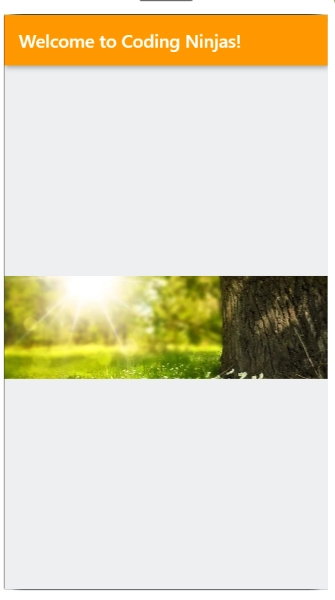
In this example, we will clip the image below into our app:

Code
import 'package:flutter/material.dart';

void main() {
  runApp(MyApp());
}

class MyApp extends StatelessWidget {
// This widget is
//the root of your application.
  @override
  Widget build(BuildContext context) {
    return MaterialApp(
      title: 'ClipOval',
      theme: ThemeData(
        primarySwatch: Colors.blue,
      ),
      home: MyHomePAGE(),
      debugShowCheckedModeBanner: false,
    );
  }
}

class MyHomePAGE extends StatefulWidget {
  @override
  _MyHomePAGEState createState() => _MyHomePAGEState();
}

class _MyHomePAGEState extends State<MyHomePAGE> {
  @override
  Widget build(BuildContext context) {
    return Scaffold(
      appBar: AppBar(
        title: Text('Welcome to Coding Ninjas!'),
        backgroundColor: Colors.orange,
      ),
      body: Center(
          child: ClipRect(
        child: Align(
          alignment: Alignment.topCenter,
          heightFactor: 0.5,
          child: Image.network('https://cdn.pixabay.com/photo/2014/02/27/16/10/tree-276014__340.jpg'),
        ),
      )),
      backgroundColor: Colors.lightBlue[50],
    );
  }
}

class MyClip extends CustomClipper<Rect> {
  Rect getClip(Size size) {
    return Rect.fromLTWH(0, 0, 100, 100);
  }

  bool shouldReclip(oldClipper) {
    return false;
  }
}
Output
ClipRect Widget in Flutter
ClipRRect is a widget that uses a round import to clip your child. It belongs to the Clippers family. The clippers' primary role is to print whatever section of the widget is required. It is similar to ClipRect. It is used to trim the child widget's import section. ClipRect has its own side based on its needs. Circulars are possible. We can create widgets based on our specifications. Clippers and ClipBehavior are two of its properties. What occurs with clippers is that a custom clipper is used to describe how the text will be clipped, and the clippings are clipped based on this choice in the clip behavior property.
Constructor
syntax:
ClipRRect(
{Key key,
BorderRadius borderRadius: BorderRadius.zero,
CustomClipper<RRect> clipper,
Clip clipBehavior: Clip.antiAlias,
Widget child})
Methods
createRenderObject (BuildContext context): The object sent to this method is RenderClipRect. RenderObjectWidget provides setup instructions for generating the RenderObject class.
Syntax
@override
RenderClipRect createRenderObject (BuildContext context)
override
debugFillProperties (DiagnosticPropertiesBuilder properties): This function allocates an extra property linked with the node using void as the object.
Syntax
@override
void debugFillProperties ( DiagnosticPropertiesBuilder properties )
override
didUnmountRenderObject(covariant RenderClipRect renderObject): The object of this function is also void. When a widget is removed from the widget tree, it is replaced with another widget of the same type.
Syntax
@override
void didUnmountRenderObject ( covariant RenderClipRect renderObject )
override
Example
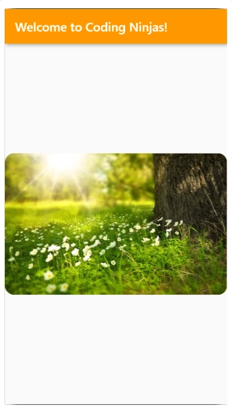
We'll use a rounded corner rectangle to trim the image below:
Code
import 'package:flutter/material.dart';

void main() {
  runApp(MyApp());
}

class MyApp extends StatelessWidget {
// This widget is
//the root of your application.
  @override
  Widget build(BuildContext context) {
    return MaterialApp(
      title: 'ClipOval',
      theme: ThemeData(
        primarySwatch: Colors.blue,
      ),
      home: MyHomePAGE(),
      debugShowCheckedModeBanner: false,
    );
  }
}
class MyHomePAGE extends StatefulWidget {
  @override
  _MyHomePAGEState createState() => _MyHomePAGEState();
}
class _MyHomePAGEState extends State<MyHomePAGE> {
  @override
  Widget build(BuildContext context) {
    return Scaffold(
        appBar: AppBar(
          title: Text('Welcome to Coding Ninjas!'),
          backgroundColor: Colors.orange,
        ),
        body: Center(
          child: ClipRRect(
            borderRadius: BorderRadius.circular(15),
            child: Image.network('https://cdn.pixabay.com/photo/2014/02/27/16/10/tree-276014__340.jpg'),
          ),
        ));
  }
}

class MyClip extends CustomClipper<Rect> {
  Rect getClip(Size size) {
    return Rect.fromLTWH(20, 20, 100, 100);
  }

  bool shouldReclip(oldClipper) {
    return false;
  }
}
Output
Explanation:
First, create a stateless widget for the main app.
Second, create your desired main widget.
Using the scaffold widget, create the Appbar.
Now, insert the ClipRect widget inside the scaffold widget's body and center it using the center widget.
Properties of ClipRect and ClipRRect Widget
children: The widgets in the tree that are below this widget.
hashCode: This object's hash code.
key: Determines how one widget replaces another in the tree.
runtimeType: A representation of the object's runtime type.
clipBehaviour: Determines how to clip.
clipper: If non-null, the clipper selects which clip to use.
borderRadius: The rounded corners' border-radius.


 8+ registered

