Do you think IIT Guwahati certified course can help you in your career?
Introduction
Flutter is a portable UI toolkit from Google that lets you create attractive natively built apps for mobile, web, and desktop from a single codebase. Flutter is free and open-source, and it works with existing code. It is utilized by developers and organizations all over the world.
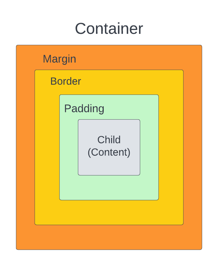
Flutter's Container class is a handy widget that combines typical widget painting, positioning, and scaling. A Container class can be used to store one or more devices and move them around on the screen as needed.
A container is just a box for storing contents. A margin divides the current container from additional contents in a fundamental element that houses a widget. In Flutter, a container is a parent widget that can hold several child widgets and manage them effectively using width, height, padding, background color, and other attributes. It's a widget that combines the child widgets' familiar painting, positioning, and sizing.
Importance of Container Class
Containers are used to adjust the size, color, and location of child widgets. We may also use characteristics like border, margin, and padding to adorn child widgets. The width and height of a given child widget are wrapped by default in the container.
Properties of Container Class
Given below are some properties of the Flutter Container Class. Before that, let's see the syntax for Container Class which is given below:
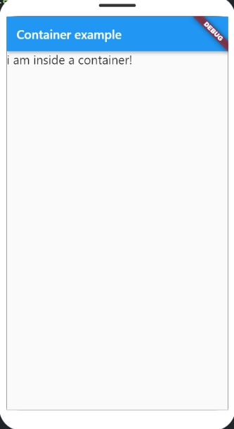
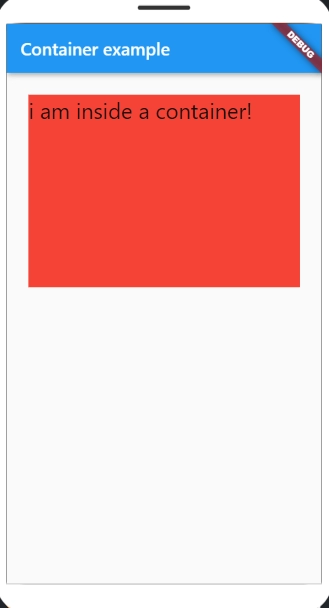
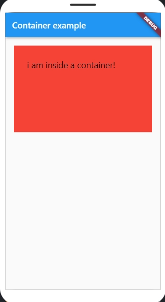
1. Child: The 'child:' attribute of the Container widget is used to store the widget's children. Any widget may be used as the child class. Consider a text widget as an example.
import 'package:flutter/material.dart';
void main() => runApp(MyApp());
class MyApp extends StatelessWidget {
@override
Widget build(BuildContext context) {
return MaterialApp(
home
: Scaffold(appBar
: AppBar(title
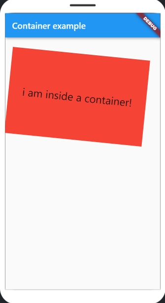
: Text("Container example"),
),
body
: Container(child
: Text("i am inside a container!",
style
: TextStyle(fontSize : 20)),
),
),
);
}
}
You can also try this code with Online C++ Compiler
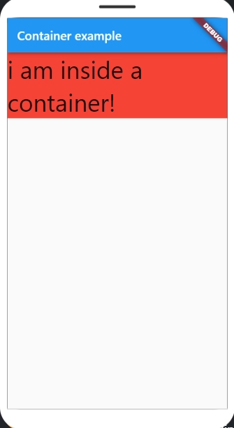
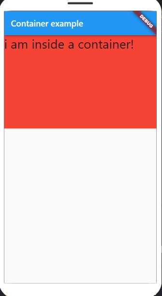
3. Margin: The margin adds empty space around the container. Take note of the white space surrounding the container. EdgeInsets. geometry is used to set the margin. all() specifies that margin exists equally in all four directions.
5. height and width: A container class takes the space required by the child by default. We can also specify the container's height and width based on our needs.
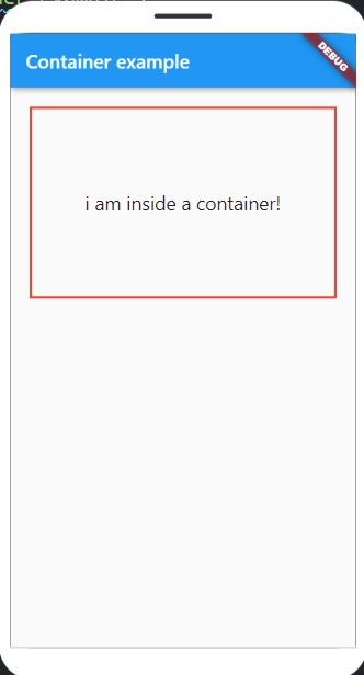
6. Decoration: The developer can use this attribute to decorate the widget. The widget behind the child is decorated or painted. We must utilize the foreground decoration parameter if we wish to decorate or paint in front of a child.
Let us give the container a boundary. However, neither the color nor the border color can be specified.
7. Transform: This container attribute allows us to rotate the container. The container can be rotated on any axis; in this case, we're rotating on the z-axis.
Flutter's Container class is a handy widget that combines typical widget painting, positioning, and scaling. A Container class can be used to store one or more widgets and move them around on the screen as needed. A container is essentially a box used to keep items.
Can a container have more than one child Flutter?
The container is a layout widget with only one child. It can, however, have several children if it is the child of a Multi-child layout widget.
What is a scaffold in Flutter?
The scaffold is a flutter class that contains numerous widgets or APIs such as Drawer, SnackBar, BottomNavigationBar, FloatingActionButton, AppBar, etc. The scaffold will extend or take over the entire screen of the smartphone. It will take up all of the available space.
What is SizedBox in Flutter?
SizedBox is a flutter SDK built-in widget. It's just a simple box with a specific size. It can be used to constrain the size of the child widget, place an empty SizedBox between the two widgets to create space, or something else entirely. It's comparable to a Container widget but with fewer properties.
What is a card in Flutter?
A card is a piece of paper that is used to represent information related to each other, such as an album, a physical location, contact information, and so on. In Flutter, a card has rounded corners and is shadowed. It was mainly used to save the content and actions of a single item.
What is a stack widget in Flutter?
In Flutter, the stack is a widget. It has a list of widgets that are stacked on top of one another. It also stacks their children like books on top of each other. To put it another way, stack developers would place numerous widgets on the same screen. You can use containers to add different images or colors.
Conclusion
In this article, we discussed Flutter Container Class. We also discussed the importance of Flutter Container Class and its different properties.
We hope that our blog has helped you enhance your knowledge regarding Flutter Container Class. Please check out these articles to improve your understanding of Flutter Container Class:Flutter RichText,Flutter Table,Flutter Animation.


 8+ registered

