


Introduction
You must have encountered tiles that expand when clicked. We will learn how to add such expansion tile cards to our application and some of their properties. It uses the style provided by google in the tile cards. So, let's begin.
Expansion Tile Card
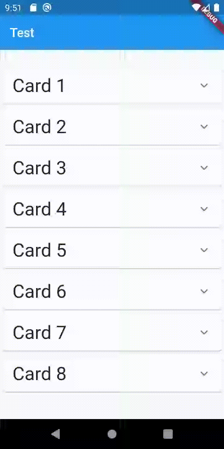
This is an example of an expansion tile card. We can see that when we click on card 4, then there is a drop-down that appears, and there is something written on it. It can be used in many different use case scenarios as per the requirements. Now, we will see the properties of the Expansion Tile Card, and then we will learn how to add the expansion tile card to our application.
Properties
The different properties of the Expansion Tile Card are given below.
- backgroundColor: It defines the color displayed behind the sublist when expanded.
- children: It represents the widgets that are displayed on expansion.
- childrenPadding: It specifies padding for the children.
- collapsedBackgroundColor: When it is not null, it defines the background color when the sublist is collapsed.
- collapsedIconColor: It establishes the icon color of the tile's expansion arrow when the sublist is collapsed.
- collapsedTextColor: It defines the color of the tile's titles when the sublist is collapsed.
- expandedAlignment: It specifies the alignment of children, arranged in a column when the tile is expanded.
- iconColor: It sets the icon color of the tile's expansion arrow icon when the sublist is expanded.
- initiallyExpanded: It specifies if the list tile is initially expanded (true) or collapsed (false, the default).
- subtitle: It defines the additional content displayed below the title.
- textColor: It specifies the color of the tile's titles when the sublist is expanded.
- tilePadding: It sets padding for the list tiles.
- title: It determines the primary content of the list item.
Some of these properties will be used when we learn to add the expansion tile card to our application.
Adding Expansion Tile Card
We will learn how to add an expansion tile card to our application step by step.
First of all, we will create a flutter application, and after that, we will add the expansion tile card to it. And then, we will add an expansion tile card to it at the end of this article, as shown below.
We need to follow the below-given steps to add an expansion tile card.
Step 1
Add the "expansion_tile_card" dependency to the "pubspec.yaml" file
Open the pubsec.yaml file, and under the dependencies section, add the dependency of the expansion tile card as shown below.
dependencies:
  flutter:
    sdk: flutter
  expansion_tile_card: ^1.1.0
Step 2
Import the dependency to the "main.dart" file
In the main.dart file uses the below-given code snippet to import the expansion tile card dependency.
import 'package:expansion_tile_card/expansion_tile_card.dart';Step 3
Create a basic app structure
In the main.dart file create a class MyApp and extend it through a StatelessWidget. Now, we can build the root of the application as shown below.
class MyApp extends StatelessWidget {
  @override
  Widget build(BuildContext context) {
    return MaterialApp(
      title: 'ExpansionTileCard Demo',
      theme: ThemeData(
        primarySwatch: Colors.blue,
      ),
      home: MyHomePage(title: 'ExpansionTile'),
    );
  }
}
Step 4
Create a Homepage for the app
We need to build the app's homepage to display the expansion tile card. To make the homepage, create a Class Homepage and extend it through a StatelessWidget. Now, create an Appbar and a body for the application, as shown below.
class _MyHomePageState extends State<MyHomePage> {
  final GlobalKey<ExpansionTileCardState> cardA = new GlobalKey();
  final GlobalKey<ExpansionTileCardState> cardB = new GlobalKey();

  @override
  Widget build(BuildContext context) {
    return Scaffold(
      appBar: AppBar(
        title: Text(widget.title!),
      ),
      body:
      ),
    );
  }
}
Step 5
Call the ExpansionTileCard in the app's body and assign content to the Expansion card.
Now, in this step, we do the actual work. We will add action on tap to the tile that would lead to expansion of the tile.
We can do this as shown below.
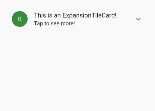
ExpansionTileCard(
              key: cardA,
              leading: CircleAvatar(child: Text('A')),
              title: Text('Tap me!'),
              subtitle: Text('I expand!'),
              children: <Widget>[
                Divider(
                  thickness: 1.0,
                  height: 1.0,
                ),
                Align(
                  alignment: Alignment.centerLeft,
                  child: Padding(
                    padding: const EdgeInsets.symmetric(
                      horizontal: 16.0,
                      vertical: 8.0,
                    ),
                    child: Text(
                      """Hi there, I'm a drop-in replacement for Flutter's ExpansionTile.

Use me any time you think your app could benefit from being just a bit more Material.

These buttons control the next card down!""",
                      style: Theme.of(context)
                          .textTheme
                          .bodyText2!
                          .copyWith(fontSize: 16),
                    ),
                  ),
                ),
The source code for the application is given below.
Source code
import 'package:flutter/material.dart';
import 'package:expansion_tile_card/expansion_tile_card.dart';

void main() => runApp(MyApp());

class MyApp extends StatelessWidget {
  @override
  Widget build(BuildContext context) {
    return MaterialApp(
      title: 'ExpansionTileCard Demo',
      theme: ThemeData(
        primarySwatch: Colors.green,
      ),
      home: MyHomePage(title: 'ExpansionTileCard Demo'),
    );
  }
}

class MyHomePage extends StatefulWidget {
  MyHomePage({Key? key, this.title}) : super(key: key);

  final String? title;

  @override
  _MyHomePageState createState() => _MyHomePageState();
}

class _MyHomePageState extends State<MyHomePage> {
  final GlobalKey<ExpansionTileCardState> cardA = new GlobalKey();
  final GlobalKey<ExpansionTileCardState> cardB = new GlobalKey();

  @override
  Widget build(BuildContext context) {
    final ButtonStyle flatButtonStyle = TextButton.styleFrom(
      shape: const RoundedRectangleBorder(
        borderRadius: BorderRadius.all(Radius.circular(4.0)),
      ),
    );

    return Scaffold(
      appBar: AppBar(
        title: Text(widget.title!),
      ),
      body: ListView(
        children: <Widget>[
          Padding(
            padding: const EdgeInsets.symmetric(horizontal: 12.0),
            child: ExpansionTileCard(
              key: cardA,
              leading: CircleAvatar(child: Text('A')),
              title: Text('Tap me!'),
              subtitle: Text('I expand!'),
              children: <Widget>[
                Divider(
                  thickness: 1.0,
                  height: 1.0,
                ),
                Align(
                  alignment: Alignment.centerLeft,
                  child: Padding(
                    padding: const EdgeInsets.symmetric(
                      horizontal: 16.0,
                      vertical: 8.0,
                    ),
                    child: Text(
                      """Hi there, I'm a drop-in replacement for Flutter's ExpansionTile.

Use me any time you think your app could benefit from being just a bit more Material.

These buttons control the next card down!""",
                      style: Theme.of(context)
                          .textTheme
                          .bodyText2!
                          .copyWith(fontSize: 16),
                    ),
                  ),
                ),
                ButtonBar(
                  alignment: MainAxisAlignment.spaceAround,
                  buttonHeight: 52.0,
                  buttonMinWidth: 90.0,
                  children: <Widget>[
                    TextButton(
                      style: flatButtonStyle,
                      onPressed: () {
                        cardB.currentState?.expand();
                      },
                      child: Column(
                        children: <Widget>[
                          Icon(Icons.arrow_downward),
                          Padding(
                            padding: const EdgeInsets.symmetric(vertical: 2.0),
                          ),
                          Text('Open'),
                        ],
                      ),
                    ),
                    TextButton(
                      style: flatButtonStyle,
                      onPressed: () {
                        cardB.currentState?.collapse();
                      },
                      child: Column(
                        children: <Widget>[
                          Icon(Icons.arrow_upward),
                          Padding(
                            padding: const EdgeInsets.symmetric(vertical: 2.0),
                          ),
                          Text('Close'),
                        ],
                      ),
                    ),
                    TextButton(
                      style: flatButtonStyle,
                      onPressed: () {
                        cardB.currentState?.toggleExpansion();
                      },
                      child: Column(
                        children: <Widget>[
                          Icon(Icons.swap_vert),
                          Padding(
                            padding: const EdgeInsets.symmetric(vertical: 2.0),
                          ),
                          Text('Toggle'),
                        ],
                      ),
                    ),
                  ],
                ),
              ],
            ),
          ),
          Padding(
            padding: const EdgeInsets.symmetric(horizontal: 12.0),
            child: ExpansionTileCard(
              key: cardB,
              expandedTextColor: Colors.red,
              leading: CircleAvatar(child: Text('B')),
              title: Text('Tap me!'),
              subtitle: Text('I expand, too!'),
              children: <Widget>[
                Divider(
                  thickness: 1.0,
                  height: 1.0,
                ),
                Align(
                  alignment: Alignment.centerLeft,
                  child: Padding(
                    padding: const EdgeInsets.symmetric(
                      horizontal: 16.0,
                      vertical: 8.0,
                    ),
                    child: Text(
                      """Hi there, I'm a drop-in replacement for Flutter's ExpansionTile.

Use me any time you think your app could benefit from being just a bit more Material.

These buttons control the card above!""",
                      style: Theme.of(context)
                          .textTheme
                          .bodyText2!
                          .copyWith(fontSize: 16),
                    ),
                  ),
                ),
                ButtonBar(
                  alignment: MainAxisAlignment.spaceAround,
                  buttonHeight: 52.0,
                  buttonMinWidth: 90.0,
                  children: <Widget>[
                    TextButton(
                      style: flatButtonStyle,
                      onPressed: () {
                        cardA.currentState?.expand();
                      },
                      child: Column(
                        children: <Widget>[
                          Icon(Icons.arrow_downward),
                          Padding(
                            padding: const EdgeInsets.symmetric(vertical: 2.0),
                          ),
                          Text('Open'),
                        ],
                      ),
                    ),
                    TextButton(
                      style: flatButtonStyle,
                      onPressed: () {
                        cardA.currentState?.collapse();
                      },
                      child: Column(
                        children: <Widget>[
                          Icon(Icons.arrow_upward),
                          Padding(
                            padding: const EdgeInsets.symmetric(vertical: 2.0),
                          ),
                          Text('Close'),
                        ],
                      ),
                    ),
                    TextButton(
                      style: flatButtonStyle,
                      onPressed: () {
                        cardA.currentState?.toggleExpansion();
                      },
                      child: Column(
                        children: <Widget>[
                          Icon(Icons.swap_vert),
                          Padding(
                            padding: const EdgeInsets.symmetric(vertical: 2.0),
                          ),
                          Text('Toggle'),
                        ],
                      ),
                    ),
                  ],
                ),
              ],
            ),
          ),
        ],
      ),
    );
  }
}
Output


 9+ registered

