Do you think IIT Guwahati certified course can help you in your career?
Introduction
The core concept of the flutter layout mechanism is the Widget. Flutter assumes everything as a widget; therefore, the icon, text, and even the app's layout are all widgets. Flutter provides plenty of specially designed widgets like Center, Align, container, etc., only for the motive of laying out the user interface.
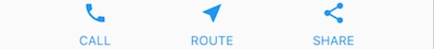
We create a flutter layout by composing widgets to create more complex widgets. As below image shows three icons with labels:
Container: It is a widget class that allows user to customize their child widget. A container is used when we want to add padding, borders, margins, or background color, to name some of its capacities.
Text: The text widget is positioned in a Container to add margins.
Layout widgets
In flutter, to put text, we have to follow a few steps, an image on the screen or an icon.
Select a layout widget
Create a visible widget
Add the visible Widget
Add the layout widget to the page
Select a flutter layout widget
We have to select from the variety of flutter layout widgets based on how we want to align or constrain the visible Widget. The below example uses a Center which centers its content vertically and horizontally.
All the flutter layout widgets have either of the following property:
If we take a list of widgets such as Row, ListView, Column, and Stack, the layout widget will have a Children property.
If we take a single child, such as Container and Center layout widget will have a Child property.
For example, for adding the text widget to the Center widget, we will use the following code:
const Center(
  child: Text('Hello Ninja!'),
),
Add the flutter layout Widget to the page
A flutter app is a widget itself, and many widgets have a method called build(). Returning and instantiating a widgets apps build() method displays the Widget.
Multiple Child Widgets
In Multiple child widgets, a given widget has more than one child widget, and the layout of each Widget should be unique.
Some of the frequently used widgets in multiple child widgets are as follows:
ListView: ListView allows to arrange its children as a list.
Table: The table is nothing but a table-based widget.
Flow: Flow is nothing but a flow-based widget.
Stack: Stack is nothing but a stack base widget.
Column: The column allows its children to arrange in a vertical manner,
Row: Row allows its children to arrange in a horizontal manner.
GridView: Gridview allows its children to arrange as a Gallery.
Expanded: expanded is used to make the children of row and column with Z to occupy the maximum possible area.
Common flutter Layout Widgets
Flutter layout has an immense library of layout widgets. Some of the commonly used ones are mentioned below. The motive is to get you up and running as quickly as possible rather than provide you with a full list.
The common flutter layout widgets fall into two categories: standard widgets from the widget library and specialized from the Material Library.
Standard Widgets from Widget Library
Container: A container is used to add margins, borders, padding, background-color pr other decorations to a widget.
ListView: It lays widgets out as a scrollable list.
Stack: Stack overlays a widget on top of another.
GridView: GridView lays the Widget out as a scrollable list.
Material Widgets
ListTitle: ListTitle is used to organize up to 3 lines of text and leading and trailing icons (optional) into a row.
Card: It helps to organize information into a box with rounded corners and a drop shadow.
Let's Understand the above widgets with a proper example. So, here is our main.dart file which contains all of the above widgets:
import 'package:flutter/material.dart';

void main() {

  runApp(const MyApp());
}

class MyApp extends StatelessWidget {
  const MyApp({super.key});

  @override
  Widget build(BuildContext context) {

    /* Container Example */
    Widget _buildDecoratedImage(int imageNumber) => Expanded(
      	child: Container(
        	decoration: BoxDecoration(
    		margin: const EdgeInsets.all(4),
        	child: Image.asset('images/pic$imageNumber.jpg'),
      	),
    );

    Widget _buildImageRow(int RowIndex) => Row(
      	children: [
        	_buildDecoratedImage(RowIndex),
        	_buildDecoratedImage(RowIndex + 1),
      	],
    );
    /* End Container Example */

    /* Grid View */
    Widget _buildGrid() => GridView.extent(
     	maxCrossAxisExtent: 150,
       	padding: const EdgeInsets.all(4),
      	mainAxisSpacing: 4,
      	crossAxisSpacing: 4,
      	children: _buildGridTileList(12));

    List<Container> _buildGridTileList(int count) => List.generate(
      count, (count) => Container(child: Image.asset('images/pic$count.jpg')));

    /* End Grid View */

  }

   /* List View */

   Widget _buildList() {
  		return ListView(
    		// Creating tile
    		children: [
      			_tile('Coding Ninjas is the best platform to learn’, Icons.logo),
      			_tile('This is a list view example', Icons.logo),
      			_tile('Coding Ninjas is the best platform to learn’, Icons.logo),
     		 	_tile('This is a list view example', Icons.logo),
    		],
  		);
	}

	// Creating listTile
	ListTile _tile(String title, IconData icon) {
  		return ListTile(
    		title: Text(title,
    		// Adding style
        	style: const TextStyle(
          		fontWeight: FontWeight.w500,
          		fontSize: 30,
        	)),

    	leading: Icon(
      		icon,
    	),
  	);
	}
	/* End List View */

}
Now, let's understand each widget separately.
Container
Containers are used to separate widgets with the help of padding or by adding borders or margins. We can also change the background of the device by placing the whole layout into a container and changing its background image or color.
Example:
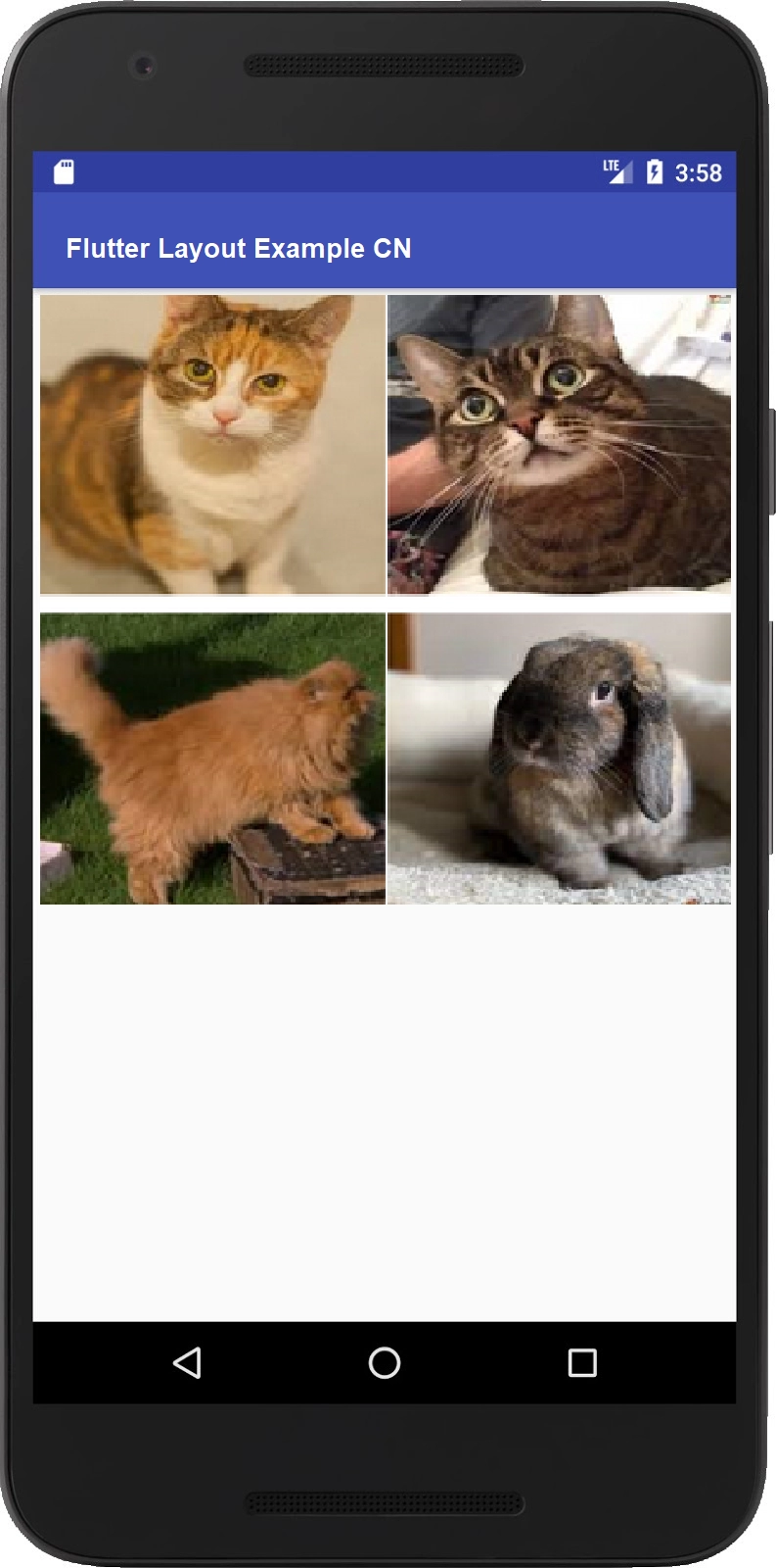
The below flutter layout consists of a column with 2 rows, of which each contains two images. In the below code, the Background color of the column is changed to light grey by using Container.
In the above example, we used the container to contain the image inside it. Then we created two different rows by calling the _buildImageRow.
GridView
GridView is used to layout widgets as a two-dimensional list. GridView delivers two pre-fabricated lists, or we can build our custom grid. Whenever a GridView detects that the contents are large to fit into the render box, it automatically scrolls.
With the help of the above code, we have created a GridView using 12 images.
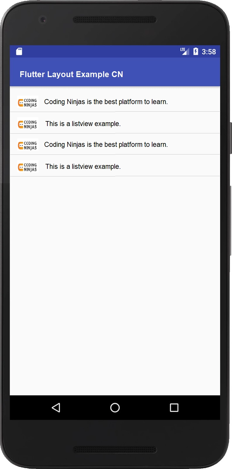
ListView
ListView is a column-like widget, that automatically provides scrolling while its content is too long for its render box.
Example
Widget _buildList() {
  return ListView(
    // Creating tile
    children: [
      _tile('Coding Ninjas is the best platform to learn’, Icons.logo),
      _tile('This is a list view example', Icons.logo),
      _tile('Coding Ninjas is the best platform to learn’, Icons.logo),
      _tile('This is a list view example', Icons.logo),
    ],
  );
}
// Creating listTile
ListTile _tile(String title, IconData icon) {
  return ListTile(
    title: Text(title,
    //adding style
        style: const TextStyle(
          fontWeight: FontWeight.w500,
          fontSize: 30,
        )),

    leading: Icon(
      icon,
    ),
  );
}
Output:
Card
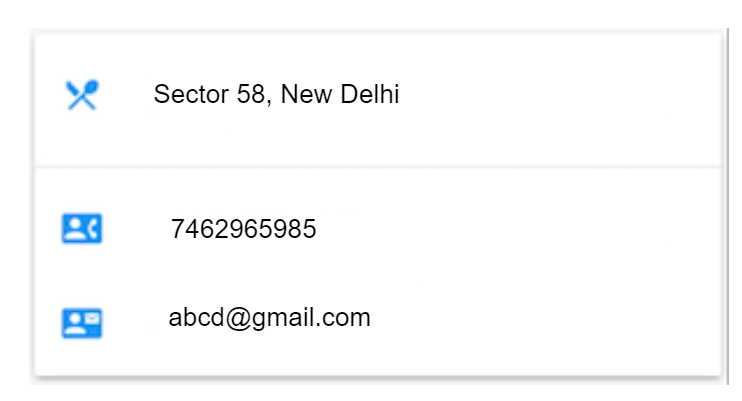
A card has relatable nuggets of info, and the card can be composed of almost any Widget, but often, it is used with ListTitle. A Card shrinks its size upto 0 by 0 px by default. A card in flutter features little rounded corners and a drop shadow, giving it a 3D effect.
ListTitle from Material Library is used to create a row containing up to 3 lines of text and optional leading and trailing icons.
Frequently Asked Questions
How do you use flutter Layouts?
The first step is to select the Layout widget, add the visible Widget to the layout widget, and add the layout widget to the page where you want to display it.
What are the different types of Flutter widgets?
The different types of flutter widgets are Text, container, and Button widget, TextField Widget, and ListView widget.
What is stack in Flutter?
It is a widget that contains a list of the Widget and places them on the top f each other. We can add different images or colors using Containers in it.
What is Card in Flutter?
A card is a flutter layout used to represent the info related to each other, like geographical location, an album, contact details, etc.
What is GridView in Flutter Layout?
GridView is a flutter widget that is used to display the items in a 2-D array.
What is flex Flutter?
Flex is a built-in flutter widget that controls how a child of base flex widgets like Column, row, and flex will fill the space available.
Conclusion
In this article, we have extensively discussed flutter layout and its various components with the help of examples.
After reading about flutter layout, are you not feeling excited to read/explore more articles on the topic of flutter? Don’t worry; Coding Ninjas has covered you. To learn, see, Flutter, google’s flutter, and flutter interview questions.


 8+ registered

