Do you think IIT Guwahati certified course can help you in your career?
Introduction
In Flutter, Bottom Sheet is a user interface element that slides from the bottom of the screen to show further information, choices, or actions. It is a typical design pattern for creating mobile apps to deliver contextual data or activities discretely.
In this blog, we will see how to create a Flutter modal bottom sheet using the showModalBottomSheet function. Let’s start going!
Modal Bottom Sheet in Flutter
A Flutter modal bottom sheet is a bottom sheet that takes up the entire screen's focus and appears at the bottom of the screen. An alternative to a menu or dialogue, a modal bottom sheet blocks user interaction with the rest of the app.
It aims to show essential data that needs immediate attention without switching to a different screen, asking the User for input, or displaying supplementary information.
Flutter modal bottom sheets have attributes that can be changed to alter how they behave, such as whether they can scroll or be dragged around.
Uses of Modal Bottom Sheets
Some common benefits of Flutter Modal Bottom Sheets are:-
Filtering and Sorting: Modal bottom sheets can provide filtering and sorting options in programs that display lists or grids of data. Users can apply filters or adjust the sorting order without leaving the home screen
Confirmation Dialogs: Modal bottom sheets are a great way to ask users to confirm essential actions before they are completed, including removing things or making permanent changes
User Input: Modal bottom sheets are ideal for discreetly gathering user input. They can display surveys, forms, or other interactive elements that call for user input
Media and Image Pickers: Modal bottom sheets can display image pickers or media selection options for apps that need uploading images or other media
Flutter showModalBottomSheet Function
A showModalBottomSheet is used to show the modal bottom sheet on the screen using the Flutter function. The static function, "showModalBottomSheet," can be used anywhere in the dart programming language to build app where BuildContext is available.
It accepts a BuildContext and a builder callback function as compulsory inputs and offers several additional optional inputs to allow customization of the bottom sheet's appearance and behavior.
Syntax
The syntax of the showModalBottomSheet function is:-
Two necessary properties must be specified in Flutter when building a modal bottom sheet using the showModalBottomSheet function:
context: TheBuildContext, a necessary argument that identifies the widget tree's current context, is used in this sentence. The widget tree is a combination of several widget to describe the view of the UI. It is used to construct the bottom sheet and to choose where and how to show it concerning the other user interface elements
builder: The builder returns the widget tree representing the modal bottom sheet content, a necessary callback function. It is responsible for producing and delivering the content on the bottom sheet
Optional Parameter of Modal Bottom Sheet
Some of the optional properties to customize the behavior and appearance of the bottom sheet are:-
backgroundColor: This attribute allows you to choose the color of the bottom sheet's background. To set the appropriate backdrop color, a Colour object is required
shape: You can specify the bottom sheet's shape using the shape attribute. To alter the container's shape, use a ShapeBorder object such as RoundedRectangleBorder or ContinuousRectangleBorder
elevation: This attribute determines the bottom sheet's elevation (shadow) to give the bottom sheet a sense of depth. For the elevation to be controlled, a double value is needed
enableDrag: If you set this value to true, the bottom sheet's content can be revealed or hidden by dragging it up and down. Dragging the bottom sheet is disabled when the value is false
isDismissible: If true, the User can dismiss the bottom sheet by tapping somewhere else on the screen
useRootNavigator: This property controls whether to display the bottom sheet using the root navigator or not
isScrollControlled: The bool-type attribute specifies whether the bottom sheet can be scrolled. If true, the bottom sheet's content may extend beyond the screen's height, allowing the User to scroll to see more
clipBehavior:This property of type Clip specifies that the bottom sheet's content will be clipped if it exceeds its container.
Creating Flutter Modal Bottom Sheet
In this section, we will see how to create a modal bottom sheet in Flutter.
Step 1: At the beginning of your Dart file, import the necessary packages.
Step 3: Next, construct the app's AppBar using the Scaffold widget, which functions as a container for your app's structure (AppBar, body, side, etc.).
Step 4: To display a modal bottom sheet, we'll use the showModalBottomSheet widget, which accepts two parameters: context and builder.
Widget build(BuildContext context) {
	return Center(
		child: ElevatedButton(
			child: const Text('showModalBottomSheet'),
			onPressed: () {

				// When the raised button is pressed
				// we display showModalBottomSheet

				showModalBottomSheet(

					// context and builder are
					// required properties in this widget

					context: context,
					builder: (BuildContext context) {

					// We set up a container inside which
					// we create center column and display text
					// Returning SizedBox instead of a Container

						return SizedBox(
							height: 100,
							child: Center(
								child: Column(
								mainAxisAlignment: MainAxisAlignment.center,
									children: const [
										Text('Welcome'),
									],
								),
							),
						);
					},
				);
			},
		),
	);
}
An Example to create Flutter Modal Bottom Sheet is:-
Code
import 'package:flutter/material.dart';

void main() => runApp(const MyApp());

// Main Mobile Application widget.
class MyApp extends StatelessWidget {
	const MyApp({Key? key}) : super(key: key);
	@override
	Widget build(BuildContext context) {
		return MaterialApp(
			title: 'Coding Ninjas Studio',
			home: Scaffold(
				appBar: AppBar(
					title: const Text('Coding Ninjas Studio'),
					backgroundColor: Colors.orange,
				),
				body: const CN_ModalBottomSheetDemo(),
			),
		);
	}
}


class CN_ModalBottomSheetDemo extends StatelessWidget {
	const CN_ModalBottomSheetDemo ({Key? key}) : super(key: key);

	@override
	Widget build(BuildContext context) {
		return Center (
			child: ElevatedButton (
				child: const Text('showModalBottomSheet'),

				// When the button is pressed
				// We display showModalBottomSheet

				onPressed: () {
          			showModalBottomSheet (
          				context: context,
          				builder: (BuildContext context) {

          					// Setting up a container
          					// Creating a center column and displaying text
          					// Returning SizedBox
          					// To display Modal Bottom Sheet

          					return SizedBox (
          						height: 100,
          						child: Center (
          							child: Column (
          							mainAxisAlignment: MainAxisAlignment.center,
 									children: const [ Text('Welcome'), ],
									),
								),
							);
						},
 					);
 				},
 			),
		);
	}
}
Output
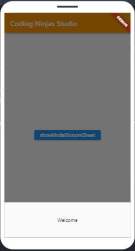
Click the showModalBottomSheet to view the hidden menu.
Explanation
The explanation of the above code is:-
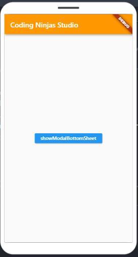
The code creates a Flutter app with a title "Coding Ninjas Studio" and an orange-themed AppBar
There is a button inside the application with the label "showModalBottomSheet."
A modal bottom sheet is displayed when the "showModalBottomSheet" button is clicked
A floating container with a fixed height of 100 pixels represents the modal bottom sheet
There is a text widget in the centre of the bottom sheet of the modal that says "Welcome."
The modal bottom sheet gives a focused view for additional information or actions and overlays the existing content
The code illustrates how to use showModalBottomSheet to build a straightforward interactive user interface for a Flutter app
Frequently Asked Questions
Are Modal Bottom Sheets Scrollable?
If the isScrollControlled property is set to true, Modal Bottom Sheets can scroll. When true, the bottom sheet's content may extend beyond the screen's height, allowing the User to scroll to see more. The bottom sheet won't scroll and will have a fixed size when the setting is false.
Can the User customize the appearance of a Modal Bottom Sheet?
Yes, the User can alter a Modal Bottom Sheet's look using the optional parameters offered by showModalBottomSheet. Users can modify the background color, shadow, shape, and other visual elements of the bottom sheet using properties like backgroundColor, Elevation, Shape, and others.
How do Users handle user interactions inside a Modal Bottom Sheet?
Users can insert different widgets into the builder callback method of showModalBottomSheet to edit the bottom sheet's content. Users can use the proper callback functions for those widgets to handle user events like button pushes and form submissions.
Conclusion
Flutter Modal Bottom Sheets are a powerful tool for enhancing user experience and designing seamless user interactions. Developers use Flutter to gather user input, deliver contextually relevant information, and simplify difficult actions.
We hope this blog has helped you enhance your Flutter Modal Bottom Sheet knowledge. Do not stop learning! We recommend you read some of our Flutter articles:
But suppose you have just started your learning process and are looking for questions from tech giants like Amazon, Microsoft, Uber, etc. For placement preparations, you must look at theproblems, interview experiences, andinterview bundles.


 8+ registered

