


Introduction
OctoImage is a multifunctional flutter image widget that is an image library for showing placeholders, error widgets, and transforming your image. We will learn about it in detail in the coming sections.
Flutter OctoImage Widget
ImageProvider is required for the OctoImage Widget to display images in an application. The images in the OctoImage widget are supplied with a Progress indicator or a Placeholder for loading the Image in it. Octosets are used by an octoImage widget that combines predefined placeholders, imagebuildesr, and error widgets.
We can use the OctoImage widget in two ways:
1. Using OctoImage:
OctoImage(
  image: NetworkImage(
      'url'),
  placeholderBuilder: OctoPlaceholder.blurHash(
    'PLACE_HOLDER',
  ),
  errorBuilder: OctoError.icon(color: Colors.red),
  fit: BoxFit.cover,
);
2. Using Octosets:
OctoImage.fromSet(
  fit: BoxFit.cover,
  image: NetworkImage(
    'url',
  ),
  octoSet: OctoSet.circleAvatar(
    backgroundColor: Colors.red,
    text: Text("M"),
  ),
);
We will learn about the OctoImage widget in detail by creating a simple application, and to build the application, we will be following these steps:
- Adding the dependencies in the pubspec.yaml file.
- Importing the dependencies to the main.dart file.
- Using a StatelessWidget for giving structure to the application
- Using the OctoImage widget for designing the body of the Application with Images
- Adding a Progress Indicator, which will be used while loading the image
- Adding an error widget to handle errors
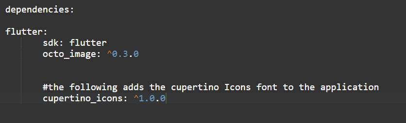
Step 1: Adding the Dependency:
We can add the octo_image dependency to the pubspecy.yaml file as shown below:
Step 2: Importing the Dependency:
In this step, we have to add the octo_image dependency that can be imported into the main.dart file
import 'package:octo_image/octo_image.dart';Step 3: Structuring the Application:
In this step, we are using a StatelessWidget to extend the structure of the application for adding an app bar(optional) and a body, as shown below:
class OctoImagePage extends StatelessWidget {
  Widget build(BuildContext context) {
    return Scaffold(
      appBar: AppBar(
        title: Text('Coding Ninjas'),
        backgroundColor: Colors.red,
      ),
      body: ListView(
        children: [
          _customImage(),
          SizedBox(height: 17),
          _simpleBlur(),
          SizedBox(height: 17),
          _circleAvatar(),
        ],
      ),
    );
  }
Step 4: Using the OctoImage Widget:
In this step, we are using the OctoImage widget as discussed above:
OctoImage(
image: NetworkImage(
'url'),
placeholderBuilder: OctoPlaceholder.blurHash(
'PLACE_HOLDER',
),
errorBuilder: OctoError.icon(color: Colors.red),
fit: BoxFit.cover,
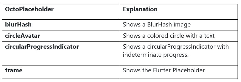
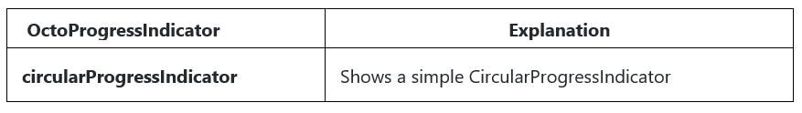
);Now, let’s have a look at all the important placeholders and indicators:
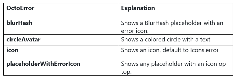
Step 5: Handling Errors:
A simple way to handle errors in the OctoImage Widget is to make use of the error widget. These are shown when the ImageProvider throws an error because the image failed loading. We can build our own custom widget, or we can also use the prebuild widgets:
OctoImage(
  image: image,
  errorBuilder: (context, error, stacktrace) =>
    const Icon(Icons.error),
);
OctoImage(
  image: image,
  errorBuilder: OctoError.icon(),
),
Included error widgets are:
Example
import 'package:flutter/material.dart';
import 'package:octo_image/octo_image.dart';

void main() {
  runApp(MyApp());
}

class MyApp extends StatelessWidget {

  Widget build(BuildContext context) {
    return MaterialApp(
      title: 'OctoImage',
      theme: ThemeData(),
      home: OctoImagePage(),
    );
  }
}

class OctoImagePage extends StatelessWidget {

  Widget build(BuildContext context) {
    return Scaffold(
      appBar: AppBar(
        title: Text('Coding Ninjas'),
        backgroundColor: Colors.red,
      ),
      body: ListView(
        children: [
          _customImage(),
          SizedBox(height: 17),
          _simpleBlur(),
          SizedBox(height: 17),
          _circleAvatar(),
        ],
      ),
    );
  }

  // circularProgressIndicator
  Widget _customImage() {
    return SizedBox(
      height: 250,
      child: OctoImage(
        image: NetworkImage('image_link_here1'),
        progressIndicatorBuilder: (context, progress) {
          double value;
          if (progress != null && progress.expectedTotalBytes != null) {
            value =
                progress.cumulativeBytesLoaded / progress.expectedTotalBytes;
          }
          return CircularProgressIndicator(value: value);
        },
        errorBuilder: (context, error, stacktrace) => Icon(Icons.error),
      ),
    );
  }


  Widget _simpleBlur() {
    return AspectRatio(
      aspectRatio: 268 / 174,
      child: OctoImage(
        image: NetworkImage(
            'image_link_here2'),
        placeholderBuilder: OctoPlaceholder.blurHash(
          'LEHV6nWB2yam9wo0adR*.7kCMdnj',
        ),
        errorBuilder: OctoError.icon(color: Colors.red),
        fit: BoxFit.cover,
      ),
    );
  }

  //circleAvtar
  Widget _circleAvatar() {
    return SizedBox(
      height: 250,
      child: OctoImage.fromSet(
        fit: BoxFit.cover,
        image: NetworkImage(
          'image_link_here3',
        ),
        octoSet: OctoSet.circleAvatar(
          backgroundColor: Colors.red,
          text: Text("Gal"),
        ),
      ),
    );
  }
}
Output:


 9+ registered

