


Introduction
The Progress Indicator describes the time required to perform certain processes such as downloading, installation, uploading, file transfer, and so on. It essentially displays the length of processes by displaying the progress of a task or a period.
Types of Progress Indicators
There are two ways to show progress in Flutter
CircularProgressIndicator
A CircularProgressIndicator is a widget that displays the progress as a circle. It's a spinning circular progress bar that shows whether the application is busy or on hold.
LinearProgressIndicator
A LinearProgressIndicator, often known as a progress bar, is a widget that displays progress linearly or down the line to demonstrate that the program is running.
There are two types of progress indicators
Indeterminate
The indeterminate progress indicator is essentially an indication that does not have a precise value at any point in time and indicates that the process is being carried out without specifying how much progress is yet to be done. We set the value attribute to null to make an indefinite progress bar.
Determinate
A determinate progress indicator is essentially an indicator with a specified value at each time or instance and indicates how much progress is made. The number here rises in steps from 0 to 1, with 0 indicating that progress is just beginning and 1 indicating that progress has been accomplished.
Example
import 'package:flutter/material.dart';
void main() {
runApp(MyApp());
}
class MyApp extends StatelessWidget {
@override
Widget build(BuildContext context) {
return MaterialApp(
debugShowCheckedModeBanner: false,
home: Loader(),
);
}
}
class Loader extends StatelessWidget {
@override
Widget build(BuildContext context) {
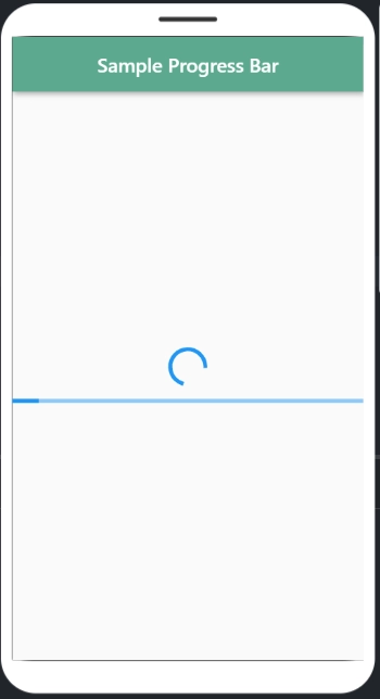
return Scaffold(
appBar: AppBar(
title: Text('Sample Progress Bar'),
backgroundColor: Color(0xFF5BA98F),
centerTitle: true,
),
body: Center(
child: Column(
mainAxisAlignment: MainAxisAlignment.center,
children: [
CircularProgressIndicator(),
SizedBox(
height: 15,
),
LinearProgressIndicator(),
],
),
),
);
}
}Output
Now let's look at the fundamental properties of a progress bar.
import 'package:flutter/material.dart';

void main() {
  runApp(MyApp());
}

class MyApp extends StatelessWidget {
  @override
  Widget build(BuildContext context) {
    return MaterialApp(
      debugShowCheckedModeBanner: false,
      home: Loader(),
    );
  }
}

class Loader extends StatelessWidget {
  @override
  Widget build(BuildContext context) {
    return Scaffold(
      appBar: AppBar(
        title: Text('Sample Progress Bar'),
        backgroundColor: Color(0xFF5BA98F),
        centerTitle: true,
      ),
      body: Center(
        child: Column(
          mainAxisAlignment: MainAxisAlignment.center,
          children: [
            CircularProgressIndicator(
              backgroundColor: Colors.amberAccent,
              valueColor: AlwaysStoppedAnimation(Colors.teal),
              strokeWidth: 10,
            ),
            SizedBox(
              height: 15,
            ),
            LinearProgressIndicator(
              backgroundColor: Colors.amberAccent,
              valueColor: AlwaysStoppedAnimation(Colors.teal),
              minHeight: 20,
            )
          ],
        ),
      ),
    );
  }
}
Output
Explanation
The following is an explanation of the above code for using Progress Indicators in Flutter:
backgroundColor: In the progress bar, this property is used to specify the background color of a linear loader and a circular spin loader.
strokeWidth: The width of the line used to form a circle in a CircularProgressIndicator is specified by this attribute.
minHeight: The minimum height of the line used to draw the indicator in a LinearProgressIndicator, or in other words, the thickness of the line in an indicator.
valueColor: is used to specify the value of the progress indicator as an animated value. The highlights of the finished work are covered by the valueColour attribute.
AlwaysStoppedAnimation: It's used to express a consistent color in a value using the valueColor attribute.
value: The value attribute distinguishes between a determinate and an indeterminate progress bar. If the value attribute is set to null, the progress indicator will be indeterminate, which means it will display the specified animation on the indicator with its motion but no indication of how much progress has been made. If it's set to non-null, it'll show how far you've come at any given time. A number of 0.0 indicates that progress has just begun, while 1.0 indicates that it has been finished.


 8+ registered

