Do you think IIT Guwahati certified course can help you in your career?
Introduction
The Scaffold widget in Flutter is used to construct the fundamental visual layout structure of the material design. It comes with practically everything we need to build a useful and responsive Flutter app, and it is quick enough to produce a general-purpose mobile application. This widget has the capacity to take up the entire device screen.
The Scaffold class spares us from having to manually create each visual component when setting up the appearance and design of our program. We can write less code for the app's appearance, which saves us time. The Scaffold widget class's function constructor and properties are listed below.
Syntax for Scaffold Class
void main() => runApp(MaterialApp(
    home: Scaffold(
// your code goes here
    )
));
Let us see some of the important properties of the Scaffold Class in the following article.
appBar
It is primarily visible at the top of the Scaffold widget and is a horizontal bar. It appears at the top of the screen and is the primary component of the Scaffold widget. The Scaffold widget is lacking without this property. It makes use of the appBar widget, which has its own set of attributes, including elevation, brightness, title, etc.
Now let us implement a simple appBar using Scaffold Class in Flutter.
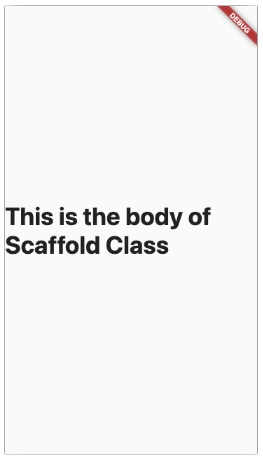
The major content of the Scaffold will be displayed using this widget's other necessary properties. It designates the area behind the floating Action Button and drawer, and below the appBar. By default, the widgets inside the body are put in the top-left corner of the available area.
Following is the simple code snippet to implement a simple body in the Scaffold Class.
Code
import 'package:flutter/material.dart';

void main() => runApp(MaterialApp(
    home: Scaffold(
        body: Center(
      child: Text(
        'This is the body of Scaffold Class',
        style: TextStyle(
          fontSize: 35,
          fontWeight: FontWeight.bold,
        ),
      ),
    )),
  ));
Output
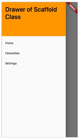
Drawer
At the side of the body, a sliding panel is visible. On mobile devices, it is often concealed, but the user can swipe it from right to left or left to right to reveal the drawer menu. To display navigation links in the application, it uses the Drawer widget properties to glide in a horizontal manner from the Scaffold edge. A suitable icon is immediately placed in an appBar attribute for the drawer. The gesture is also programmed to open the drawer automatically.
Let us implement a simple drawer in the Scaffold Class.
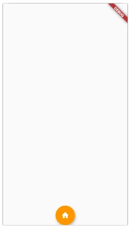
It appears as a button floating above the body in the bottom right corner. It is a circular icon button that floats over the screen's content at a specific location to advertise the application's main activity. Its location cannot be altered while the page is being scrolled. It uses the FloatingActionButton widget properties using Scaffold.floatingActionButton.
Following the code for the simple floatingActionButton using Scaffold Class.
Code
import 'package:flutter/material.dart';

void main() => runApp(MaterialApp(
    home: Scaffold(
        // setting the location of the floating action button
        floatingActionButtonLocation: FloatingActionButtonLocation.centerDocked,
        floatingActionButton: FloatingActionButton(
          child: Icon(Icons.home),
          backgroundColor: Colors.orange,
          onPressed: () {},
        )),
  ));
Output
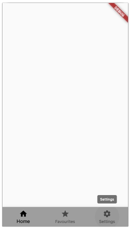
bottomNavigationBar
This widget creates a navigation bar at the base of the scaffold, much like a menu. The majority of mobile applications display it. The developer can add several icons or texts as elements in the bar using this attribute. Subsequent to the persistentFooterButtons and body, it ought to be rendered.
Let us implement a simple bottomNavigationBar in the Scaffold Class.
Covering all the properties of the scaffold class is not possible in a single article. Therefore, I will be explaining some important properties of the Scaffold Class that are usually used.
Property
Description
backgroundColor
This property of the Scaffold Class is used to color the whole Scaffold widget.
floatingActionButtonAnimator
Used to provide animation to move the floatingActionButton.
primary
It tells whether the Scaffold will be displayed or not.
endDrawer
A widget is provided as a parameter for the endDrawer property. It is the same as the Drawer, with the exception that it opens in the other direction.
endDrawerEnableOpenGesture
Once again, this property accepts a boolean value to specify whether or not the drag action will open the endDrawer.
extendBody
The extendBody property takes in a boolean as the object. This property's value is always false by default, but it can't be null. When persistentFooterButtons or a bottomNavigationBar are present, their height is added to the body, and they are relocated below the body if the value is set to true.
floatingActionButtonLocation
This property is used to give an appropriate location for the floatingActionBotton.
persistentFooterButton
A list of widgets is input into this attribute. They are typically displayed as buttons beneath the scaffold.
resizeToAvoidBottomInsets
A boolean value is accepted as the object for this property. If true, the floating widgets on the scaffold will automatically resize themselves out of the way of the on-screen keyboard.
Frequently Asked Questions
What is Scaffold Class in Flutter?
Flutter's Scaffold class offers a variety of widgets or APIs, including Drawer, SnackBar, BottomNavigationBar, FloatingActionButton, AppBar, etc. The Scaffold Class will enlarge or take over the entire screen of the smartphone. It will take up the space that is open.
Can we use scaffold inside scaffold Flutter?
Yes, but when we create two distinct screens, each with a different Scaffold, it is exactly what we want.
Why MaterialApp is used in Flutter?
Flutter has a built-in class called MaterialApp. It is probably the primary or central element of flutter. We have access to all the additional widgets and components that the Flutter SDK offers through the MaterialApp.
What is the difference between scaffold and container in Flutter?
AppBar, Body, Bottom Navigation, Floating Action, and Persistent Footer are features of the scaffold. Scaffolding will alter the appearance and feel of Material on screen. A basic/common widget in Flutter called a container will hold other widgets.
What is SafeArea in Flutter?
A widget with padding around its children to keep the operating system from interfering.
Conclusion
In this article, we have learned about the Scaffold Class in Flutter.


 8+ registered

