Do you think IIT Guwahati certified course can help you in your career?
Introduction
A ‘Text’ widget in Flutter allows us to display a string of text in our application on a single line. Depending on the layout limitations, we can break the string across multiple lines or display it all on the same line. If we don't give the text widget any styling, it will default to the closest ‘DefaultTextStyle’ class style. There is no specific style for this class. In this article, we'll learn how to style a ‘Text’ widget and use it in our application.
A Simple Example to Understand Text Widget
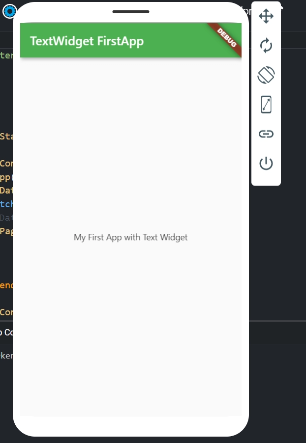
The title of our project appears in the application bar, and a message appears in the application body in this example.
We utilised a MaterialApp widget in the above code to call the home screen using the MyTextPage() class. This class contains the scaffold widget, which has appBar and body, where the title and body are displayed using the ‘Text’ widget. It is a simple ‘Text’ widget situation in which we pass the string we want to display on our page.
When we execute this application in an emulator or on a device, we should see something like this:
Text Widget Constructor
In Flutter, we are utilising the text widget constructor to create a custom look and feel for our text:
The Text widget in our application has the following basic properties:
TextAlign: This property controls how our text is oriented horizontally. It also has control over the text's position.
TextDirection: It determines how textAlign values influence the layout of our text. We usually write text from left to right, but this parameter allows us to change that.
Overflow: When the text will not fit in the available space, it is called overflow. This means we've provided more text than the given space allows.
TextScaleFactor: This value scales the text that the ‘Text’ widget displays. If we set the text scale factor to 1.5, our text will be 50 percent larger than specified font size.
SoftWrap: When there isn't enough room, SoftWrap is utilised to determine whether or not to reveal all text widget content. If this is correct, all material will be displayed. Otherwise, not all content will be displayed.
MaxLines: It determines the number of lines that can be displayed in the text widget.
TextWidthBasis: This variable describes how the text width is defined.
TextHeightBehavior: This property is used to adjust the appearance of the paragraph between the first and last lines.
Style: This widget's most frequent property is style, which allows developers to style their text. It may style the foreground and background colors, font size and weight, letter and word spacing, locale, and shadows, among other things.
See the table for a better understanding:
Attributes
Description
foreground
It establishes the paint as the text's foreground.
background
It establishes the paint as the text's background.
fontWeight
It determines the text's thickness.
fontSize
It determines the text's size.
fontFamily
It is used to specify the font's typeface. We must first download a typeface file for our project and save it in the assets/font folder. Finally, set up the pubspec.yaml file so that it can be used in the project.
fontStyle
It is used to make the font bold or italic in appearance.
Color
It is used to determine the text's colour.
letterSpacing
It's used to figure out how far apart the text's characters are.
wordSpacing
It is used to indicate the distance between two text words.
shadows
It's used to create a background for the text.
decoration
We use the three parameters decoration, decorationColor, and decorationStyle to decorate text. The decoration determines the location. ‘decorationColor’ specifies the colour and ‘decorationStyle’ specifies the shape.
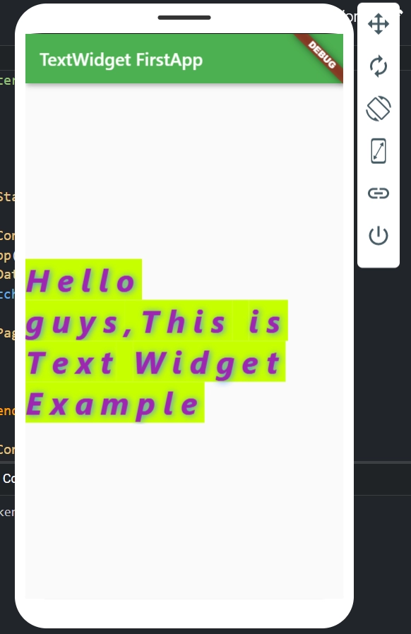
When we execute this application in an emulator or on a device, we should see something like this:
Flutter RichText Widget
We may want to display a line or a paragraph with numerous styles, such as bold, italicised, underlined, different colour, different font, or all at once. In such a situation, we should use the RichText widget, which allows us to run numerous test styles without having to switch between multiple widgets.
In Flutter, RichText is a very handy widget for showing a paragraph of text on the UI with numerous styles. We can have several styles inside the widget by giving it a tree of TextSpan widgets. Each TextSpan can override the default style by setting its own.
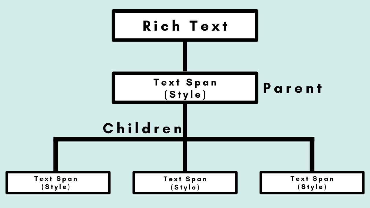
RichText Structure
The RichText widget's structure is seen in the image below. The parent TextSpan in this image has its own style property and text parameter, and it can include multiple children TextSpans, each of which has its own style property.
We'll now see how to use this widget in our application based on the previous outline.
Example
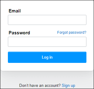
Assume our software has a login screen as well as the ability to create a new user account. The part for creating a new user account contains both regular and coloured text, as demonstrated in the screenshot below:
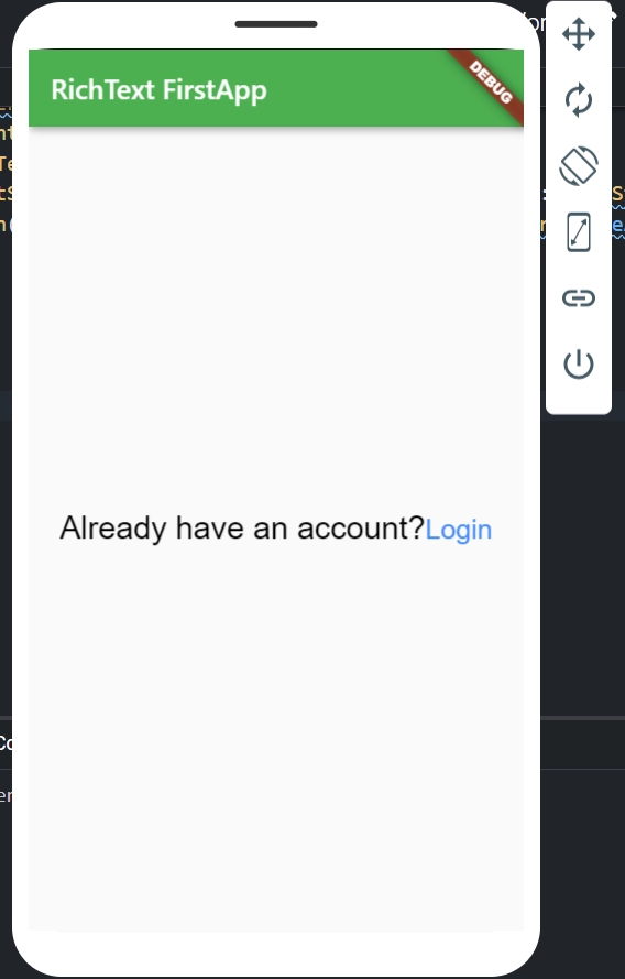
The text may be seen in the image above "Don't have a login? Sign up" is a single-line text with a clickable word at the end that takes the user to the sign-up page. This type of text will be divided into two sections. The first portion used the parent TextSpan to input the black-coloured text "Don't have an account?" The second portion employs the children's TextSpan to colour the text "Sign up" blue. Look at the code below:
We need to add onTap() action on this part because "Sign up" is a clickable text. TapGestureRecognizer() in the TextSpan implements the onTap() action. To make the text tappable in our example, we'll use the recognizer attribute. To help you understand it better, we'll show you the whole code sample.
In the IDE ( Integrated development environment) you're using, make a new project. Open the project, go to the ‘lib’ folder, and replace the ‘main.dart’ file with the following code.
When we execute this application in an emulator or on a device, we should see something like this:
Showing an Icon in a Text Widget
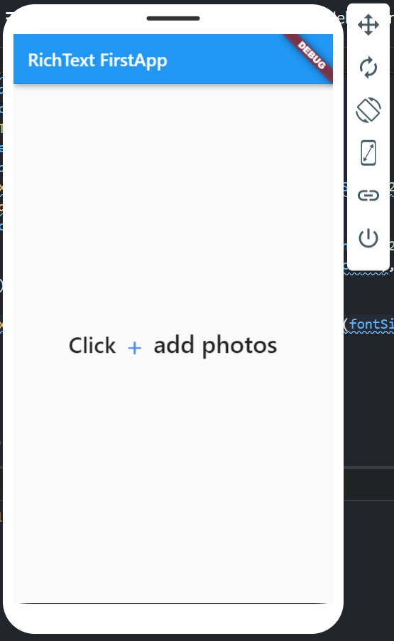
Developers may need to include an icon with the text widget on occasion. To do this, Flutter has a WidgetSpan() function within the RichText() widget that allows you to combine a text widget with an icon. The following example demonstrates it clearly:
When we execute this application in an emulator or on a device, we should see something like this:
Frequently Asked Questions
What is the flutter text widget?
A Text widget in Flutter allows us to display a string of text in our application on a single line. We can break the string across multiple lines or display it all on the same line, depending on the layout limitations.
What are the properties of the Flutter text widget?
The text widget includes numerous styling and alignment settings. Let's go over each property with an example. Let's look at the list of properties below.
style
textAlign
textDirection
softWrap
overflow
textScaleFactor
maxlines
What is RichText widget in Flutter?
The RichText widget is used to display text that has been styled in various ways. The displayed text is represented by a tree of TextSpan objects, each of which has its own associated style.
What are the properties in the RichText widget name some of them?
There are many properties in the RichText widget some of them are mentioned below:
children: The widgets in the tree below this widget.
hashCode: This object's hash code is hashCode.
key: Determines how one widget in the tree substitutes another.
runtimeType: A representation of the object's runtime type.
text: This widget's text to display.
How can we give color to a text?
Color can be applied to Text Widget in a variety of ways, as shown below:
Using built-in colors: Colors.blue
Using ARGB format(Alpha Red Green Blue): Color.fromARGB(255, 255, 0, 0)
Using RGBO format(Red Green Blue Opacity): Color.fromRGBO(0, 155, 0, 0.8)
Conclusion
In this article, we have discussed ‘Flutter Text’ which is one of the widgets in Flutter. We have also discussed creating it and the different ways to do it. So basically, a text widget in flutter allows us to display a string of text in our application on a single line. We can break the string across multiple lines or display it all on the same line, depending on the layout limitations.


 8+ registered

