


Introduction
In this article, we will learn how to use Tooltip in Flutter. The Flutter Tooltip is a built-in widget in flutter based on material design, which shows a textual description of a widget in a floating label when a user long-pressed and or hovers over the widget. The tooltip widget becomes very helpful when the UI of the application is too dense to display all the information on the screen; in a way, it makes the app more accessible.

Flutter Tooltip
A Flutter tooltip is a material design class in Flutter that delivers text labels to describe the functionality of a button or a user interface action. In other words, we used it to show additional information when the user moves or points over a particular widget. It improves the accessibility of the application. Wrapping the widget with it is beneficial when the user long presses the widget because, in that case, it emerges as a floating label.
There are two methods to implement the tooltip in a widget. The first is by using the widget itself; the other way is limited to some widgets such as IconButton, FloatingActionButton, etc., which provide a tooltip as a property that takes in a string as a parameter. One should keep in mind that the Tooltip widget is customizable through its properties, but the tooltip property isn’t.

| Properties | Descriptions |
message |
A string message is used to display in the tooltip. |
height |
Used to set the height of the tooltip's child. |
textStyle |
Used to decide the style for the message of the tooltip. |
margin |
Used to determine the space surrounding the tooltip. |
showDuration |
Specifies the length of time for showing the tooltip after a long press is released. By default, it is 1.5 seconds. |
decoration |
Used to determine the shape and background color of the tooltip, the default tooltip shape is a rounded rectangle with a 4.0 PX border-radius. |
verticalOffset |
Determines the vertical gap between the widget and the tooltip. |
waitDuration |
Specifies the time when a pointer hovers over a tooltip's widget before displaying the tooltip. When the pointer escapes the widget, the tooltip message will be disappeared. |
padding |
Determines the space to insert the tooltip's child. By default, it is 16.0 PX in all directions. |
preferBelow |
Specifies whether the tooltip is being displayed below the widget or not. By default, it is true. We will show the tooltip in the opposite direction if we do not have sufficient space to show the tooltip in the preferred direction. |
Demo example:
Tooltip(
message: 'User Account',
child: IconButton(
icon: Icon(Icons.high_quality),
onPressed: () {
/* your code */
},
),
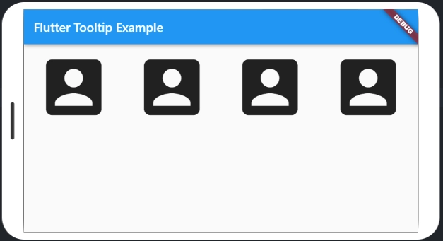
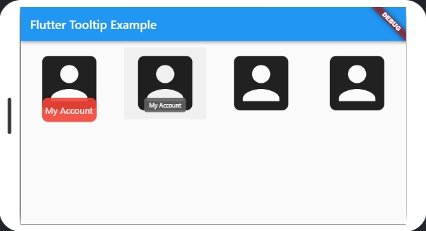
), The IconButton tooltip property is employed, taking a string parameter. One can notice that pressing the icon on the screen for more than one-second displays the tooltip. This is one of the ways of using the tooltip for the widgets, but this is all it has got; Anything else to change its looks can't be done. In the body, we have two user account icons that we created in a container with some padding, and in it, we have the widget Tooltip. When we use the tooltip, the message property is a must provide, and in this case, it is 'User Account' that pops up when the text is hovered or long pressed.


 9+ registered

