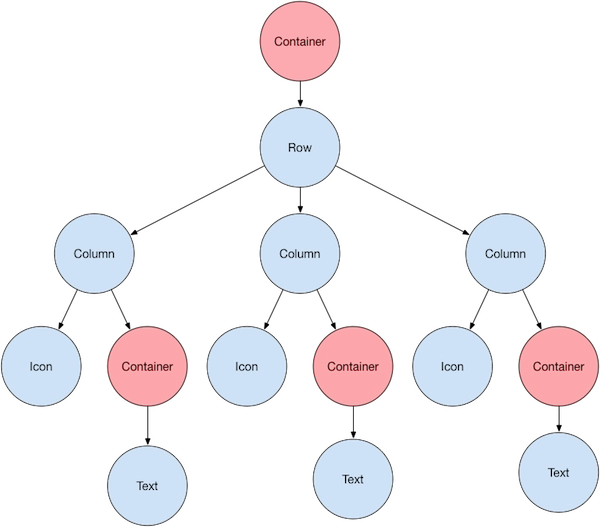
Layout Widgets
A widget in Flutter can be made by combining one or more widgets. Flutter provides a vast range of widgets with layout features that can be used to connect many widgets into a single widget. The child widget, for example, can be centered using the Center widget.
The following are some of the most common layout widgets:
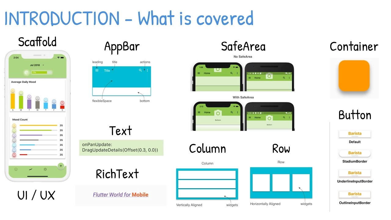
Container: A rectangular box with a backdrop, border, and shadow decorated with BoxDecoration widgets.
Center: Its child widget should be centered.
Row: Arrange the children in a row in a horizontal direction.
Column: Arrange the children of a column in a vertical direction.
Stack: Arrange them in a stack, one on the other.
Source: docs.flutter.dev
Types of Widget
The Flutter widget is divided into two categories:
- Visible (Output and Input)
- Invisible (Layout and Control)
Visible widget
The viewable widgets are connected to the data entered and outputted by the user. This widget's most important kinds are:
Text
A Text widget contains text that will be shown on the screen. We may align the text widget using the text-align property, and the style property allows us to customize Text with font, font weight, font style, letter spacing, color, and many other options.
Image
This widget contains the picture, which may be retrieved from various sources, including the asset folder or straight from the URL.
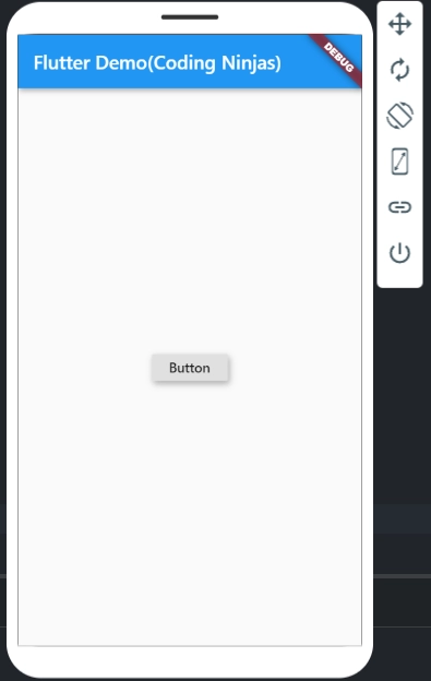
Button
This widget allows you to conduct an activity with a single click. Flutter does not support the Button widget natively; instead, it employs buttons like the FlatButton and the RaisedButton.
Example for Visible Widget
Below is the complete source code for using a button:
import 'package:flutter/material.dart';

void main() => runApp(MyApp());

class MyApp extends StatelessWidget {

  @override

  Widget build(BuildContext context) {

    return MaterialApp(

      // Name of Application

      title: 'Flutter Widgets',

      theme: ThemeData(

        primarySwatch: Colors.blue,

      ),

      home: MyHomePage(title: 'Flutter Demo(Coding Ninjas)'),
    );
  }
}

class MyHomePage extends StatelessWidget {

  final String title;

  const MyHomePage({Key? key, required this.title}) : super(key: key);

  @override

  Widget build(BuildContext context) {

    return Scaffold(

      appBar: AppBar(

        title: Text(title),

      ),

      body: Center(

        child: new RaisedButton(

          child: Text("Button"),

          elevation: 5.0,

          onPressed: () {

            // Do something here

          },
        ),
      ),
    );
  }
}
Output:
Invisible Widget
The invisible widgets are associated with widget layout and control. It allows you to modify how the widgets operate and appear on the screen. Among the essential sorts of these widgets are:
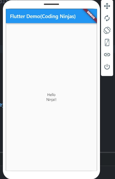
Column
A column widget is a widget that arranges all of its children's widgets vertically. It uses the mainAxisAlignment and crossAxisAlignment attributes to establish space between widgets. The major axis in these attributes is the vertical axis, while the cross axis is the horizontal axis.
Row
The row widget is similar to the column widget in that it creates widgets horizontally rather than vertically. The horizontal axis is the main axis, while the vertical axis is the cross axis.
Center
This widget is used to center the child widget contained within it. The cente widget is present in all of the preceding examples.
Example for Invisible Widget
Below is the complete source code for using a Column:
import 'package:flutter/material.dart';

void main() => runApp(MyApp());

class MyApp extends StatelessWidget {

  // Root Widget of your application

  @override

  Widget build(BuildContext context) {

    return MaterialApp(

      // Name of your Application

      title: 'Flutter Widgets',

      theme: ThemeData(

        primarySwatch: Colors.blue,

      ),

      home: MyHomePage(title: 'Flutter Demo(Coding Ninjas)'),

    );
  }
}


class MyHomePage extends StatelessWidget {
  final String title;
  const MyHomePage({Key? key, required this.title}) : super(key: key);

  @override

  Widget build(BuildContext context) {

    return Scaffold(

      appBar: AppBar(

        title: Text(title),

      ),

      body: Center(

        child: new Column(

          mainAxisAlignment: MainAxisAlignment.center,

          children: <Widget>[

            new Text(

              "Hello",
            ),

            new Text("Ninja!!"),

          ],
        ),
      ),
    );
  }
}
Output:
State Management Widget
There are primarily two sorts of widgets in Flutter:
- StatelessWidget
- StatefulWidget
StatefulWidget
A StatefulWidget keeps track of its current state. It primarily consists of two classes: the state object and the widget. It is dynamic because the inside data might change over the widget's lifespan. This widget lacks a construct() function. It provides a method called createState() that returns a class that extends the Flutters State Class. Checkbox, Radio, Slider, InkWell, Form, and TextField are instances of StatefulWidgets.
StatelessWidget
The StatelessWidget has no state information. Throughout its existence, it stays motionless. Text, Row, Column, Container, and so on are instances of StatelessWidgets.
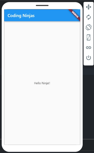
Example for State Management Widget
The bare app screen layout tree was utilising Stateless Widgets.
import 'package:flutter/material.dart';

// function to trigger build pricess
void main() => runApp(const CodingNinjas());

class CodingNinjas extends StatelessWidget {

  const CodingNinjas({

    Key ? key

  }): super(key: key);

  @override
  Widget build(BuildContext context) {

    return MaterialApp(

      home: Scaffold(

        backgroundColor: Colors.lightGreen,

        appBar: AppBar(

          backgroundColor: Colors.green,

          title: const Text("CodingNinjas"),

        ), // AppBar

        body: Container(

          child: const Center(

            child: Text("Hello Ninja!!"),

          ), // Center

        ), // Container

      ), // Scaffold

    ); // MaterialApp

  }

}
Output:
Frequently Asked Questions
What is flutter?
Flutter is a framework that allows you to create entirely platform-agnostic mobile applications for iOS and Android.
What are the advantages of flutter?
The following are some of the significant advantages of using flutter:
- Cross-platform Development
- Reduce Code Development
- Live and Hot Reloading
- Flexible UI
- Good community support
What are widgets in flutter?
A flutter widget is any component on a display of the Flutter app. The screen's appearance is entirely determined by the widgets used to construct the app and the order in which they are used.
How many are flutter widgets categories available?
Flutter widgets are divided into 14 categories, including accessibility, animation, scrolling, styling, etc.
What are the standard layout widgets?
The standard layout widgets are container, center, row, column, and stack.
Conclusion
In this article, we have extensively discussed the Flutter widgets and their uses. We looked at various categories of widgets.
After reading about the Flutter widgets, are you not feeling excited to read/explore more articles on flutter? Don’t worry; Coding Ninjas has you covered. To learn, see Flutter basics, Flutter App Development, and Flutter navigation.
Refer to our Guided Paths on Coding Ninjas Studio to upskill yourself in DSA, Competitive Programming, JavaScript, System Design, and many more! If you want to test your competency in coding, you may check out the mock test series and participate in the contests hosted on Coding Ninjas Studio! But suppose you have just started your learning process and are looking for questions asked by tech giants like Amazon, Microsoft, Uber, etc. In that case, you must look at the problems, interview experiences, and interview bundle for placement preparations.
Nevertheless, you may consider our paid courses to give your career an edge over others!
Do upvote our blogs if you find them helpful and engaging!
Happy Learning!


 8+ registered

