Creating a Gauge Chart
Gauge charts can be made in the following two ways.
- Making a single-value gauge chart: This simple gauge chart is based on a Pie chart.
- Creating a gauge chart with additional number ranges: This Gauge graphic is built on a Doughnut chart and a Pie chart combined.
Example
We will learn how to prepare the data and create a simple Gauge chart with a single value.
Data Preparation
Consider the following data:

Step 1: Create data for the Gauge chart as shown below.

Step 2: The data will look as follows:
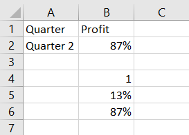
You can observe the following:
- B6 contains the value corresponding to B2.
- B4 has 100% to represent half of the Pie chart.
- B5 has a value to make B5 and B5 by 100%, which makes the second half of the Pie chart.
Creating a Simple Gauge Chart
The steps to make a simple gauge chart with one value are as follows:
Step 1: Select the data – C5:C7.
Step 2: Insert a Pie chart.

Step 3: Right-click on the chart.
Step 4: Select Format Data Series from the dropdown list.
Step 5: Click SERIES OPTIONS.
Step 6: Type 90 in the box – Angle of the first slice.

As you can see, you'll change the upper half of the Pie chart into a Gauge chart.
Step 7: Right-click on the bottom Pie slice.
Step 8: Click on Fill. Select No Fill.
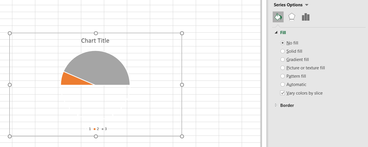
The bottom Pie slice will become invisible as a result of this.
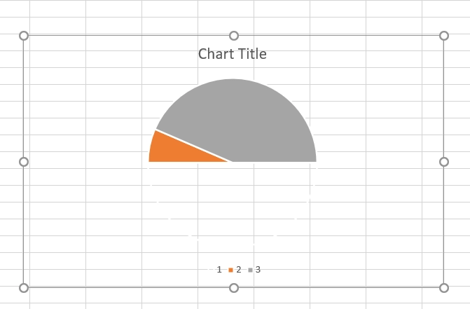
The Profit Percentage is represented by the Pie slice on the right.
Step 9: Make the chart appealing as follows.
- Change the colours of the pie pieces' fills.
- Select 3-D FORMAT as the Top bevel and Angle as the Angle by clicking on the right Pie slice.
- Select 3-D FORMAT as the Top viewpoint and Divot by clicking on the left Pie slice.
- Select 1 percent as Point Explosion under SERIES OPTIONS by clicking on the right Pie slice.
- Add a Data Label to the right Pie slice by clicking on it.
- The data label's size and location.
- In Chart Elements, uncheck Legend.
- Give the chart a title of Profit Percentage and place it in the desired location.

Your gauge chart is ready.
Advantages of Gauge Chart
Gauge charts can be used to display a value relative to one to three data ranges. They are commonly used to visualize the following:
- Work that has been completed vs. overall work.
- Sales as a percentage of an objective.
- In comparison to the total number of service tickets received, service tickets have been closed.
- Profit as a percentage of the target.
Disadvantages of Gauge Chart
Though the gauge charts are still the preferred ones by most executives, there are certain drawbacks to them. They are:
- Simple in nature and unable to convey the context.
- Frequently deceive by missing crucial information, which is possible in today's Big Data visualisation requirements.
- If numerous charts are to be utilised, they waste space. For instance, to show information about multiple cars on a single dashboard.
- They aren't suitable for colourblind people.
As a result of these factors, Stephen Few's bullet charts are gaining popularity. Bullet charts are the data analysts' preferred method of data analysis.
FAQs
-
What is Excel?
Microsoft Excel is powerful data visualisation and analysis software, which uses spreadsheets to store, organise, and track data sets with formulas and functions.
-
What is a gauge chart?
A gauge chart shows the minimum, the maximum and the current value depicting how far you are from the maximum.
-
What is a gauge dial or axis?
This is the most significant component of any gauge chart since it reflects the range of data (mostly in a numeric form). It also defines other intervals and colours in addition to the data range.
-
What is a needle in a gauge chart?
In the current frame, a needle points to a specific value on a dial. The needle's tip should, in theory, be able to move around over time.
-
What is a pivot point in a gauge chart?
A pivot point is the centre of the needle where the value of its present placement is displayed for us to see.
Key Takeaways
In this article, we learnt about gauge charts in excel. We also learned about the advantages and disadvantages of a gauge chart. We also saw an example of creating a gauge chart in Excel.
Apart from this, you can also expand your knowledge by referring to the blog- Introduction to Excel.
For more information, refer to Worksheets in Excel.
Refer to our guided paths on Coding Ninjas Studio to learn more about DSA, Competitive Programming, JavaScript, System Design, etc. Enroll in our courses and refer to the mock test and problems available; take a look at the interview experiences and interview bundle for placement preparations.
Do upvote our blog to help other ninjas grow.
Happy Learning!


 8+ registered

