Table of contents
1.
Introduction
2.
Prerequisites for Creating a Circle in CSS
3.
Creating an Empty Circle by Using the border-radius Property
3.1.
Syntax
4.
Example 1: Basic Circle
4.1.
HTML
4.2.
Output
5.
Example 2: Colored Circle
5.1.
HTML and CSS
5.2.
Output
6.
Example 3: Circle with Shadow
6.1.
HTML and CSS
6.2.
Output
7.
Example 4: Circle with Image Background
8.
Browser compatibility
9.
Frequently Asked Questions
9.1.
How do I create a circle in CSS?
9.2.
What happens if the width and height are not equal?
9.3.
Can I add text or images inside a circle?
10.
Conclusion
Last Updated: Dec 28, 2024
Easy

How To Create Circle with CSS?

Author Rahul Singh
0 upvote
Career growth poll
Do you think IIT Guwahati certified course can help you in your career?

Introduction

Creating circles in CSS is simple and enhances web design. Use the border-radius property set to 50% on a square container to form a perfect circle. Adjust the size with the container's dimensions or use pseudo-elements like ::before and ::after for decorative circles. Circles are ideal for buttons, and accents, adding style and engagement to your designs.

This article will guide you through the process of creating a circle in CSS, its syntax, and examples to help you understand it better. By the end of this article, you’ll be equipped to use circles effectively in your projects.

Prerequisites for Creating a Circle in CSS

Before you start creating a circle in CSS, make sure you have a basic understanding of the following:

HTML Basics:
You need to know how to write simple HTML code to create elements like <div> or <span> that will be styled into circles.

CSS Fundamentals:
Understand basic CSS properties like width, height, and border-radius. These are essential for shaping elements.

A Text Editor:
Use any code editor like Visual Studio Code, Sublime Text, or even Notepad to write your HTML and CSS code.

A Browser:
Have a web browser like Chrome, Firefox, or Edge to test and see how your circle looks.

Once you have these basics covered, you can begin creating circles with CSS. 

Creating an Empty Circle by Using the border-radius Property

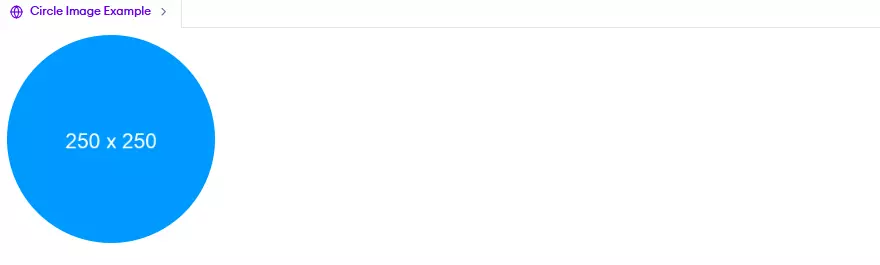
The border-radius property in CSS is a powerful tool for styling elements by making their corners rounded. By setting the border-radius to 50% and ensuring the element's width and height are equal, you can create a perfect circle. This technique is frequently used in profile pictures, buttons, and other design elements.

Syntax

The basic syntax for creating a circle using CSS is as follows:

selector {
    width: value;
    height: value;
    border-radius: 50%;
    border: border-width border-style border-color;
}


  • selector: The HTML element you want to style (e.g., div, img).
     
  • width and height: The dimensions of the circle (must be equal).
     
  • border-radius: The key property to make the element circular; it is set to 50%.
     
  • border: Optional; specifies the style, width, and color of the border.

Example 1: Basic Circle

Here’s an example of creating a simple, empty circle:

HTML

<!DOCTYPE html>
<html lang="en">
<head>
    <meta charset="UTF-8">
    <meta name="viewport" content="width=device-width, initial-scale=1.0">
    <title>Circle Example</title>
    <style>
        .circle {
            width: 100px;
            height: 100px;
            border-radius: 50%;
            border: 2px solid black;
            margin: 50px auto; /* Center the circle horizontally */
        }
    </style>
</head>
<body>
    <div class="circle"></div>
</body>
</html>


Output

Output

A black-bordered circle with a diameter of 100px will appear on your webpage.

Example 2: Colored Circle

You can also fill the circle with a background color:

HTML and CSS

<!DOCTYPE html>
<html lang="en">
<head>
    <meta charset="UTF-8">
    <meta name="viewport" content="width=device-width, initial-scale=1.0">
    <title>Colored Circle</title>
    <style>
        .colored-circle {
            width: 120px;
            height: 120px;
            border-radius: 50%;
            background-color: #4CAF50; /* Green color */
            margin: 50px auto; /* Center the circle horizontally */
        }
    </style>
</head>
<body>
    <div class="colored-circle"></div>
</body>
</html>


Output

Output

A green circle with a diameter of 120px will appear.

Example 3: Circle with Shadow

Adding a shadow to your circle can enhance its appearance:

HTML and CSS

<!DOCTYPE html>
<html lang="en">
<head>
    <meta charset="UTF-8">
    <meta name="viewport" content="width=device-width, initial-scale=1.0">
    <title>Shadow Circle</title>
    <style>
        .shadow-circle {
            width: 150px;
            height: 150px;
            border-radius: 50%;
            background-color: #FF5722; /* Orange color */
            box-shadow: 0px 4px 8px rgba(0, 0, 0, 0.3); /* Adds a shadow */
            margin: 50px auto; /* Center the circle horizontally */
        }
    </style>
</head>
<body>
    <div class="shadow-circle"></div>
</body>
</html>


Output

Output

A circular shape with an orange fill and a subtle shadow effect.

Example 4: Circle with Image Background

<!DOCTYPE html>
<html lang="en">
<head>
 <meta charset="UTF-8">
 <meta name="viewport" content="width=device-width, initial-scale=1.0">
 <title>Circle Image Example</title>
 <style>
   .circle-image {
     width: 250px;
     height: 250px;
     border-radius: 50%;
     background-image: url('https://via.placeholder.com/250/09f/fff.png'); /* Placeholder image */
     background-size: cover;
     background-position: center;
   }
 </style>
</head>
<body>
 <div class="circle-image"></div>
</body>
</html>


Output

Output

These examples show different variations of creating circles using CSS. You can experiment with sizes, colors, borders & background properties to achieve the desired visual effect.

Browser compatibility

The border-radius property is widely supported across modern browsers, like: 

  • Chrome: Version 4.0 and above
     
  • Firefox: Version 3.0 and above
     
  • Internet Explorer: Version 9.0 and above
     
  • Safari: Version 3.1 and above
     
  • Opera: Version 10.5 and above
     

As you can see, the border-radius property has excellent browser compatibility, and you can confidently use it to create circles in your CSS designs without worrying about major browser inconsistencies.
 

However, it's important to note that older versions of Internet Explorer (IE8 and below) do not support the border-radius property. If you need to support these older browsers, you may need to use alternative techniques or provide fallback styles.

Frequently Asked Questions

How do I create a circle in CSS?

To create a circle in CSS, set the border-radius property to 50% and ensure the element's width and height are equal.

What happens if the width and height are not equal?

If the width and height are not equal, the shape will become an ellipse instead of a circle.

Can I add text or images inside a circle?

Yes, you can add text or images inside a circle by using appropriate alignment properties like text-align or flexbox for centering.

Conclusion

In this article, you learned how to create circular shapes using the border-radius property in CSS. From basic empty circles to advanced examples like colored circles with shadows, we covered a range of techniques to enhance your web designs. Circles are simple to create and can significantly improve the aesthetic appeal of your projects. 

You can also check out our other blogs on Code360.

Live masterclass