


Introduction
The disabled attribute in the HTML <button> tag is used to disable a button, preventing user interactions such as clicking. When this attribute is present, the button appears grayed out and cannot trigger any event. It is commonly used in forms to restrict actions until specific conditions are met.

In this article, you will learn about the syntax, functionality, and examples of the disabled attribute in the <button> tag.
Definition & Usage
The "disabled" attribute in HTML is used to make a button non-clickable or inactive. When a button is disabled, users cannot interact with it, & it appears grayed out in most browsers. This feature is useful when you want to prevent users from clicking a button until certain conditions are met, such as filling out a form or agreeing to terms & conditions.
The "disabled" attribute can be added directly to the `<button>` tag. It does not require a value; simply including the word "disabled" inside the tag will deactivate the button. For example:
<!DOCTYPE html>
<html lang="en">
<head>
    <meta charset="UTF-8">
    <meta name="viewport" content="width=device-width, initial-scale=1.0">
    <title>Disabled Button Example</title>
</head>
<body>
    <h1>Example of a Disabled Button</h1>
    <form>
        <label for="username">Enter your username:</label>
        <input type="text" id="username" name="username"><br><br>

        <button type="submit" disabled>Submit</button>
    </form>
</body>
</html>
Output
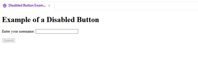
In this example:
- The `<button>` tag includes the "disabled" attribute.
- Since the button is disabled, users cannot click it to submit the form.
- The purpose here could be to ensure that the user fills out the input field before enabling the button.
You can also enable or disable buttons dynamically using JavaScript. For instance, you can disable a button initially & then enable it once the user completes a required action. For example:
<!DOCTYPE html>
<html lang="en">
<head>
    <meta charset="UTF-8">
    <meta name="viewport" content="width=device-width, initial-scale=1.0">
    <title>Enable Button Dynamically</title>
    <script>
        function enableButton() {
            document.getElementById("submitButton").disabled = false;
        }
    </script>
</head>
<body>
    <h1>Enable Button After Input</h1>
    <form>
        <label for="password">Enter your password:</label>
        <input type="password" id="password" name="password" oninput="enableButton()"><br><br>

        <button type="submit" id="submitButton" disabled>Submit</button>
    </form>
</body>
</html>
Output

In this code:
- The button starts off disabled.
- As soon as the user types something into the password field, the `oninput` event triggers the `enableButton()` function.
- This function removes the "disabled" attribute from the button, making it clickable.
The "disabled" attribute is commonly used in forms, modals, & other interactive elements to guide users through a process or prevent accidental actions. It ensures that users follow the intended flow of the application.


 8+ registered

