Table of contents
1.
Introduction
2.
Syntax
3.
<input> Type Attribute
3.1.
Attributes of the <input> Tag
3.2.
Example 1: Using the type Attribute
3.3.
Example 2: Using the value Attribute
3.4.
Example 3: Using the placeholder Attribute
3.5.
Example 4: Using the required Attribute
3.6.
Example 5: Using the disabled Attribute
4.
Supported Browsers
5.
Frequently Asked Questions
5.1.
What is the purpose of the type attribute in the <input> tag?
5.2.
Can I pre-fill an input field with default data?
5.3.
How can I prevent users from submitting a form without filling in all the fields?
6.
Conclusion
Last Updated: Dec 20, 2024
Easy

HTML <Input> Tag

Author Rahul Singh
0 upvote
Career growth poll
Do you think IIT Guwahati certified course can help you in your career?

Introduction

The HTML <input> tag is used to create interactive elements within a form, enabling users to enter and submit data. It supports various input types like text, password, email, and more, making it essential for collecting user information on a web page.

HTML <Input> Tag

In this article, we will discuss the syntax, attributes, and examples of how the <input> tag works. We’ll also look at how different attributes like type, value, and placeholder make it versatile for creating forms, along with supporting browsers.

Syntax

The basic syntax for the <input> tag is quite simple:

<input type="text">


This forms a basic text input field. The <input> tag is self-closing, so it does not need to have a closing tag (</input>). You can apply several attributes to it and customize its behavior, including type, name, value, placeholder, and so on.

<input> Type Attribute

The type attribute specifies what kind of data will the input field accept. And is one of the most popularly used attributes for <input> tag. Among these, some common ones are:

  • text - a simple text input
     
  • password - hides the entered characters (typically used for password fields)
     
  • email - expects an email address to be entered and automatically does validation
     
  • number - allows numeric input only
     
  • submit - creates a submit button

Attributes of the <input> Tag

Besides type, the <input> tag supports many other attributes that define the behavior of input fields. These include:

  • name: Specifies the name of the input field (used to reference form data after submission).
     
  • value: Defines the default value of the input field.
     
  • placeholder: This attribute provides a hint inside the input field about what data to enter.
     
  • required: This attribute marks the field as mandatory to fill out before submitting the form.
     
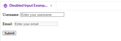
  • disabled: prevents the user from doing anything with the input field.

Example 1: Using the type Attribute

<!DOCTYPE html>
<html lang="en">
<head>
    <meta charset="UTF-8">
    <meta name="viewport" content="width=device-width, initial-scale=1.0">
    <title>Input Type Example</title>
</head>
<body>
    <form>
        <label for="username">Username:</label>
        <input type="text" id="username" name="username" placeholder="Enter your username"><br><br>
        
        <label for="password">Password:</label>
        <input type="password" id="password" name="password" placeholder="Enter your password"><br><br>
        
        <label for="email">Email:</label>
        <input type="email" id="email" name="email" placeholder="Enter your email" required><br><br>
        
        <input type="submit" value="Submit">
    </form>
</body>
</html>


Output

Output

Explanation:

  • The type="text" field is for entering the username.
     
  • The type="password" hides the characters typed for privacy when entering the password.
     
  • The type="email" expects an email input and shows a warning if the email format is invalid.

Example 2: Using the value Attribute

The value attribute pre-fills an input field with a default value. This is useful when you want to show a placeholder or initial data.

<!DOCTYPE html>
<html lang="en">
<head>
    <meta charset="UTF-8">
    <meta name="viewport" content="width=device-width, initial-scale=1.0">
    <title>Input Value Example</title>
</head>
<body>
    <form>
        <label for="first-name">First Name:</label>
        <input type="text" id="first-name" name="first-name" value="Rahul"><br><br>
        
        <label for="last-name">Last Name:</label>
        <input type="text" id="last-name" name="last-name" value="Singh"><br><br>
        
        <label for="email">Email:</label>
        <input type="email" id="email" name="email" value="rahul.singh@example.com" required><br><br>
        
        <input type="submit" value="Submit">
    </form>
</body>
</html>


Output

Output

Explanation:

  • The value="Rahul" and value="Singh" pre-fill the first and last name fields with default values.
     
  • The value="rahul.singh@example.com" fills in the email field with a default email address.

Example 3: Using the placeholder Attribute

The placeholder attribute provides a hint inside the input field, showing users what information they should enter.

<!DOCTYPE html>
<html lang="en">
<head>
    <meta charset="UTF-8">
    <meta name="viewport" content="width=device-width, initial-scale=1.0">
    <title>Placeholder Example</title>
</head>
<body>
    <form>
        <label for="username">Username:</label>
        <input type="text" id="username" name="username" placeholder="Enter your username" required><br><br>
        
        <label for="email">Email:</label>
        <input type="email" id="email" name="email" placeholder="e.g., user@example.com" required><br><br>
        
        <input type="submit" value="Submit">
    </form>
</body>
</html>


Output

Output

Explanation:

  • The placeholder="Enter your username" provides a hint inside the username field, which disappears once the user starts typing.
     
  • The placeholder="e.g., user@example.com" gives an example of the format for the email input.

Example 4: Using the required Attribute

The required attribute ensures that the user cannot submit the form unless they fill out the required fields.

<!DOCTYPE html>
<html lang="en">
<head>
    <meta charset="UTF-8">
    <meta name="viewport" content="width=device-width, initial-scale=1.0">
    <title>Required Input Example</title>
</head>
<body>
    <form>
        <label for="name">Full Name:</label>
        <input type="text" id="name" name="name" placeholder="Enter your full name" required><br><br>
        
        <label for="email">Email:</label>
        <input type="email" id="email" name="email" placeholder="Enter your email" required><br><br>
        
        <input type="submit" value="Submit">
    </form>
</body>
</html>


Output

Output

Explanation:

  • The required attribute on both the "Full Name" and "Email" fields ensures that the user must fill out these fields before submitting the form.

Example 5: Using the disabled Attribute

The disabled attribute disables the input field, preventing the user from interacting with it.

<!DOCTYPE html>
<html lang="en">
<head>
    <meta charset="UTF-8">
    <meta name="viewport" content="width=device-width, initial-scale=1.0">
    <title>Disabled Input Example</title>
</head>
<body>
    <form>
        <label for="username">Username:</label>
        <input type="text" id="username" name="username" placeholder="Enter your username"><br><br>
        
        <label for="email">Email:</label>
        <input type="email" id="email" name="email" placeholder="Enter your email" disabled><br><br>
        
        <input type="submit" value="Submit">
    </form>
</body>
</html>


Output

Output

Explanation:

  • The disabled attribute on the "Email" input field makes it uneditable. Users cannot change the value of this field.

Supported Browsers

The <input> tag is supported by all modern browsers, including:

  • Google Chrome
     
  • Mozilla Firefox
     
  • Safari
     
  • Microsoft Edge
     
  • Opera
     

Old versions of browsers, like Internet Explorer, do not support every kind of input type like including email, date and number. It is thus imperative to test your form using different browsers.

Frequently Asked Questions

What is the purpose of the type attribute in the <input> tag?

This attribute specifies the data that can be entered into a given input field, as a text, password, e-mail, or a number.

Can I pre-fill an input field with default data?

Yes, you can use the value attribute to set default data in an input field when the page loads.

How can I prevent users from submitting a form without filling in all the fields?

You can use the required attribute to ensure that the user must fill out the fields before submitting the form.

Conclusion

In this article, we have discussed the basics of the <input> tag along with syntax and how a number of attributes such as type, value, and placeholder may be used in customizing form fields. These help in enhancing user experience as well as in achieving data correctness. Whether you want to develop a simple or complex form, knowing the work behind the <input> tag is necessary in creating web pages that work interactively.

Live masterclass