Do you think IIT Guwahati certified course can help you in your career?
Introduction
Image hover effects in CSS enhance user experience by adding interactive animations or transformations when the user hovers over an image. These effects make websites more dynamic, visually appealing, and engaging. With just a few lines of CSS, you can create stunning hover effects like zoom, blur, grayscale, or text overlays. In this blog, we'll explore different types of image hover effects in CSS with examples.
What are Image Hover Effects?
Image hover effects in CSS are significant effects that can make your images much more exciting and responsive whenever some user hovers over them. You can use any hovering effect that you want.
Interactivity plays an important role in a website. If your website is all-static, users’ interest in it goes down. Here image hover effects come into play. With these effects, you make your images much more interactive. They quickly load on your website and encourage users to spend more time on it. No matter how many hover effects you apply to your website, they don’t slow it down.
Examples
To add the hover effect, we add ":hover" to the CSS selectorin the style tag or the CSS file for that specific component of the HTML file. You can add hover effects to the CSS selector that can be a class, ID, or an HTML attribute.
To understand the topic better, we will apply some image hover effects listed below.
Sliding Text on Image
Scaling an Image
Rotating and Swapping an Image
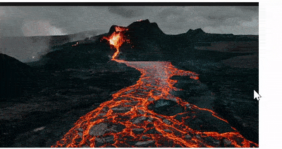
Fading Out an Image
Multilayering an Image
Please notice that in the following codes, the URL of the image(s) used in the "img" tag will vary depending on the path of the image in your systems.
1. Sliding Text on Image
In this effect, a sliding text will appear above the image with some content whenever we hover over an image.
In this, we mainly use the transition effect with a specified time. This will make the hover effect work smoothly.
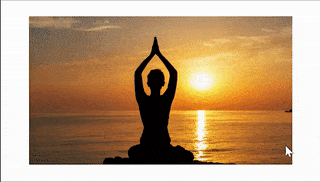
In this effect, hovering over an image will enlarge it and bend its border.
In this, we mainly use the “transform: scale()” effect. It scales the image when we hover over it. Also, the border-radiuseffect bends the border of the image.
In this, if we hover over an image, it piles up as many layers of the image, fading down from top to bottom. It also makes the cursor a pointer when we hover over it.
We use the "img: nth-child()" functionality to refer to the nth-copy(or child) of the image.
Also, we use the "transform: translate()" functionality. It moves the image from its current position to the X-axis and Y-axis parameters specified.
Implementing hover effects can enhance the user experience and improve the visual appeal of your website. However, it's essential to follow best practices to ensure the effects are smooth, accessible, and optimized.
Here are some best practices for implementing hover effects:
Use Subtle Animations Keep hover effects simple and smooth to avoid distracting users. Subtle transitions enhance the design without overwhelming the content.
Add Transitions Always use the transition property to create smooth effects.
Optimize Performance Use CSS properties like transform and opacity instead of width or height for better performance because they leverage GPU rendering.
Make Effects Accessible Ensure hover effects are keyboard-friendly and not the only way to access content. Use :focus alongside :hover for better accessibility.
Test on Different Devices Hover effects work on desktop devices but may not work on touchscreen devices like mobile phones. Provide an alternative interaction like click events for mobile users.
Maintain Consistency Use consistent hover effects across your website to provide a seamless user experience.
Limit Hover Effects on Important Elements Avoid using hover effects on critical elements like buttons or links if they might confuse users.
Use Color Contrast Make sure the hover effect is clearly visible without affecting the readability of the content.
Combine Multiple Effects Wisely You can combine effects like shadow, opacity, and scale — but don't overuse them.
Fallback for Older Browsers Add CSS vendor prefixes or fallback properties for older browsers that don't support modern CSS features.
Frequently Asked Questions
How do you change the image on the hover effect?
To change an image on hover using CSS is a simple yet effective way to add an extra layer of engagement to the website. It is a great way to create an interactive experience for users, which can help to keep them on the site longer and increase their overall satisfaction.
How do you apply the hover effect in CSS?
In CSS, in the style tag or the ".css" file, add the ": hover" to the CSS selector when styling your component.
How to disable hover in CSS?
Remove the ":hover" from the CSS selector from the style tag, and the animations will be removed that were there in the first place while you applied the hovering effect. Also, you can set the pointer-event properties of the specified element to none to achieve the same.
Why are image hover effects in CSS used?
Image hover effects in CSS are used so that images are more interactive and animated to make the website engaging.
Can hover be used on ID in CSS?
Yes, you can use the hover effect on a CSS selector that can be a class, ID, or an HTML attribute.
What is the banner hover effect?
A banner hover effect applies animations like zoom, color overlay, or text pop-up on a website banner when the user hovers over it.
How to create a zoom effect on image hover with CSS?
Use the transform: scale() property with the :hover selector to enlarge the image on hover. Apply transition for smooth animation.
How to apply the hover effect in CSS?
Use the :hover pseudo-class in CSS to apply visual changes like color, size, opacity, or animations when the user hovers over an element.
Conclusion
CSS helps you style your website the way you want it to. And images are great visual aids for your website. Thus, making your images interactive while hovering over them makes your website more engaging and responsive. In this article, we studied the concept of image hover effects in CSS with some examples.
If you want to design your website more and make it much more eye-catching, do read our following articles:


 8+ registered

