Tools in Charts
A new tab, ‘Chart Tools’, appears on the ribbon when you click on a chart. Under CHART TOOLS, there are two tabs.
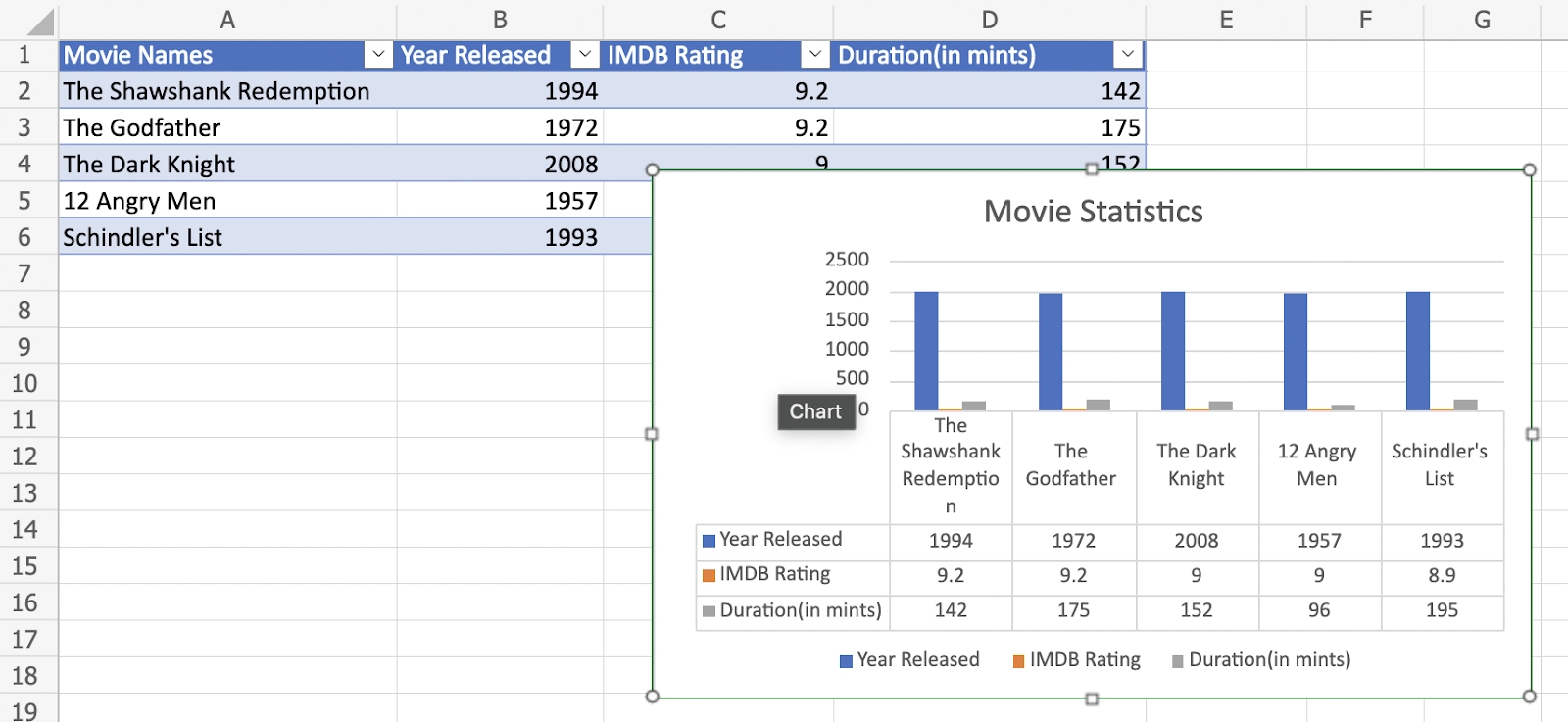
Representation of Various Charts
We will take the example of ‘movie statistics’ and will see the data in various formats of charts in Excel. We will first select the range A1:D6.

Select different chart symbols from the Charts category on the Insert tab to view the representation in the form of charts in Excel.
Column Chart
Line Chart

Pie Chart

Bar Chart

Area Chart

Scatter Chart

Other Charts
Some of the other chart representations are also available. They are:

Recommended Charts in Excel
The Insert tab's ‘Recommended Charts’ command assists you in creating a chart that is ideal for your data. Go to 'Insert Tab' and then select the Charts group, as you did previously.

When you don't have a pre-existing design for how the data should look, recommended charts are the best option. Excel collects a lot of data to figure out how to make these recommended charts, so taking a look at what it offers isn't a bad idea.
Building Charts in Excel
- Prepare your data.
- Insert a chart and choose the chart type.
- Make sure your chart is correct.
- Make your chart unique by customizing it.
FAQs
1. What is meant by charts in Excel?
Excel's most basic technique of visualizing data is through charts. They provide a variety of graphic representations of your data to make it easier to understand.
Excel's more complex capabilities and business intelligence suite also provide other techniques to find data relationships.
Charts in Excel are a visual tool to see trends in your worksheet's data.
2. How to change the legend position in charts?
By default, the legend position will be at the bottom.


We will be executing the steps below to shift the legend to the right side of the chart.
1. Choose the chart.
2. Look on the right side of chart in the Format section, click the dropdown button of Legend, then in Position, change it to Right.

3. List down the most commonly used charts.
Bar Chart: When comparing multiple kinds of data, these Excel charts are most beneficial. For example, it is effective when comparing salaries for different cities. The bar chart is one of the common forms of charts which is preferred mostly.
Pie Chart: It is excellent for displaying the link between a single piece of data and the entire data set. For instance, if you wanted to display how much profit your department contributed in comparison to the overall earnings of the company, a Pie Chart would be ideal.
Line Chart: These are great for displaying changes over time. While a Bar Chart is ideal for displaying the maximum profit at a single point in time, Line Charts are better for displaying how that profit changes over time. You can immediately recognize your company's highs and lows and their relationship to other points on the line chart!
Since they are the most widely utilized, all three of these sorts of charts can be found in the Charts group. Each Chart Type has its own set of applications; experiment to see what works best for you, and don't forget to use the Recommended Charts function!
4. What do you mean by Column Vs. Line charts in Excel?
In Excel, column vs. line charts is used to compare the variations of two or more items simultaneously. For example, you may depict the annual profits versus expenses data using a column vs. line chart, where the columns indicate profits and the line represents expenses.
- First, to make a column chart, select all of the data and press the shortcut key F1.
- To create the column vs. line chart, you'll need to alter the chart type. Right-click on the chart area and then select the chart type option from the drop-down menu.
- Select the combo option in the chart type window, then the column and line combo option. This will change the chart into a column vs. line chart.
5. What are pivot charts?
A Pivot Chart is a real-time interactive chart that reacts to changes in real-time data.
Key Takeaways
In this blog, we learned the concepts of charts in Excel. Excel files with a lot of data can be tough to understand. Charts make it easy to visualize comparisons and trends by graphically illustrating your workbook data. You can choose from a variety of charts in Excel to see which one best fits your data. To utilize charts properly, you must first understand how they are used.
Refer here to learn more about line charts, bar charts and pie charts in Excel.
Refer to our guided paths on Coding Ninjas Studio to learn more about DSA, Competitive Programming, JavaScript, System Design, etc. Enroll in our courses and refer to the mock test and problems available. Take a look at the interview experiences and interview bundle for placement preparations.
Do upvote our blog to help other ninjas grow.

Credits: GIPHY
Happy Learning!


 8+ registered

