Do you think IIT Guwahati certified course can help you in your career?
Introduction
When working with data, visualization is the greatest approach to immediately grasp it. Rather than studying them in tabular form, visualizing them enables a more natural and rapid comprehension. Visualizing your data may also yield unexpected outcomes. Many fascinating insights may be derived from our data by understanding the distribution of the data. We'll be covering one such distribution in this article: The Normal Distribution. We'll also be discussing a way to visualize the distribution with the help of a Histogram.
Normal distribution
The normal distribution is a fundamental notion in statistics. It may also be found in data science and machine learning, as well as several unexpected real-world events. When it comes to statistics, the normal distribution is essential. It not only approximates a wide range of variables, but actions based on its insights have a strong track record. It is also known as the Gaussian distribution after Carl Friedrich Gaus, who discovered it.
Talking about probability distributions, Normal distribution is the most popular one, and hence the one people often tend to begin with, so let's dig into this without any further ado.
Characteristics of Normal Distribution
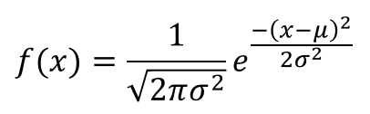
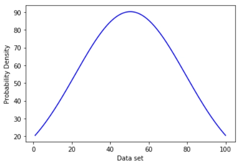
A normal distribution may be described using only two parameters, the mean and standard deviation, which are denoted by the Greek letters mu (𝝁) and sigma (𝛔). Its probability density curve is shown below(fig.1):
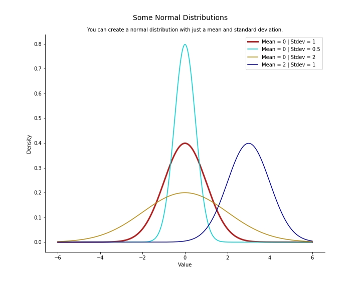
The normal distribution has various properties that make it extremely useful. The area under the curve is 1, its mean, median, and mode are equal, it’s also symmetrical around the mean. Another defining characteristic of the normal distribution is the empirical rule, we’ll be elaborating on this next. We may vary the form and position of the distribution by adjusting the mean and standard deviation. Altering the mean causes the curve to shift along the number line, but changing the standard deviation causes the curve to stretch or squash.
The image below will help you get a better understanding of the above statement.
Fig. 1: Probability density function of normal distribution
Another essential feature of a normal distribution is that it retains its normal shape throughout, in contrast to other probability distributions that change their features after a modification.
Standard Normal Distribution
A normal distribution with μ = 0 and σ = 1 is termed as Standard Normal Distribution. We’ll discuss its importance in the forthcoming section.
Empirical Rule
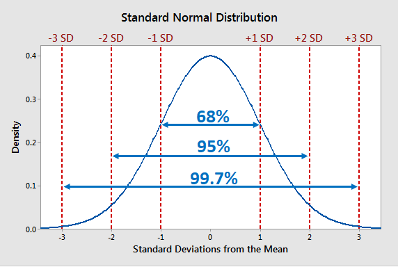
The empirical rule, also known as the three-sigma rule or the 68-95-99.7 rule, is a statistical rule that asserts that with a normal distribution, nearly all observed data will lie within three standard deviations (denoted by σ) of the mean or average (denoted by µ).
As you can see from the above image, we can draw the following inferences:
68% of observations lie within 1 standard deviation of the mean.
95% of the observations lie within 2 standard deviations of the mean.
99.7% of observations lie within 3 standard deviation of the mean
The remaining 0.3% values are often accounted as outliers or noise. Essentially, as the numbers in question deviate from the mean, the likelihood that the observation belongs to that distribution decreases.
Importance of Standard Normal Distribution
We may use a Standard Score or z-score to compute the probability that a given value comes from a specific distribution or to compare values from multiple distributions, with a standard normal distribution.
A normal distribution can be easily converted to a Standard normal distribution with the help of the following formula
Determining Normality of a Probability Distribution
To determine the normality of distribution, we can use the following methods:
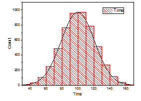
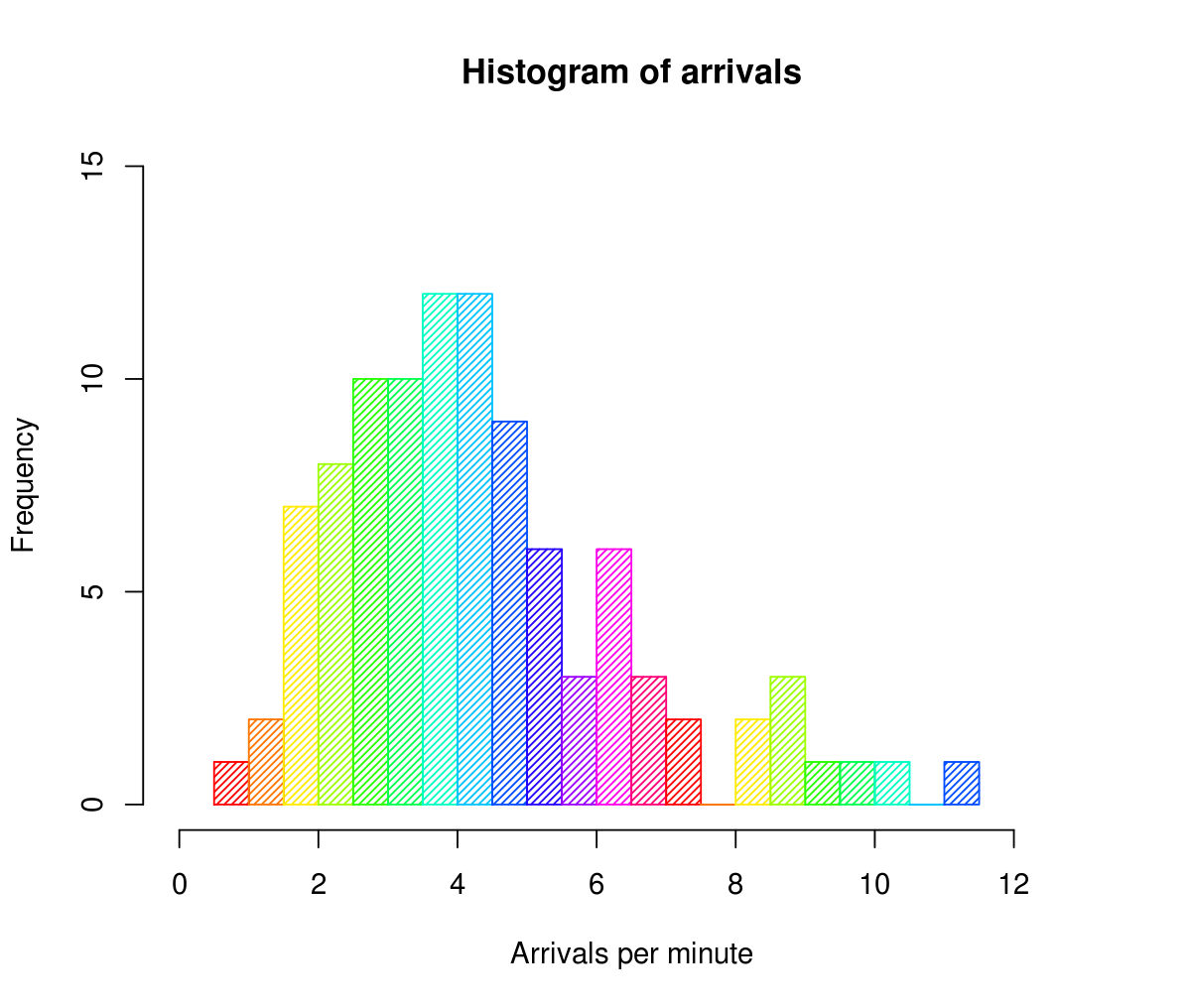
Histogram
When you acquire a sample of results from an experiment, one of the first things you do is plot the number of occurrences versus the sample values to produce the distribution curve (histogram). In many circumstances, the resultant curve will reveal the sort of probability distribution that your data adheres to. We’ll be discussing Histograms in detail in the next half of this article.
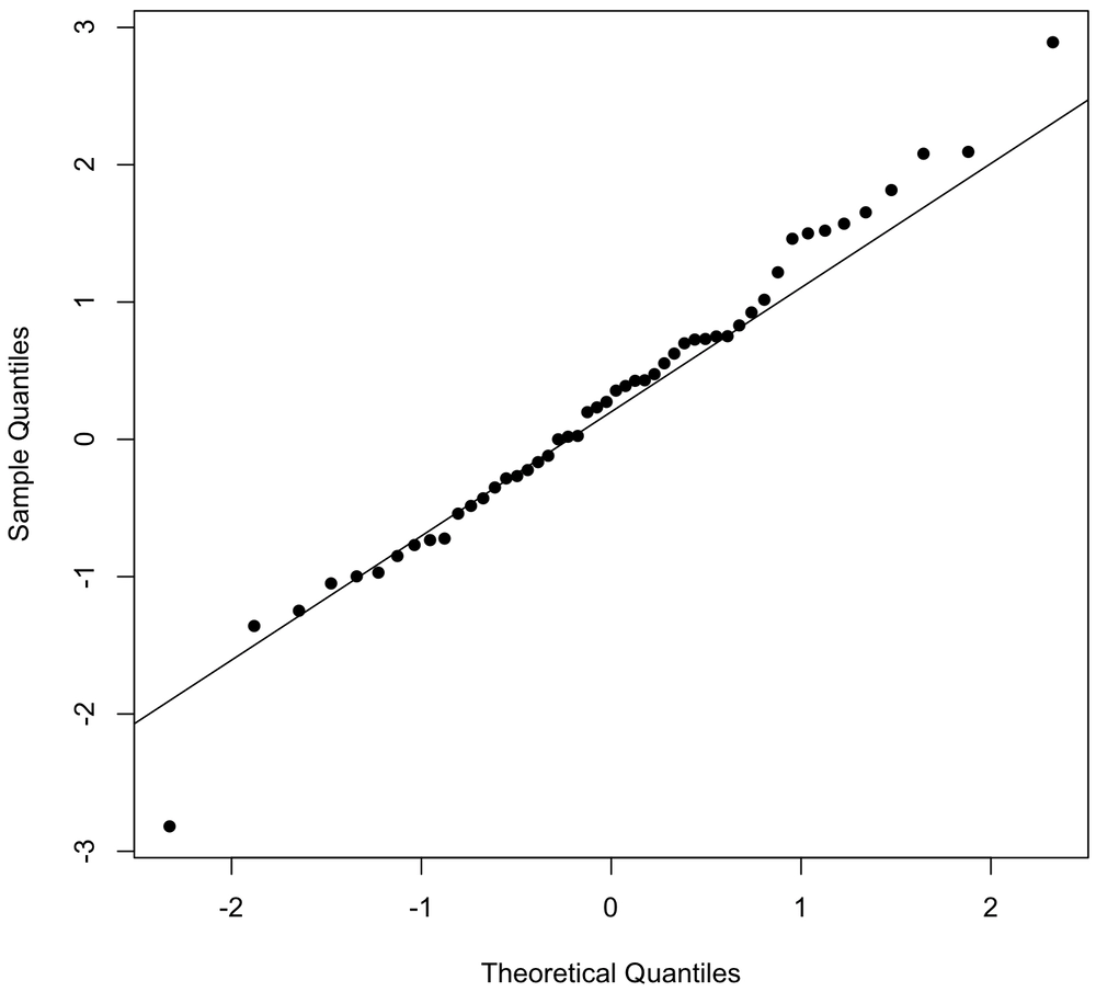
This graph will assist you in determining whether your dependent variable follows a normal distribution. If both sets of data(x-axis and y-axis) belong to a normal distribution, the resultant Q-Q plot will form a straight line angled at 45 degrees. The figure below might aid you in understanding
Kernel Density Estimation plots are essentially a smoothened version of a histogram plot. If you modify the number of bins or merely the start and end values of a bin, the histogram results might vary greatly. We utilize the density function to get around this.
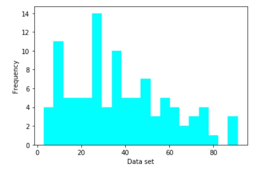
The histogram is a well-known tool for displaying distributions. A histogram depicts the frequency distribution of data. The taller the bar in a histogram, the more frequently it appears in the observed data. Because histograms are so straightforward, they help us overcome the knowledge barrier. Histograms offer the most descriptive power of any summarising approach while also being the quickest way to analyze data as the human brain favors visual perception. However, if you are not cautious, viewers may not comprehend your histogram, or you may not get the most out of it. Let’s delve into the details of the Histogram and how we can use it to its fullest extent.
Histograms are 2D(two-dimensional) plots with two axes:
X-axis: It is the horizontal axis that is split into numerical values( intervals or bins).
Y-axis: It is the vertical axis depicting the frequency of each bin/interval.
The area of vertical rectangular bars represents the frequency of each bin. Each bar represents a range of continuous numeric values for the variable under consideration. Histograms may have bars of varying widths. However, in order to indicate similar ranges of data for each period, they are usually plotted with the same width.
When to Use a Histogram
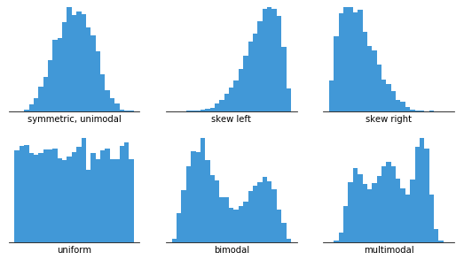
Histograms are useful for displaying basic distributional characteristics of dataset variables. You can observe where the distribution's peaks are, whether it's skewed or symmetric and whether there are any outliers.
To create a histogram, we just need a variable that takes continuous numeric data. This indicates that regardless of their absolute values, the variances between values remain constant.
You can use a histogram when you want to:
Understand and visualize the distribution of data and seek outliers
Determine the center of the data
Evaluate the fit of a probability density function.
Some good practices for using a Histogram
Using zero-valued baselines
As the height of each bar implies the frequency of data in each bin, altering the baseline or inserting a break in the scale would skew the sense of data distribution. Hence it is crucial to use zero-valued baselines for consistent results.
Choosing the appropriate bin size
The number of bins has an inverse relation with the size of the bins. The greater the bin size, the fewer bins are required to capture the whole range of data. The lower the bin size, the more bins are required.
Bin boundaries must be distinguishable
Labels should generally fall on the bin margins in order to better explain where the limits of each bar sit. Labels aren't required for every bar, but having them every few bars helps the audience keep track of the value. Furthermore, it is preferable if the labels are values with a limited number of significant digits to make them easier to read.
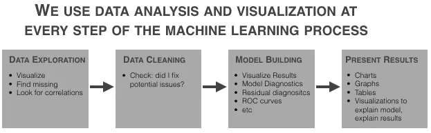
Applications in Machine learning
The truth is that if you want to construct a machine learning model, you'll have to spend a lot of time conducting data analysis first. Furthermore, when you've used an ML method, you'll utilize data analysis to investigate the findings of your model. Data analysis and visualization are essential components of practically every stage of the machine learning workflow.
Let’s have a look at how we can implement the concepts we learned above using python.
Normal Distribution
import numpy as np
import matplotlib.pyplot as plt

# Creating a series of data of in range of 1-100.
x = np.linspace(1,100,200)

#Creating a Function.
def normal_dist(x , mean , sd):
    prob_density = (np.pi*sd) * np.exp(-0.5*((x-mean)/sd)**2)
    return prob_density

#Calculate mean and Standard deviation.
mean = np.mean(x)
sd = np.std(x)

#Apply function to the data.
pdf = normal_dist(x,mean,sd)

#Plotting the Results
plt.plot(x,pdf , color = 'blue')
plt.xlabel('Data set')
plt.ylabel('Probability Density')
plt.show()
You can also try this code with Online Python Compiler
What is data standardization? Data standardization refers to the process of converting raw data to a standard normal distribution.
What is the difference between a histogram and a bar graph? The visual difference between a histogram and a bar graph is that the bars have no spaces between them in a histogram, whereas the bars are evenly spaced in a bar graph. The bar graph generally contains categorical data, whereas the histogram contains quantitative data.
What are the applications of Normal Distribution in Machine Learning? Data with a Normal Distribution is helpful for model construction in Machine Learning. Models like Linear/Logistic regression, Gaussian Naive Bayes are explicitly computed with the premise that the distribution is normal.
Key Takeaways
This post was an introduction to the Normal distribution and Data visualization method: the histogram. We learned the characteristics and some of the most important things concerning Normal distribution. We also had an overview of Histograms and learned how best we can incorporate them. If you're interested in learning more about Machine learning and data science, check this course out!


 18+ registered