System iOS Buttons
The system defines four different iOS button styles, each with three different sizes. Each design has a particular visual prominence, which can help you explain a hierarchy of activities in your app. A system button can be configured to use any style and size combination. A system button employs a size-specific corner radius and the tint color of your app by default. These attributes and those that affect the content layout and the existence of an activity indicator can be changed in your button setup if necessary.

Button Content
Develop button text that explains what the button performs in an instant. One can use a glyph (or icon), a title, or both to convey a button's purpose. Consider employing an existing or modified SF symbol in your button if a glyph makes sense. To use text, make a short title that conveys the button's function. To explain the button's action, use title-style capitalization and a name that begins with a verb — for example, a button that allows people to add things to their shopping cart might have the title "Add to Cart."
Subtitle
Provide a subtitle if it offers further information. A subtitle might accompany a button's title. The subtitle effectively transmits supplementary information linked to the button's action because it employs a smaller text size than the title. For example, you could utilize the subtitle to update the number of goods in a "Add to Cart" button. Avoid using a subtitle to explain what a button performs; the view, title, and picture of a button should convey all the information consumers need to understand what it does.
Filled buttons
Since the filled style is the most visible, it aids in identifying the activity that people are most likely to seek. At the same time, keep a view from having too many populated buttons. So people must analyze many potential possibilities before deciding. Having too many filled iOS buttons might raise cognitive strain.
Roles
A role can be assigned to a system button, indicating the button's semantic information within your program. A controller can perform the following functions:
- Normal: No particular significance.
- Primary: The button is the standard button, which means it's the one most people will select.
- Cancel: The cancel button stops the current action.
- Destructive: The button conducts an action that can potentially destroy data.
The role of a button can further affect the appearance you choose. For example, the title of a primary button is in bold font, but the title of a destructive button is red.
Toggle Buttons
A toggle button is a system button that alternates between two states, including on and off or displays and hides.

A toggle button has two different visual designs to distinguish the states. A calendar, for example, has two backdrops that look for a toggle button in the month view that displays and hides the day's events.
Pop-up Buttons
A pop-up button is a system button that can present a list of independent options. The menu closes once individuals select an item from a pop-up button's menu, and the button's content can be updated to reflect the current selection.

A pop-up button assists users in making decisions that affect their content or the environment.
Pull-Down Buttons
A pull-down button is a type of system button that can show a menu of things or actions related to the button's purpose.

The menu closes once customers select an item from a pull-down button's menu, and your program performs the action they chose. People can close the menu by touching elsewhere on the screen without selecting an item. Unlike a pop-up button, a pull-down button always shows the same information irrespective of the chosen menu item.
Close Button
The parent view of a close button is closed. Show a close button in the upper right corner of a sheet or a collection's self-contained view.

The close and complete buttons both close the window, but providing both can be misleading because they don't do opposite operations. You might also want to include a cancel button in this case so that people can abandon their edits when they exit the view.
Creating Application for iOS Button
We will be creating iOS Buttons with the help of XCode.
XCode Setup
For the XCode setup, go to the ‘App store’ on your apple device and download the Xcode application.
Creating a New Project in XCode
Click on ‘Create a new Project’.
After this, follow the below steps for choosing a template:
- Go to ‘iOS’.
- Select ‘App’.
- Click on ‘Next’.

Then it will redirect you to select the project name and organization:

Here, we have given the project name ‘CNiOSButton’ and the organization identifier ‘com.codingninjas’. Select the interface as ‘Storyboard’ and language ‘Swift’. Click on ‘Next’.
iOS Button App
The ‘CNiOSButton’ project then gets created. We can see the folder structure below:

We will then select the ‘iPhone 12 Pro Max’ from above.

Upon clicking on the play button in the upper-left side panel, the ‘CNiOSButton’ application will run.
This is the below output when we run at the very start:

We will then add more files for the button class. The steps for adding files are like this:
First, we will click on ‘New File’.

Then we will choose the template for the new file:
- Choose ‘iOS’.
- Then click on ‘Cocoa Touch Class’.

Then, after clicking on next, we will be redirected to give the class name.

We will then give the class name for a two-lined button, for example: ‘Button_TwoLinedB’. Similarly, we can create another file for the icon text button with the name ‘Button_IconTextB’. After giving the class name, click on ‘Next’.
The file structure looks like this:

Two Lined Button
Add the following code for two lined button in ‘Button_TwoLinedB.swift’.
//
//  Button_TwoLinedB.swift
//  CNiOSButton
//

import UIKit

struct Button_TwoLinedBViewModel {
    let primaryText: String
    let secondaryText: String
}

final class Button_TwoLinedB: UIButton {
    private let primaryLabel: UILabel = {
        let label = UILabel()
        label.numberOfLines = 1
        label.textAlignment = .center
        label.textColor = .blue
        label.font = .systemFont(ofSize: 20, weight: .semibold)
        return label
    }()

    private let secondaryLabel: UILabel = {
        let label = UILabel()
        label.numberOfLines = 1
        label.textAlignment = .center
        label.textColor = .blue
        label.font = .systemFont(ofSize: 18, weight: .regular)
        return label
    }()

    override init(frame: CGRect) {
        super.init(frame: frame)
        addSubview(primaryLabel)
        addSubview(secondaryLabel)
        clipsToBounds = true
        layer.cornerRadius = 10
        layer.borderWidth = 1
        layer.borderColor = UIColor.secondarySystemBackground.cgColor
        backgroundColor = .systemYellow
    }

    required init?(coder: NSCoder) {
        fatalError()
    }

    func configure(with viewModel: Button_TwoLinedBViewModel) {
        primaryLabel.text = viewModel.primaryText
        secondaryLabel.text = viewModel.secondaryText
    }

    override func layoutSubviews() {
        super.layoutSubviews()
        primaryLabel.frame = CGRect(x: 0,
                                    y: 0,
                                    width: frame.size.width,
                                    height: frame.size.height/2)
        secondaryLabel.frame = CGRect(x: 0,
                                      y: frame.size.height/2,
                                      width: frame.size.width,
                                      height: frame.size.height/2)
    }
}
Add the following code for two lined button in ‘ViewController.swift’.
//
//  ViewController.swift
//  CNiOSButton
//

import UIKit

class ViewController: UIViewController {

    override func viewDidLoad() {
        super.viewDidLoad()
        let button_twolined = Button_TwoLinedB(frame: CGRect(x: 0, y: 0, width: 330, height: 65))
        view.addSubview(button_twolined)
        button_twolined.center = view.center
        button_twolined.configure(with: Button_TwoLinedBViewModel(
            primaryText: "Start Free Course",
            secondaryText: "1 month free, then Rs. 199/month"
        ))
    }
}
Output
After clicking on the play button in the upper-left side panel, the ‘CNiOSButton’ application will run.
This is the below output for two lined button:

Icon Text Button
Add the following code for the icon text button in ‘Button_IconTextB.swift’.
//
//  Button_IconTextB.swift
//  CNiOSButton
//

import UIKit

struct Button_IconTextBViewModel {
    let text: String
    let image: UIImage?
    let backgroundColor: UIColor?
}

final class Button_IconTextB: UIButton {
    private let label: UILabel = {
        let label = UILabel()
        label.numberOfLines = 1
        label.textAlignment = .center
        label.textColor = .blue
        label.font = .systemFont(ofSize: 20, weight: .semibold)
        return label
    }()

    private let viewIconImage: UIImageView = {
        let imageView = UIImageView()
        imageView.tintColor = .white
        imageView.contentMode = .scaleAspectFit
        imageView.clipsToBounds = true
        return imageView
    }()

    override init(frame: CGRect) {
        super.init(frame: frame)
        addSubview(label)
        addSubview(viewIconImage)
        clipsToBounds = true
        layer.cornerRadius = 10
        layer.borderWidth = 1
        layer.borderColor = UIColor.secondarySystemBackground.cgColor
    }

    required init?(coder: NSCoder) {
        fatalError()
    }

    func configure(with viewModel: Button_IconTextBViewModel) {
        label.text = viewModel.text
        backgroundColor = viewModel.backgroundColor
        viewIconImage.image = viewModel.image
    }

    override func layoutSubviews() {
        super.layoutSubviews()
        label.sizeToFit()
        let iconSize: CGFloat = 30
        let iconPosX: CGFloat = (frame.size.width - label.frame.size.width - iconSize - 5)/2
        let iconPosY: CGFloat = (frame.size.height - iconSize)/2
        viewIconImage.frame = CGRect(x: iconPosX,
                                     y: iconPosY,
                                     width: iconSize,
                                     height: iconSize)
        label.frame = CGRect(x: iconPosX + iconSize + 5,
                             y: 0,
                             width: label.frame.size.width,
                             height: frame.size.height)
    }
}
Add the following code for two lined button in ‘ViewController.swift’.
//
//  ViewController.swift
//  CNiOSButton
//

import UIKit

class ViewController: UIViewController {

    override func viewDidLoad() {
        super.viewDidLoad()
        let button_twolined = Button_TwoLinedB(frame: CGRect(x: 0, y: 0, width: 330, height: 65))
        view.addSubview(button_twolined)
        button_twolined.center = view.center
        button_twolined.configure(with: Button_TwoLinedBViewModel(
            primaryText: "Start Free Course",
            secondaryText: "1 month free, then Rs. 199/month"
        ))

        let button_iconText = Button_IconTextB(frame: CGRect(x: (view.frame.size.width - 330)/2, y: 60, width: 330, height: 65))
        view.addSubview(button_iconText)
        button_iconText.configure(with: Button_IconTextBViewModel(
            text: "Check Out",
            image: UIImage(systemName: "cart"),
            backgroundColor: .systemRed
        ))
    }
}
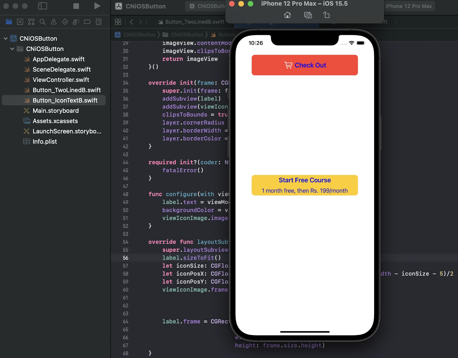
Output
After clicking on the play button in the upper-left side panel, the ‘CNiOSButton’ application will run.
This is the below output for two lined button and an icon text button:
Hope you have gone through the steps along with us and understood the creation of iOS Buttons on XCode.
Frequently Asked Questions
What are system iOS buttons?
A system button can be configured to use any style and size combination. A system button employs a size-specific corner radius and the tint color of your app by default.
What is the role of system iOS buttons? Give some examples.
A role can be assigned to a system button, indicating the button's semantic information within your program. Some common types of roles are Normal, Primary, and Cancel Destructive.
What is the use of pop-up iOS buttons?
A pop-up button assists users in making decisions that affect their content or the environment.
What is the use of a toggle button?
Toggle iOS buttons can assist individuals in managing the state of a material or a view. People expect a toggle button to show their current selection and change the state of something.
When do we use a close button?
We use a close button only when we want to give functionality to dismiss the current window, and there is no Complete/Done button. Providing both can be misleading.
Conclusion
In this article, we have extensively discussed different types of iOS buttons and their uses. We have also mentioned the steps for creating iOS Buttons on XCode. After Want to explore more articles on iOS? Don’t worry; Coding Ninjas has you covered. To learn, see iOS App Development, Swift Tutorial and iOS TextField.
Refer to our guided paths on Coding Ninjas Studio to learn more about DSA, JavaScript, System Design, DBMS, Java, etc. Enroll in our courses and refer to the mock test and problems available. Take a look at the interview experiences and interview bundle for placement preparations.
Do upvote our blog to help other ninjas grow. 🥷✨

Happy Learning, Ninja!


 9+ registered

