Do you think IIT Guwahati certified course can help you in your career?
Introduction
A Kernel Density Estimate (KDE) plot is a visualization method that provides a detailed representation of the probability density of continuous variables.
What is Kdeplot?
KDE stands for Kernel Density Estimate, which is a graphical way to visualise our data as the Probability Density of a continuous variable. It is an effort to analyse the model data to understand how the variables are distributed.
Implementation of Kdeplot
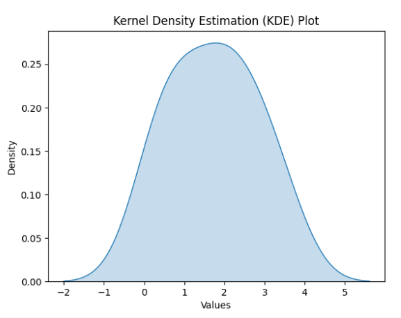
To implement a Kernel Density Estimation (KDE) plot in Python, you can use libraries like Seaborn or Matplotlib. Here's a simple example using Seaborn:
import seaborn as sns
import matplotlib.pyplot as plt

# Sample data
data = [0.1, 0.5, 0.7, 1.2, 1.5, 2.0, 2.2, 2.5, 3.0, 3.5]

# Create KDE plot using Seaborn
sns.kdeplot(data, shade=True)

# Add labels and title
plt.xlabel('Values')
plt.ylabel('Density')
plt.title('Kernel Density Estimation (KDE) Plot')

# Display the plot
plt.show()
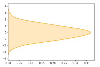
Apart from all these doing seaborn kdeplot can also do many things, it can also revert the plot as vertical for example.
import seaborn as sn
import matplotlib.pyplot as plt
import numpy as np
data = np.random.randn(500)
res = sn.kdeplot(data, color='orange', vertical=True, shade='True')
plt.show()
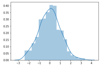
KDE plot can also be drawn using distplot(), Let us see how the distplot() function works when we want to draw a kdeplot. Distplot: This function combines the matplotlib hist function (with automatic calculation of a good default bin size) with the seaborn kdeplot() and rugplot() functions. The arguments to distplot function are hist and kde is set to True that is it always show both histogram and kdeplot for the certain which is passed as an argument to the function, if we wish to change it to only one plot we need to set hist or kde to False in our case we wish to get the kde plot only so we will set hist as False and pass data in the distplot function.
Example 1:
import seaborn as sn
import matplotlib.pyplot as plt
import numpy as np
data = np.random.randn(500)
res = sn.distplot(data)
plt.show()
Example 2:
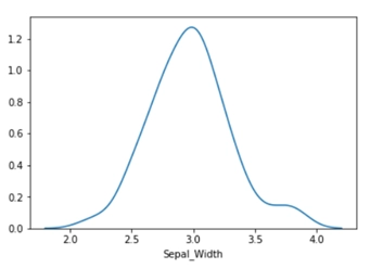
For iris dataset, sn.distplot(iris_df.loc[(iris_df[‘Target’]==’Iris_Virginica’),’Sepal_Width’], hist=False)
This graphical representation gives an accurate description of If the data is skewed in one direction or not also explains the central tendency of the graph. Check out this problem - Largest Rectangle in Histogram
Find this article intriguing? Explore more blogs now!
Creating a Univariate Seaborn Kdeplot
To create a univariate Seaborn KDE plot in Python, you can use the kdeplot() function from the Seaborn library.
Example 1
import seaborn as sns
import numpy as np
import matplotlib.pyplot as plt
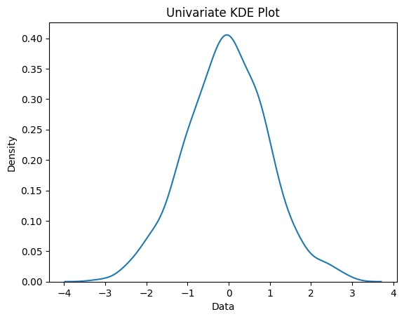
# Generate some example data
data = np.random.normal(size=1000)
# Create the plot
sns.kdeplot(data)
# Add labels and title
plt.xlabel('Data')
plt.ylabel('Density')
plt.title('Univariate KDE Plot')
# Show the plot
plt.show()
In this example, we first import the necessary libraries: Seaborn, NumPy, and Matplotlib. We then generate some example data using NumPy's random.normal() function.
Next, we create the KDE plot using Seaborn's kdeplot() function and pass in the data as the input. Seaborn automatically calculates and plots the kernel density estimate.
Finally, we add labels and a title to the plot using Matplotlib's xlabel(), ylabel(), and title() functions. We then display the plot using Matplotlib's show() function.
The resulting plot will show the distribution of the data as a smooth curve, with the x-axis representing the data values and the y-axis representing the density of those values.
Example 2
import seaborn as sns
import pandas as pd
import matplotlib.pyplot as plt
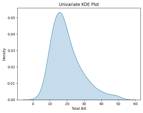
# Load a dataset
tips = sns.load_dataset("tips")
# Create the plot
sns.kdeplot(data=tips["total_bill"], shade=True)
# Add labels and title
plt.xlabel('Total Bill')
plt.ylabel('Density')
plt.title('Univariate KDE Plot')
# Show the plot
plt.show()
In this example, we load a dataset using Seaborn's load_dataset() function, which loads the "tips" dataset from the Seaborn library. We then create the KDE plot using Seaborn's kdeplot() function and pass in the "total_bill" column of the dataset as the input. We also set the shade parameter to True to fill the area under the curve with color.
Finally, we add labels and a title to the plot using Matplotlib's xlabel(), ylabel(), and title() functions. We then display the plot using Matplotlib's show() function.
The resulting plot will show the distribution of the "total_bill" column of the "tips" dataset as a smooth curve, with the x-axis representing the bill amount and the y-axis representing the density of those amounts. The shaded area under the curve indicates the proportion of the data that falls within each range of values.
Creating a KDE plot can answer many questions such as
What range is covered by the observer?
The central tendency of the data.
If the data is skewed in one direction or not.
The bimodality of the data.
Are there significant outliers?
KDE plot is a probability density function that generates the data by binning and counting observations. But, rather than using a discrete bin KDE plot smooths the observations with a Gaussian kernel, producing a continuous density estimate. KDE can produce a plot that is less cluttered and more interpretable, especially when drawing multiple distributions. However, sometimes the KDE plot has the potential to introduce distortions if the underlying distribution is bounded or not smooth.
What is Seaborn?
Seaborn is a python library integrated with Numpy and Pandas (which are other libraries for data representation). Seaborn is closely related to Matplotlib and allow the data scientist to create beautiful and informative statistical graphs and charts which provide a clear idea and flow of pieces of information within modules.
Install seaborn as pip install seaborn
Syntax of KDE plot: seaborn.kdeplot(data) the function can also be formed by seaboen.displot() when we are using displot() kind of graph should be specified as kind=’kde’, seaborn.display( data, kind=’kde’)
Normal KDE plot:
import seaborn as sn
import matplotlib.pyplot as plt
import numpy as np
data = np.random.randn(500)
res = sn.kdeplot(data)
plt.show()
This plot is taken on 500 data samples created using the random library and are arranged in numpy array format because seaborn only works well with seaborn and pandas DataFrames.
We can also add color to our graph and provide shade to the graph to make it more interactive.
import seaborn as sn
import matplotlib.pyplot as plt
import numpy as np
data = np.random.randn(500)
res = sn.kdeplot(data, color='orange', shade='True')
plt.show()
Our task is to create a KDE plot using pandas and seaborn. Let us create a KDE plot for the iris dataset.
#importing important library
import seaborn as sns
import matplotlib.pyplot as plt
import numpy as np
from sklearn import datasets
import pandas as pd
%matplotlib inline

# Setting up the Data Frame
iris = datasets.load_iris()

#changing column names
iris_df = pd.DataFrame(iris.data, columns=['Sepal_Length', 'Sepal_Width', 'Patal_Length',
                                      'Petal_Width'])
iris_df['Target'] = iris.target
#changing target from values to labels
iris_df['Target'].replace([0], 'Iris_Setosa', inplace=True)
iris_df['Target'].replace([1], 'Iris_Vercicolor', inplace=True)
iris_df['Target'].replace([2], 'Iris_Virginica', inplace=True)

# Plotting the KDE Plot
sns.kdeplot(iris_df.loc[(iris_df['Target']=='Iris_Virginica'),
                   'Sepal_Width'], color='green', shade=True, Label='Iris_Virginica')

# Setting the X and Y Label
plt.xlabel('Sepal Length')
plt.ylabel('Probability Density')
Iris data contain information about a flower’s Sepal_Length, Sepal_Width, Patal_Length, Petal_Width in centimetre. On the basis of these four factors, the flower is classified as Iris_Setosa, Iris_Vercicolor, Iris_Virginica, there are in total of 150 entries.
Steps that we did for creating our kde plot,
We start everything by importing the important libraries pandas, seaborn, NumPy and datasets from sklearn.
Once our modules are imported our next task is to load the iris dataset, we are loading the iris dataset from sklearn datasets, we will name our data as iris.
Now we will convert our data in pandas DataFrame which will be passed as an argument to the kdeplot() function and also provide names to columns to identify each column individually.
Add a new column to the iris DataFrame that will indicate the Target value for our data.
Now the next step is to replace Target values with labels, iris data Target values contain a set of {0, 1, 2} we change that value to Iris_Setosa, Iris_Vercicolor, Iris_Virginica.
Now we will define kdeplot() we have defined our kdeplot for the column of sepal width where the target values are equal to Iris_Virginica, the kdeplot is green in colour and has shading parameter set to True with a label that indicates that kdeplot is drawn for Iris_Virginica.
Finally, we provide labels to the x-axis and the y-axis, we don’t need to call show() function as matplotlib was already defined as inline.
We can also provide kdeplot for many target values in same graph as,
# Plotting the KDE Plot
sns.kdeplot(iris_df.loc[(iris_df['Target']=='Iris_Virginica'),
            'Sepal_Width'], color='green', shade=True, Label='Iris_Virginica')

sns.kdeplot(iris_df.loc[(iris_df['Target']=='Iris_Setosa'),
            'Sepal_Width'], color='blue', shade=True, Label='Iris_Setosa')

sns.kdeplot(iris_df.loc[(iris_df['Target']=='Iris_Vercicolor'),
            'Sepal_Width'], color='red', shade=True, Label='Iris_Vercicolor')

# Setting the X and Y Label
plt.xlabel('Sepal Length')
plt.ylabel('Probability Density')
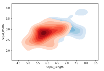
We can also create a Bivariate kdeplot using the seaborn library. Seaborn is used for plotting the data against multiple data variables or bivariate(2) variables to depict the probability distribution of one with respect to the other values.
Syntax using bivariate kdeplot,
seaborn.kdeplot(x,y)

Bivariate kdeplot on the iris dataset

import seaborn as sns
import matplotlib.pyplot as plt
import numpy as np
from sklearn import datasets
import pandas as pd
%matplotlib inline

iris = datasets.load_iris()
iris_df = pd.DataFrame(iris.data, columns=['Sepal_Length', 'Sepal_Width', 'Patal_Length',
                                      'Petal_Width'])
iris_df['Target'] = iris.target
iris_df['Target'].replace([0], 'Iris_Setosa', inplace=True)
iris_df['Target'].replace([1], 'Iris_Vercicolor', inplace=True)
iris_df['Target'].replace([2], 'Iris_Virginica', inplace=True)

#query for target selection
iris_virginica = iris_df.query("Target=='Iris_Virginica'")

# Plotting the KDE Plot
sns.kdeplot(iris_virginica['Sepal_Length'],
            iris_virginica['Sepal_Width'],
            color='b', shade=True, Label=’Iris_Virginica’,
            cmap="Blues", shade_lowest=False)
To obtain a bivariate kdeplot we first obtain the query that will select the target value of Iris_Virginica, this query selects all the rows from the table of data with the target value of Iris_Virginica.
Now we will define kdeplot of bivariate with x and y data, from our data we select all entries of sepal_length and speal_width for the selected query of Iris_Virginica.
The color of the graph is defined as blue with a cmap of Blues and has a shade parameter set to true.
Frequently Asked Questions
What is KDE plot used for?
The KDE plot is a technique that allows for non-parametric estimation of the probability density function of a random variable. Its primary use is to visually represent the distribution of a dataset, as well as to evaluate the assumptions made by parametric models and to uncover patterns and trends in the data.
What does KDE mean in statistics?
KDE is a statistical method that estimates the probability density function of a random variable using a non-parametric approach. The technique involves the use of kernel functions to replace each data point, and then adding up the kernel functions to derive the probability density estimate.
What is the advantage of KDE?
KDE offers the benefit of producing a seamless estimation of a variable's probability density function (PDF) without requiring any assumptions about its distribution. As a result, this approach enables a more adaptable and intricate depiction of the data in comparison to traditional histograms or density plots.
What is the difference between histogram and KDE plot?
In terms of data visualization, a histogram and a KDE plot differ in that a histogram presents the frequency of data values falling within predetermined intervals (also known as "bins"), while a KDE plot illustrates the density estimate of the data values as a continuous curve. Typically, histograms are more suitable for visualizing discrete data.
What is KDE in pandas?
KDE (Kernel Density Estimation) in pandas is a statistical technique used to estimate the probability density function of a continuous random variable. It provides a smoothed representation of the underlying distribution of the data, often used for data visualization and analysis.
Conclusion
In this article, we have discussed KDE Plot Visualization with Pandas and Seaborn. KDE plots offer a powerful visualization tool in data analysis, allowing insights into the underlying distribution of continuous variables. Leveraging the capabilities of Pandas and Seaborn, analysts can create informative visualizations that enhance understanding and drive informed decision-making in various domains.


 8+ registered

