Picking the Right Colours for your Landing Page
-
Using the colour wheel to create your colour palette
Here I have used Adobe Colour CC (https://color.adobe.com/create/color-wheel) to create colour palettes using the colour wheel. It is a powerful tool which can be used easily and smoothly.
a) Analogous Colours
Since analogous colours are found in nature, these colours can be used to generate a harmonious, calm and serene flow on your landing page.
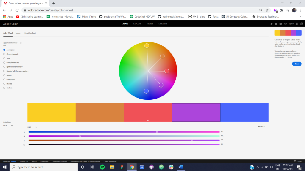 Figure 1 Analogous Color Scheme using Adobe Color CC
b) Monochromatic Colours
When you are unsure of which colors to use but you have one color in mind which resonates with the image of your brand, product or company, a monochromatic colour scheme will come to your rescue. These colors blend into each other well.
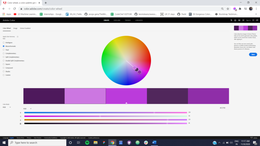
Figure 2 Monochromatic Color Scheme using Adobe Color CC
c) Complementary Colours
Complementary colours are useful when you want an element to be visible distinctively on your background. Usually, one of these colours is used as the background and the other colour is used to create an element in the foreground.
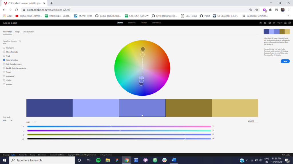
Figure 3 Complementary Color Scheme using Adobe Color CC
d) Shades
You can imagine shades to be a palette wherein one base (primary) color is taken into consideration and different amounts of black colour are mixed with it to generate a palette. These colors will blend in each other well and since a different amount of contrast is used to generate these shades, each color will be visible distinctively. Different shades of one colour offer a sense of familiarity and the image of the product is upheld.
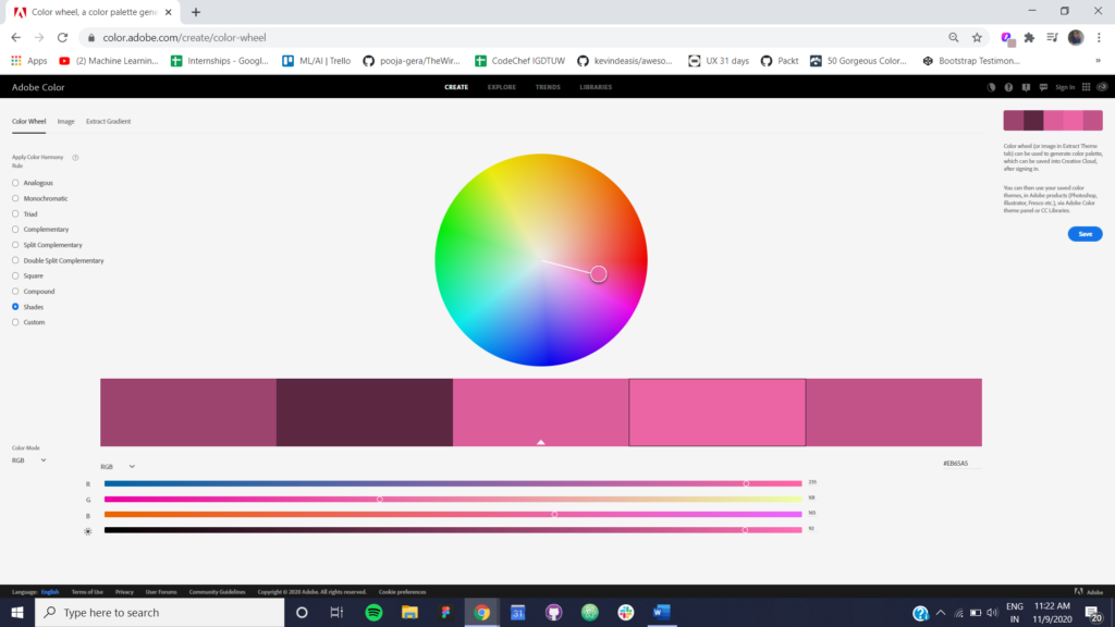
Figure 4 Shades using Adobe Color CC
3. Understand the colour meanings and use them to your advantage
Canva is an online graphic designing tool. It offers pre-made templates which one can tweak as per their own requirements and also create their own designs. They have a dedicated blog on graphic design techniques. They have prepared an amazing resource about different colours and their meanings. You just
have to select the colour you’re looking for on their page and a detailed description of the
colour and its usage will be presented to you. You can check out this resource.
3. The 60-30-10 rule
It is always advisable to choose three colours for your landing page and apply the 60-30-10 rule.
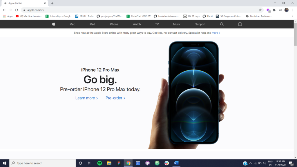
Figure 3 60-30-10 Rule © https://apple.com/in/
Notice how the white colour takes up most of the space (60%), this colour is used for your background. The black colour covers up the navigation bar and the headings (30%) and the Call-To-Action elements (buttons and links) make up the blue colour (10%). Using the 60-30-10 rule will make your landing page look professional and subtle.
4. Colour palette generators
For non-designers, or for those who have just started out with web design, there exist many amazing tools which can assist you in creating a beautiful colour palette for your landing page. I have curated a list of colour palette generators below which are fast and easy to use.
Picking the right Typography for your Landing Page
-
Number of fonts
There should be a maximum of two fonts on your landing page. One for all your headings and one for all your content. Use of multiple fonts creates a disturbance on your page and takes away the focus from the purpose of the page and makes the users invest their time into trying to read different elements and eventually, they won’t be staying on your page for long.
-
Content Alignment
Look at the image below:
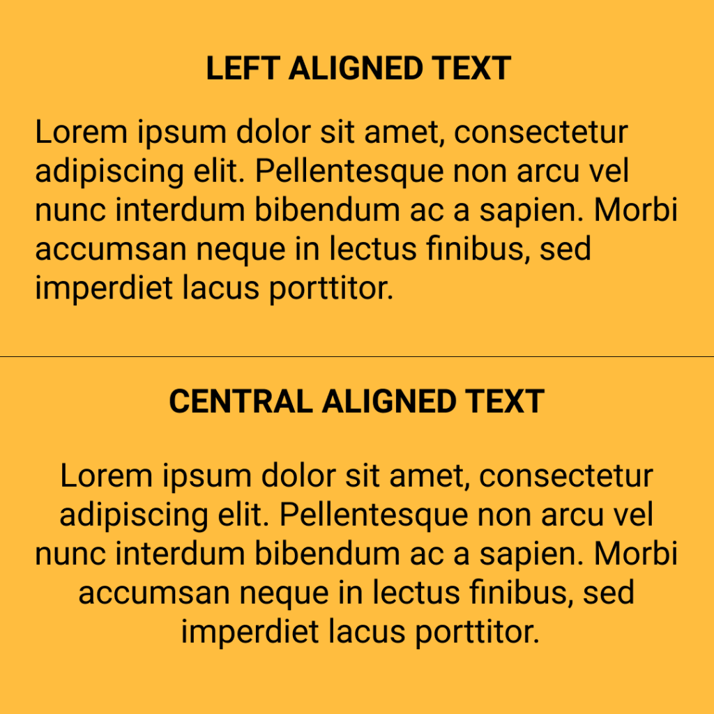
Figure 4 Text Alignment
Try reading the left aligned text and the centrally aligned text, which one are you able to read better? The left-aligned text, isn’t it? While reading, our eyes tend to find it comfortable to read paragraphs with the same indentation. Unless extremely necessary, align your content to the left, or to the right depending upon the position of your text on your page.
-
Font sizes and weights
Different font sizes and weights differentiate one piece of text from another based on their importance. The headline you want the users to read first should have the largest font size and the boldest font-weight. Your mind processes big and more prominent elements before the other elements. Make sure you put that to good use.
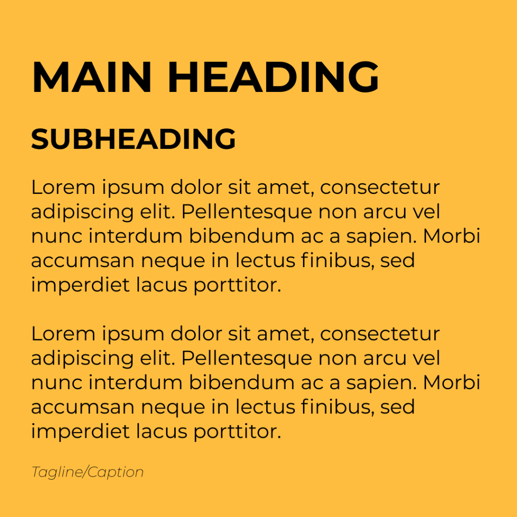
Figure 5 Font Sizes and Weights
Below is the list of some popular fonts that will add to the beauty of your landing page. Whenever in doubt, you can always come back to this blog and pick any font that goes with the vision of your brand.
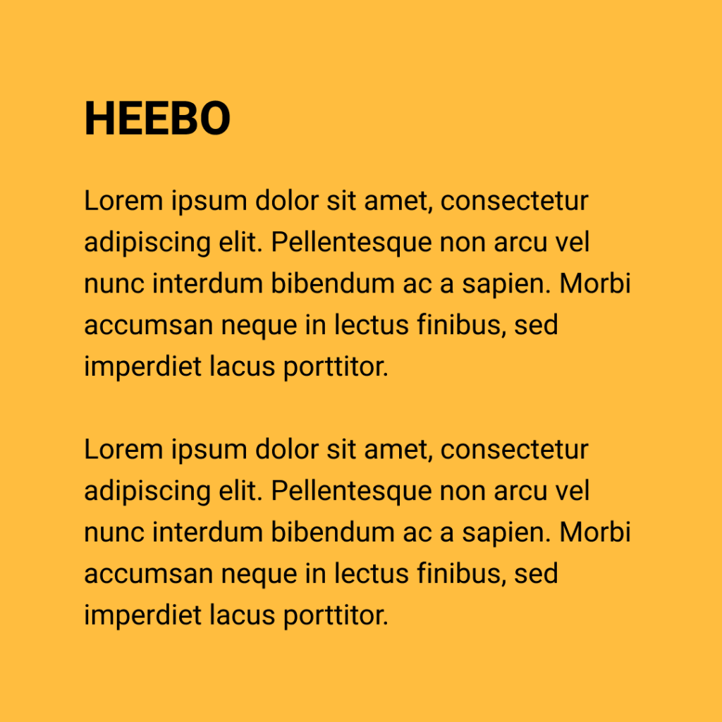
Figure 6 Font – Heebo
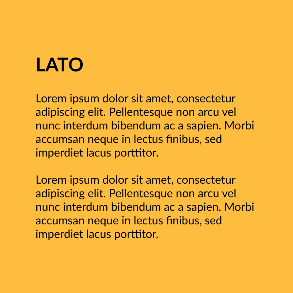 Figure 7 Font – Lato
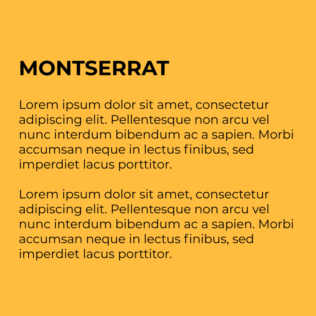
Figure 8 Font -Montserrat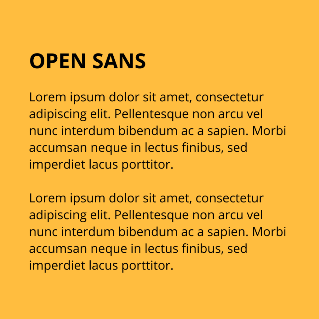 Figure 9 Font – Open Sans
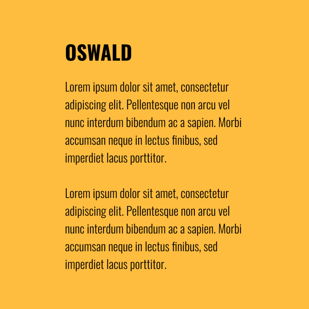 Figure 10 Font – Oswald
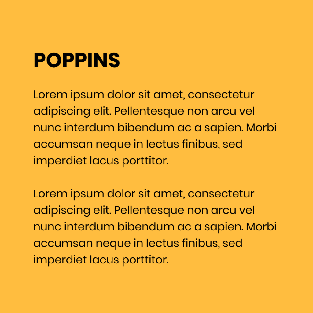 Figure 11 Font – Poppins
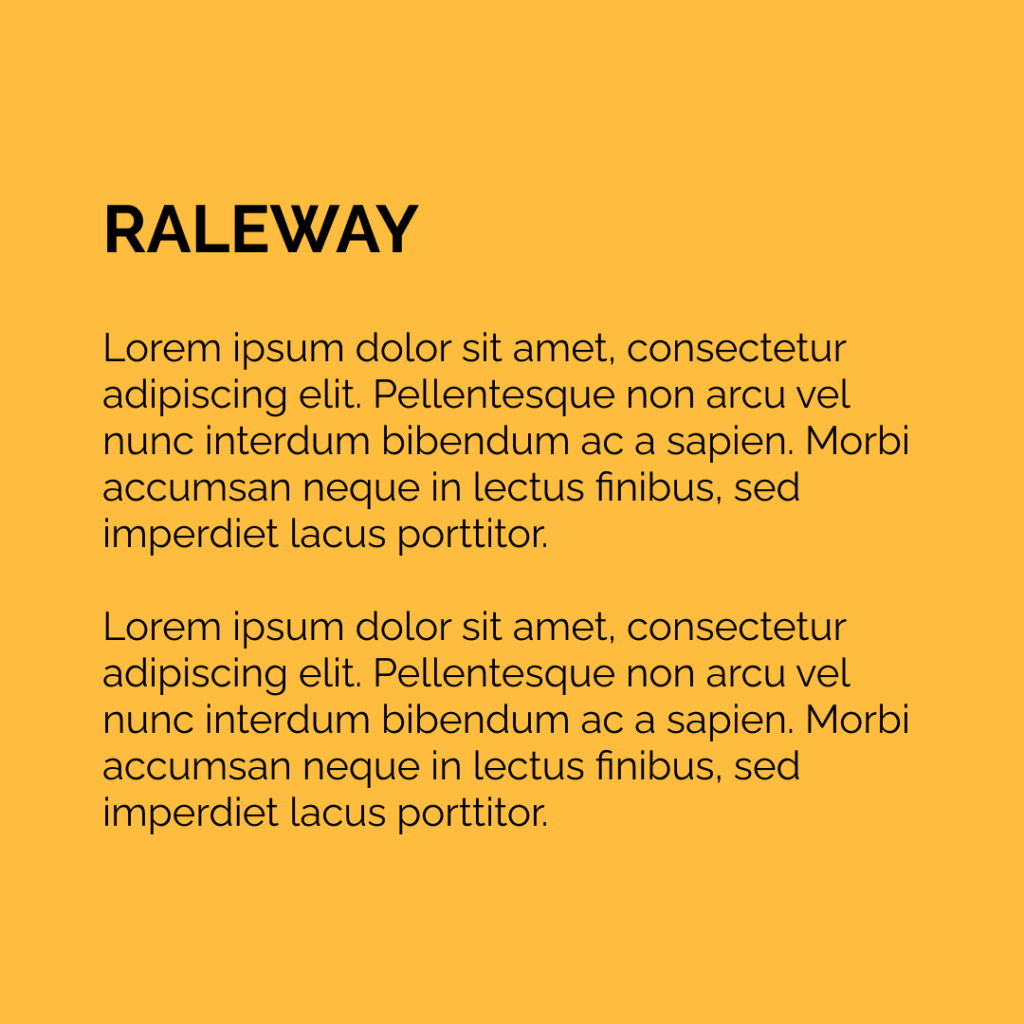 Figure 12 Font – Raleway
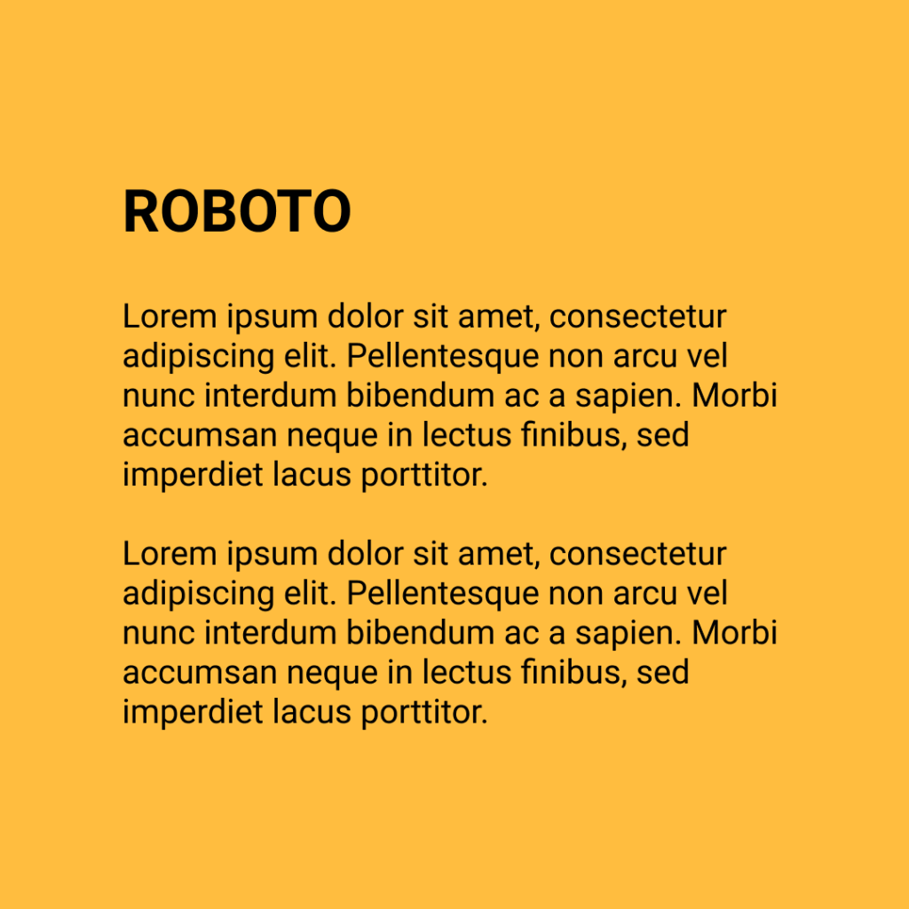 Figure 13 Font – Roboto
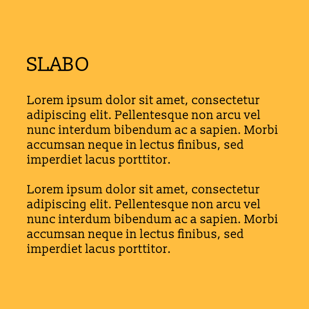 Figure 14 Font – Slabo
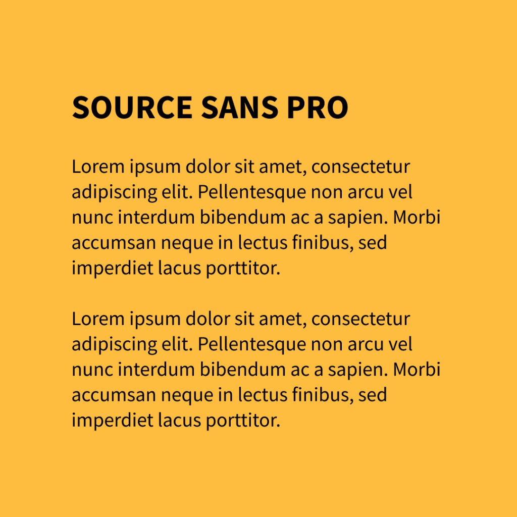 Figure 15 Font – Source Sans Pro
Picking the Right Image/Illustration of the Hero Section of your Landing Page
“A picture speaks a thousand words.” Undoubtedly that’s true. The first thing that a user will notice
is the image you have put up on your landing page. Keep in mind the undermentioned things while
selecting the image you need:
-
Image Quality: There are a lot of online resources which will offer you premium HD quality images for free. However, hiring a professional photographer to click an image which resonates with the brand can also prove to be a great and viable option.
-
Relevance to the brand/product/service/company: This goes without saying that the image needs to be either of the product that is being offered or of something related to the product.
-
Creativity: The sky is the limit for your imagination. To make sure that your landing page attracts a large user base you need to have a picture that speaks for itself. Make good use of the resources available online. In case you’re unable to find a good image, use vector illustrations or patterns to beautify your page.
-
Colours of the Image: The colours of the image should be in alignment with the colours of your page or vice-versa to offer a nice blend-in on your landing page.
-
Image Copyrights: If you are using an online resource, make sure to give proper credits and attribute the author. It gives out a positive message about your ethical practices.
Creating an Effective Call-To-Action
A call to action is a button or a link which tells the user what to do next now that he has landed on your page. Often same phrases are used on the websites for the CTA buttons. To offer a personalised experience, try replacing the already existing phrases with the undermentioned phrases:
- Replace “Learn More” with “Find Out What We Stand For”
- Replace “Get Started” with “Dive In”
- Replace “Discover” with “Explore Our Vision”
- Replace “Continue” with “Visit Our Home”
- Replace “Download” with “Download Our App Now”
- Replace “Start Now” with “Let’s Begin”
To create, be inspired
It is important to be inspired by the already existing websites which have received appreciation from far and near to start with your project. Visit the websites below and understand their distinctive features and why they make to the list of best web designs.
-
Pitch: https://pitch.com
-
Cellag: https://www.cellag.org/
-
Wealth Simple: https://www.wealthsimple.com/en-ca/
-
Sennep: https://www.sennep.com/
-
Portfolio of Bruno-Simon: https://bruno-simon.com
Keep in mind, when you are designing the landing page, it should come from within. Do not copy big brands or other carefully designed websites. They were not built keeping in mind your product/business/services.
As much as advertisement and marketing are important to attract a large customer base towards your product, a dedicated landing page is crucial to attracting a large user base towards your website.


 9+ registered

