Do you think IIT Guwahati certified course can help you in your career?
Introduction
Consider a scenario where you already have a design in mind for your upcoming webpage. The design includes a variety of intriguing layouts and compositions, including two-dimensional layouts that account for viewport width and height and fluid and flexible layouts.
Now, the question arises: How do you choose the optimal CSS style for these?
This article will go through various features of CSS layouts. Different display settings, positioning, contemporary layout tools like flexbox and CSS grid, and some historical approaches you might still want to know about are all covered.
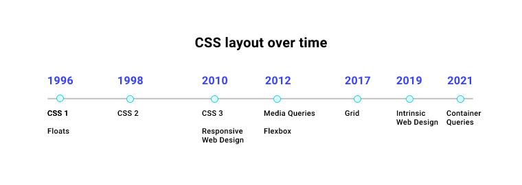
Timeline
CSS was a game-changer when first introduced, as it allowed the designers to play with the designs without tampering with the HTML code.
Håkon Wium Lie proposed CSS (Cascading Style Sheets) on October 10, 1994, while working at CERN alongside Tim Berners-Lee, and the rest is history. CSS was not the only style language under development at the time, but its cascading and evolving sequence set it apart from the competition.
Each approach has its own set of applications, benefits, and drawbacks. No method is intended to be used alone. Understanding what each layout approach is designed for can help us choose which way is most suited to each assignment.
Normal Flow
When we do nothing to influence page layout, the browser uses normal flow to layout HTML pages by default. The HTML is presented exactly as it appears in the source code, with elements layered on top of one another.
The normal flow will provide the layout we require for many of the items on our website. However, for more complicated layouts, we will need to change this default behavior using some of the CSS tools at our disposal.
Display property
The display property primarily performs two functions. The first thing it does is identify whether the box to which it is applied is inline or block.
Inline elements function similar to words in a sentence. In the inline direction, they sit next to one other.
Block elements extend to fill the container in the inline direction. Unless modified by additional CSS code, a block element will grow to the extent of the inline dimension, encompassing the whole width in horizontal writing mode.
The other function of the display property is to determine how the element's children should behave. The values of our concern here are display: flex and display: grid.
CSS displays everything as a box. Understanding how the CSS Box Model works is a fundamental CSS concept. Refer to this article to learn more about CSS Box Model.
Flexbox
The Flexible Box Layout CSS module, more commonly known as flexbox, is intended to make it simple to arrange items in one dimension — either as a row or as a column.
Enabling flexbox on an element is relatively easy; we just set the display property as
display: flex. All its children then become flex items.
In the above example, by default, the divs would display as block elements. However, on setting display as flex, some default values are assigned to the flex container. They appear to be in a row because of the property flex-direction, whose default value is row.
As discussed earlier, the child items of a flex container are now flex items. We can change the alignment, justification, and order of each item individually.
CSS layout provides a great deal of choices and flexibility. Refer to this amazing article to learn more about the capabilities of CSS Flexbox.
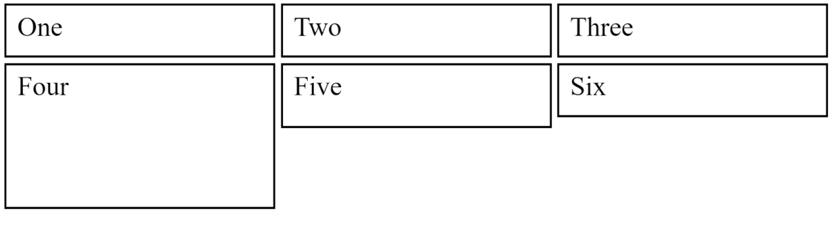
Grid Layout
The main difference between grid layout and flexbox is that flexbox is designed for laying out elements in one direction. In contrast, grid layout is for laying out elements in two dimensions.
Grid Layout, like flexbox, is enabled with a particular display value display: grid.
We also specify certain row and column tracks for the parent using the grid-template-rows and grid-template-columns attributes, in addition, to display: grid.
We don't need to apply any rules to the child components because they are automatically placed into the cells produced by our grid.
We also have the option to place elements in the grid by explicitly specifying the position rather than relying on auto-placement.
Using the grid-column and grid-row attributes, we can define the start and end lines for each item. As a result, the elements can span multiple tracks.
In the above example, the first row, consisting of boxes: one, two, and three, are placed in the grid by default values, but we have manually changed the start and end positions for boxes four and five in the second row.
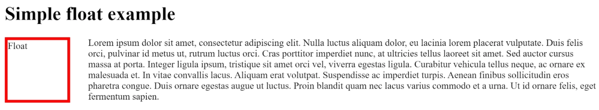
Floats
Floating an element alters its behavior and the behavior of the block level components that follow it in normal flow. The floating element is shifted to the specified position, and the surrounding content floats around it.
The float property can be assigned the values: left, right, inherit, and none.
While none is the default value, left floats the element to the left, right floats it to the right, inherit allows the element to transfer the float property from its parent.
Positioning is more about controlling and fine-tuning the location of particular objects on a website than designing the primary layouts of a page. Positioning allows you to shift an element from where it would typically be put in normal flow to a different position.
Understanding positioning also aids in understanding normal flow and what it means to shift an object out of the typical flow.
If you want to learn more about CSS positioning, check out this amazing article.
Table Layout
Before flexbox and grid layout came into the picture, web developers used to design entire web pages with the help of tables. While it was the only solution at that time, it has its own set of problems: layouts of a table are very rigid and difficult to debug.
You must take note of the fact that, although it still counts as a way to design web pages, it's more of a legacy method that's best avoided unless there's a solid reason as to why you can't proceed further before incorporating the Table layout.
Multiple-column layout
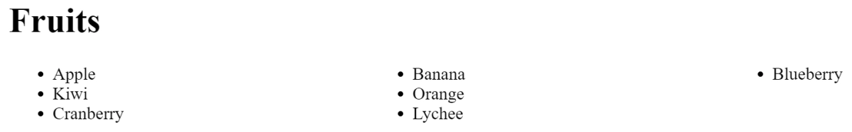
The multi-column layout CSS module allows us to arrange information in columns, like how text flows in a newspaper. If you have a really long list of components, it might result in a lot of scrolling and lost time for the user. It might also result in a lot of whitespace on the page. With CSS multi-column, you may break this into numerous columns to deal with both of these problems.
Here, column-count allows us to specify the number of columns we want to partition our elements into, and the column gap determines the gap between those partitions.
OUTPUT
Frequently Asked Questions
What are the two most prominent ways to design a CSS webpage?
Flexbox and CSS grid are the two most preferred layout options by developers nowadays.
Can inline elements behave like block elements? CSS elements by default have their display as either inline or block. But the user can change this value by setting the display property of the element as required.
Key Takeaways
CSS layout provides a great deal of variety and versatility. Choosing the best layout approach for a given situation might be difficult, and you may need more than one to address your problem.
You can also check out some important CSS concepts such as Introduction to CSS, CSS Selectors, CSS Pseudo-elements, and CSS Margins.
While preparing for front-end roles, we suggest you go through the CSS Interview Questions, including the most common conceptual questions asked in interviews.
Happy Learning!
Live masterclass
Resume & linkedin tips to crack Amazon GenAI Interviews
by Anubhav Sinha
30 Jul, 2026
12:30 PM
Master PowerBI using Flipkart Dataset & Ace 20LPA+ Data Roles
by Prerita Agarwal
27 Jul, 2026
12:30 PM
Multi-Agent AI Support Bot using OpenAI & Gemini
by Saurav Prateek
28 Jul, 2026
12:30 PM
Zomato Data Analysis Case Study: Ace 25L+ Roles in FoodTech(no use)
by Abhishek Soni
29 Jul, 2026
11:30 AM
Zomato Sales Analytics: SQL + PowerBI for 25LPA Jobs
by Abhishek Soni
29 Jul, 2026
11:30 AM
Resume & linkedin tips to crack Amazon GenAI Interviews
by Anubhav Sinha
30 Jul, 2026
12:30 PM
Master PowerBI using Flipkart Dataset & Ace 20LPA+ Data Roles


 9+ registered

