Do you think IIT Guwahati certified course can help you in your career?
Introduction
Hey Ninjas! You must have heard about Tableau if you are interested in data visualisation and analysis. Tableau is a powerful data visualisation tool used by Data Analyst in large companies that helps create interactive reports and dashboards. Tableau can connect to multiple data sources like spreadsheets, databases, etc. Converting the data into meaningful visualisations can help find valuable patterns and insights about the data. Tableau also allows sharing of visualisations with others.
This article will teach us about the Tableau interface and its main components. A good understanding of the Tableau interface is needed to become good at Tableau and perform tasks efficiently.
About Tableau Main Interface
We will use Tableau Public in this article among Tableau's various products. Tableau Public is a free version of Tableau Desktop with fewer features.
Let us look at the steps to open Tableau Main Interface:
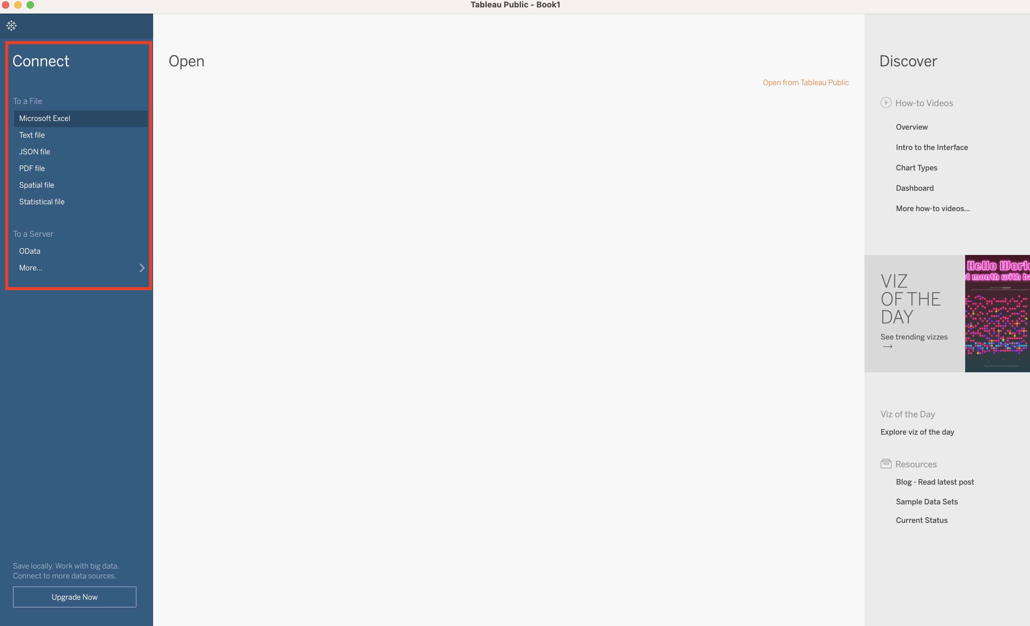
When opening Tableau, we must connect to a data source on the start page. This data source can be an Excel spreadsheet, a CSV file, a JSON file, a PDF file, etc.
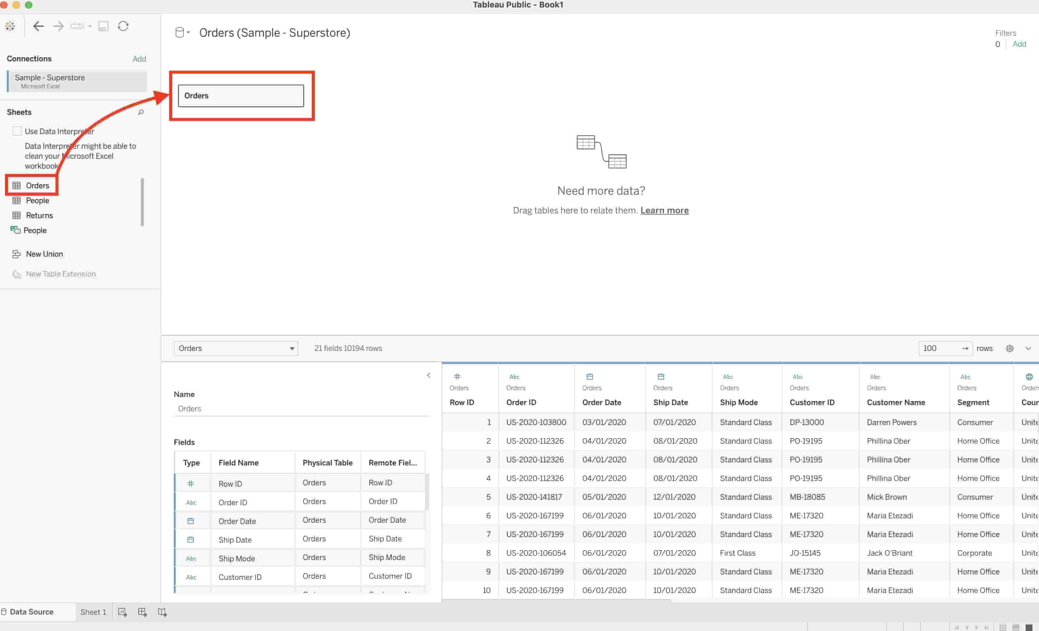
After choosing and connecting to a data source, we will see the data source page, where we can preview and edit our data before creating visualisations.
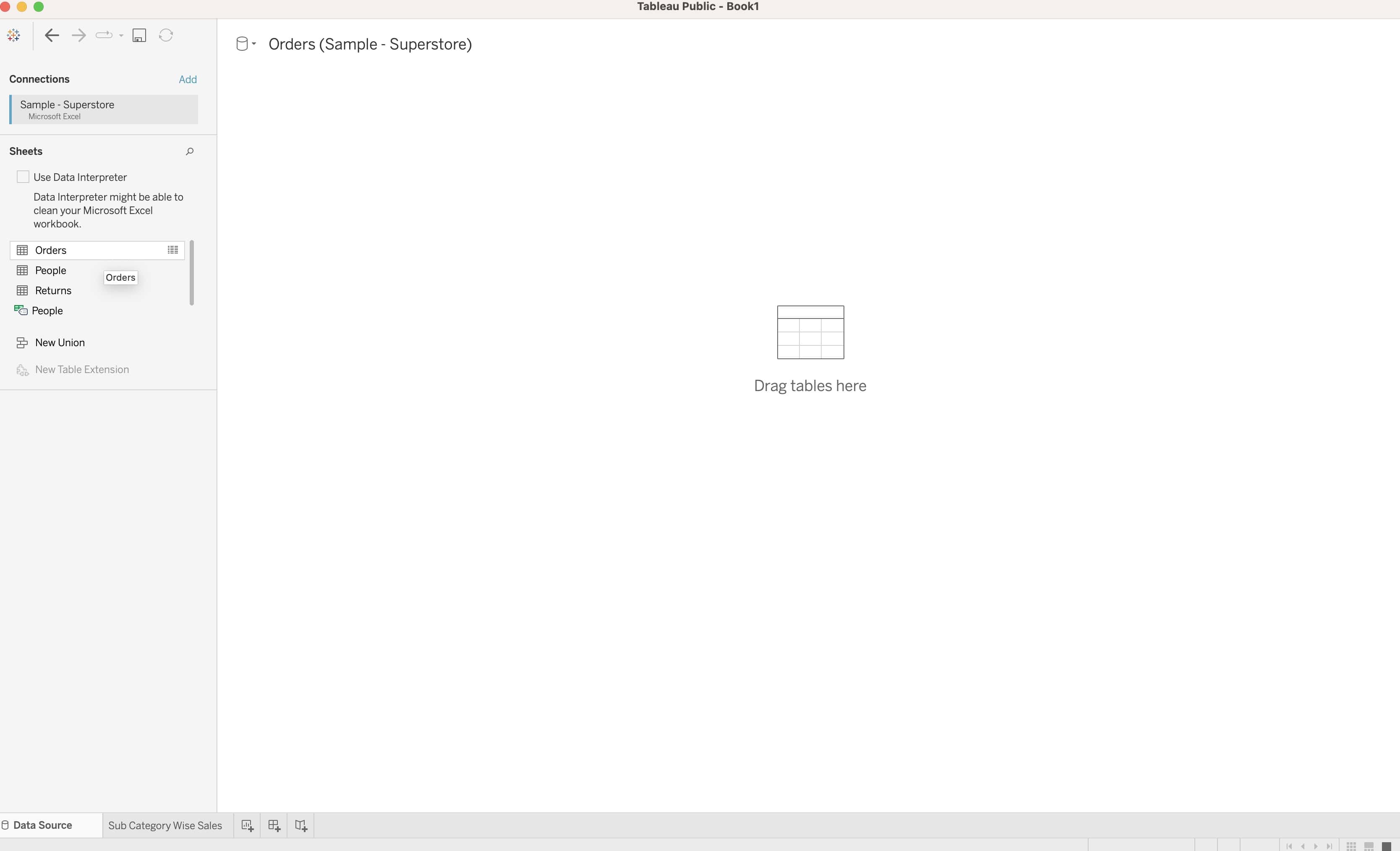
We can also join multiple tables, create custom fields (by splitting), rename fields, etc. This article uses Tableau's sample data set, Sample - Superstore.
Then, we drag and drop tables to the canvas area in the centre of the data source page.
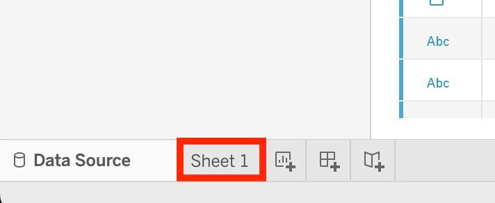
To go to the Tableau Main Interface, click the “Sheet 1” tab at the bottom of the data source page.
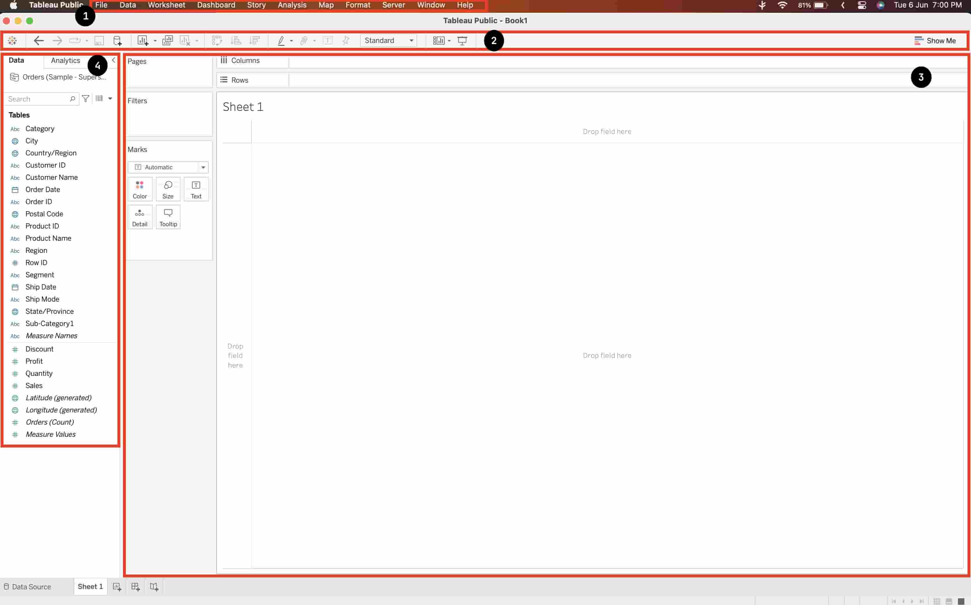
We can observe that the Tableau Main Interface has the following components that allow us to create visualisations:
Toolbar
Ribbon
Workshop Area
Data and Analytics Pane
All these components together ensure a smooth user experience. Now we will look at each of these components one at a time.
Toolbar in Tableau
The toolbar is a row of buttons at the top of the interface. It contains icons for common actions and commands.
We can hover over each icon to see its name and its description.
Some of the most used buttons on the toolbar are:
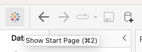
Show Start Page: Opens the Start Page.
Undo: Undoes the last action performed on the sheet.
Redo: Redoes the last undid action.
Save: Saves the current sheet on the computer.
New Data Source: Opens the connect functionality to connect to various sources like Python and SQL.
New Worksheet: Opens a new worksheet.
Clear Worksheet: Clears the current worksheet.
Swap: Swaps the fields on the Rows and Columns shelves.
Sort Ascending: Sorts the selected field in Ascending order according to its values.
Presentation Mode: Opens the worksheet in presentation mode (hides everything else).
Show Me: Shows different visualisations we can create with our data.
Ribbon in Tableau
The ribbon consists of different tabs for different categories of options. A ribbon is present at the top of each application.
The Ribbon in Tableau contains the following tabs:
File: Contains options for file operations like creating, saving, opening files, etc.
Data: Contains options about data sources.
Worksheet: Contains options for creating new worksheets and formatting the current worksheet (change title, tooltips, etc.)
Dashboard: Contains options for creating and editing dashboards. A dashboard contains multiple visualisations arranged in a layout.
Story: Contains options for creating and editing stories. A story is a sheet that contains a sequence of dashboards. A story helps to explain change over time.
Analysis: Contains options for adding analytical objects to visualisations.
Map: Contains options for changing the map visualisation.
Format: Contains options for global formatting of the worksheet.
Server: Contains options for publishing and managing workbooks on the server.
Window: Contains options for arranging and switching between different worksheets.
Help: Contains options for accessing online resources and assistance.
Workshop Area in Tableau
The Workshop Area contains the blank area where our visualisations come to life! It allows dragging and dropping fields from the data pane to create visualisations.
The Workshop Area also contains cards and shelves. We can drag fields from the data pane to the row and column shelves. We can also drop fields on the different options in the Marks card options, like Label or Tooltip. The Rows and Columns card determine the axes of visualisation. The Marks card determines the type and style of marks (lines, colour, etc.). The Filters card determines which data points are present or absent in the visualisation.
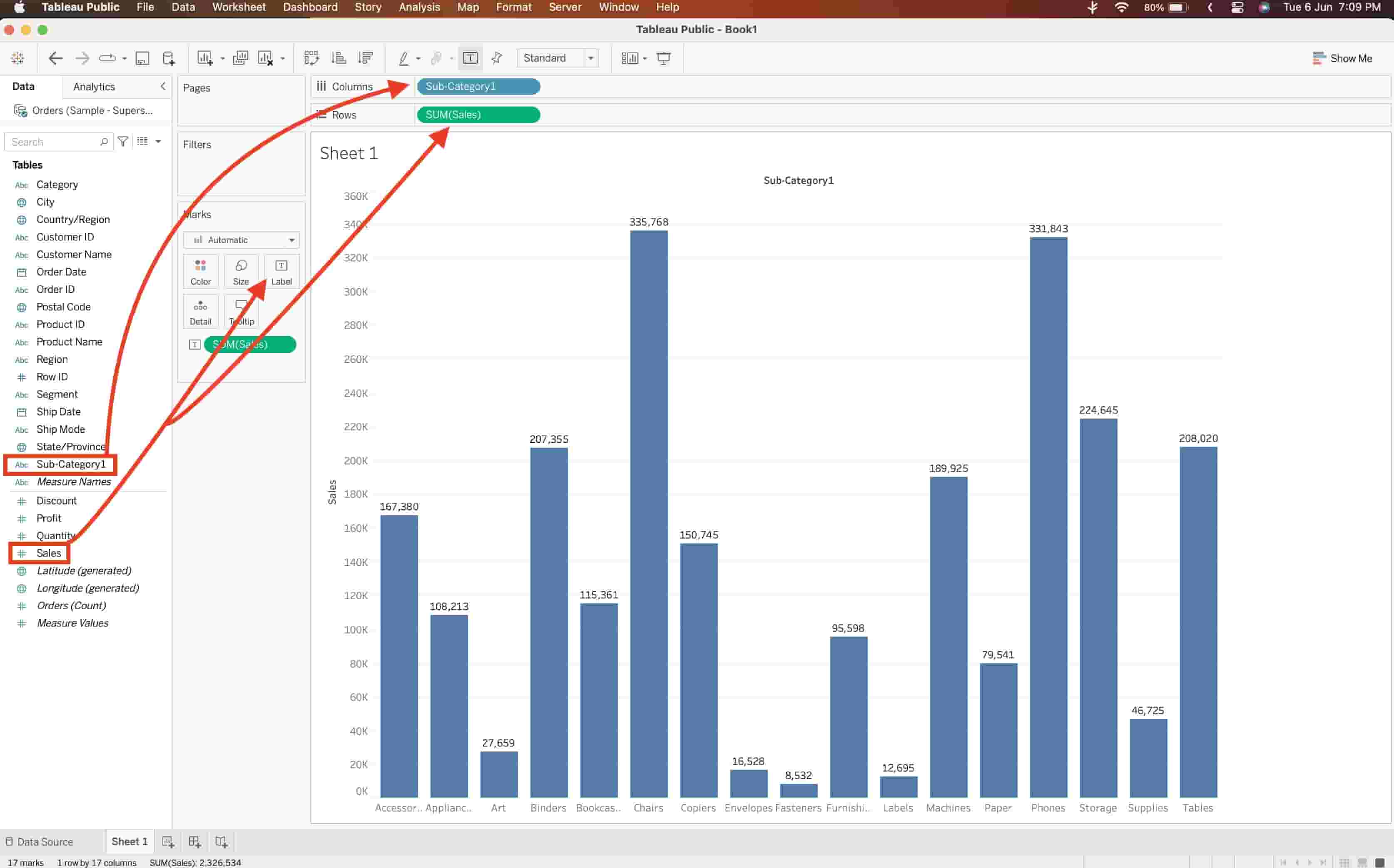
Let us look at a sample visualisation.
In this visualisation, we dragged and dropped the SubCategory field into the Columns shelf. We also dragged and dropped the Sales field into the Rows shelf. We also added a label to each bar in the resultant visualisation by dragging and dropping the Sales field onto the Label box in the Marks card.
Data and Analytics Pane in Tableau
The Data and Analytics Pane is present on the left side of the interface, below the toolbar. It contains two tabs - Data and Analytics. We can switch between these two by clicking on them.
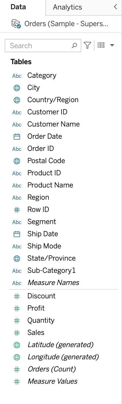
Data Pane
The Data Pane shows all the fields in the data source classified as dimensions or measures.
Dimensions are the categorical fields that define how data is grouped, such as City, Customer ID etc. Measures are numerical fields that specify how data is aggregated, such as Profit, Sales, etc. It contains continuous values which can be measured.
Analytics Pane
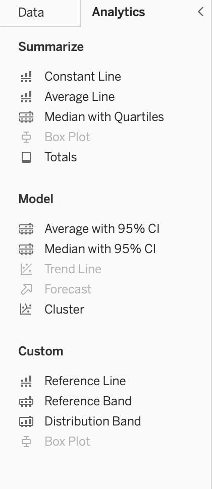
The Analytics Pane shows various analytical objects that we can drag and drop to our view to enhance the visualisation. It includes reference lines, forecasts, average lines etc. These analytical objects allow us to discover hidden insights and take full advantage of our data.
The Analytics Pane has three sections:
Summarize: Contains analytical objects that help summarize the data.
Model: Contains analytical objects that model the data or add predictions.
Custom: Contains analytical objects that create custom calculations for visualisation.
We can only apply the non-greyed-out analytical objects to our current visualisation. Let us now look at some of these most commonly used analytical objects. If you hover over a greyed-out object, Tableau will show the requirements for enabling that object.
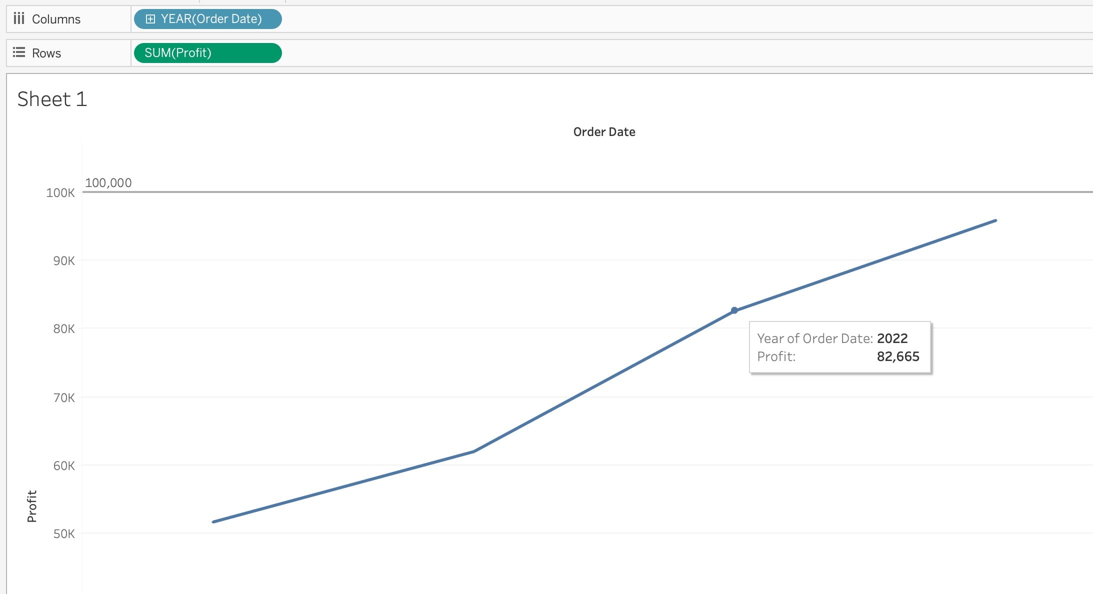
Constant Line
A constant line is a vertical or horizontal line that shows a constant value in a view. We can use it to compare a specific value with other values.
In the above visualisation, a constant line shows the target profit in a year.
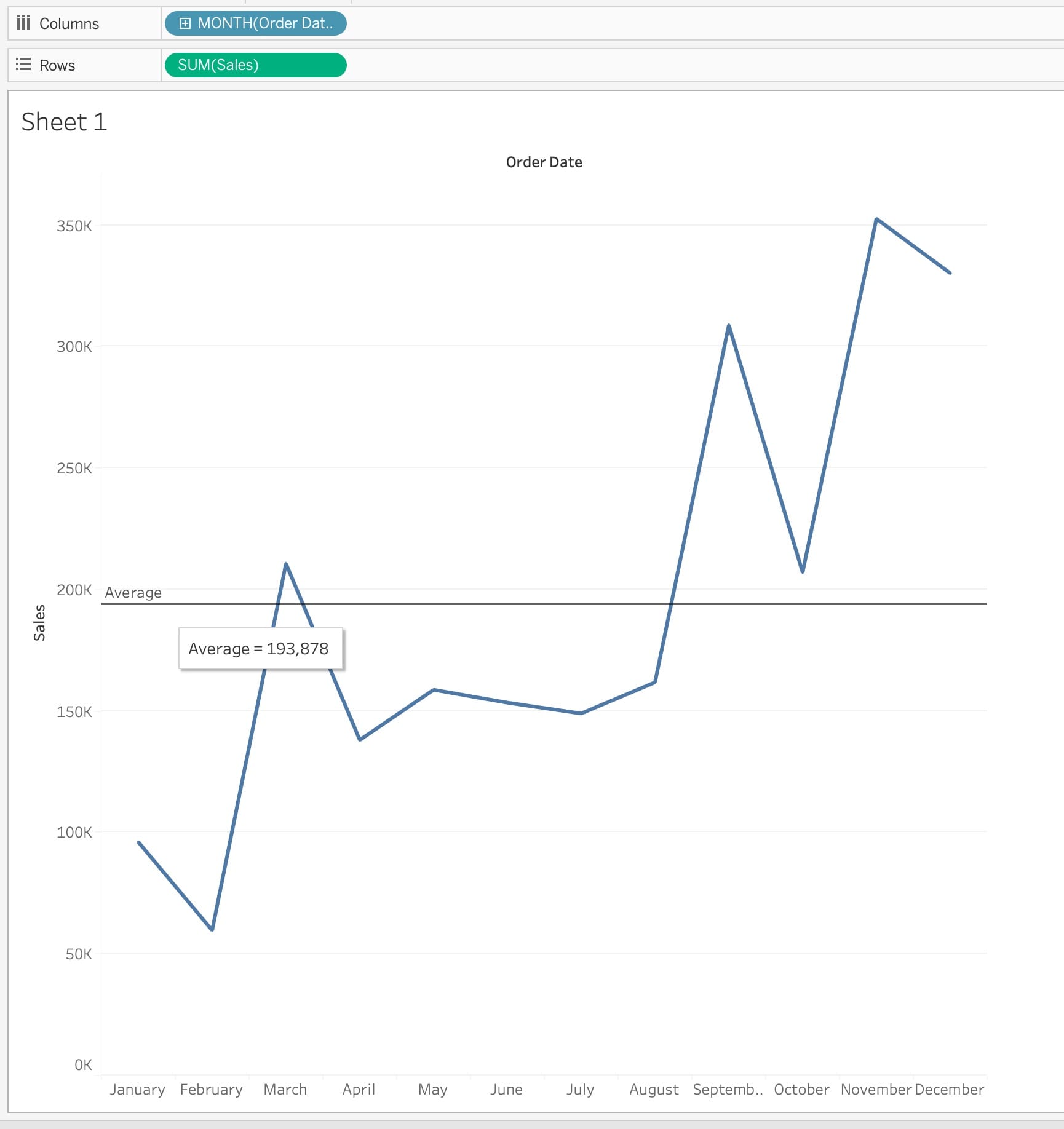
Average Line
An average line is a vertical or horizontal line that shows the average of a measure in a view.
In the above visualisation, an average line shows the correlation between months and corresponding sales. We can use an average line to identify the months where the sale was less than average.
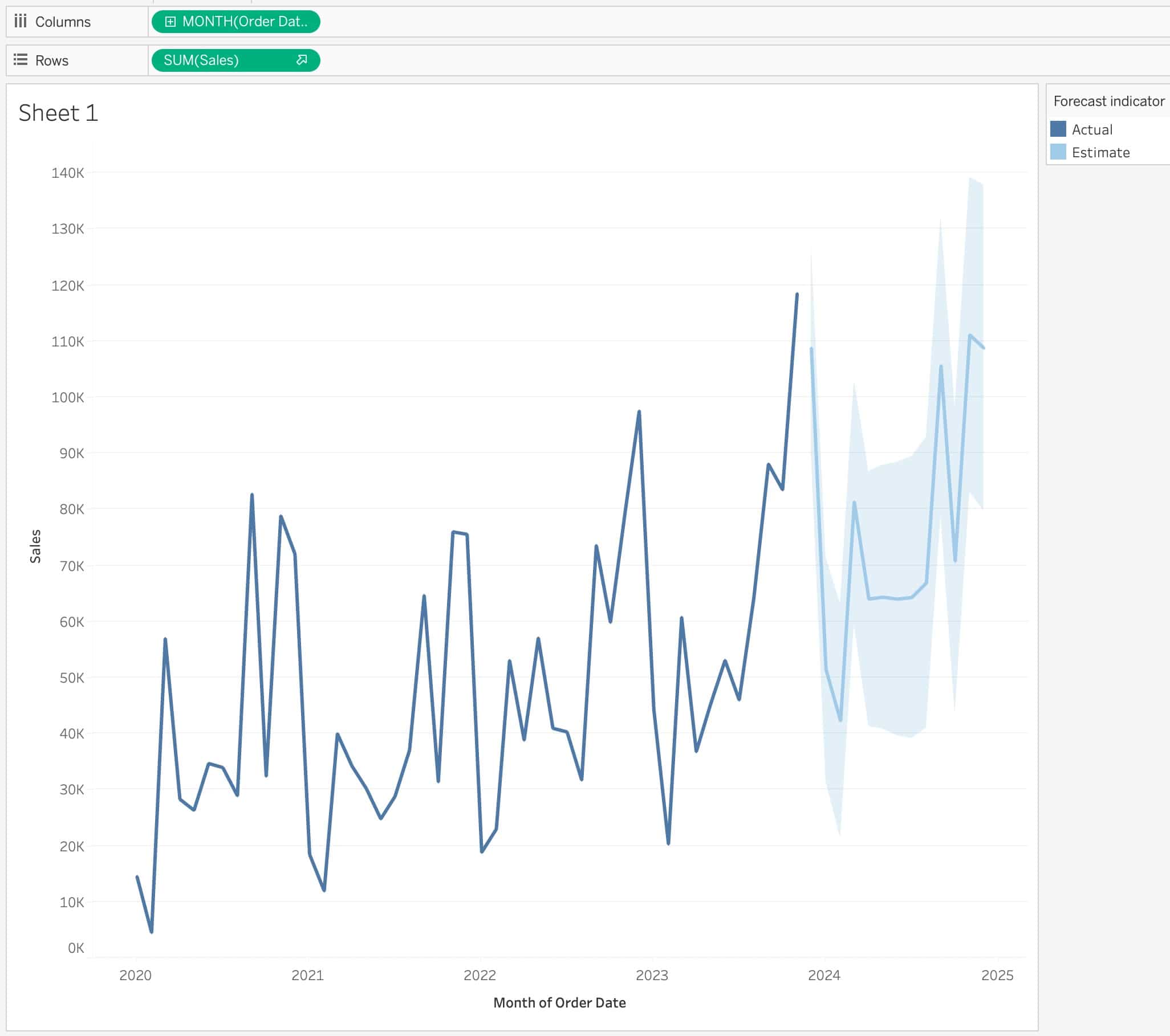
Forecast
A forecast predicts future values based on past values in a view. We can use forecasts to estimate future outcomes.
In the above visualisation, we use a forecast to estimate sales for future months.
Frequently Asked Questions
What are the different products by Tableau?
Tableau offers various products: Tableau Desktop (Personal and Professional), Tableau Public (Free), Tableau Online (Cloud-based sharing), and Tableau Server.
How can we share Tableau visualisations?
There are various ways to share Tableau visualisations. To share a Tableau visualisation, we can publish it to Tableau Server or Tableau Online and share its link. We can also embed the visualisation in a website.
What are the disadvantages of using Tableau?
Some disadvantages of using Tableau include the high cost associated with enterprise licenses, the steep learning curve of the software and limited customisation options.
What kind of visualisations can we create using Tableau?
Tableau enables us to create a huge variety of visualisations. They include bar charts, line graphs, pie charts, scatter plots, heat maps, geo maps, etc.
Give examples of a few companies which use Tableau.
Several large companies use Tableau for data visualisation. These companies include Coca-Cola, Walmart, Verizon, LinkedIn, Nike, and Netflix.
Conclusion
In conclusion, understanding the Tableau Interface is essential to mastering Tableau. The interface consists of several components - the toolbar, the ribbon, the workshop area and the data and analytics pane, each of which serves a specific purpose. By understanding the purpose of each component, you can use Tableau to its full potential.
We recommend reading the following articles to learn more about Tableau and Data Analysis:


 8+ registered

