Do you think IIT Guwahati certified course can help you in your career?
Introduction
People often don't know how to make Line Charts in Microsoft excel and get confused. Are you also the one? You are in the right place.
This blog will not directly go through the theoretical procedure of making Line Charts, but we will first learn about Line Charts. Furthermore, we will discuss making Line Charts in Microsoft excel of given data.
After reading this blog, you will know everything about Line Charts and make them. Knowing a Line Chart will help you to understand your data more efficiently.
So, won't you want to know how to make Line Charts in Microsoft excel?
Let's dive into the topic now to know more in detail.
What is Line Chart
A chart is a tool in Excel that allows you to explain data visually. Charts help your audience understand the significance of data and make comparisons and trends much easier to perceive.
Trends throughout time are displayed using line charts. If the horizontal axis has text labels, dates, or a few number labels, use a line chart. A scatter plot (XY chart) data shows scientific XY.
Difference Between Scatter and Line Chart
Scatter plots depict how one variable influences another. Individual data values are recorded as marks in line graphs, similar to scatter plots. The distinction is that a line links together each data point. The local change from point to point can be visualized in this way.
Use of Line chart
Line graphs are used to track changes across time, both short and long. When there are fewer changes, line graphs are preferable over bar graphs. Line graphs can also compare changes for multiple groups over the same period.
Representation of Data in Line Chart
So, do you know how we create a line chart of given data? The instructions listed below will show you how to make a line chart with similar results. We will utilize the data from the sample spreadsheet for this graph. You can either copy this data into your worksheet or create your own.
Let's start...
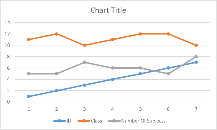
1. Open your MS Excel and copy the following data in a blank worksheet or create/open your worksheet that contains data you want to represent in the line chart.
ID
Class
Number Of Subjects
1
11
5
2
12
5
3
10
7
4
11
6
5
12
6
6
12
5
7
10
8
2. Now, select the range of data from A1:C8 you want to plot in the line chart.
3. On the Insert tab, then click on Insert Line or Area Chart tab.
4. Click on Line with marker tab.
Output:
5. Now select the chart to check out the design and format tabs.
6. Choose the chart style from the design tab you want to apply.
After selecting style:
7. You can also change the title of the chart.
8. To alter the font size of the chart title, right-click it, select Font, and then in the Size box, type the desired size. Click the OK button.
Output:
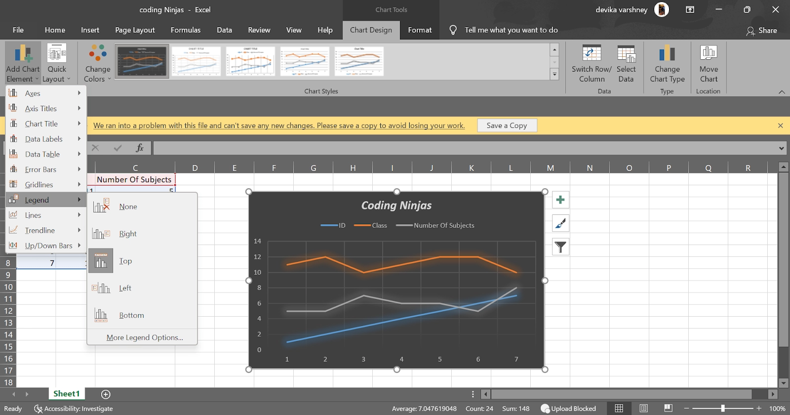
9. After selecting the chart area, click the legend on the diagram or Select it from a drop-down menu of chart elements (on the Design tab, click Add Chart Element > Legend, then choose a legend position).
Output:
10. Click one of the data series or choose it from a list of chart elements to plot it along a secondary vertical axis (on the Format tab, in the Current Selection group, click Chart Elements)
11. Click Format Selection in the Current Selection group on the Format tab. The task pane Format Data Series appears.
FAQs
1. How can we change the data range included in the Line chart?
Click ‘Select Data’ in the Data group on the Design tab. Then you can uncheck the data which you do not want to display.
2. How can we change the colors of the line and Marker?
The Format Data Series pane appears by right-clicking the line. Change the line color by clicking the paint bucket symbol. Change the fill and border colors of the markers by clicking Marker.
3. How can we add a trendline?
Choose a line chart. On the chart's right side, click the + button, the arrow next to Trendline, and More Options. The Trendline Format pane appears. Select a Trend/Regression type from the drop-down menu. Linear is selected. Indicate how many periods should be included in the forecast—type 2 in the Forward box.
4. How to change the axis type to the Date axis?
Format Axis by right-clicking the horizontal Axis and selecting Format Axis. The Format Axis pane is displayed on the screen. Select the Date Axis from the drop-down menu.
5. How can we use theme colors?
If you wish to utilize theme colors that aren't the same as the default theme for your worksheet, do the following:
Click Themes in the Themes group on the Page Layout tab.
From the Office drop-down menu, select the theme you want to use.
Key Takeaways
In this article we have extensively discussed the topic of a Line chart. Furthermore, we learned how to represent our data in the line chart.
We hope that this blog has helped you enhance your knowledge regarding encryption and if you would like to learn more, check out our articles on Pie chart and Bar chart. Do upvote our blog to help other ninjas grow.


 9+ registered