Do you think IIT Guwahati certified course can help you in your career?
Introduction
Hello Ninjas, This is an era of data-driven decision-making. Visualizations play an essential role in extracting meaningful insights from complex datasets. There are diverse visualization options available. Dual-axis chart in Tableau is a powerful tool for finding out relationships between variables in a single chart. In this article, we will learn about Dual Axis Chart, its advantages, and disadvantages. We will also look at its implementation and some of its use cases.
Let's dive into the world of data visualization and learn to make Dual Axis Chart using Tableau.
What is Tableau?
Tableau is the most famous and powerful data visualization and Business Intelligence tool. It enables users to create interactive dashboards and reports. With a user-friendly interface and drag-and-drop functionality, Tableau simplifies data exploration. It supports various data sources. It offers advanced features like data blending, calculations, and forecasting.
Tableau's intuitive visualizations aid businesses in uncovering patterns, trends, and correlations. It empowers organizations to make data-driven decisions. Whether used by analysts, business users, or data scientists, Tableau helps unlock the full potential of data. It enhances understanding, communication, and collaboration across teams.
What is a Dual Axis Chart In Tableau?
Dual Axis charts or combo charts in Tableau plot the relationship of one variable with two or more variables. By presenting multiple data sets simultaneously, dual-axis charts enable effective comparison between variables. With Tableau's drag-and-drop functionality, users can easily create visually compelling dual-axis charts. These charts provide deeper insights and reveal correlations that might otherwise go unnoticed.
Tableau offers flexible customization options to make the visualization even more attractive. Dual-axis charts can compare Sales and profit margins, revenue and customer satisfaction, or any other combination of metrics. They help clarify their relationship with precision.
Features of Dual Axis Chart
The features of Dual Axis Charts are:
Dual Axis charts allow for the simultaneous display of two different measures or dimensions, facilitating direct comparisons between them.
Dual Axis charts efficiently use space on a dashboard by displaying two data sets together in a single chart. It enables users to present more information compactly.
Dual Axis charts visualize relationships between variables with different scales or measurement units.
Tableau offers customization options for dual-axis charts, including axis labeling, formatting, and styling.
Uses of Dual Axis Chart
Following are some real-world uses of Dual Axis Charts
Temperature and Precipitation Patterns: Meteorologists can analyze patterns and correlations, such as how temperature changes affect the amount of rainfall, by plotting temperature and precipitation on separate axes.
Stock Market Analysis: Dual-axis charts can compare stock prices and trading volume. Investors can identify periods of high trading activity coinciding with significant price movements.
Sales and Profit Margin Analysis: Dual-axis charts can compare sales revenue and profit margins over time or across different product categories.
Website Analytics: Dual-axis charts can be employed to examine website traffic and conversion rates.
Healthcare: Healthcare providers can use dual-axis charts to track patient outcomes and compare treatment costs across different providers.
Drawbacks of Dual Axis Chart
The drawbacks of dual-axis charts are:
Dual Axis charts can be misinterpreted if not used carefully.
Dual Axis charts can become complex when dealing with multiple measures or dimensions.
Dual Axis charts may require additional effort from viewers to process the information effectively.
Dual Axis charts are not suitable for all types of data and analysis scenarios.
Creating a Dual Axis Chart in Tableau
Follow the steps given below to create an interactive Dual Axis chart.
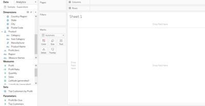
Import data in Tableau
You can import data from various sources in Tableau. For this example, we will be using the Sample-Superstore dataset that is available in Tableau itself.
You can see the imported data and its fields on the left side of the screen.
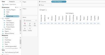
Add a field to the horizontal axis
Add the Sub-category field from the dimensions pane to Columns.
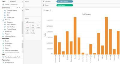
Add the first measure to make a graph
Drag and drop any fields from the Measures Pane in the Row present at the top of the screen. We will select the Sales field.
Here is how your chart will look.
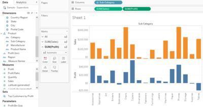
Add the second measure
Select another variable you want to study along the Sales. We will select the Profit. Drag and Drop Profit into the Rows next to the Sales.
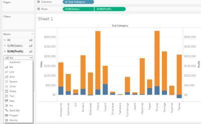
This is how your chart looks now.
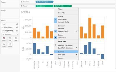
Here we have two charts present on the same axis. The next step is to convert it into a Dual Axis Chart.
Covert into a Dual Axis Chart
Hover the mouse pointer on the Profit pill on the Rows shelf. Click on the downward triangle. A drop-down menu will appear. Select the Dual Axis option from the drop-down menu.
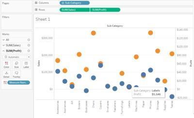
Dual Axis visualization is now ready. This is what your chart looks like.
Dual Axis visualization is now ready.
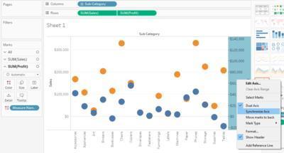
Synchronize Axis
Our visualization is now ready. However, the charts have different scales. Hence, you need to bring both measures to the same scale. Right-click on any axis(Sales or Profit) and select Synchronize Axis option from the menu.
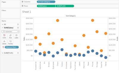
Now your image should look like this with the synchronized axis.
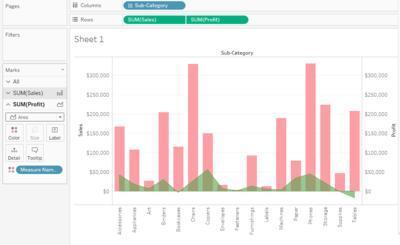
Customize your Dual Axis Chart
Customize the shape of fields from Automatic to bar in the markets card.
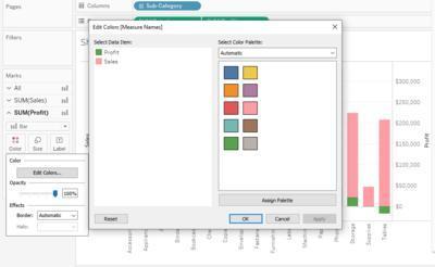
Change the respective colours.
You can use different combinations like bar and line chart or bar and area chart etc., based on your needs.
The image shows the chart with a bar and area chart combination.
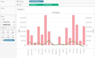
The below image shows the chart with a line and bar chart combination.
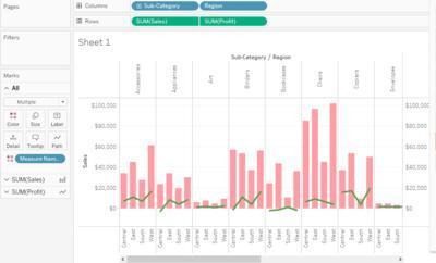
You can also add another field in the Columns shelf for presenting more information. Here we are adding Region in the column shelf.
The chart now gives region-wise information about Sales and Profit for different sub-categories.
Dual Axis charts or combo charts in Tableau plot the relationship of one variable with two or more variables. Dual-axis charts enable effective comparison between variables.
What is Tableau?
Tableau is a powerful data visualization and business intelligence tool. It enables users to create interactive dashboards and reports to analyze and present data visually.
How can I synchronize the scales of the two axes in a dual-axis chart?
The charts sometimes have different scales. It makes comparing a bit tedious. Tableau provides an option to synchronize the scales.
Right-click on any axis(Sales or Profit) -> select Synchronize Axis option from the menu.
Can a dual-axis chart with a continuous and discrete variable be created?
Creating a dual-axis chart with a combination of continuous and discrete variables in Tableau is possible. You can create a dual-axis chart where the temperature values are displayed as a line chart (continuous) on one axis and the month values as a bar chart (discrete) on the other.
What alternative visualization techniques can be considered instead of a dual-axis chart?
Side-by-Side Bar charts, Scatter Plots, Stacked Bar Charts, Area Charts, Heatmap, etc., are alternative visualizations of dual-axis charts.
Conclusion
Dual Axis Charts effectively visualize and compare two or more variables in a single chart. Tableau offers various customization options to make the charts more attractive.
This article taught us about the dual-axis chart, its advantages and disadvantages, its implementations, and some of its use cases.
To learn more about Tableau, check out the following articles.


 8+ registered

