Do you think IIT Guwahati certified course can help you in your career?
Introduction
Hey learners, we all must have used bar charts sometimes in school. In this blog, we will learn the most basic chart, the bar chart. Bar charts mostly use for comparing data across categories.
In this blog, we will learn about bar charts and discuss their importance, various types of bar charts, and how we can create a bar chart in Tableau.
Bar Chart
A bar chart in Tableau visually represents data using rectangular bars. It is used to describe categorical data of a dataset. It is an effective way to compare different categories and their corresponding values.
We can create several types of bar charts, like simple vertical bar graphs, segmented bar graphs, stacked bar graphs, and side-by-side bar graphs. First, we will discuss the importance of bar charts and then move to the types and creation of bar charts.
Importance of Bar Charts
Bar charts are important in Tableau due to the following reasons:
Data Comparison:Bar charts provide a clear way to compare data sets between different groups. The bars' length or height visually represents the data's magnitude.
Visualization: Bar charts simplify complex data sets into easy visual representations. It is used for a quick understanding of data distribution.
Communication: Bar charts are a highly effective way to convey information to the user.
Analysis of Categorical Data:Bar charts are very useful when working with categorical data, such as geographic regions, etc. Bar charts provide a clear visualization of the distribution and performance of categorical data.
Flexibility:Tableau provides a wide range of customization options for bar charts. The user can adjust the labels, colors, format, and other elements to enhance the chart.
Various Types of Bar Charts in Tableau
There are many types of charts in Tableau, depending on the requirements. Below are some common types of bar charts.
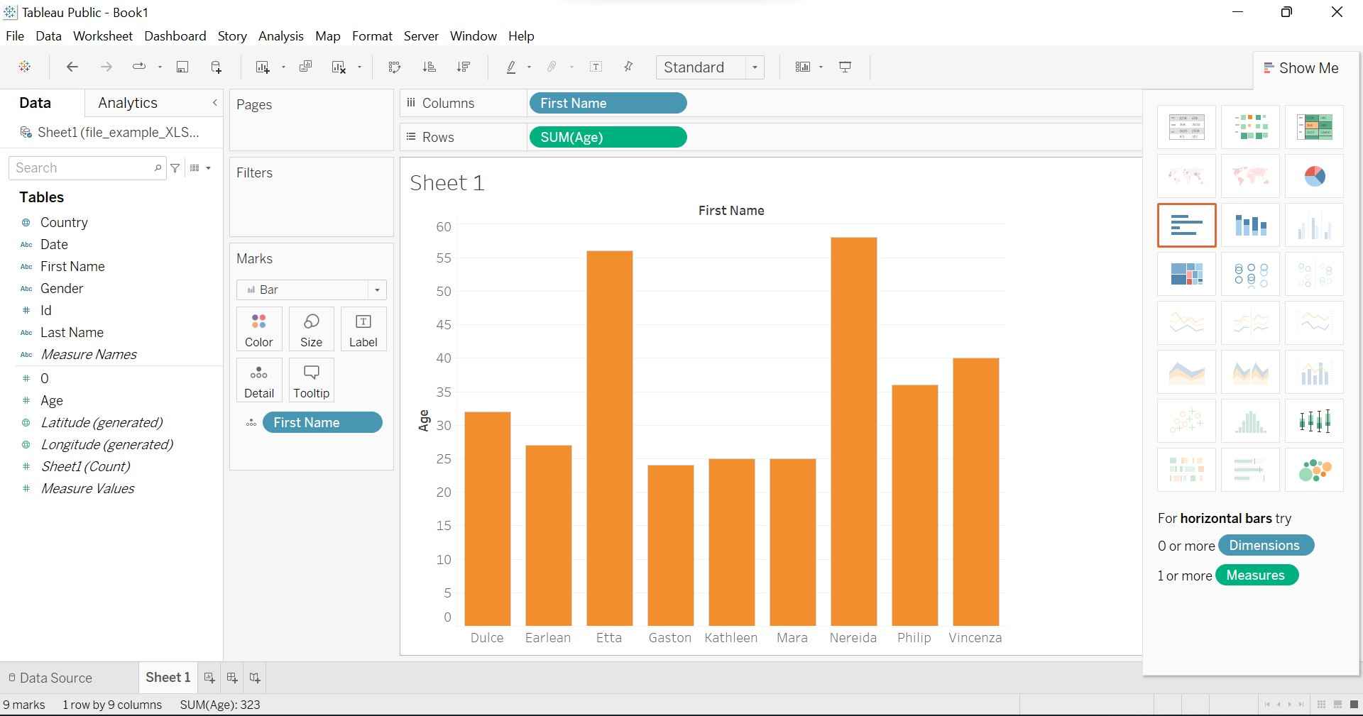
Vertical Bar Chart
Vertical bar chart is a common type of bar graph. The bars are arranged vertically along the x-axis. The height of each bar represents the corresponding value. Vertical bar charts are useful for comparing categories. Below is an example of a vertical bar chart in Tableau.
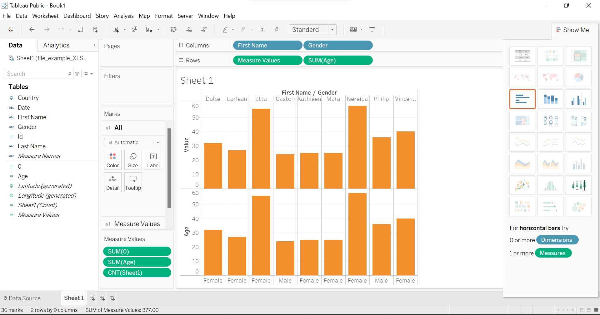
Segmented Bar Chart
In this bar chart, we divide the bar chart into segments with various parameters. Below is an example of a segmented bar chart in Tableau.
In the above example, we added parameters Measure Values and Age in the Rows section. In the Column section, we added First Name and Gender. This will create a segmented bar chart.
Stacked Bar Chart
The stacked bar chart shows the contribution of different sub-categories within every main category. Bars are stacked on top of each other and represent the total value for each category. Each section in a stack is assigned a unique color. Below is an example of the Stacked Bar Chart.
In the above example, we added Age in the Rows section and we added Gender and Country parameters in the Columns section. This will create the stacked bar chart.
Side-by-Side Bar Chart
The Side-by-Side bar chart is also known as Grouped Bar Chart. It is another way to display multiple bars side by side within each category. In this bar chart, all the values are placed side by side instead of getting stacked from one to another. Below is an example of a side-by-side bar chart.
In the above example, we added Age in the Rows section. In the Columns section, we added Country, Gender, and First Name. This will create a side-by-side bar chart.
Creating Bar Charts in Tableau
Suppose we want to create a vertical bar chart in Tableau then below are the steps you have to follow to create a vertical bar chart.
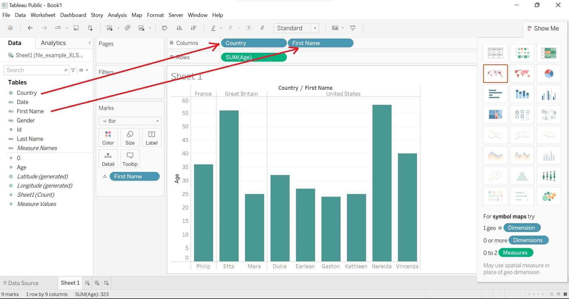
Step 1. Open Tableau and navigate the data source to the worksheet. Suppose we have the below example sheet and you can get these kinds of data from the internet.
Step 2. Drag and drop the dimension field that you want to use for the vertical axis. Suppose here we are taking the Age field and dropping it into the Rows section, as shown below.
Step 3. Drag and drop the measure fields that you want to use for the horizontal axis. Suppose here we are taking Country and First Name and dropping these into the Columns section, as shown below.
Step 4. Tableau will automatically create the desired bar chart. Below is our desired vertical bar chart.
Suppose you want to create a stacked bar chart, then click on the "Show Me" button, which is at the top right corner. In the "Show Me" panel, you can select the stacked bar chart type. After clicking it, your chart will automatically be converted into a stacked bar chart. In this way, you can create various "Bar" chart types in a single click by using the "Show Me" panel.
Frequently Asked Questions
How can we create a basic bar chart in Tableau?
Drag a dimension field to the Columns section and a measure field to the Rows section. Tableau will automatically generate a vertical bar chart with the categories on the x-axis and the values on the y-axis.
Can we change the orientation of the bars in Tableau?
Yes, you can change the orientation of the bars in Tableau.
How can we add color to my bar chart?
Drag a dimension field to the Color section to add color to your bar chart.
Can we sort the bars in my bar chart in Tableau?
Yes, you can sort the bars in your bar chart. Right-click on the measuring axis, then go to "sort" and choose the desired sorting option (ascending or descending order).
Can a stacked bar chart be created in Tableau?
Yes, Tableau provides a feature to create a stacked bar chart. Tableau will generate a stacked bar chart where each bar represents a category, and the segments within the bar represent the sub-categories.
Conclusion
In this article, we discussed the Bar charts and their types in Tableau. We also discussed how to create various bar charts in Tableau. We hope this blog helped you to enhance your knowledge of the bar charts in Tableau. Check the below articles to know more.
But suppose you have just started your learning process and are looking for questions from tech giants like Amazon, Microsoft, Uber, etc. For that reason, take a look at the problems, interview experiences, and interview bundles for placement preparations.
However, you may consider our paid courses to give your career an edge over others!


 8+ registered

