Do you think IIT Guwahati certified course can help you in your career?
Introduction
Tableau's interactive Bullet Charts are very helpful for data analysts. Bullet charts help to visualize complex information effectively. Bullet Charts help you track progress, set goals, and compare performance. It is suitable for both beginners and experienced Tableau users. Let’s dive into the article.
Tableau
Tableau is a data visualization and Business Intelligence software. It helps users connect to different data sources. Users can create interactive visualizations, reports, and dashboards.
Tableau allows for easy exploration and analysis of data. It supports a wide range of data types and formats. Tableau is widely used in various industries for data analysis and decision-making. It offers a user-friendly interface with drag-and-drop functionality. Tableau is known for its powerful data visualization capabilities.
What is a Bullet Chart?
A Bullet Chart is a type of data visualization. It provides a concise and detailed representation of multiple data points. Let's take a point-by-point explanation of bullet charts:
Purpose
Bullet charts primarily compare sales and earnings to targets and benchmarks. They are useful for tracking progress.
It helps you track your progress, set goals, and analyze your performance.
Horizon
Bullet charts have horizontal bars that represent the metric being analyzed. The length of the bar shows how much the data is worth. It also gives a picture of the information.
Comparative Marker
Bulleted charts typically include comparative markers to provide additional context. These markers show different points of reference, like goals, past data, or industry standards.
Range and Threshold
Bullet charts often include ranges or thresholds that indicate different levels of performance. You can use different colors to show good, ok, and bad performance levels.
Additional Contextual Information
Bullet charts can show more information using labels, tooltips, or annotations. This helps to explain the data being displayed.
This helps users understand charts and interpret insights effectively.
Compact and Space Saving
One of the main advantages of bullet charts is their compactness. You can show lot of information in a small space by using graphs and charts. It helps you understand things easily.
Customization Options
Tableau has many customization options for bullet charts. You can change colors, labels, markers, and more to fit your preferences and branding.
Interactivity
Bullet charts can be created interactively with Tableau. Users can interact with charts easily by filtering data and selecting specific details. This results in a fun and dynamic experience.
Advantages and Disadvantages of Bullet Chart
Now we will discuss Advantages and Disadvantages of Bullet Chart:
Advantages of Bullet Charts
Below are the advantages of Bullet Chart:
Clear Visualization
Bullet charts present data clearly and concisely. Thus, making it easy to compare values and understand performance at a glance.
Efficient Use of Space
Bullet charts allow you to visualize multiple data points in a compact format. So it helps in saving valuable space on your dashboards and reports.
Comparison in Context
It includes comparative metrics such as targets and benchmarks. Thus, it provides immediate context for evaluating performance and progress.
Data Rich Presentation
Bullet charts show lots of data at once, like actual values, targets, and ranges. They give you a big picture of your data.
Goal Setting and Tracking
Bullet charts are useful to track progress and identify improvement areas. They help you monitor your performance.
Customizable and Flexible
Tableau has several ways to customize bullet charts. Users can change how they look, what colors to use, and their labels to fit what they want.
Disadvantages of Bullet Charts
Limited Types of Data
Bullet charts primarily compare a metric against a target or benchmark. It may not be suitable for visualizing complex relationships or multiple variables simultaneously.
Possible Over Simplification
Bullet charts are compact and summarize data in a simplified representation. This can make it harder to analyze complex patterns as there's less detail and nuance, slowing things down.
Complexity of Interpretation
Charts with bullets are easy to read. However, adding comparisons and other information can make them harder. This especially affects people who are new to visualizations.
Potential Clutter in Design
It's best to avoid showing too many bullet charts on one dashboard. If the dashboard has lots of data or extra fields, it can become overwhelming and hard to read. It requires careful design and layout planning not to overwhelm the viewer.
Constrained Aesthetics
Bullet charts are known for their straightforward design. This simple design makes things easy to read, but some people may want more options for how it looks.
How to read a Bullet Chart?
To read a bullet chart, consider a typical example with the following components:
Horizon
Bullet charts have horizontal bars that represent the metric being analyzed. The length of the bar shows the value of the measure and gives a visual picture of the information.
Goal
A target line shows the goal for a metric on a chart, usually as a vertical line. It helps track progress and focus on achieving the desired value.
The bar's position compared to the target line can show if the measurement was good, bad, or not on target.
Comparative Marker
Bulleted charts typically include comparative markers to provide additional context. Markers can represent different things like goals, past data, or standards from the industry.
Range or Threshold
Ranges or thresholds can be included to indicate different levels of performance visually. These can be color-coded sections on the bars or additional lines on the chart.
Zones measure performance and show what's good, okay, or bad. They help you check quickly how well you're doing.
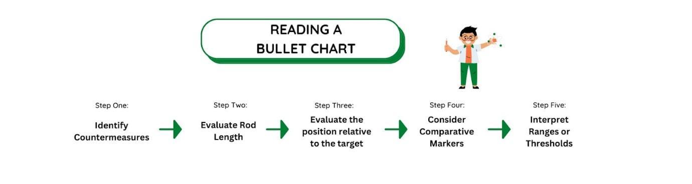
Steps Involved
The below diagram shows the steps involved in reading a Bullet Chart:
Now let's look at the steps to read a bullet chart.
Step 1: Identify Countermeasures
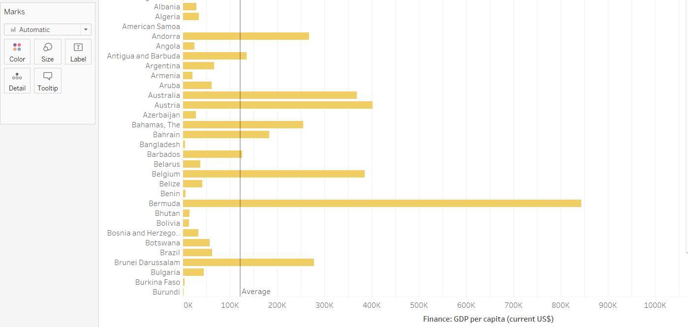
Let's start by understanding what the horizontal bars represent. A Key Performance Indicator (KPI) measures how well a company is doing. Examples of KPIs are Revenue, Profitability, or other related metrics. In the above example, we have KPI as GDP.
Step 2: Evaluate Rod Length
Note the length and position of the horizontal bar. It represents the value of the analyzed measure. The longer the bar, the higher the value of the key figure.
Step 3: Evaluate the position relative to the target
Check the position of the bar relative to the finish line. If the bar crosses the target line, the measured value has exceeded the target. If the target is not met, this indicates that the measure failed to achieve the desired target.
Step 4: Consider Comparative Markers
Notice the additional markers or reference lines on the chart. They provide valuable context for comparing current performance against benchmarks or historical data. Evaluate how your metrics compare to these markers to measure performance.
Step 5: Interpret Ranges or Thresholds
If the chart has ranges or sections, figure out which range the bars are in.
This allows you to understand your performance level based on predefined thresholds.
To read bullet charts and understand your progress, check these steps and visuals. It will help you gain insights from your data.
Making Bullet Chart in Tableau
Follow these steps to create a bullet chart in Tableau.
Prepare your Data
Ensure your data is organized in a format suitable for creating a bullet chart. Usually, you need a way to show more than just a number like Revenue or Income. You also need to include other information like Category or Region.
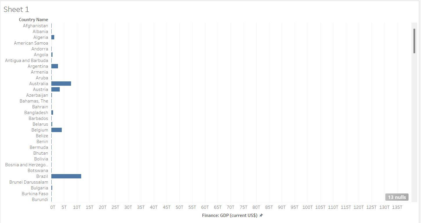
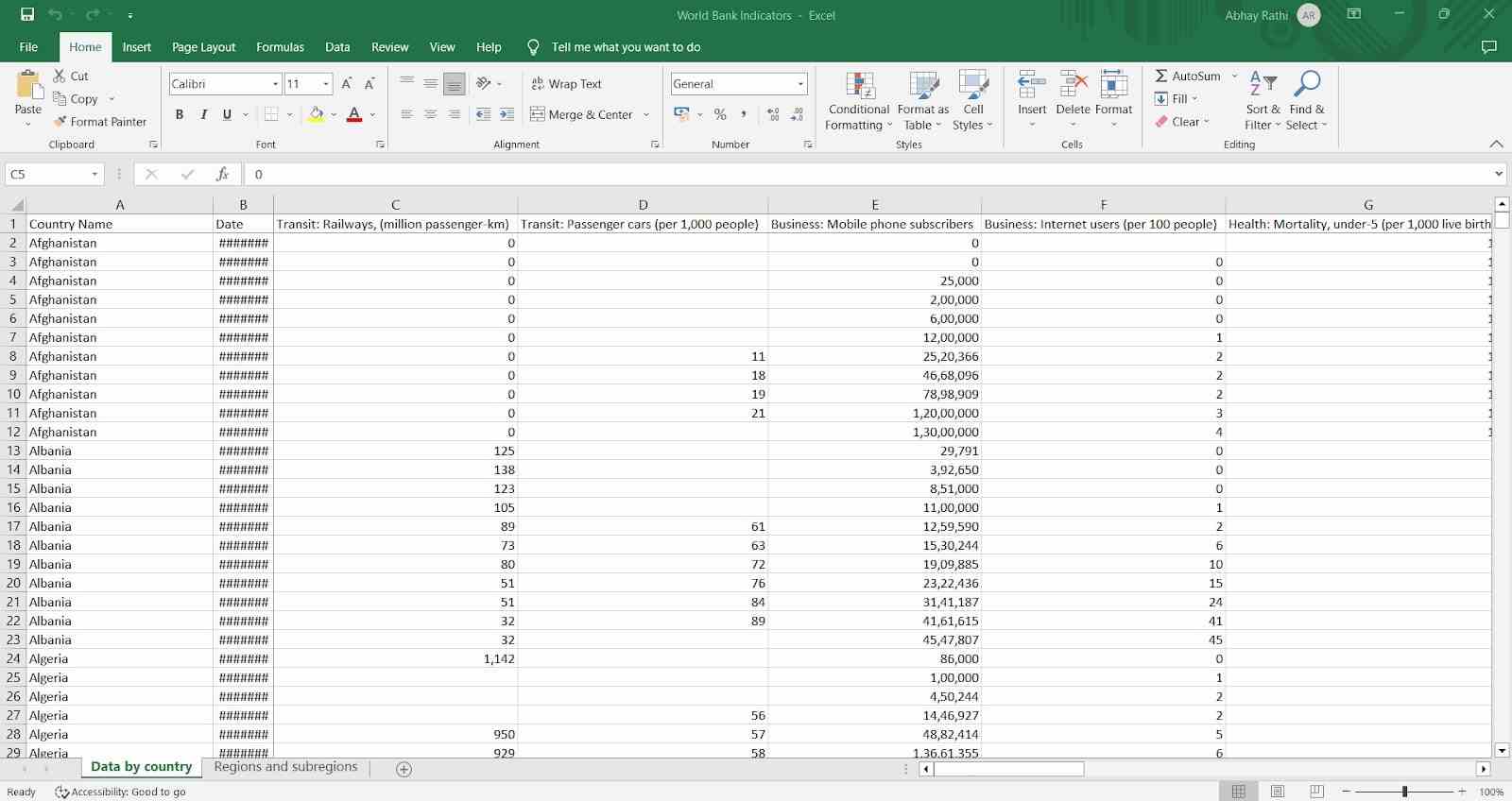
For this tutorial, we will be taking the below Excel file.
The above excel sheet contains all the data of the World Bank Indicators.
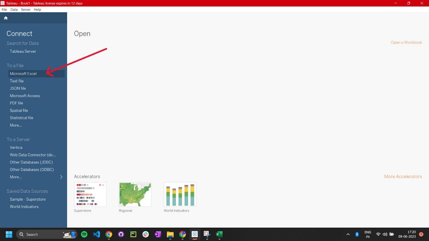
Open Tableau and Connect to Your Data Source
To create a bullet chart, open Tableau and connect to the data source that has the data you want to show. This can be a spreadsheet, database, or other supported data source.
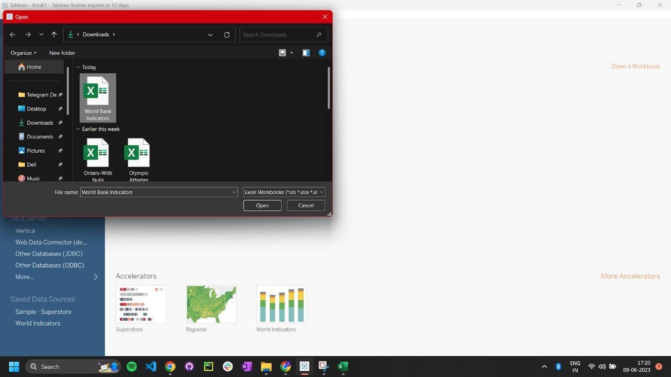
Selecting the Excel file.
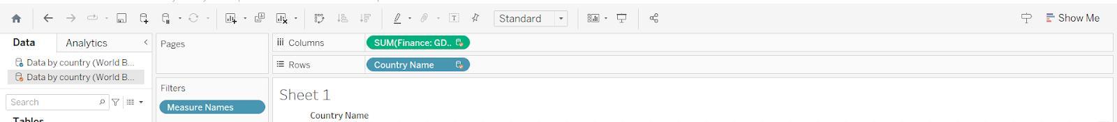
Drag the Required Fields to the Shelf
Move the country name and other measures you want to show to the horizontal bar. Then, put the categories, regions, and other dimensions that give context in the rows area.
Here we will select the country name to the rows, i.e. the vertical bar.
And we will select GDP per capita for the columns, i.e. the horizontal bar.
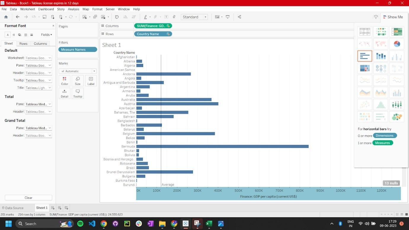
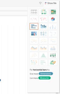
Create a Bullet Chart
Then you can select the option below to create a bullet chart.
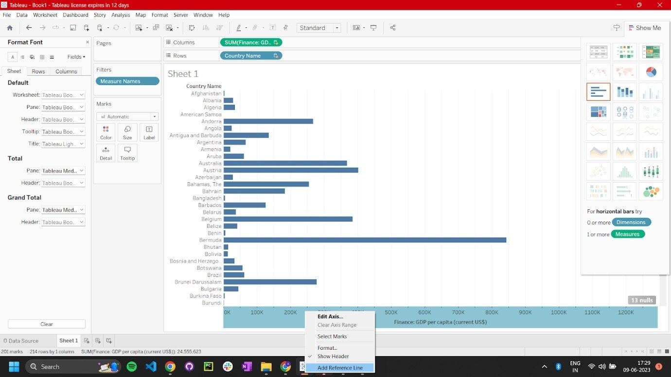
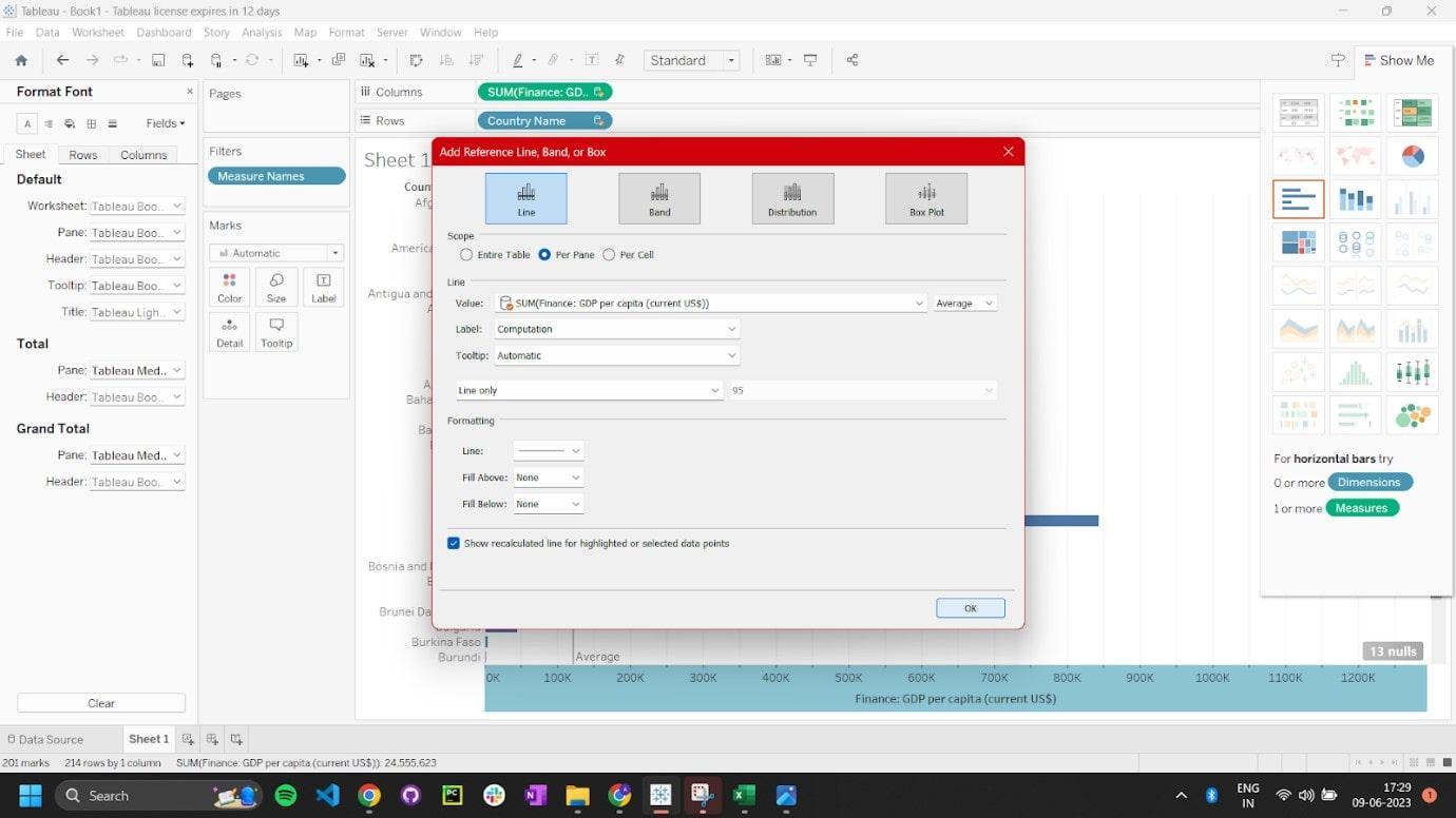
Add a Reference Line
Right-click the secondary axis, go to Add Reference Line.
Select the type of reference line to include target values or benchmarks.
Adjust the reference line settings as needed.
This is the output you will get:
Customizing Appearance
Customize the appearance of the bullet chart to your liking. Tableau's formatting options let you change colors, labels, tooltips, and other visual elements.
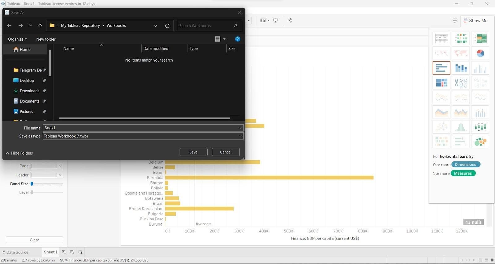
Save and Share your Bullet Chart
After finishing your bullet chart, save it as a Tableau workbook (.twbx) and share it with others. You can save it as an image or post it to Tableau Server/ Tableau Public for sharing.
The above steps should be followed while making bullet chart in Tableau. They will help you visualize and analyze your data in a better way.
Frequently Asked Questions
What is a Tableau Bullet Chart?
Tableau's bullet chart is a helpful way to show lots of data in one picture. It combines bars, markers, and info to make it easy to understand. It tracks progress, sets goals, and compares performance against goals.
How do we create a bullet chart in Tableau?
When making bullet chart in Tableau, choose the data fields you need. These fields may include measures, goals and additional dimensions to give context. Use Tableau's charting tools to create a horizontal bar. Then, add target reference lines and customize the look as you prefer.
Can we customize the appearance of bullet charts in Tableau?
Yes, Tableau offers many customization options for bullet charts. You can customize graphs by changing colors, labels, adjusting bar size, and thickness. You can also add reference lines and other features to make the graph look the way you want it to. These options allow you to customize your chart to suit your needs and visual style.
How can we make bullet chart interactive in Tableau?
Tableau has interactive features that make bullet charts interactive for you to use. You can change the data shown on your screen by using filters, parameters, and actions. You can also focus on specific details or criteria by drilling down into them. Incorporating interactivity increases user engagement and facilitates data exploration.
Are there any best practices for creating bullet charts in Tableau?
There are some ways to make bullet charts in Tableau better. To create a good chart, you should follow a few simple steps. First, choose the right scale. Then, use clear labels to describe the data. Use the same colors and formatting throughout the chart.
Does Tableau have additional support or resources for creating bullet charts?
Tableau provides lots of help for making bullet charts. You can find instructions, examples, and advice on the Tableau website. To learn how to make bullet charts and visualize data, visit the Tableau website. You can take Tableau courses and ask Tableau experts for help. This will help you improve your skills.
Conclusion
In summary, making bullet chart in Tableau unlocks powerful data visualization capabilities. These charts present multiple data points in a concise and visually appealing way. Tableau's tools and customization options enable analysts to create engaging, interactive bullet charts. Combine and share bullet charts with other visualizations for a more significant impact.


 8+ registered

