Do you think IIT Guwahati certified course can help you in your career?
Introduction
Hey Ninjas! Line charts are a way of visually representing data. It shows how some data changes over a specific period. It is the most basic depiction of data that we use in Tableau. When we want to analyse product prices over a period of time we mainly use line charts in Tableau.
In this blog, we will discuss the use of line charts and their advantages and disadvantages. We will see how to make line charts in Tableau, along with an example.
What is Line Chart?
The line chart is a representation of changes in data over a period of time. It is the most basic chart type which we use to compare data prices and analyse the changes in data so that we can forecast how the data might look in the future.
Importance of Line Charts
Before learning how to make line charts in Tableau, it is important to understand the importance of line charts.
It is an efficient way of representing changes in data over short and long periods.
It helps us identify patterns and predict future changes in data. For example, while working with sales data, we can use line charts to determine the sales pattern in different months over the past few years and predict the sales for upcoming months.
With the help of line charts, different data groups can be compared at once. We can compare the stock prices of other companies in the last few months in line charts.
Advantages of Line Charts
So, Ninjas, you might have understood the importance of line charts. Now let us look at some of the advantages of line charts.
It is a simple and clean way to represent changes in data.
Line charts can also show different small changes in data that other charts might not be able to depict.
Line charts can also be used to represent various data types and their aggregation also.
Line charts help us keep track of data by simply seeing the data to make better decisions.
We can also represent multiple data on an axis at the same time and compare them simultaneously.
Disadvantages of Line Charts
There are some disadvantages of line charts that we need to consider before using them.
Different line charts will be built when we show various kinds of data on the same axes, making it difficult to understand.
It can only represent integer changes in any data and does not work well with fractional changes.
If the data values are missing for a time period, the line chart might not be the best fit to represent the data.
It is an efficient way of representing data over a short period. Still, it isn't easy to understand and analyse line charts when representing data over a long time.
Creating Line charts in Tableau
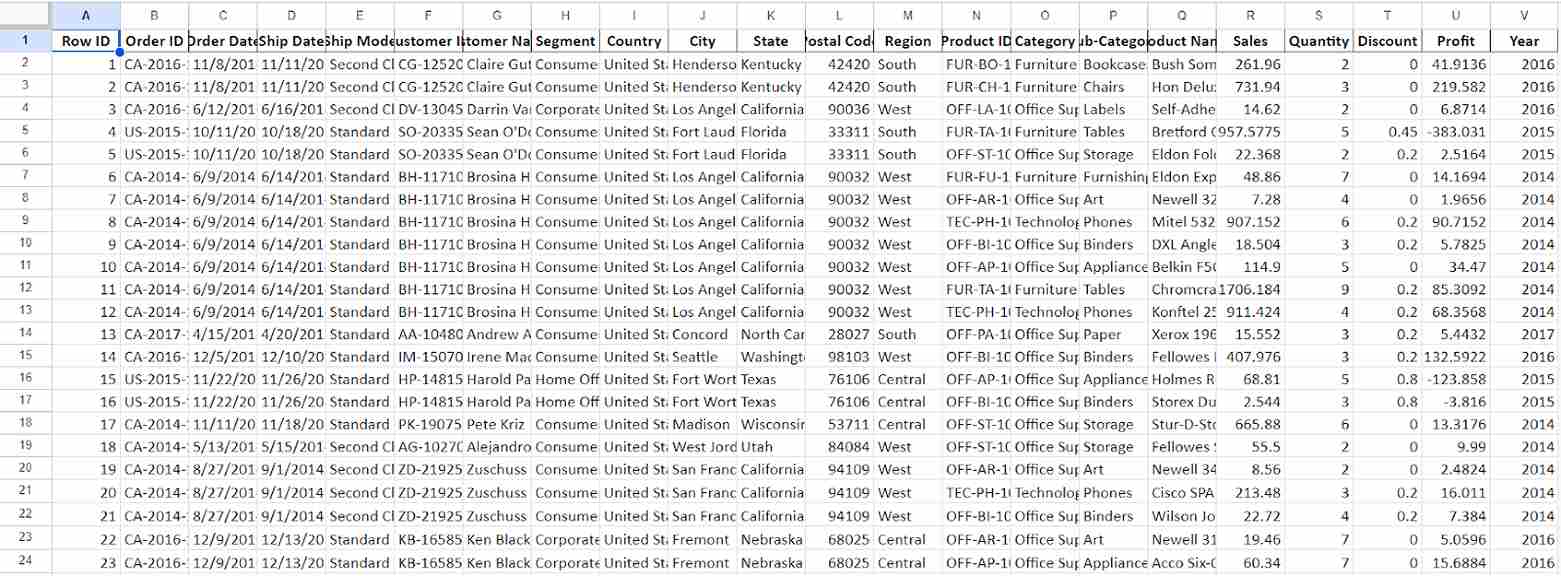
Firstly, let us look at example data, on which we will try to make line charts.
We have taken a sample dataset from Tableau Public showing the sales and profit of a superstore for different years.
Now step by step, we will try to use the line chart in Tableau.
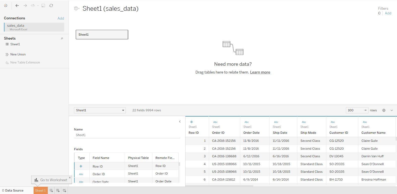
Step 1: We have data present in Excel form. Let us upload this Excel file on Tableau.
After connecting the Excel file to Tableau, It should look like the image below.
Step 2: Now, we will go to the worksheet. This is where we will create line charts for the data.
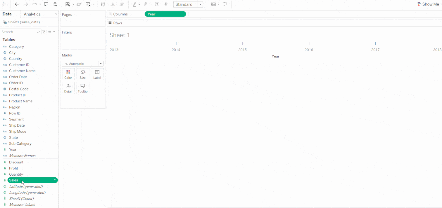
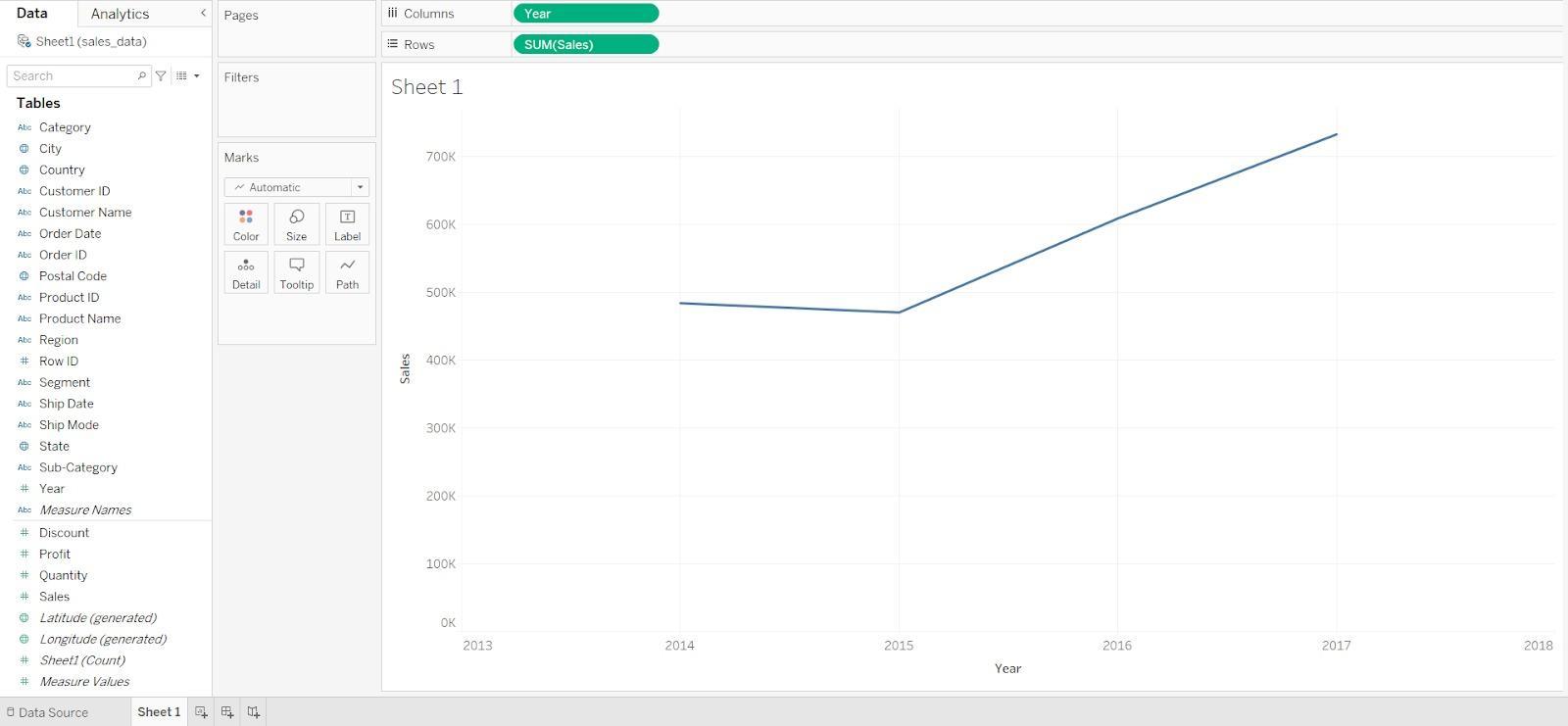
Step 3: For this example, we will add Sales data on Y-axis and Year on the X-Axis of the line chart. To do this, we will just drag and drop the sales and year icons into columns and rows.
Now, we have created a line chart (Sales vs Years), and it should look like this.
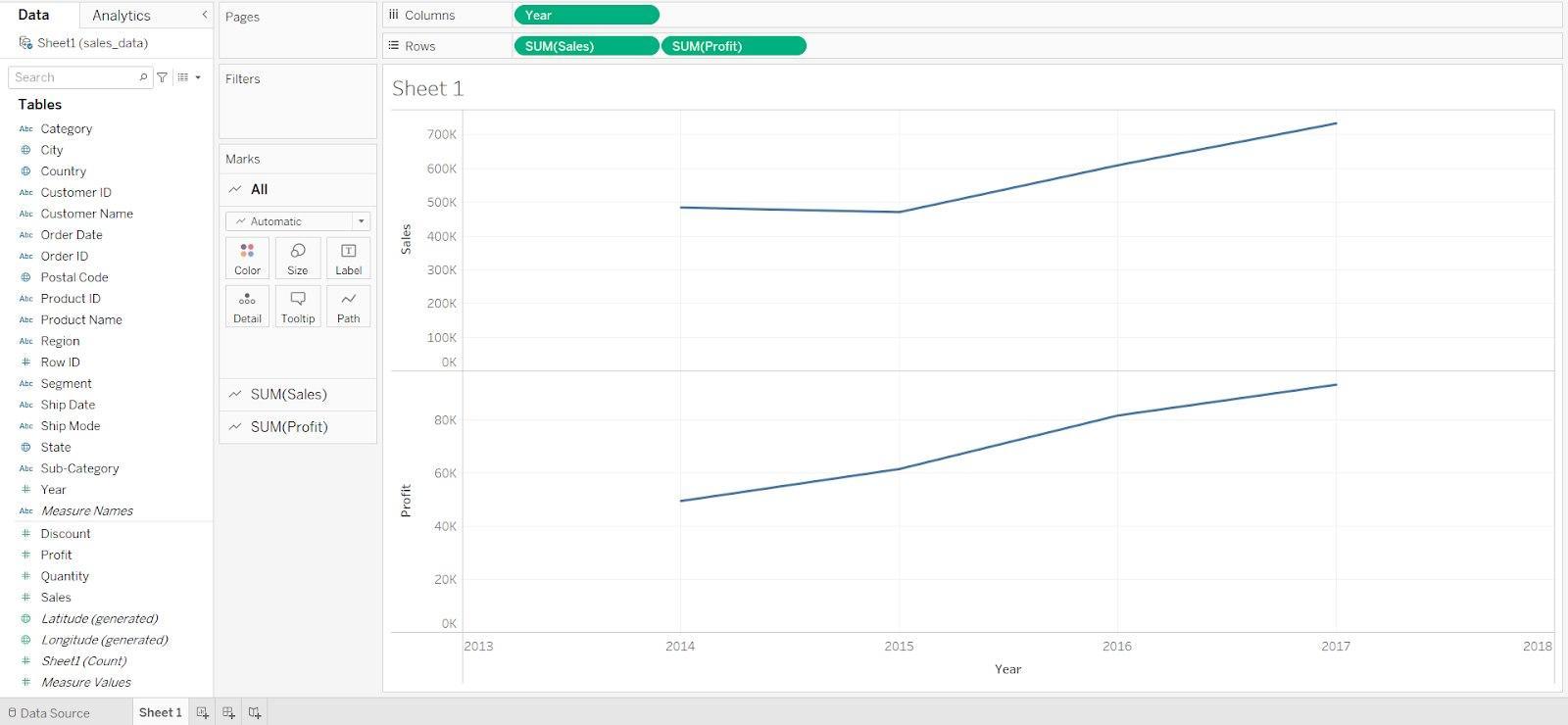
Step 4: As we have created a line chart, now we will try to create a multi-line chart by dragging profit data to the rows. A new line chart will be created by dragging and dropping, as shown below.
The line chart should look like this.
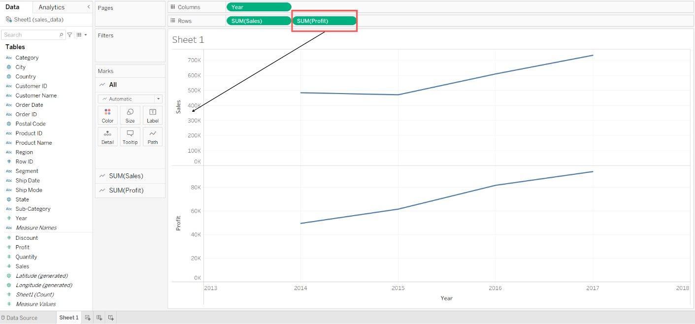
Step 5: Now,we will merge both line charts by dragging the SUM(Profit) icon onto the Y-axis of the first line chart.
The Multi-line chart should look like this.
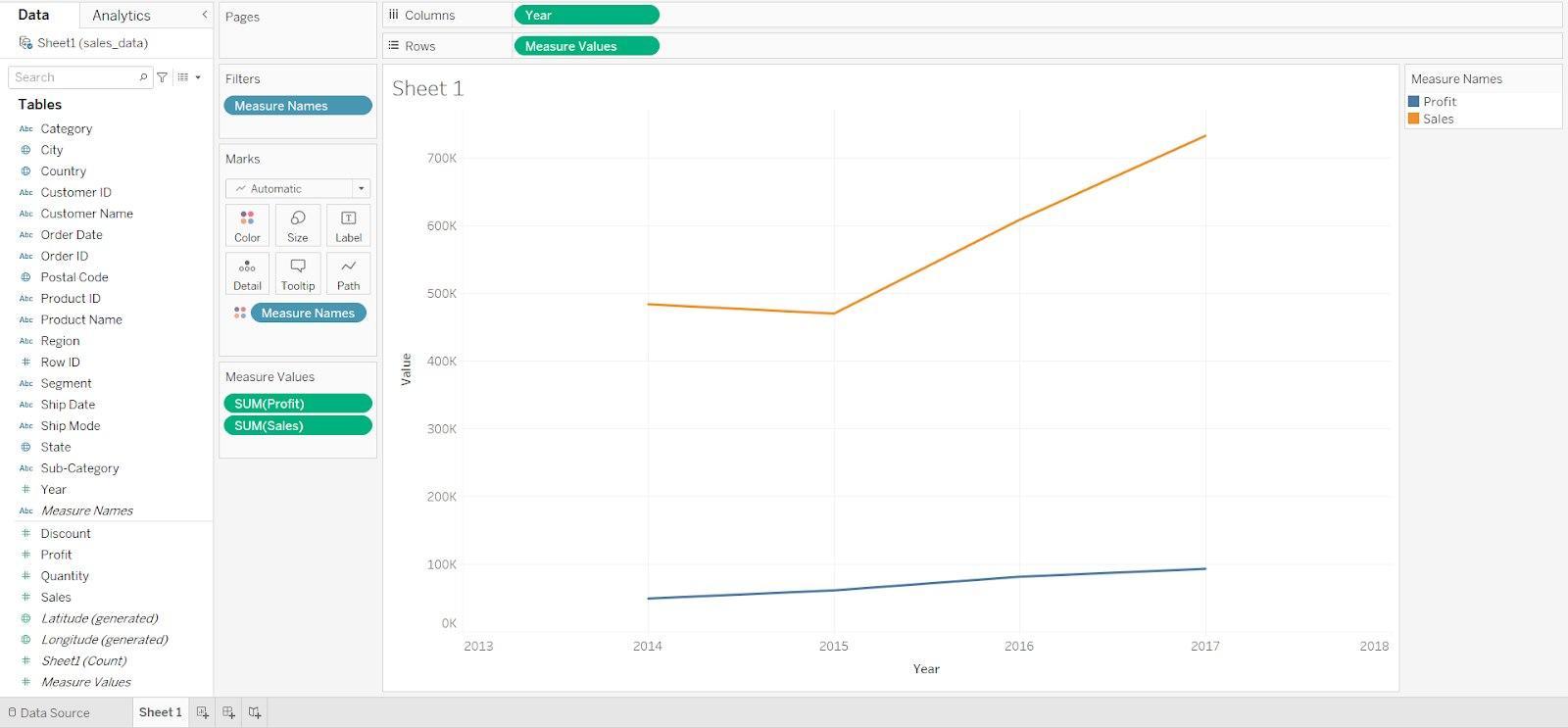
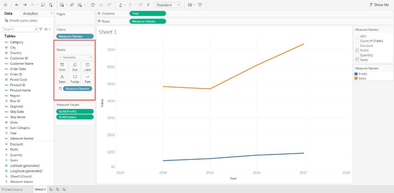
Step 6: We can also change the color, size, add labels and change the types of lines of the line charts to make the charts more appealing by using the options under Marks icons.
So, Ninjas, This is the complete step-by-step procedure to make a line chart in Tableau.
Frequently Asked Questions
What is Tableau?
Tableau is a data visualisation tool used to create stunning visuals, and it also helps us do various operations on the data.
What is a line chart?
Line charts are a way of visually representing data. It shows how some data changes over a specific period.
Can we add forecast lines to the line charts in Tableau?
Yes, Tableau has a feature named add Trend line, which helps us in adding forecast lines.
What is the importance of line charts?
Line charts are useful for analysing changes in data over a period of time.
What data types are supported in line charts?
Integers and boolean data types are supported in line charts.
Conclusion
This article discusses the topic of making line charts in Tableau. In this blog, we have discussed the importance of line charts, their advantages and disadvantages and how to create line charts in Tableau. We hope this blog has helped you enhance your knowledge of line charts in Tableau. If you want to learn more, then check out our articles.
But suppose you have just started your learning process and are looking for questions from tech giants like Amazon, Microsoft, Uber, etc. In that case, you must look at the problems, interview experiences, and interview bundles for placement preparations.
However, you may consider our paid courses to give your career an edge over others!


 8+ registered

