Do you think IIT Guwahati certified course can help you in your career?
Introduction
Hello ninjas! You must have heard about terms like line charts, visualizations, graphs, etc. In this article, we are going to study Sparkline in Tableau. We will explore its concept, advantages, disadvantages, and even how to make one.
What is Tableau?
Tableau is a great data analysis and visualization tool. To make interactive visualizations, it represents your data in visual forms like pie charts, bar graphs, etc. It also helps in gaining valuable insights from these visuals, which helps in finding patterns, trends, etc. Furthermore, it helps in making wise business decisions based on the information presented. Hence, we can say that it is a Business Intelligence tool.
What are sparklines in Tableau?
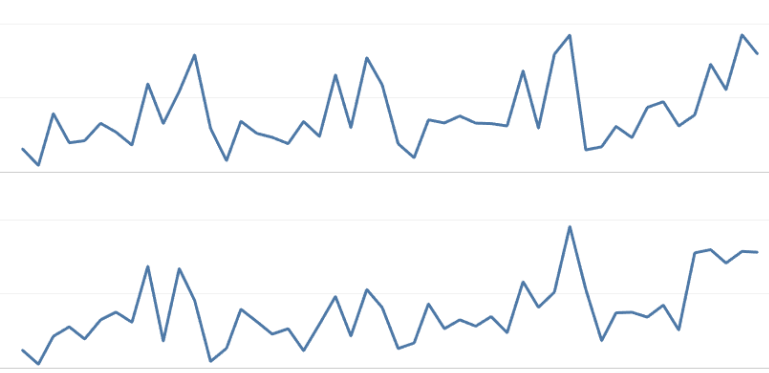
Sparkline in Tableau is a tiny and compact form of visualization. It is a form of a line graph but without axes or coordinates.
An example of a sparkline in Tableau is as follows:
Now, let us see some uses of sparklines:
Find trends in cycles.
Economic or business cycles
Maximum and minimum values in the chart
General increase or decrease in the chart
Advantages and Disadvantages of Sparkline
Let us look at some advantages and disadvantages of Sparkline.
Advantages
Let us look at some advantages of Sparkline.
Sparklines are small and compact charts that fit in with the textual fields.
Sparklines can easily spot patterns, business cycles, trends, and maximum and minimum values in the chart.
Sparkline is an effective visualization for spotting trends in large data sets where finding trends in other visualization techniques like traditional graphs is complex.
Sparklines convey information in a condensed form.
Disadvantages
Now, let us discuss some disadvantages of Sparkline.
Sparklines are not very detailed about many variables that affect the variations of the chart.
When a chart with quantitative information is to be presented, sparklines are not used. These scenarios require detailed graphs and charts with axes and coordinates.
Creating Sparkline in Tableau
To create Sparkline in Tableau, we should follow the following steps:
Open a data set for making the Sparkline in Tableau.
Put your measurement’s name and value on the ‘rows’ shelf.
Place a date field or whichever field you want to take for the column on the ‘columns’ shelf.
Reduce the width to make the sparks or trends pop.
Remove measures from the view which are not that relevant.
Hide axes from the view to format it.
After all these steps, you will successfully create a sparkline for your data.
Example
Let us understand this by an example.
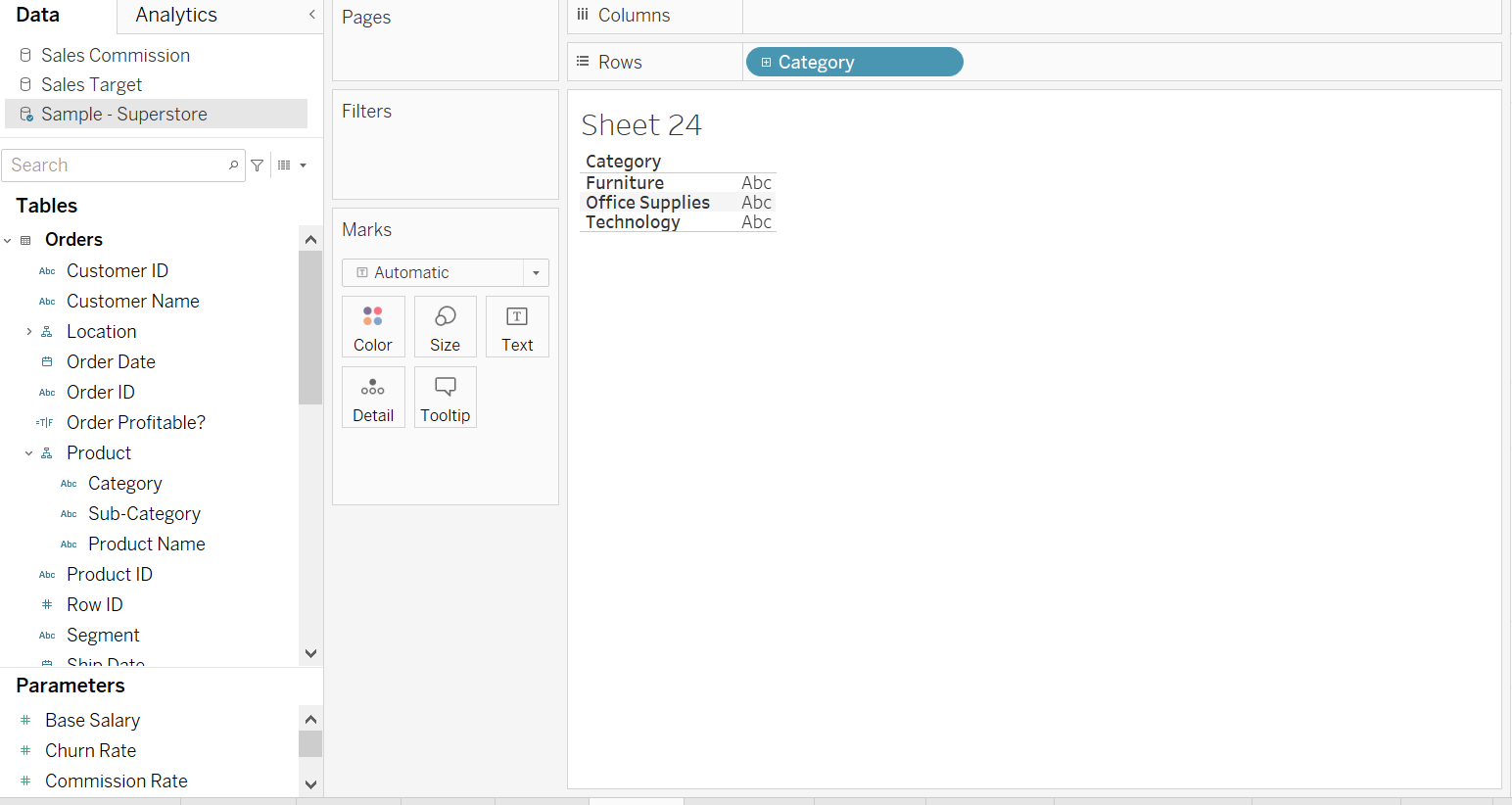
Here, we have chosen the Superstore dataset, which itself comes with the Tableau Desktop. After opening the Superstore workbook in your Tableau application, follow the following steps:
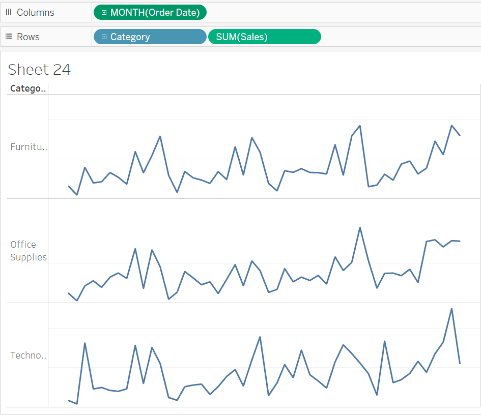
Add Product Category to the Rows Shelf
You can drag the Product Category from Tables Data to the Rows shelf. It is the measurement name.
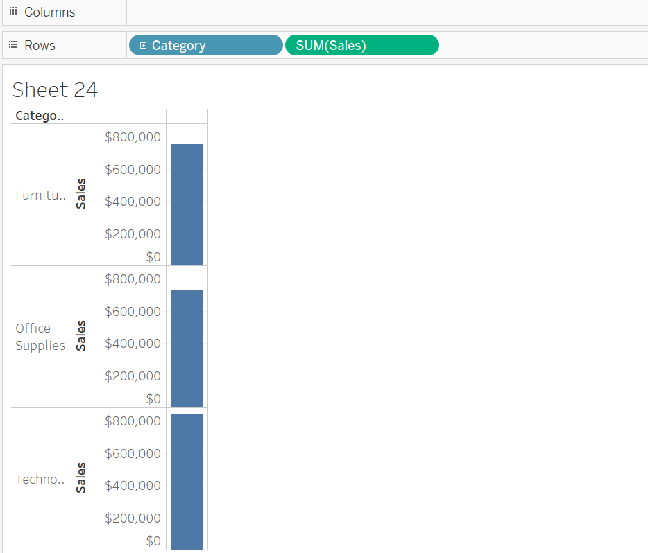
Add Sales to the Rows Shelf
You can drag and drop Sales from Tables Data to the Rows shelf. It is the measurement’s value.
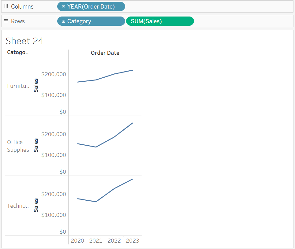
Add Order Date to the Columns Shelf
You can drag the Order Date from the Tables Data to the Columns Shelf.
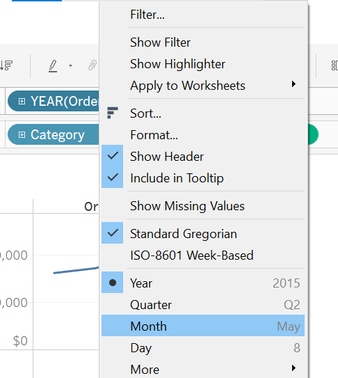
Change the Date Format to Months Instead of Years
You can do this by right-clicking on the Order Date and selecting Months.
This step will enhance the visualization of the sparklines as seen below:
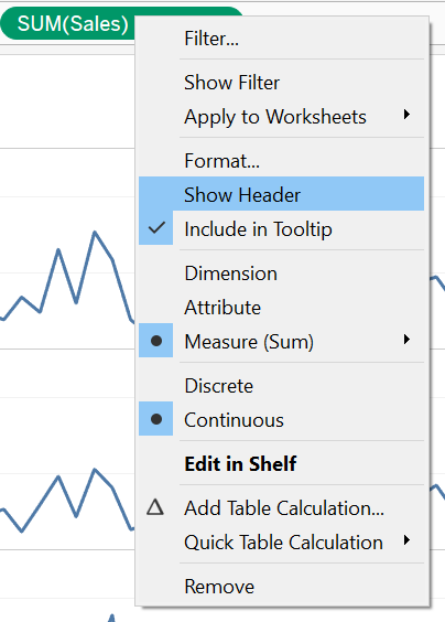
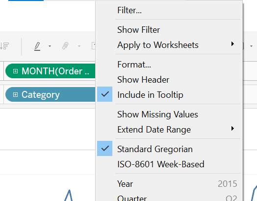
Remove the Show Header Option from Sales and Month
You can remove the Show Header options from the Sales and Month categories by right-clicking them and deselecting this property.
Finally, the Sparkline in Tableau for Furniture, Office Supplies, and Technology variations concerning the months is ready.
Frequently Asked Questions
What are sparklines?
A sparkline is a visual representation of data in a line chart. It is generally drawn without coordinates or axes. It depicts the variation of some measurement values in a simple way. It is generally used to find trends in a series of values, business cycles, and maximum and minimum in the chart.
What is Tableau?
Tableau is a tool for data analysis and visualization. Without coding, it enables users to make interactive visualizations of their data. It helps in visualizing the data in a short period. Also, it helps get insights from the data and helps in making business decisions.
Why is it called a Sparkline?
It is called a sparkline because it depicts small charts placed within the text to provide information in a condensed way. The line chart in this can have pin-point variations causing the line chart to be seen as sparks.
When is Sparkline used?
It is used to show trends over time. It shows variations in the values of the dataset. Also, these trends can be seasonal, business cycles, etc. It can show maximum and minimum values during these cycles.
When is Sparkline not used?
If the user wants detailed information about the chart or graph made, then sparklines are not advised. You should not use sparklines if you need specific details in your visualization.
Conclusion
Sparkline in Tableau is an effective way to present the variations qualitatively. It is a compact and tiny visualization form without axes or coordinates. In this article, we studied Sparkline in Tableau, its advantages and disadvantages, and an example.
If you wish to widen your horizon on this topic, do read the following articles:


 8+ registered

