Do you think IIT Guwahati certified course can help you in your career?
Introduction
Welcome to Coding Ninjas; Today, we are going to take a read at a very famous library for creating UI components in React. In this article, we will discuss what is Material UI React with features, how to get started with Material UI, and explore various Material UI React components. We will also discuss some tips and best practices for using Material UI.
Material UI React Overview
Material UI React is a library inspired by Google’s Material Design System that was introduced by a French Software Engineer called Olivier Tassinari in 2014. Now Material UI React is an open-source project whose source code is present on GitHub and is managed by its contributors. In the world of React, Material UI has become one of the famous libraries for creating UI components. Material UI provides a variety of components, such as buttons, icons, forms, layouts, navigation, and many more.
There are several features of Material UI React that make it one of the popular libraries:
Material UI components are beginner-friendly because the implementation of using most components is simple and easy.
As Every React Developer uses Material UI at least once in their projects, the active community and resources help them to use it efficiently, and issues can be cleared as the community is active and vast.
Material UI not only helps you in React but also supports popular frameworks like Gatsby, Next.js, Angular, Vue, etc.
Material UI provides responsive components that can be used to create applications for different screen sizes.
Material UI also provides customizable themes where the developers can create and apply the custom themes to their web apps.
Material UI allows CSS-in-JS Approach, where developers can use CSS in JavaScript code, which makes the customizations simple and easy for beginners. These CSS styles can also be used in JavaScript popular libraries like JSS or Emotion.
Installing Material UI React
In order to use Material UI components in React, you should know how to create and deal with Components in React; we need to go through some steps, which are the following:
First, you need to create the react application; here is an example of creating with ‘npx create-react-app’. You need to make sure you’ve downloaded the latest version of Node.js before moving forward.
npx create-react-app material-ui-app
We need to change the directory to ‘material-ui-app’ using the ‘cd’ command.
cd material-ui-app
Now We need to start the local-host server to see Webapp on the local browser.
npm start
2. First, You need to install the package Material UI; this package will have all the dependencies you’ll need while creating your application;
You can download Material UI using npm:
npm install @material-ui/core
You can download Material UI using yarn:
yarn add @material-ui/core
3. In this example, we will import a button from ‘material-ui/core’, which we have installed in our application. ‘Button’ is the component’s name that you can import from the ‘material-ui/core’ component:
import { Button } from '@material-ui/core';
4. You only need to make changes in ‘App.js’ present in the ‘src’ directory.
6. If you installed the packages and have written the code successfully. You will be able to see your component rendered on your default web browser.
React Material UI Components
As we have already discussed that Material UI provides various variety of components that you can use in your application. These components will help you to make your application interface modern and good-looking.
Let’s understand some components and what those components do:
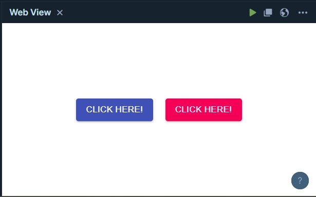
Button: ‘Button’ component is used to create the button, which comes with a variety of styles, and the styles are customizable. JavaScript logic can also be added to some button events.
Icons: Material UI provides a wide variety of icons. Over 1000+ icons are there, which you can use in your application.
Checkbox: ‘Checkbox’ component is used to create the checkbox, which comes with a variety of styles, and the styles are customizable. JavaScript logic can also be added to this checkbox according to our conditions.
Navigation: Material UI also provides you navigation components, including ‘Pagination’, ‘Link’, ‘Menu’, and ‘Drawer’.
Layout: Material UI provides you layout components, such as ‘Box’, ‘Container’, ‘Grid’, and ‘Stack’.
Feedback: There are also some feedback components that you can use, including ‘Alert’, ‘Feedback’, ‘Dialog’, Progress’, and ‘Snackbar’.
Material UI Theming
As we have seen that Material UI can be used in React for Theming, but the question arises of how. In this section, we will discuss how to do theming with a quick example: We want to change the style of the ‘Button’ and ‘Typography’ components provided by Material UI, and this custom theme can be done by the ‘createTheme’ function. In our case, we are only making changes in ‘App.js’ present in the ‘src’ directory.
A customized theme is created using the Material UI provided function createTheme. The theme contains a color scheme where the primary color is purple, and the secondary color is green. Custom typography styles are also added for the h3 variant, including font size, font weight, and font family.
The components inside ThemeProvider use the customized theme provided to them. The code renders a Typography component with the h3 variant and two Button components with primary and secondary colors, respectively. The Typography component and the Button components will have the specified styles for the primary and secondary colors and the h3 variant, respectively, by utilizing the customized theme.
Material UI Icons
We can also use Material UI Icons for free in our React application; There are 1000+ icons provided by Material UI. Here in this section, we will discuss Icons that can be imported from Material UI and can be used in our React application as an example.
Here we are importing icons from the ‘@material-ui/icons’ package that provides the icons:
In this code, the Icon component provided by Material UI was imported and used to render three icons: Email, Phone, and LocationOn. The icons were specified using their respective names from the Material UI icon library. Each icon was then rendered within a Button component and displayed on the screen.
React material Ui provides a lot of amazing features, some of the key features are:
Rich Component Library: It offers a lot of customizable and ready-to-use components like buttons, cards, menus, dialogs etc
Responsive Design: Each and every component is designed to be responsive and work seamlessly across different devices of different sizes
Icons and Typography: React Material UI includes a variety of Material icons and typographic styles that be used to make stunning websites
Theming and Customization: It has easy theming and customization options using CSS-in-JS, which enables developers to match the UI with the project requirements
Performance Optimization: It optimizes performance through features like tree-shaking, lazy loading, and server-side rendering support
Integration with React Ecosystem: It integrates smoothly with React and works well with other popular libraries like Redux
Material UI is the library that is used for creating UI components. Material UI provides a variety of components, such as buttons, icons, forms, layouts, navigation, and many more. Material UI can be used for various frameworks, including React, Angular, Vue, Next.js, and Gatsby.
What is material UI in React?
React Material UI is a popular UI framework that has a wide range of predesigned components and styles following Google's material design guidelines. It simply the UI development and helps in making visually appealing modern websites.
Is it good to use material UI in React?
Yes, it is a good choice to use Material UI in React because it offers a wide range of customizable components, responsive design, accessibility features, and strong community support.
What is the difference between Material Design and MUI?
Material Design is a design language and visual system developed by Google, while MUI (Material UI) is a specific implementation of Material Design principles in the form of a UI framework for React.
Conclusion
Material UI has become one of the famous libraries for creating UI components that can be used for various frameworks. In this article, we discussed What is Material UI with its features, explored various Components of Material UI React, and discussed the best practices for using Material UI.
If you want to know about how React Codebase can be used to create a Mobile Native Application, You should read this article on ‘React Native App Development’.
Also, check out some of the Guided Paths on topics such as Data Structure and Algorithms, Competitive Programming, Operating Systems, Computer Networks, DBMS, and System Design, etc.


 18+ registered

