Do you think IIT Guwahati certified course can help you in your career?
Introduction
Data analysis and visualization are the essential parts of Machine learning. Data visualization helps us to find out patterns, anomalies, and trends in the dataset; data visualization is the easiest way to understand what the dataset is trying to convey, as we can see through our naked eye and process all the patterns of the dataset in our brain.
Data is visualized in the forms of pie charts, bar graphs, histograms, scatter plots, etc., where every plot has its specific way of displaying the data.
Holoviews is an open-source package in python, where appealing visualizations can be made with minimal code and effort. HoloViews support 'matplotlib' and 'bokeh'.
Features
Allow you to create data structures that both store and display your data.
To visualize the data, we need to import some necessary libraries, i.e., pandas and seaborn. We will use 'matplotlib' and 'bokeh' as extensions for visualization purposes.
import pandas as pd import seaborn as sns import holoviews as hv from holoviews import opts
import math #extensions used for visualization hv.extension('bokeh', 'matplotlib')
The following output indicates that all the libraries have been successfully loaded.
Loading and filtering the dataset
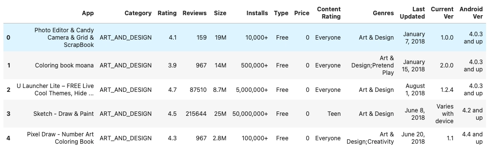
We will be loading our dataset using the pandas library. The dataset is about google play store apps. Each column will have app_name, category, rating, review, size, installs, etc.
Loading the dataset and printing its size.
data = pd.read_csv("googleplaystore.csv") data.shape
(10841, 13)
Delete all the rows having “NaN” values.
data = data.dropna()
data.shape
(9360, 13)
We can see the shape of data before and after filtering. So, the first step is to filter the data (always not necessary to drop all the "nan" values, you can also replace them).
Displaying the first five entries of the dataset.
data.head(5)
Creating Visualizations
Plotting curve and histogram
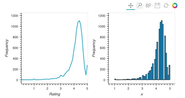
We can see the rating of apps in the dataset; it lies between 1 to 5. We will be plotting a frequency distribution of ratings of all the apps.
# loading rating of all the apps in y y = np.array(data['Rating'])
# plotting curve xs = [i*0.1for i in range(51)] ys = [] for i in range(51): ys.append(0) for i in range(len(y)): ys[int(y[i]*10)]+=1 curve = hv.Curve((xs,ys), 'Rating', 'Frequency')
# plot both graphs together curve + histogram
In the x-axis, we can see the rating of apps between 1 to 5, and in the y-axis frequency of apps. Each bar in the graph denotes the total number of apps having frequency x.
Plotting bar graph
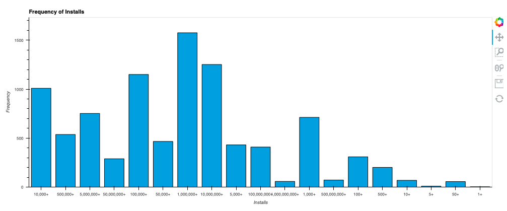
In this part, I will plot the bar graph for the 'Installs' column from the dataset.
# loading 'Installs' column y = np.array(data['Installs'])
# function to frequency of each type deffreq(y): mp = {} for i in y: if (i in mp): mp[i] += 1 else: mp[i] = 1 return mp
#assiging X and Y, keys and values of a map X, Y = list(freq(y).keys()), list(freq(y).values())
# creating bar graph info = list(zip(X, Y)) bars = hv.Bars(info, hv.Dimension('Installs'), 'Frequency').opts(fontscale=0.7, width=1000, height=400, title='Frequency of Installs') bars
The graph's x-axis represents the total number of installs, and the graph's y-axis represents frequency. A bar in the graph represents the total number of apps having x installs.
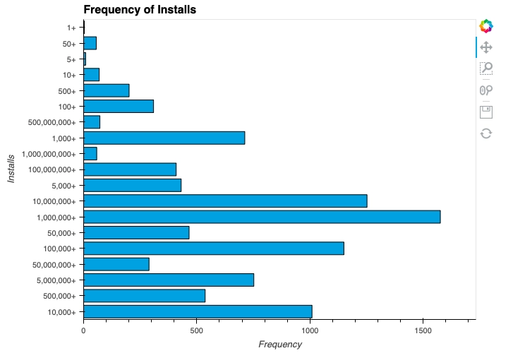
We can also invert the above graph by adding some simple code.
We have inverted the bar graph. (Installs can be seen clearly as compared to the previous graph)
Tabular data and its conversions
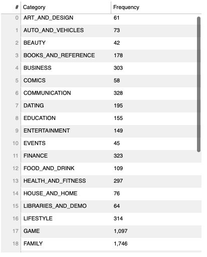
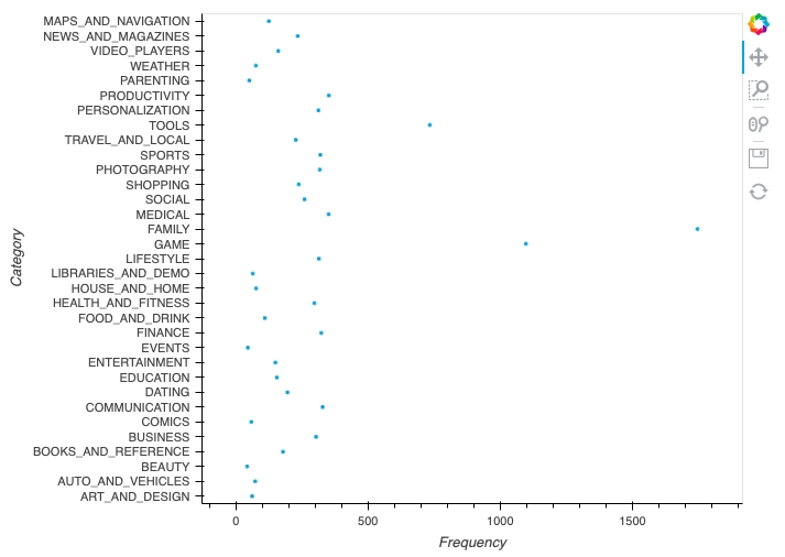
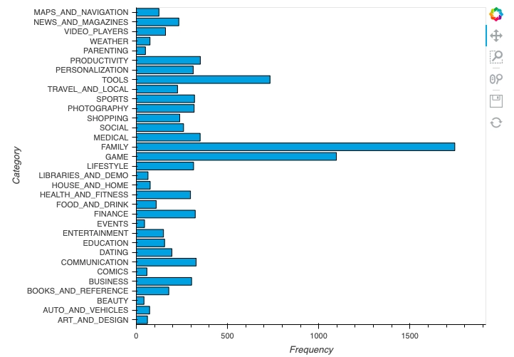
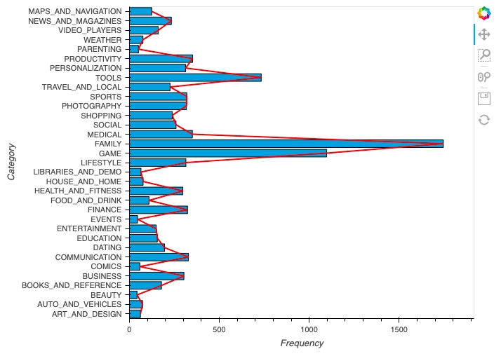
In this part, we will construct tabular data of the 'Category' column, where the frequency of each category will be stored in the table—further using that tabular data to construct various graphs.
Making tabular data
# loading cateory column a = data["Category"]
# function to frequency of each type deffreq(y): mp = {} for i in y: if (i in mp): mp[i] += 1 else: mp[i] = 1 return mp
# assiging X and Y, keys and values of map x1, y1 = list(freq(a).keys()), list(freq(a).values())
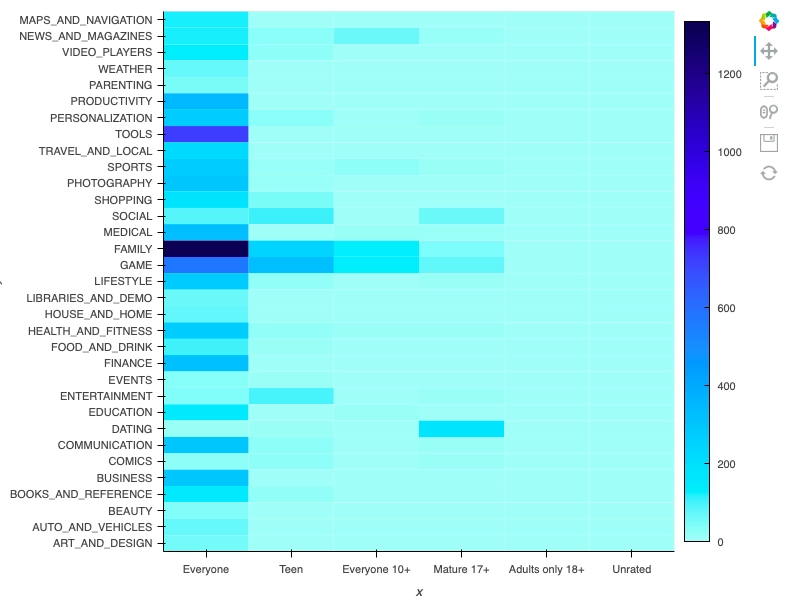
for i in range(len(category_)): dict_data[(content_rating_[i], category_[i],)]+=1 heat_map_data = [] for i in dict_data: heat_map_data.append((i[0], i[1], dict_data[i]))
The above heatmap gives frequency of apps having both category_types[i] and content_rating_types[j] feature (0 <= i < len(category_types), 0 <= j < len(content_rating_types)).
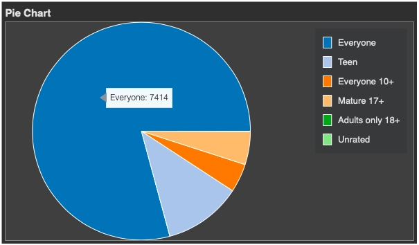
Pie chart using Bokeh
In this part, I will plot the pie chart for the ‘Content Rating' column from the dataset.
I need to import a few more things to plot the pie chart.
from bokeh.palettes import Category20 from bokeh.plotting import figure from bokeh.transform import cumsum from math import pi import panel as pn pn.extension()
# getting the frequency of each ‘Content Rating’ type Cnt_rating = {} for i in data['Content Rating']: if i in Cnt_rating: Cnt_rating[i] += 1 else: Cnt_rating[i] = 1
# plotting the pie chart DATA = pd.Series(Cnt_rating).reset_index(name='value').rename(columns={'index':'country'}) DATA['angle'] = DATA['value']/DATA['value'].sum() * 2*pi DATA['color'] = Category20[len(Cnt_rating)]
1. How should I use HoloViews as a short-qualified import?
A: We recommend importing HoloViews usingimport holoviews as hv.
2. Why are the sizing options so different between the Matplotlib and Bokeh backends?
A: The way plot sizes are computed is handled in radically different ways by these backends, with Matplotlib building plots ‘inside out’ (from plot components with their own sizes) and Bokeh building them ‘outside in’ (fitting plot components into a given overall size). Thus there is not currently any way to specify sizes in a way that is comparable between the two backends.
3. The default figure size is so tiny! How do I enlarge it?
A: Depending on the selected backend…
# for matplotlib: hv_obj = hv_obj.opts(fig_size=500)
# for bokeh: hv_obj = hv_obj.opts(width=1000, height=500)
4. How do I export a figure?
A: The easiest way to save a figure is the hv.save utility, which allows saving plots in different formats depending on what is supported by the selected backend:
# Using bokeh
hv.save(obj, 'plot.html', backend='bokeh')

# Using matplotlib
hv.save(obj, 'plot.svg', backend='matplotlib
You can also try this code with Online Python Compiler
5. How do I create a Layout or Overlay object from an arbitrary list?
A: You can supply a list of elements directly to the Layout and Overlay constructors. For instance, you can use hv.Layout(elements) or hv.Overlay(elements).
Key Takeaways
So that is the end of the article. Let us brief out the article:
In this article, we saw the installation of holoviews. Furthermore, we explored some features and went through the installation process of holoviews. In the implementation part, we took a sample dataset to plot the various graphs. We came across curve plot, histogram plot, bar graph, converting tabular data to other forms of plots, heatmap, and piechart in the visualizations section.
Thus, holoviews is an excellent tool for visualization purposes. Check out this problem - Largest Rectangle in Histogram
For more information, you can visit the official website of holoviews.
Hello readers, here’s a perfect course that will guide you to dive deep into Machine learning.


 8+ registered

