Do you think IIT Guwahati certified course can help you in your career?
Introduction
What is the best thing about comic books and mangas? The pictures, of course! Visual aids such as pictures, drawings, graphs, etc., help us visualize the given information more coherently. It is appealing to the eyes and helps us visualize everything quickly! The same goes for Machine Learning. Dataset visualization helps us see what the data looks like at a glance. It helps us visualize the correlation between all the attributes, explore the data and find trends.
This blog will use Seaborn and Matplotlib libraries for the TMDB 5000 Movie Dataset visualization to see the relationship among the features.
Analyzing the data
First, load the data and have a look at it! You can download the zip folder of the dataset from this source.
#imports
import numpy as np # linear algebra
import pandas as pd # data processing, CSV file I/O (e.g. pd.read_csv)
import seaborn as sns
import matplotlib.pyplot as plt
%matplotlib inline
You can also try this code with Online Python Compiler
#reading the csv file and converting it in dataframe
data = pd.read_csv("../Downloads/tmdb_5000_movies.csv")
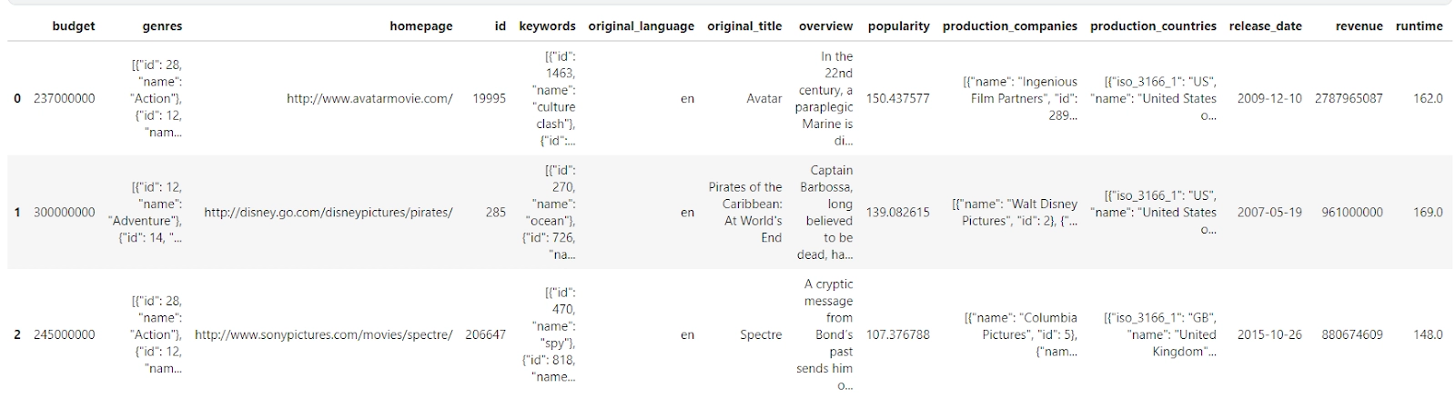
#Looking at the first two entries of the data
data.head(3)
You can also try this code with Online Python Compiler
We determine how many rows under which columns have null values out of 4803 rows from the output. We can replace the null values or delete the columns that won’t be useful for our movie dataset visualization using this information.
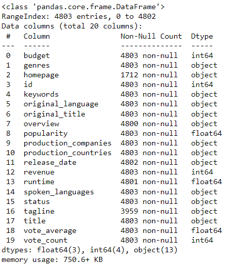
Looking at the correlation between the features using Heatmaps
Using the corr() function on the DataFrame is the easiest way to find the correlation between features with numeric values. Try to work on a copy of the original dataset. We don't want to mess with the original dataset! Looking at the data, we realize that the id column has nothing to do with other features, so let us drop it. Also, we want to see the correlation between the movie’s profit and the other numerical feature values.
data_new= data.copy()
del data_new["id"] #deleting the id column because eventhough it has numerical value it has no relation to other features
data_new["profit"]=data_new["revenue"]-data_new["budget"] # adding profit column to see its correlation
#visualization using heatmap
plt.subplots(figsize = (10,5))
sns.heatmap (data_new.corr(), annot = True,linewidths =0.75,linecolor = "White",fmt = ".2f",center = -0.1)
plt.show()
You can also try this code with Online Python Compiler
Before we infer anything from the above heatmap, let’s first see what is corr() and the results of corr():
The corr() method returns a table with many values representing how directly two columns are related.
The value might range from -1 to 1.
1 denotes a one-to-one association (perfect correlation), and for this data set, each time a value in the first column increased, the value in the second column increased as well.
0.9 is likewise a good association, and increasing one value will almost certainly increase the other.
-0.9 would be exactly as desirable as 0.9, but if one value increases, the other is likely to decrease.
0.2 denotes a poor association, implying that just because one value rises does not mean the other would as well.
You need to have at least 0.6 or -0.6 to call it a good correlation.
This table returned by the corr() function is helpful, but we'd like to make it more appealing and insightful. Something to visualize! Thus we utilize the heatmap from the Seaborn library for this. The lightest and darkest hues represent the best correlations!
What can we infer from the correlation heatmap?
When we look at the heatmap, we can make out things like a huge budget does not necessarily mean higher profit.
Although if the movie gains popularity, it can make a good profit.
Popular movies get more votes.
A high budget does not mean a movie will have a long runtime. This could mean the quality of props and the CGI used is fantastic (Just guessing).
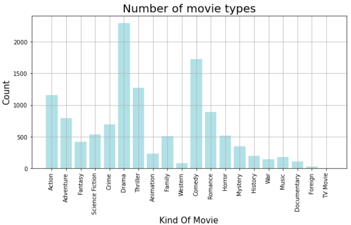
Finding the number of movie types in all years using the Bar chart
Let us look at the frequency of movie genres throughout the years using the Bar chart from Matplotlib.
The column “genres” in the original DataFrame has String values. But if we look at the string carefully, we realize that it is an array of JSON objects. So I will be using the json library to convert this string into the array. Thus, I will separate the genre names from the string.
After that, the rest of the code is easy to understand.
import json #importing json
genre_arr=[]
for json_obj_arr_str in data["genres"]:
    genre_obj_arr=json.loads(json_obj_arr_str) # converts the string to array of json objects
    for j in range(len(genre_obj_arr)):
        genre_arr.append(genre_obj_arr[j]["name"])
genre_df=pd.DataFrame(genre_arr, columns = ['genres']) #making dataframe for all the genres
from collections import Counter
genre_count_dict=Counter(genre_df["genres"]) # making dictionary where the key
#is genre name and value is the count of the genre
genre_name=[]
genre_count=[]
for genre in genre_count_dict:
    genre_name.append(genre)  #putting genres into array
    genre_count.append(genre_count_dict[genre]) #putting the frequency into array
#visualization using bar graph
plt.figure( figsize = (15,5))
plt.bar(genre_name,genre_count,color ='powderblue')
plt.xticks(rotation = 90)
plt.xlabel("Kind Of Movie",fontsize=15)
plt.ylabel("Count",fontsize=15)
plt.title("Number of movie types",fontsize = 20)
plt.grid()
plt.show()
You can also try this code with Online Python Compiler
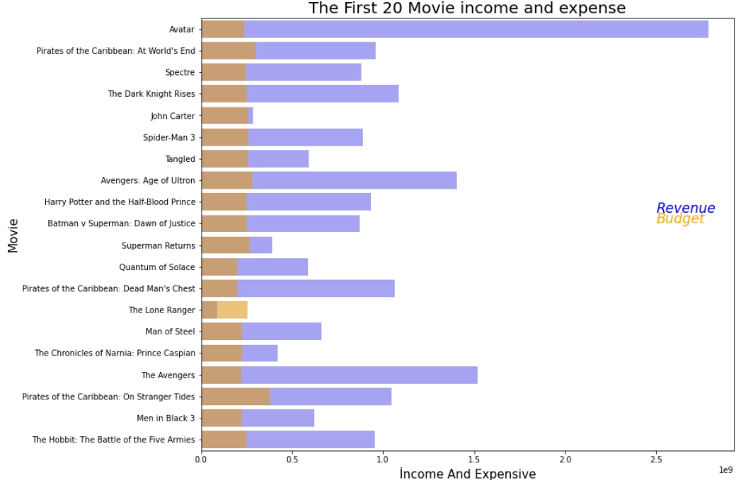
From the above plot, we can make out that “Avatar” made a considerable profit followed by “The Avengers” and “Avengers: Age of Ultron” (Shout out to all the Marvel fans!).
We also notice that the “Pirates of the Caribbean” franchise (Here, we see three movies from this franchise )also makes a lot of profit.
“The Lone Ranger” was a failure because the bar of Budget is longer than the bar for the revenue. That is, the revenue made was less than the budget, therefore, leading to a loss.
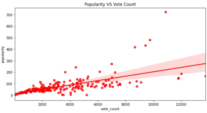
Finding a correlation between popularity and votes of movies using Regplot
Earlier, through the heatmap, we saw that the correlation between popularity and vote_count is above 0.7. Let us make a Regression plot using Regplot from the Seaborn library.
#visualization of popularity v/s votes through regression plot
plt.subplots(figsize = (20,15))
plt.title("Popularity VS Vote Count")
sns.regplot( data.vote_count.head(200),data.popularity.head(200), color = "r")
plt.show()
You can also try this code with Online Python Compiler
From the above plot, we can see that the more votes, the more popular the movie is.
There are very few films on the above 300 popularity side.
There are a lot of unpopular movies because of the area below the 200 popularity mark.
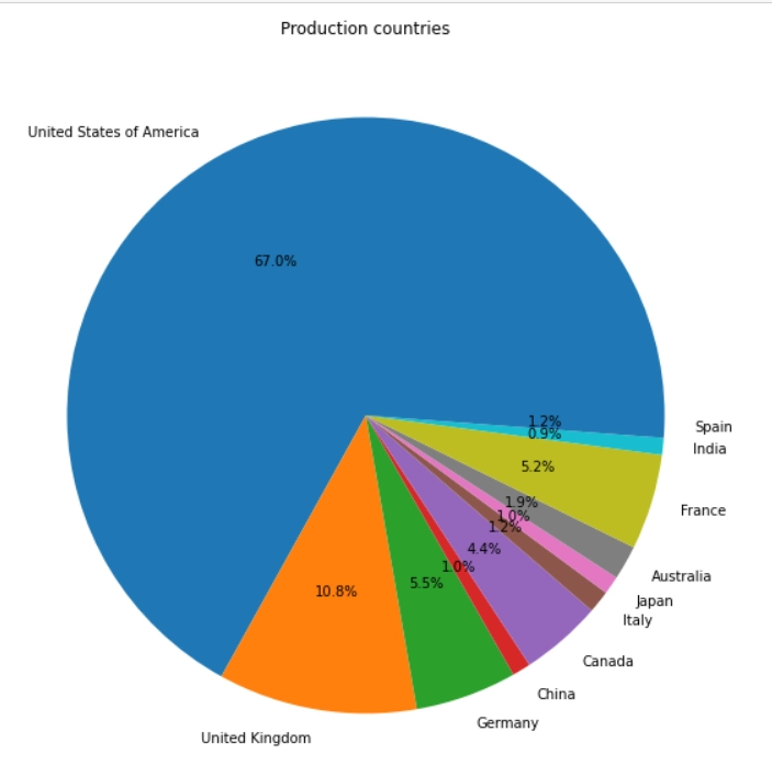
Displaying production countries using a Pie chart
Let us have a look at the production countries. We are going to use Pie chart from Matplotlib.
import json #import json
from collections import Counter #importing counter to make dictionary for country and its count
prod_countries_arr=[]
for string in data["production_countries"]:
    prod_coun_obj=json.loads(string) # converts the string to array of json objects
    for j in range(len(prod_coun_obj)):
        prod_countries_arr.append(prod_coun_obj[j]["name"])
countries_df=pd.DataFrame(prod_countries_arr,columns=['countries'])# making dataframe for production countries
countries_count_dict=Counter(countries_df["countries"])
countries_name=[]
countries_count=[]
for country_name in countries_count_dict:
    if(countries_count_dict[country_name]>50):
        countries_name.append(country_name)
        countries_count.append(countries_count_dict[country_name])
labels = countries_name
colors = sns.color_palette()
sizes= countries_count
#visualizing using pie chart
plt.figure(figsize = (10,10))
plt.title('Production countries')
plt.pie(sizes,labels=labels,colors = colors,autopct='%1.1f%%',textprops= {"fontsize": 10},shadow = False)
plt.show()
You can also try this code with Online Python Compiler
We see in the Pie chart that the United States of America is the largest production country, covering a massive 67% of all the movies produced.
The United States is followed by the United Kingdom with 10.8 %, which is so much less than The United States.
Among all the production countries, Italy, Japan, China, and India are among the lowest.
Budget of movies and their profit represented by a Bubble chart
Let us find out if films with high budgets make high profits or not. For this, we will use the Bubble chart. The size of the bubble represents the profit; that is, the bigger the bubble, the higher the yield. Consider the first 20 movies.
#Make a copy of the data
budget_profit=data.copy()
#Make a profit column
budget_profit["profit"]=budget_profit["revenue"]-budget_profit["budget"]
profit_of_movies=[]
budget=[]
movie=[]
colors = np.random.rand(20)
for i in range(20):
    profit_of_movies.append(budget_profit["profit"][i]/1000000)
    budget.append(budget_profit["budget"][i]/10000)
    movie.append(budget_profit["title"][i])
#Visualization using bubble chart
plt.figure(figsize = (10,5))
plt.scatter(movie, budget, s=profit_of_movies,c=colors,alpha=0.5)
plt.title("Budget of movies and their profit")
plt.xticks(rotation='vertical')
plt.ylabel("Budget (X 10000)")
plt.xlabel("Movie names")
plt.show()
You can also try this code with Online Python Compiler
What can we find out from the bubble chart given above?
From the above bubble chart, we can say that “Avatar” had a high budget, high revenue, and higher profit.
However, “John Carter” had more funding than “Avatar” but significantly less profit.
In this graph,“Pirates of the Caribbean: On Stranger Tides” has the highest budget.
“The Avengers” has less budget than “The Avengers: Age of Ultron” but it has more profit as its bubble is bigger.
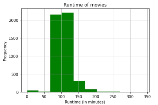
Showing frequency of runtime of movies on a histogram
What is the usual runtime for movies? Do people like long movies? Let us find out how long movies last. A movie dataset visualization would be incomplete without a histogram, so let’s use a histogram for this.
runtime_arr=[]
for minutes in data["runtime"]:
    runtime_arr.append(minutes)
#visualization using histogram
plt.hist(runtime_arr,color="green")
plt.title("Runtime of movies")
plt.xlabel("Runtime (in minutes)")
plt.ylabel("Frequency")
plt.grid()
plt.show()
You can also try this code with Online Python Compiler
What can we find out from the histogram given above?
Good thing the majority of the films have a runtime of around 130 minutes!
No movie exceeds 300 minutes.
We see that most movies have a runtime ranging from 90 minutes to 140 minutes.
The runtime around 0, 50, or 250 minutes are either of unreleased movies or just wrong data. We can remove such movies from the dataset so that they do not hinder our ML models.
1. When should we use a histogram or a bar graph? Answer: We use Bar charts to compare variables, while we use histograms to depict variable distributions. Bar charts plot categorical data, whereas histograms represent quantitative data with data ranges divided into bins or intervals.
2. When should we use a line graph?
Answer: We use Line graphs to track changes over short and long periods. When more minor changes exist, line graphs are better to use than bar graphs. We can use Line graphs to compare changes over the same period for more than one group.
3. What are the drawbacks of the histogram?
Answer: Histograms depend a lot on the number of bins and the variable's maximum and minimum. It doesn't allow the detection of relevant values. It is impossible to distinguish between continuous and discrete variables. It makes comparing distributions difficult. If you don't have all of the information in memory, it's harder to form.
Key Takeaways
In this blog, we did movie dataset visualization using the charts and graphs of Matplotlib and Seaborn libraries. We saw how to visualize the same data using different ways and finding the correlation between the features. We learned how to come up with questions and use the dataset and the dataset visualization techniques to see trends and patterns in the dataset at a glance and make our code more appealing and understandable to the eyes. In this movie dataset visualization project, there are many more features and trends yet to be explored. There is an assortment of graphs and charts used apart from the ones mentioned in this article. So, if you are keen to learn more about data visualization, check out our industry-oriented machine learning course curated by our faculty from Stanford University and Industry experts.
Live masterclass
Prompt Engineering: Must-have GenAI Skill for 30L+ Roles at Amazon
by Anubhav Sinha
16 Jul, 2026
12:30 PM
Using Netflix Data to Master Power BI
by Ashwin Goyal
13 Jul, 2026
12:30 PM
Top GenAI Skills to crack 30L+ CTC at Amazon & Google
by Sumit Shukla
14 Jul, 2026
11:30 AM
JioHotstar Sports Analytics using IPL Dataset
by Prerita Agarwal
15 Jul, 2026
12:30 PM
Prompt Engineering: Must-have GenAI Skill for 30L+ Roles at Amazon


 9+ registered

