Get a skill gap analysis, personalised roadmap, and AI-powered resume optimisation.
Introduction
People often don't know how to make Pie charts in Microsoft Excel and get confused. Are you also the one? You are in the right place.
This blog will not directly go through the theoretical procedure of making Pie charts, but we will first learn about Pie charts and their use. Furthermore, we will discuss making Pie charts in Microsoft excel of given data.
After reading this blog, you will know everything about Pie charts and how to make them. Knowing a Pie chart will help you to understand your data more efficiently.
So, won't you want to know how to make Pie charts in Microsoft excel?
Let's dive into the topic now to know more in detail.
What is Pie Chart
A chart is a tool in Excel that allows you to explain data visually. Charts help your audience understand the significance of data and make comparisons and trends much easier to perceive. There are many types of charts, but here we will focus on the Pie chart. Pie charts are used to show how each value (slice) contributes to a total (pie). One data series is always used in pie charts.
Use Of Pie Charts
Using pie charts, one column or row of spreadsheet data can be converted into a pie chart. Each data point (slice of pie) represents the size or percentage of that slice concerning the entire pie. When you only have one data series, pie charts work best.
Data Representation in Pie Chart
So, do you know how we create a Pie chart of given data? The steps below will show you how to make a Pie chart with similar results. We will utilize the data from the sample spreadsheet for this graph. You can either copy this data into your worksheet or create your own.
Let's start…
Births
Deaths
Suffered by diseases
2016
84
78
34
2017
73
56
56
2018
76
32
77
2019
63
34
89
2020
38
89
77
2021
67
67
45
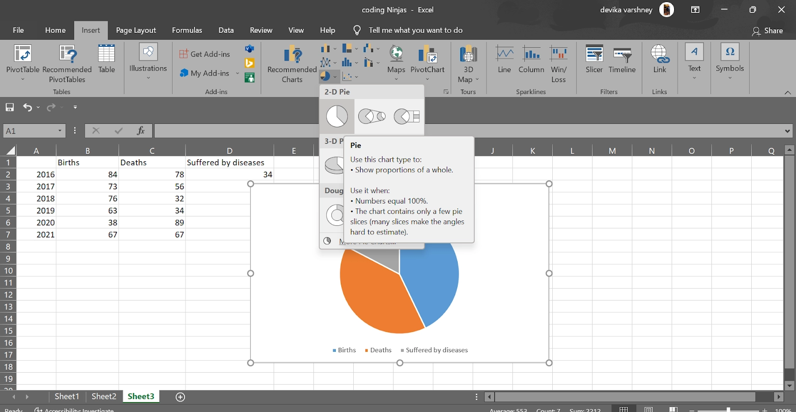
1. Select data range from A1:D2 to make a Pie chart for the 2016 series.
2. Now click on the Insert tab, then in the Charts group, click the Pie symbol.
3. Under the 2-D pie heading, click on the pie.
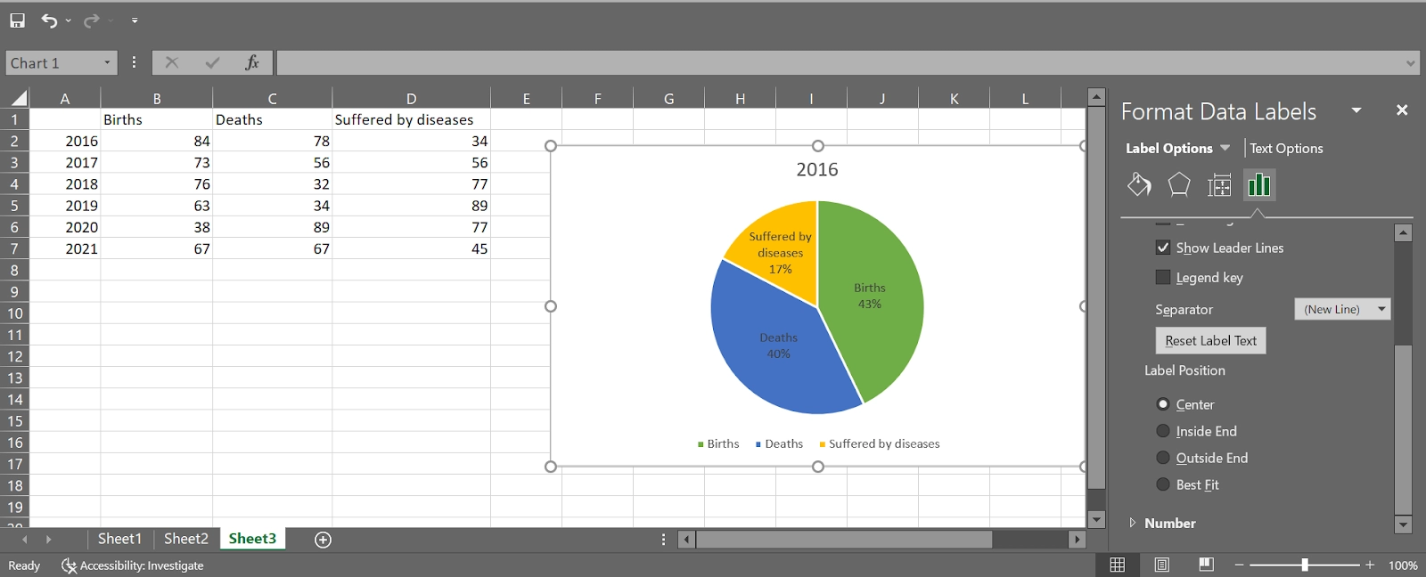
Final Result:
The data taken by us in 2016(Births, Deaths and Suffered by diseases) is now represented in the form of pie chart. Likewise, we can make individual pie charts for the rest of the years.
FAQs
1. How to change the color of the Pie chart?
Change the color scheme of the pie chart by clicking the paintbrush icon on the right side of the chart.
2. How to format a Pie chart to represent the Percentage, Category Name of every part?
Click on add data label by right-clicking the pie chart and then right-click the pie chart and select Format Data Labels. Click Center after checking Category Name, unchecking Value, and checking Percentage.
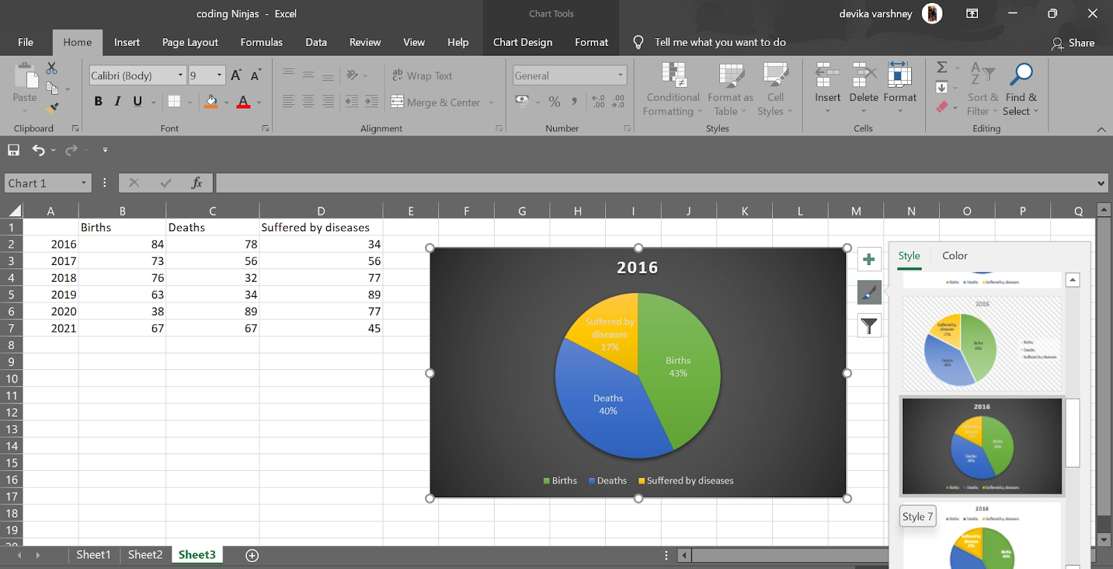
3. How can we use the Pie chart style?
You can apply various chart themes (also known as styles) to your bar chart in Microsoft Excel. To use them, first select your chart, then click the "Chart Styles" icon on the right, which resembles a paintbrush.
A drop-down menu will appear under the "Style" area with a range of style possibilities. Change the visual appearance of your chart by choosing one of these styles, which includes modifying the bar arrangement and background.
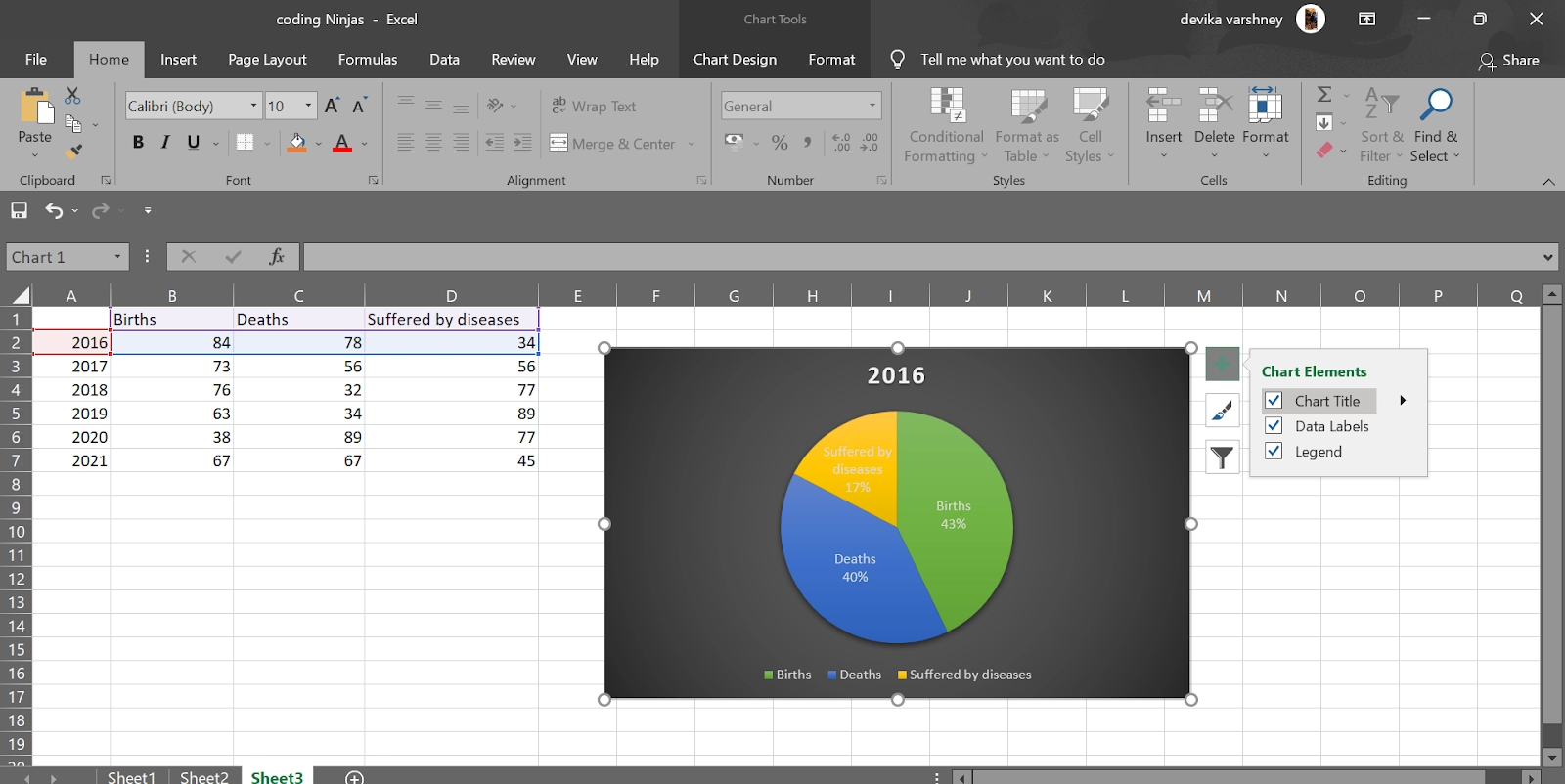
4. How can we remove the Pie chart title?
If you wish to delete the chart title, choose your chart and click the "Chart Elements" icon on the right, graphically represented by a green "+" sign. To deselect the "Chart Title" option, click the checkbox next to it.
5. How can we format legends of the Pie Chart?
Right-click the legends and select the format legend button. Now, you can make changes as you want.
Key Takeaways
In this article we have extensively discussed the topic of a Bar chart. Furthermore, we learned how to represent our data in the Bar chart.
We hope that this blog has helped you enhance your knowledge regarding encryption and if you would like to learn more, check out our articles on Line chart and Bar chart. Do upvote our blog to help other ninjas grow.


 9+ registered

