Do you think IIT Guwahati certified course can help you in your career?
Introduction
Hello, Ninjas! In today’s article, we will create Python histograms using the powerful Matplotlib library. We will explore different approaches and functions to create Python histograms. Let’s elevate our data analysis game and unlock valuable insights with this must-read article.
Before delving into approaches to creating a histogram, let’s start with the types of plots existing.
Types of Plot
The different types of plots which can be used to plot the data are -
Histogram
Line Plot
Bar Chart
Scatter Point
Area Plot
Pie Chart
Today’s discussion will revolve around Histograms.
What is a Histogram?
Histogram is a type of visual data representation in which we organize the group of data according to given ranges. In the histogram, we plot bars (groups of data points) that tell about the frequency or occurrence of a particular interval in an area diagram. The height of the rectangular bars is proportional to the frequency.
Creating a Matplotlib Histogram
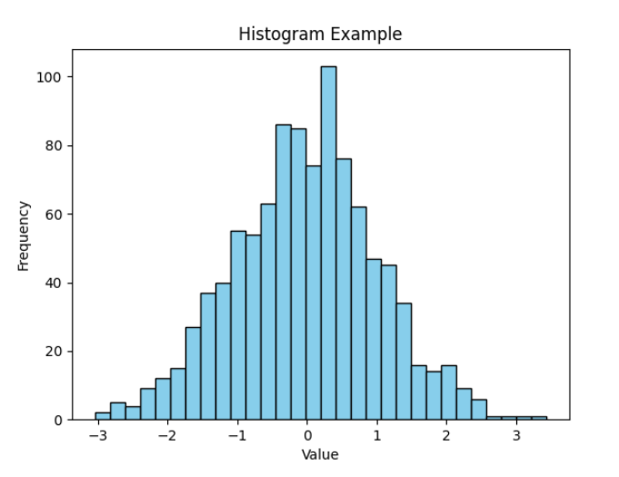
Creating a histogram in Python using Matplotlib is a straightforward process. Matplotlib is a popular data visualization library that provides a wide range of plotting functions, including histograms. Here's a simple example of how to create a histogram using Matplotlib:
import matplotlib.pyplot as plt
import numpy as np

# Generate random data for the histogram
data = np.random.randn(1000)

# Create a histogram
plt.hist(data, bins=30, color='skyblue', edgecolor='black')

# Add labels and title
plt.xlabel('Value')
plt.ylabel('Frequency')
plt.title('Histogram Example')

# Show the plot
plt.show()
Output
Explanation
In this example, we import the necessary libraries: matplotlib.pyplot for plotting and numpy to generate random data. We generate random data using numpy (np.random.randn(1000) in this case). We use plt.hist() to create the histogram. The bins parameter specifies the number of bins, and color and edgecolor set the color of bars and their edges. Labels and a title are added using plt.xlabel(), plt.ylabel(), and plt.title(). Finally, we display the plot using plt.show().
When to use Histogram?
Histograms are best used in the following scenarios -
When we need to summarize the data.
To Compare the frequency of a specific group of data with other groups.
To know the most or least frequently occurred interval.
When we need an idea about the probability distribution of the given data.
Before creating a Python histogram using Matplotlib, we must know some essential functions and their usage to generate a histogram successfully.
Essential Functions
The essential functions needed to plot any histogram are -
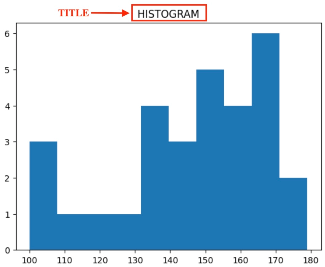
The Title Function
This function is used to give a title to any histogram that we are creating. It takes a string as input and prints the title at the top-middle of the histogram.
Syntax
The syntax for the title function is:
library_import_name.title()
Example
In the image below, The title() function sets the heading of the histogram.
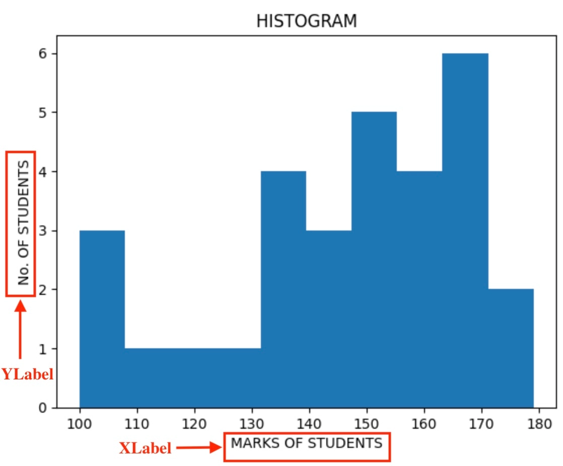
The Axis Labelling Functions
As their name suggests, the axis labeling functions are used to label the x and y-axis of the histogram. They take a string as input and print the x and y-axis labels at the middle of these axes.
As you can see in the image below, the x and y axes are labeled.
The Show Function
As its name suggests, the show() function is used to print or depict any image or figure, here, a histogram.
Syntax
The syntax for the show function is:
library_import_name.show()
Example
As you can notice in the image below, the show() function helped to print this histogram.
Histogram Function
This is the most crucial function used while creating any histogram, as it helps to create the histogram. It takes two arguments: the array of numbers (or data) and the array of intervals or bins in which this data’s frequency will be divided.
Syntax
The syntax for the Histogram creation function is:
library_import_name.hist()
Example
As we can notice in the image below, the data could be plotted as a histogram due to the hist() function only.
There are various parameters taken by the .hist() function that provides flexibility in customizing the histogram plot according to the needs. Let’s look at them one by one:
Attribute
Description
list
It is an array or a list of integers that are to be plotted on a histogram.
bins
Specify the number of intervals in which the data is to be divided. It is an optional parameter.
density
It normalizes the bins heights so that the integral of the histogram comes out to be 1. It is an optional parameter of boolean type and default value as ‘false’.
range
Represents the lower and upper bound of bins and is not provided, taken as (list.min(), list.max()). Both extreme values are not considered. It is an optional parameter of type ‘tuple’ having a default value of ‘None’.
histtype
Used to create histograms of different types. Eg: ‘bar’, ‘stacked’, ‘step’, ‘stepfilled’. Its default value is ‘bar’.
align
Controls the positioning of bars relative to bin edges. It centers the bar on the left, between, or right of bin edges.
weights
Specify an array of weights for each value of data in ‘list’.
label
Used to provide a string or sequence of strings that can match multiple datasets.
stacked
Return ‘True’ if multiple data are stacked on top of each other.
color
Sets the color or sequence or sequence of color specifications for the bars.
log
Holds a ‘true’ value if the histogram axis is set on a logarithmic scale.
rwidth
Specify the relative width of bars with respect to bin width.
orientation
Determines the orientation of the bars.
The Tick Marks Function
The ticker marks function is used to label the x-axis with the given interval values. In the histogram, it is used to depict the values where the particular interval ends. It takes in an array of intervals and marks the x-axis with the same.
Syntax
The syntax for the tick marks function is:
library_import_name.xticks()
Example
The xticks() function clearly defines the ending and starting of each interval in the image below.
Before starting with the approaches, let’s go through the important pre-requisite needed to be able to plot histograms easily.
Matplotlib Package
Matplotlib provides a library that can be used to plot graphs and create visualizations in Python. It is important to install the matplotlib package as it helps in data visualization. You can install the matplotlib package easily in MacOS, windows, or Linux by using the following command pip command -
Once you have installed the matplotlib package, you have to import it into the Jupyter Notebook or Python Script by using the following command -
from matplotlib import pyplot as plot
Through using this command, you can access the functionalities provided by matplotlib to create a variety of plots and visualizations. The matplotlib also provides a range of customization options through which we can enhance the look of the plot. It helps you customize the color of the bars, labels, titles, and many more.
Histogram In Python Using Matplotlib
There are different ways to plot a Python histogram using the matplotlib (plotting library). Let’s look at each one of these one by one -
Approach 1
We import the pyplot module available in the matplotlib library as plot.
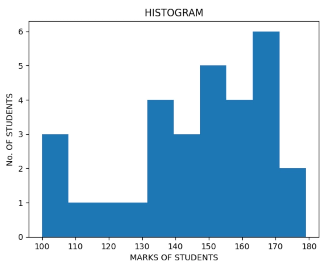
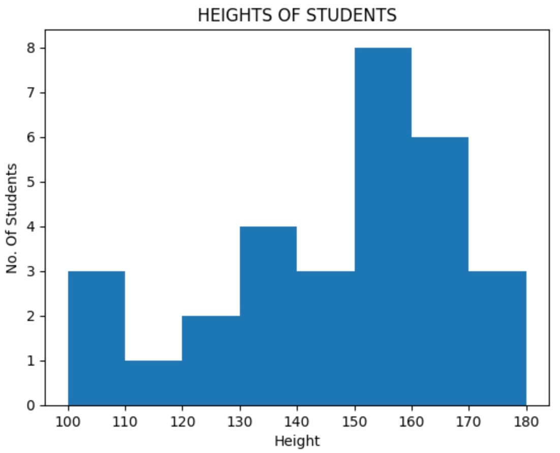
Then we take values (height of students) as input in the form of an array, say, [100, 101, 102, 111,121, 129, 135, 136, 137, 138, 140, 141, 147, 150, 151, 152, 153, 154, 157, 158, 159, 162, 165, 166, 167, 169, 168, 171, 174, 179].
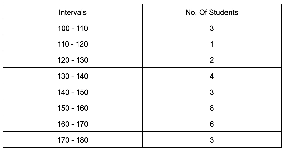
Now we divide these values into intervals of equal size. We can divide the values(or marks) in any number of intervals, here we divide it in 8 intervals from 100 to 180.
So, according to these intervals, the heights of students are distributed. The table portraying the same is (based on the taken example)- In the histogram, the x-axis will have the count of students, and y axis will represent the intervals.
5. To represent these values on a histogram, we use plot.hist().
6. We set the title of the histogram by using the plot.title() function.
7. We can also name the x and y axis according to our needs by using the plot.xlabel() function and plot.ylabel() functions, respectively.
Code
# Importing matplotlib
from matplotlib import pyplot as plot

# Inserting data
height_of_students = [100, 101, 102, 111,121, 129, 135, 136, 137, 138, 140, 141, 147, 150, 151, 152, 153, 154, 157, 158, 159, 162, 165, 166, 167, 169, 168, 171, 174, 179]

# Creating the internals
intervals = [100, 110, 120, 130, 140, 150, 160, 170, 180]

# Title of histogram
plot.title(" HEIGHTS OF STUDENTS ")

# Creating histogram using hist() function
plot.hist(height_of_students, intervals)

# Labeling the x and y-axis
plot.xlabel("Height")
plot.ylabel("No. Of Students")

# Printing histogram
plot.show()
Output
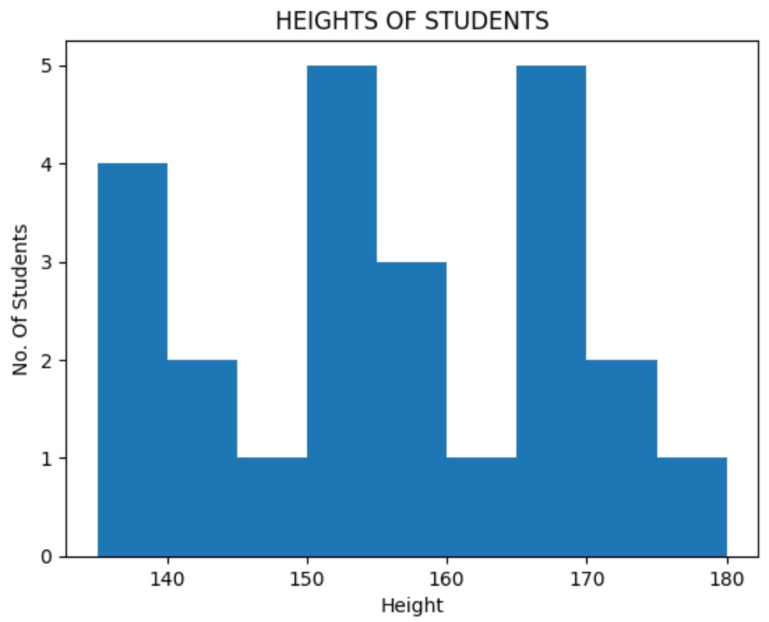
Now, as you can see, it is very confusing as we cannot determine where the particular interval ends, as seen from the histogram. To rectify this, we use the plot.xticks() functions. That brings us to the second approach.
Approach 2
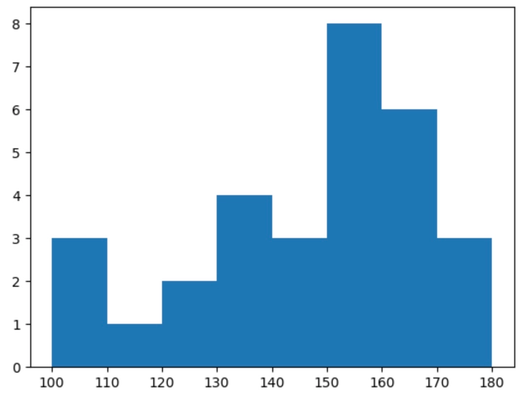
In this approach, we use the plot.xticks() function to clearly mark the interval points on the x-axis (The rest of the code and approach remain the same ).
Code
# Importing matplotlib
from matplotlib import pyplot as plot

# Inserting data
height_of_students = [100, 101, 102, 111,121, 129, 135, 136, 137, 138, 140, 141, 147, 150, 151, 152, 153, 154, 157, 158, 159, 162, 165, 166, 167, 169, 168, 171, 174, 179]

# Creating the internals
intervals = [100, 110, 120, 130, 140, 150, 160, 170, 180]

# Title of histogram
plot.title(" HEIGHTS OF STUDENTS ")

# Creating histogram using hist() function
plot.hist(height_of_students, intervals)

# Labeling the x and y-axis
plot.xlabel("Height")
plot.ylabel("No. Of Students")

# Using the sticks () function to distinguish between the ending of each interval
plot.xticks([100, 110, 120, 130, 140, 150, 160, 170, 180])

# Printing histogram
plot.show()
Output
Therefore, here, we can clearly see the division of marks according to provided intervals.
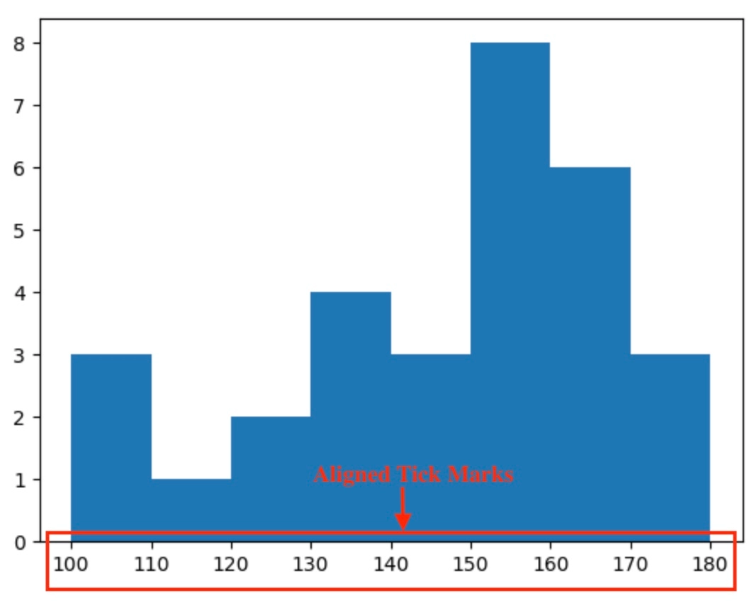
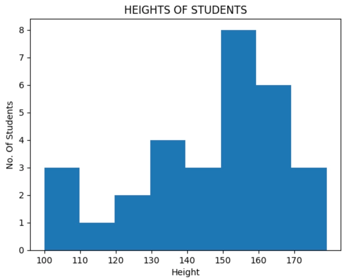
But it seems tedious to add the tick marks every time we plot a histogram. So to rectify this, we use the bins. This brings us to the third approach.
Approach 3
In this approach, we use the bins to ease the task of marking the intervals on the x-axis. The bins divide the intervals into N intervals(N being provided). We can also provide it with the range of integers in the form of a list of how we want the intervals to be. The N or number of intervals can be interpreted by the no. of rows we used in Table 1. Instead of mentioning the whole array in the xticks() function, we just need to pass the bins as the argument.
Code
# Importing matplotlib
from matplotlib import pyplot as plot

# Inserting data
height_of_students = [100, 101, 102, 111,121, 129, 135, 136, 137, 138, 140, 141, 147, 150, 151, 152, 153, 154, 157, 158, 159, 162, 165, 166, 167, 169, 168, 171, 174, 179]

# Creating the internals
intervals = [100, 110, 120, 130, 140, 150, 160, 170, 180]

# Title of the histogram
plot.title(" HEIGHTS OF STUDENTS ")

# Labeling the x and y-axis
plot.xlabel("Height")
plot.ylabel("No. Of Students")

# Providing bins with the list of range in which we want the intervals to be divided.
# 10 here represents the gap
bins = list(range(100,180,10))

# Creating histogram using hist() function
#here we provide bins the no. of piece it should divide the given interval in.
plot.hist(height_of_students, bins = 8)

# Passing bins as argument to xticks function so tha tit marks the x axis accordinly.
plot.xticks(bins)

# Printing histogram
plot.show()
Output
Frequently Asked Questions
Can one plot multiple histograms on the same graph?
Yes, matplotlib allows you to plot multiple histograms in a single graph.
Are there any alternative libraries to Matplotlib for creating a histogram?
Though matplotlib is widely used for data visualizations, we can also use Seaborn, Plotly, and Pandas, which have their unique features.
Can one customize the appearance of the histogram created with Matplotlib?
Yes, matplotlib offers a wide variety of customization options, including adjusting colors, number of bins, title, etc.
Are there other plots available in Python for data visualization?
Yes, Python offers a diverse set of plots besides histograms.
What is the purpose of a histogram in data analysis?
Histograms are used to represent the frequency distribution of a given dataset visually.
Conclusion
In this article, we explored the world of Python histograms using the Matplotlib library. We learned some essential functions needed to create a histogram and discovered various methods to create a histogram in Python. We learned how effectively we can visualize the given data and gain insights from the datasets.


 9+ registered

