Examples of Radar Chart construction
Below is our dataset. We'll use it to demonstrate how we can build a radar chart. In a real-world situation, you'll probably have really big datasets, and this dataset is just a dummy dataset to illustrate the process.
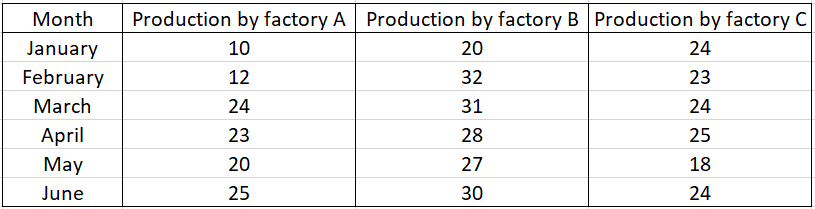
The above data is used to compare the production among factories A, B and C. All three of them are identical, but their production varies. We can use a radar chart to easily compare and find the best factory performance for a month.
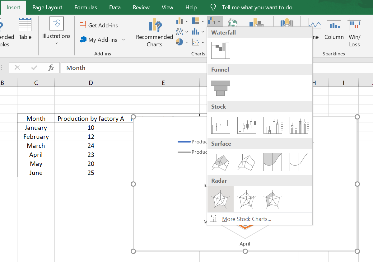
Select the table of cells with the relevant data where you want to apply a radar chart.
After selecting the relevant cell, click on Insert Tab->Radar chart dropdown (in the chart section) and select the normal Radar Chart (from among the three options Radar, Radar with markers and Filled Radar chart). You have now created a simple radar chart.
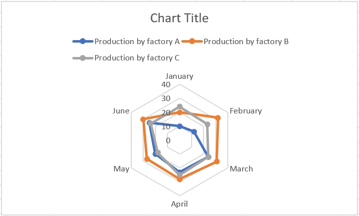
Here we have the normal radar chart.
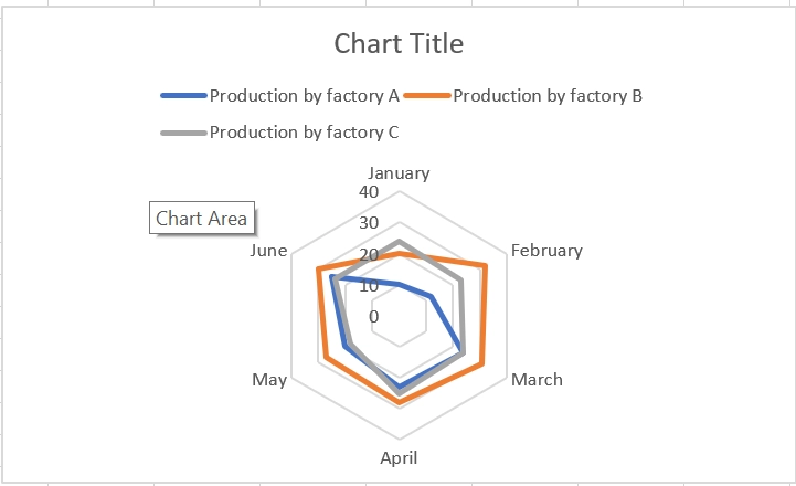
Normal Radar chart
The other radar charts, i.e., Radar with markers and filled Radar, are also given below for the above data.
Radar chart with markers
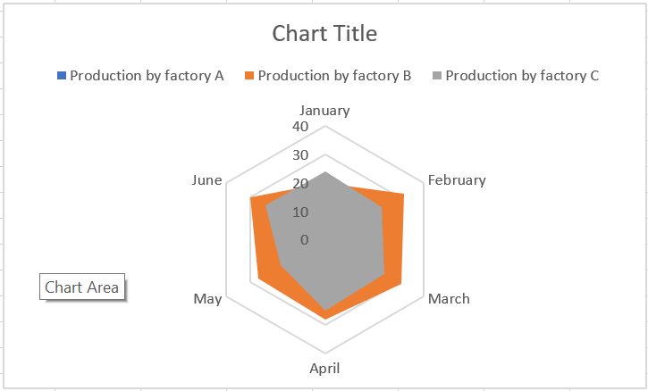
Filled Radar chart
The radar charts have their own pros and cons and we’ll be discussing those in the coming section.
Advantages and disadvantages of Radar Charts
This type of chart works well when we have to compare certain parameters/categories across a known performance standard. For example, let's say a teacher wants to compare a student's scores to the average of the class in each subject. This can be easily achieved, and the teacher can easily tell from the results the subjects that need more work for each student. It can also help parameters/categories that might not be directly comparable.
It's important to recognize that these comparisons can become messy if you have a lot of variables. The overlapping polygons can become difficult to distinguish as the variables grow very large. Below is an example of when this situation occurs.
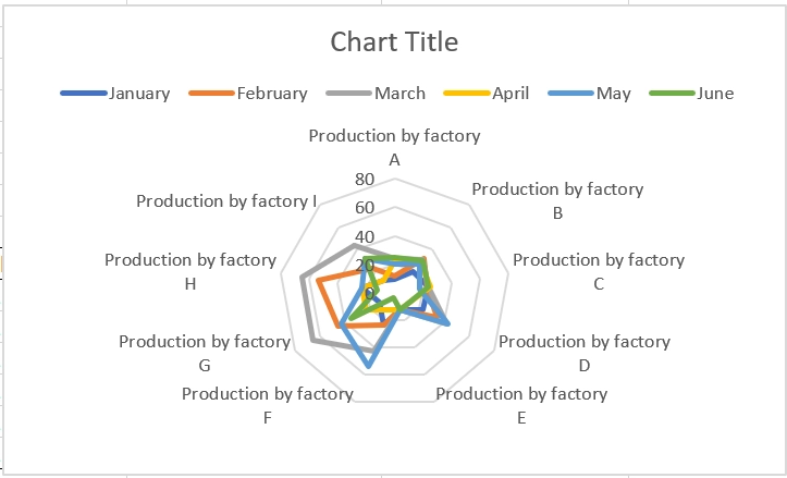
It’s very hard to compare the production between too many variables.
The variables measured in different units can also make the graph hard to understand.
FAQs
1. What are the different names used for radar charts?
The other names often used are spider chart, web chart, spider-web chart, star chart, Kiviat diagram, etc.
2. How to edit and format a radar chart?
To do this, select the chart -> click on the '+' on the top right of the chart -> hover over the chart element that needs to be edited -> click on the black arrow that appears to the right of the element -> Click on more options -> The format window for the chart element appears.
You can also add styling and colour by selecting the paintbrush icon below the '+' symbol.
3. Advantages of learning excel?
It's a good way to store and visualize data. Here you can perform calculations and easily print reports. It's often a useful skill in various jobs and often required.
4. How to remove formatting from a cell or a group of cells?
Select the cells where you want to remove the formatting and press Alt + H + E + F to remove formatting from the selected cells.
5. How can we select and delete a column or a row in a worksheet?
Press Ctrl + Spacebar (for selecting column) and Shift + Spacebar (for selecting row) key to select a column and Ctrl + '-' to delete the selected row/column.
Key Takeaways
This article extensively discusses building radar charts for your data in excel and their applications. They can be used to compare different variables for the same parameter/category and provide an easy to understand graphical representation of the data. Refer to introduction to excel to learn more about excel. It's best to start with an understanding of excel as a beginner. After the previous article, refer here to learn more about worksheets in excel, area charts.
Refer to our guided paths on Coding Ninjas Studio to learn more about DSA, Competitive Programming, JavaScript, System Design, etc.
Enrol in our courses and refer to the mock test and problems available.
Take a look at the interview experiences and interview bundle for placement preparations.
Do upvote our blog to help other ninjas grow.
Happy Coding!


 8+ registered

