Table of contents
1.
Introduction
2.
Props of Button
3.
Code Implementation
4.
Frequently Asked Questions
4.1.
How do buttons work in react-native?
4.2.
Can we add style to Button in react-native?
4.3.
How do I disable a button?
5.
Conclusion
Last Updated: Mar 27, 2024

React Native Buttons

Author soham Medewar
0 upvote
Career growth poll
Do you think IIT Guwahati certified course can help you in your career?

Introduction

Users engage with mobile apps mostly through touch. They can do various actions such as pressing a button, scrolling through a list, or zooming in on a map. React Native includes components for a wide range of basic gestures, as well as a robust gesture responder system for more complex gesture recognition.

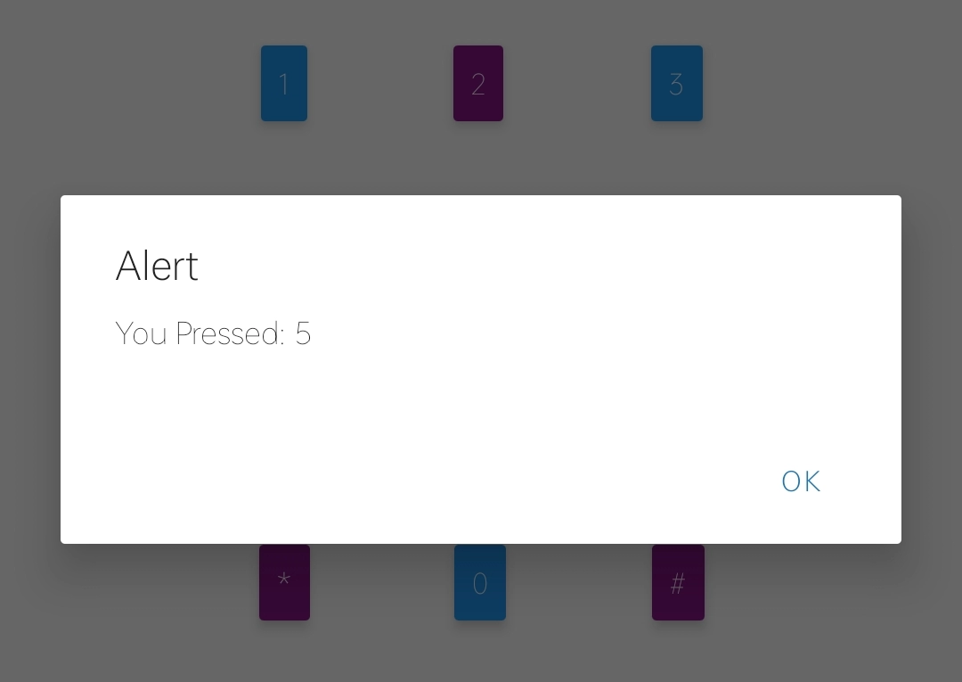
A simple button component that should look well on any platform. Allows for a limited amount of customization.

If the basic button does not suit your project, you may create your own by combining it with any of the "Touchable" components given by React Native. The "Touchable" components can capture tapping movements and provide feedback when a gesture is recognized.

To know more about touchables, visit here.

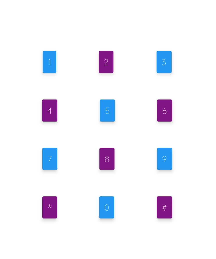
Here we will build a simple UI for a mobile keypad using react native buttons.

Before going on to the implementation part, I will tell you about the setup. I will be writing code on the expo platform, which makes debugging code easier. You just need to sign up to the site and create a random project.

Also read, React devtools

Props of Button

Prop Type Required Functionality
onPress function yes Handler to be called when the user taps the button.
title string yes Text inside the button.
accessibilityLabel string no Text to display for blindness accessibility features.
accessibilityActions array no Accessibility actions allow assistive technology to call a component's activities programmatically.
onAccessibilityAction function no When the user makes accessibility actions, this method is called. This function takes only one argument: an event specifying the name of the action to perform.
color color no Color of the button.
disabled boolean no If true, disable all interactions for this component.
hasTVPreferredFocus boolean no TV preferred focus.

For more props, refer to the official site of react-native-button.

Code Implementation

import React, { Component } from 'react';
import { Button, StyleSheet, View } from 'react-native';

export default class ButtonBasics extends Component {
  _onPressButton(num) {
    alert('You Pressed: '+num)
  }

  render() {
    return (
      <View style={styles.container}>
        <View style={styles.alternativeLayoutButtonContainer}>
          <Button
            onPress={() => this._onPressButton(1)}
            title="1"
          />
          <Button
            onPress={() => this._onPressButton(2)}
            title="2"
            color="#841584"
          />
          <Button
            onPress={() => this._onPressButton(3)}
            title="3"
          />
        </View>
        <View style={styles.alternativeLayoutButtonContainer}>
          <Button
            onPress={() => this._onPressButton(4)}
            title="4"
            color="#841584"
          />
          <Button
            onPress={() => this._onPressButton(5)}
            title="5"
          />
          <Button
            onPress={() => this._onPressButton(6)}
            title="6"
            color="#841584"
          />
        </View>
        <View style={styles.alternativeLayoutButtonContainer}>
          <Button
            onPress={() => this._onPressButton(7)}
            title="7"
          />
          <Button
            onPress={() => this._onPressButton(8)}
            title="8"
            color="#841584"
          />
          <Button
            onPress={() => this._onPressButton(9)}
            title="9"
          />
        </View>
        <View style={styles.alternativeLayoutButtonContainer}>
          <Button style={styles.customButton}
            onPress={() => this._onPressButton("*")}
            title="*"
            color="#841584"
          />
          <Button
            onPress={() => this._onPressButton(0)}
            title="0"
          />
          <Button
            onPress={() => this._onPressButton("#")}
            title="#"
            color="#841584"
          />
        </View>
      </View>
    );
  }
}

const styles = StyleSheet.create({
  container: {
  flex: 1,
  justifyContent: 'center',
  },
  alternativeLayoutButtonContainer: {
    marginHorizontal: 40,
    marginVertical: 20,
    flexDirection: 'row',
    justifyContent: 'space-evenly'
  },
});
You can also try this code with Online Javascript Compiler
Run Code

Output

Whenever you press any button, you will get the following output.

Also see,  React Native Reanimated

Read More, React Native Paper

Frequently Asked Questions

How do buttons work in react-native?

One of the components that work on its click is a button. The React Native Button is a simple component that is activated by clicking it. It imports the react-native Button class.

Can we add style to Button in react-native?

The <Button /> component in React Native doesn't accept a style prop, and the color prop is limited and appears differently on Android, iOS, and the web. We may make custom buttons that match the look of our app using the <Pressable /> component.

How do I disable a button?

To disable a button using only JavaScript, you need to set its disabled property to false. For example, disabled = true.

Conclusion

In this article, we have discussed buttons in react native and also implemented a small keypad using react native buttons.

Want to learn more about web development or android development? Here is an amazing course for both by coding ninjas.

Happy Learning!

Live masterclass