


Introduction
Suppose you are a developer. Sometimes you have to deal with web development or simply HTML and CSS. In that case, you must have faced difficulty arranging the layouts and positions of elements.
In some scenarios, if you want to arrange all the elements towards the left, center, or right, you have to do it individually for every element. So is there any better way to efficiently handle the layout and positioning of elements?
The answer is Yes. We can use the Flexbox property to arrange the elements together and quickly. We will learn all about flexbox while preceding further in the blog, so let's get on with our topic without wasting any time.
Click on the following link to read further: Hooks in React JS
FlexBox and its Properties
Flexbox is an option available in CSS that enables you to manage layouts based on rows and columns. This is the default way to manage layouts in react. It is used in mobile development as it can be used to adjust our layout for different screen sizes and is also responsive.
Properties of FlexBox
In this section, we will have a brief introduction to the properties of the flexbox. We will learn all of them with examples in a different blog section.
Flex direction
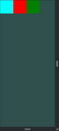
flex-direction is the property of flex that controls the order in which the flexbox items will be arranged. There are mainly four directions or values which can have. By default, the direction of flex is row.
- Row: the elements will arrange in left to right order according to their size. And if they have to wrap, then the following line will start under the first item of the previous row.
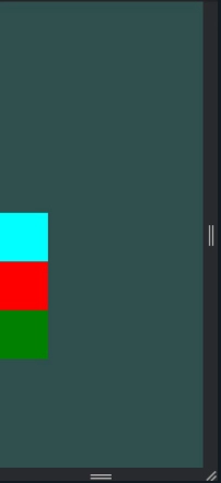
- Column: The items will be arranged in the top to bottom order. And if they have to wrap, then the following line will start in the right direction of the last line.
- Column- reverse: As the name suggests, it works in the opposite direction of the column, i.e., in this, items will align in the bottom to the top order. And in the case of wrapping, it will start from the bottom of the container in the right direction of the last line.
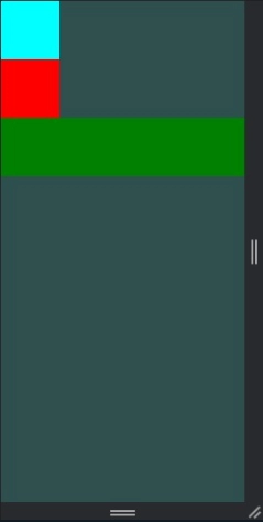
- Row-reverse: This is the opposite of row as it aligns the items in the right to left order, and in the case of wrapping, the next line will start to form the right side of the container and below the last line.
Justify Content
This property defines or describes how the children will align with the central axis of the parent container. It will also be responsible for the different spaces between children inside the parent container. This property has different values that we can use as developers, which we will learn here.
- Flex-start: It is the default value of justify-content in which it arranges or aligns the items in the direction of flex of the central axis.
- Flex-end: The items will be arranged at the opposite end of the container's central axis.
- Space-between: Align the children in the main direction with equal spaces between all of them.
- Space-around: It will arrange the children evenly along the container's main axis. In this, the half-space of the total space between children will be at the start of the flex and another half at last.
- Space-evenly: The children will be arranged in equal space along with the main axis start and end.
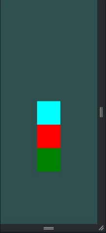
- Center: It will align the children in the container's main axis center.
Align Items
It will describe how the children will arrange themselves in the container. It is pretty similar to justify-content, but the difference between them is that justify-content arranges the items along the central axis and align items will arrange them in a cross axis.
- Stretch: The children will be stretched to match the container’s height along the cross axis.
- Flex-start: It will arrange the children at the start of the container along the cross axis.
- Flex-end: The items will be arranged at the end of the container along the cross axis.
- Center: Align the children along the center of the cross axis.
- Baseline: It will align the children along the standard baseline of the cross axis. Each element can be adjusted accordingly.


 18+ registered

