Do you think IIT Guwahati certified course can help you in your career?
Introduction
React-Toastify emerges as a remarkable library for orchestrating sleek notifications within React applications, fostering enhanced user engagement. This article unfurls the essence of React-Toastify, elucidating its installation, a diverse range of notification types, salient features, and practical implementations, all while shedding light on the advantages and drawbacks it holds.
In this blog, we will learn about react toastify and will explore more about its core concepts.
What is React Toastify?
React Toastify is a popular library for creating toast notifications in React applications. Toast notifications are non-intrusive messages that inform users about events, actions, or alerts. React Toastify simplifies the process of implementing and customizing toast notifications in a React project.
Why Toastify?
User-Friendly Alerts: Toast notifications provide a user-friendly way to convey information without interrupting the user experience.
Customization: React Toastify offers a high degree of customization, allowing developers to tailor notifications to match the application's design.
Ease of Use: With a simple API, React Toastify is easy to implement and suitable for developers of all levels.
Responsive Design: Ensures that toast notifications work seamlessly across various screen sizes and devices.
Community Support: Being a popular library, React Toastify benefits from an active community, ensuring updates and support.
Install Toastify
Kickstart your journey with React-Toastify through a seamless installation process. Execute the following command to install the library:
npm install react-toastify
Next, import the necessary CSS file to ensure the correct styling of the notifications:
import 'react-toastify/dist/ReactToastify.css';
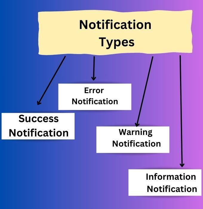
Types of Toast Notification
React-Toastify provides a broad spectrum of notification types to cater to varying informational needs:
Success Notification:
Signals successful completion of operations.
toast.success("Profile updated successfully!");
Error Notification:
Alerts users about errors or issues
toast.error("Failed to load data!");
Warning Notification:
Provides important reminders or warnings.
toast.warn("Your password will expire in 3 days!");
Information Notification:
Disseminates general information or updates.
toast.info("A new version is available for download.");
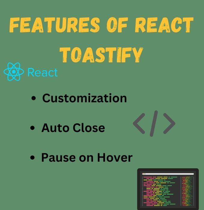
Features of React Toastify
React-Toastify is imbued with features enhancing the notification experience:
Customization: Tailor the appearance and behavior of toasts.
Auto Close: Set a duration for toasts to disappear automatically.
Pause on Hover: Pause the auto-close timer on hover, providing ample time for user interaction.
Animation Effects: Supports various animation effects for a visually appealing user experience.
Positioning: Allows placement of toast notifications at different positions on the screen.
Timeouts: Provides control over the duration each toast notification is displayed.
How to Prevent Multiple Toasts?
In React Toastify, preventing multiple toasts can be achieved by utilizing the toastId property. Each toast notification is assigned a unique toastId by default. When creating a new toast, the library checks if a toast with the specified toastId already exists. If it does, the existing toast is updated instead of creating a new one. This mechanism prevents the stacking of identical toasts, ensuring a cleaner and less cluttered display. For example,
import { toast } from 'react-toastify';
const showToast = () => {
 toast('This is a toast message', {
   toastId: 'unique-toast-id', // Specify a unique toastId
 });
};
By setting a custom toastId, developers can control the uniqueness of each toast and avoid unnecessary duplication.
Use Transitions and Animation for Toasts
React Toastify provides built-in support for transitions and animations, allowing developers to enhance the visual appeal of toast notifications. Transitions can be applied to the entrance and exit of toasts, creating smooth and visually pleasing effects. There are several key transition features:
Entrance Animation: Customize the animation when a new toast appears.
Exit Animation: Define the animation when a toast is dismissed or fades out.
Timeout and Close Button: Set the duration for the toast to stay visible, and provide a close button for user interaction.
For example,
import { toast } from 'react-toastify';
import 'react-toastify/dist/ReactToastify.css';
const showToastWithTransition = () => {
 toast('Animated toast!', {
   transition: Slide, // Specify the transition effect
   closeButton: true,
   autoClose: 2000, // Set the timeout in milliseconds
 });
};
By incorporating transitions and animations, React Toastify enables developers to create a more engaging and polished user experience with visually appealing toast notifications.
Limiting Number of Toasts
Enhance user experience by limiting the number of toasts shown at a time:
// Limiting the number of toasts
<ToastContainer limit={3} />
Adding a Swipe or Drag to Dismiss Feature:
Engaging user interfaces often come with intuitive gestures to perform actions swiftly. React-Toastify accords with this notion by offering a built-in feature to dismiss notifications with a swipe or drag action. This gesture-based dismissal is not only engaging but also provides a quick and easy way for users to manage notifications on the screen.
// Swipe or Drag to Dismiss
toast("Swipe me to dismiss!", { draggable: true });
Practical Examples and Edge Cases
React-Toastify shines in real-world scenarios, like in a social media app where notifying users about new messages or updates is crucial. Edge cases, such as handling multiple notifications, are adeptly managed by React-Toastify.
// Multiple notifications example
for (let i = 0; i < 5; i++) {
    toast.info(`Notification number ${i + 1}`);
}
Advantages and Disadvantages
React-Toastify, while powerful, comes with its set of pros and cons.
Advantages
Ease of use and customization.
Enhances user interaction through timely feedback.
Disadvantages|
Learning curve for mastering customization options.
Framework dependency: Anchored to React.
Frequently Asked Questions
Can React-Toastify handle a queue of notifications?
Yes, it manages a queue, displaying notifications in an orderly manner.
Is the swipe-to-dismiss feature built-in?
Yes, simply set the draggable prop to true to enable this feature.
Is React-Toastify suitable for large-scale applications?
Absolutely, its flexibility and feature-rich nature make it apt for large-scale implementations.
Conclusion
React-Toastify is a sterling choice for developers keen on elevating user interaction through clear, engaging notifications in React applications. Its array of features, ease of use, and the ability to cater to real-world scenarios make it a noteworthy library for enhancing user experience. As React-Toastify continues to evolve, it promises a trajectory of enriched features and better integration, cementing its place in the toolkit of adept developers.


 9+ registered

