Creating a Scatter Plot in Excel
With the source data perfectly organized, making a scatter plot takes only the following two quick steps:
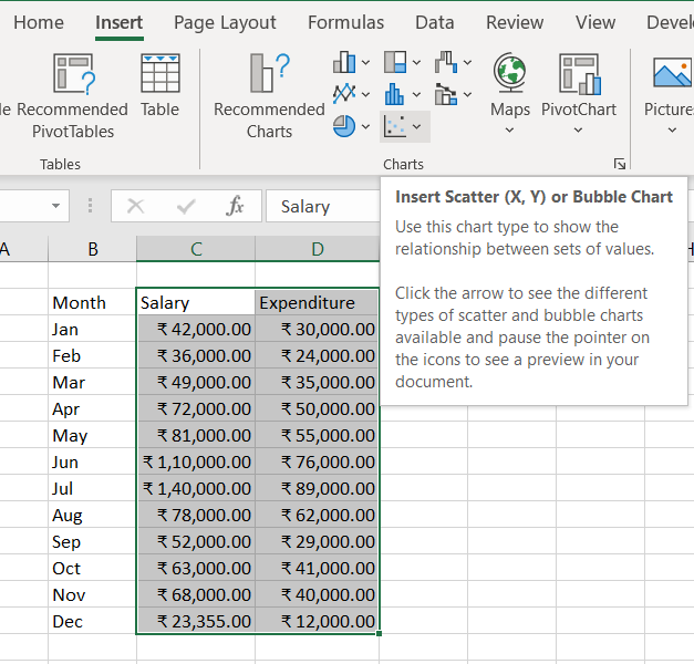
- Select the two columns with numeric data (including the column headers). In our example, it is the range C2:D14. Do not select any other columns such that to avoid confusing Excel.
- Go to the Insert tab > Chats group, select the Scatter chart icon as shown in the figure, and select the desired template. Click the first thumbnail to insert a classic scatter graph:
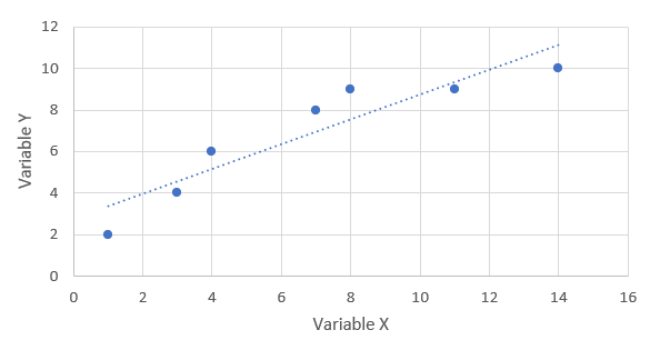
Scatter Plot:

Scatter chart types
We can characterize scatter plots into the following types:
- Scatter: Only contains markers at the desired point.
- Scatter with Smooth Lines and Markers: Contains markers joined by a smooth line.
- Scatter with Smooth Lines: Contains a smooth like with no visible markers.
- Scatter with Straight Lines and Markers: Contains markers joined by a straight line.
- Scatter with Straight Lines: Contains a straight like with no visible markers.
We can see all these here:

Scatter Plot and Correlation
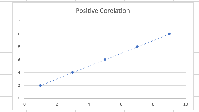
To analyze the scatter plot correctly, we need to understand how the variables relate. There exist three types of correlation:
- Positive correlation: As the x variable increases, so does the y variable. For example, the student's amount of time studying and their grades.
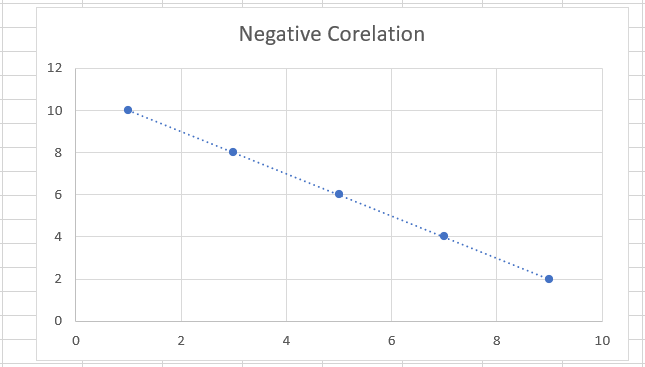
- Negative correlation: As the x variable increases, the y variable decreases. An example would be ditching classes and grades; as the number of absences increases, the exam scores fall.
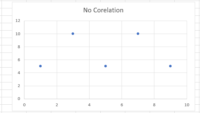
- No correlation: There is no apparent association between the two variables. The dots are spread around the entire chart area. For example, students' weight and grades appear not to correlate.
FAQs
1. What are the uses of MS Excel?
Microsoft Excel is software made by Microsoft that lets users organize, format, and calculate data using a spreadsheet system. Excel is one part of the Microsoft Office suite.
2. What are the advantages of MS Excel?
MS Excel allows us to create a visual representation of data and information. We can visually display the data in bar charts, column charts, and graphs. It automatically revises the charts and graphs once the data gets modified.
3. What are the uses of a scatter plot?
We use a scatter plot to determine whether or not two variables have a relationship or correlation(r). Plotting a scatter plot with your data points can help determine whether there's a potential association between the variables.
4. What is the weakest correlation?
The weakest linear relationship is denoted by a correlation coefficient(r) equal to 0 (or r = 0). A positive correlation denotes that if one of the variables becomes larger, the other variable tends to get larger(0 < r < 1). A negative correlation means that if one of the variables becomes larger, the other variable tends to get smaller(-1 < r < 0).
5. What is an outlier in scatter plots?
An outlier is the point or points farthest away from the regression line in a scatter plot. There is at least one in most circumstances, and usually, only one outlier on a scatter plot.
Key Takeaways
This article gives information about the Scatter Plot. We also discussed the advantages of using a Scatter Plot and how it makes an individual's life easier.
Click here to read about Introduction to Excel, Introduction to Charts, Trendline in Excel & Must have Excel Skills.
Refer to our guided paths on Coding Ninjas Studio to learn more about DSA, Competitive Programming, JavaScript, System Design, etc. Enroll in our courses and refer to the mock test and problems available. Take a look at the interview experiences and interview bundle for placement preparations.
Do upvote our blog to help other ninjas grow.
Happy Learning!


 9+ registered

