Do you think IIT Guwahati certified course can help you in your career?
Introduction
Machine learning is to make a system learn with the help of data and statistics. This data is stored as a data set and is used to perform many functions. Machine learning with Python provides this data for many purposes, like calculating the average, greatest, or smallest, and many more.
In this article, we will learn about scatter plot in Python using a data set.
What is a Scatter Plot?
The scatter plot is a collection of data sets stored as dots in a diagram. This helps to store and understand the data quickly and easily. A single point shows two values, i.e., one shows the value at the x-axis and another on the y-axis.
Scatter plot Python provides a function to create this diagram with a few lines of code.
Let's see an example of the scatter plot.
Example
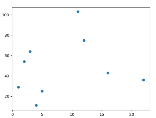
x = [1, 2, 5, 3, 5, 12, 11, 22, 4, 16]
y = [29, 54, 25, 64, 25, 75, 103, 36, 11, 43]
Above is an example of a Scatter Plot in which the given numbers on the x and y values are stored as a diagram.
Scatter Plot Python
The Matplotlib module is a module in Python that provides a method to create the scatter plot. We need two arrays of equal size indicating the values of the x and y axis to create the scatter plot diagram with the help of this method.
matplotlib.pyplot.scatter()
Scatter plots visualize the relationship between variables by using dots to depict the relationship. Using the matplotlib library's scatter() method to create a scatter plot. Scatter plots are often used to show the relationship between variables and how changing one impacts the other.
The above code shows the plotting of the data. We created two arrays indicating the x and y of the data and plt.scatter() and plt.show() functions used in the matplotlib library to create and view the dataset on the screen.
Comparing scatter() and plot() in matplotlib.pyplot
Why may you prefer to use plt.plot or plt.scatter over the other, aside from their unique features?
matplotlib.pyplot.plot() can be substantially more efficient than matplotlib.pyplot.scatter() as datasets reach larger than a few thousand points, even though it doesn't matter as much for tiny amounts of data. The reason is that because each point can be rendered with a different size and/or color using plt.scatter, each point must be constructed separately by the renderer. On the other hand, in plt.plot, the points are always almost identical, requiring only one determination of the points' appearance for the full collection of data.
The difference between these two can result in drastically different performances for large datasets. Hence matplotlib.pyplot.plot() should be chosen over matplotlib.pyplot.scatter () in these cases.
Scatter Plot Python using Random Data
The data sets used in machine learning can include thousands or even millions of values.
When testing an algorithm, you might not have access to real-world data and instead have to rely on randomly generated values.
We can create an array of random data with the help of the NumPy module.
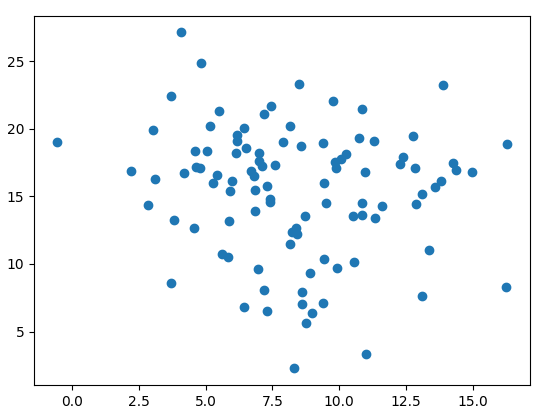
Let's take an example of 100 data and create two arrays, one for the x-axis and the other for the y-axis.
For the x-axis, we will take the mean of 8 and the standard deviation of 3.
For the y-axis, we will take the mean of 15 and the standard deviation of 5.
Code in Python
import numpy
import matplotlib.pyplot as plt
x = numpy.random.normal(8.0, 3.0, 100)
y = numpy.random.normal(15.0, 5.0, 100)
plt.scatter(x, y)
plt.show()
Output
In the above code, we created two arrays with 100 random entries with the help of the random method, such that all the numbers in x and y have a mean of 8 and 13, and a standard deviation of 3 and 5, respectively. Then we plot all the points with scatter and show the function.
Colors and Legend in Scatter Plot
We can change the colors of the scatter plot in Python to differentiate the graphs in a single diagram. We can also add a legend to identify the particular graph.
Let’s see an example of the colors and legend in a diagram.
Code in Python
import matplotlib.pyplot as plt
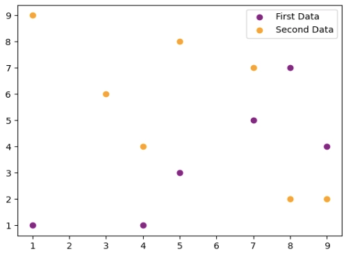
# first data
x = [7, 4, 8, 9, 1, 5]
y = [5, 1, 7, 4, 1, 3]
// Creating the graph with the values of x and y. And c indicates the color of the first data.
plt.scatter(x, y, c='purple')
# second data
x = [3, 8, 5, 4, 7, 1, 9]
y = [6, 2, 8, 4, 7, 9, 2]
// Creating the graph with the values of x and y. And c indicates the color of the first data.
plt.scatter(x, y, c='Orange')
#Adding Legend
plt.legend(["First Data", "Second Data"])
plt.show()
Output
In the above code, we represent the two data sets with two different colors and add a legend to indicate that the purple color is for the first data set and the other is for the second data set.
Scatter Plot using Different Shapes
Python provides many shapes in matplotlib library which are used to define the graph more clearly and also help in differentiating more than one graph in a single diagram.
Let’s see an example of a scatter plot using different shapes.
Code in Python
import matplotlib.pyplot as plt
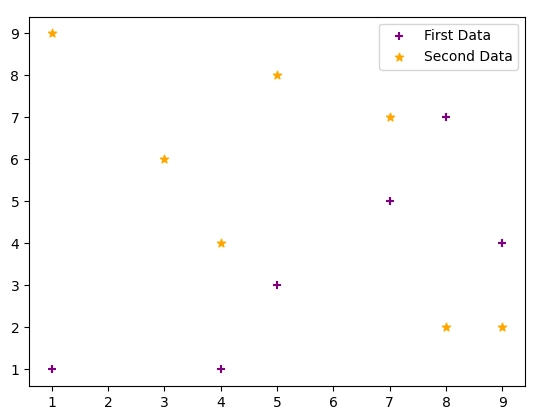
# first data
x = [7, 4, 8, 9, 1, 5]
y = [5, 1, 7, 4, 1, 3]
# Creating the graph with the values of x and y. And c indicates the color of the first data.
plt.scatter(x, y, c='purple', marker='+')
# second data
x = [3, 8, 5, 4, 7, 1, 9]
y = [6, 2, 8, 4, 7, 9, 2]
# Creating the graph with the values of x and y. And c indicates the color of the first data.
plt.scatter(x, y, c='Orange', marker='*')
#Adding Legend
plt.legend(["First Data", "Second Data"])
plt.show()
Output
The above code uses the marker attribute to change the shape of the points in the diagram and uses legend to identify the data.
Connect Scatter Plot Points with Line
Python also provides a method to join the points of the scatter plot to show the sequence of the points.
Let’s see an example to connect the scatter plot points.
Code in Python
import numpy as np
import matplotlib.pyplot as plt
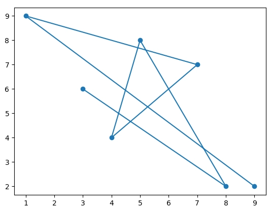
x = [3, 8, 5, 4, 7, 1, 9]
y = [6, 2, 8, 4, 7, 9, 2]
plt.scatter(x, y)
# plot with x and y data
plt.plot(x, y)
plt.show()
Output
In the above code, first, we created the graph with the help of the scatter function and joined these points with the help of the ‘plot’ function and showed the diagram.
Frequently Asked Questions
What is the legend used in the Scatter Plot Python?
The legend in the scatter plot is used to identify the particular data set with more than one data set in the graph. We can use the plt.legend() method to make a legend in Python language.
What is the use of the NumPy library in Python?
NumPy is the Python library that is used to work with the arrays. We used the random method to get the values randomly in an array with a given mean of the values and standard deviation.
What is Matplotlib?
Matplotlib is an open-source Python library used for plotting low-level graphs. John D. Hunter created it, and it is free of cost to use. It is mostly written in Python language.
How do you plot a scatter plot in Python DataFrame?
To plot a scatter plot in Python using a DataFrame, use matplotlib with plt.scatter(df['x'], df['y']), or seaborn with sns.scatterplot(x='x', y='y', data=df), and then call plt.show() to display it.
Conclusion
In this article, we learned about scatter plot Python and its examples. We had also seen the plotting of two or more data-set in a single diagram with the help of different colors and using the legend and also discussed the point plotting with line.


 6+ registered