Do you think IIT Guwahati certified course can help you in your career?
Introduction
Seaborn's heatmap() method visualizes rectangular data as a color-coded matrix, providing an intuitive representation for data patterns.
Seaborn, a Python data visualization library based on Matplotlib, provides a high-level interface for drawing attractive and informative statistical graphics. One of the most powerful tools in Seaborn's arsenal is the heatmap, which visualizes data through variations in coloring.
This article will delve into Seaborn heatmaps, exploring their functionality, applications, and customization.
What is Seaborn Heatmap?
A Seaborn heatmap is a two-dimensional graphical representation of data where individual values contained in a matrix are represented as colors. It's an effective way to display a correlation matrix or to show patterns across two dimensions.
Some of the key parameters for creating heatmaps in Seaborn include:
data: The dataset to be visualized, typically a Pandas DataFrame.
cmap: The colormap to represent data.
annot: An option to annotate each cell with numerical data.
linewidths: The width of the lines that will divide each cell.
Return Value
The return value of the heatmap function is a matplotlib.axes.Axes object. This object represents the subplot on which the heatmap is drawn.
Why Do We Use Seaborn Heatmap?
Heatmaps are used for various reasons:
To discover patterns and correlations between data points.
To visualize complex data in an easily digestible format.
To highlight trends and outliers within datasets.
Types of Seaborn Heatmaps
Seaborn allows for various types of heatmaps, each serving different visualization needs.
Basic Heatmap
A basic heatmap can be created using the following code:
import seaborn as sns
import matplotlib.pyplot as plt
import pandas as pd


# Ensure you have Pandas and Seaborn installed, or install them using pip:
# pip install pandas seaborn


# Create a simple DataFrame using Pandas
# Let's create a DataFrame that represents a simple cross-tabulation
data = {
    'A': [100, 120, 130, 140],
    'B': [90, 100, 110, 120],
    'C': [80, 98, 100, 130],
    'D': [70, 88, 90, 110]
}
df = pd.DataFrame(data, index=['W1', 'W2', 'W3', 'W4'])


# Create the heatmap using Seaborn
# 'cmap' defines the color scheme
# 'annot=True' will display the data values in each cell
sns.heatmap(df, cmap='coolwarm', annot=True)


# Add titles and labels if needed
plt.title('Basic Heatmap with Pandas DataFrame')
plt.xlabel('Columns')
plt.ylabel('Weeks')


# Display the heatmap
plt.show()
In this code, we first import the necessary libraries: Seaborn, Matplotlib, and Pandas. We then create a DataFrame df with some sample data. This DataFrame is passed to Seaborn's heatmap function to create the heatmap. The cmap='coolwarm' parameter specifies the color scheme, which in this case is a gradient from cool to warm colors. The annot=True parameter is used to annotate the heatmap with the actual data values.
Anchoring the Colormap
Anchoring the colormap in a Seaborn heatmap involves fixing the colormap's range to specific values so that specific data points correspond to particular colors. This can be particularly useful when you want to emphasize certain ranges within your data or when you want to compare multiple heatmaps on the same scale.
import seaborn as sns
import matplotlib.pyplot as plt
import pandas as pd
import numpy as np


# Ensure you have Pandas and Seaborn installed, or install them using pip:
# pip install pandas seaborn numpy


# Create a simple DataFrame using Pandas
# Let's create a DataFrame with random data
np.random.seed(10)
data = np.random.rand(10, 12)
df = pd.DataFrame(data, columns=[f'Month {i+1}' for i in range(12)],
                  index=[f'Product {i+1}' for i in range(10)])


# Create the heatmap using Seaborn
# 'cmap' defines the color scheme
# 'annot=True' will display the data values in each cell
# 'vmin' and 'vmax' anchor the colormap
sns.heatmap(df, cmap='coolwarm', annot=True, vmin=0, vmax=1)


# Add titles and labels if needed
plt.title('Heatmap with Anchored Colormap')
plt.xlabel('Months')
plt.ylabel('Products')


# Display the heatmap
plt.show()
In this example, we use np.random.rand(10, 12) to generate a 10x12 array of random numbers between 0 and 1. We then create a Pandas DataFrame from this array. The vmin=0 and vmax=1 arguments to sns.heatmap anchor the colormap so that the color corresponding to the value 0 is at one end of the colormap and the color corresponding to the value 1 is at the other end. This means that all the cells in the heatmap will be colored according to where their value falls within this range.
Choosing the Colormap
Choosing the colormap for a Seaborn heatmap is a crucial step because it determines the color scheme of your visualization. Different colormaps can highlight different types of patterns and it's important to choose one that is appropriate for the data and the context of your analysis.
import seaborn as sns
import matplotlib.pyplot as plt
import pandas as pd
import numpy as np


# Ensure you have Pandas and Seaborn installed, or install them using pip:
# pip install pandas seaborn numpy


# Create a simple DataFrame using Pandas
# Let's create a DataFrame with random data
np.random.seed(10)
data = np.random.rand(10, 12)
df = pd.DataFrame(data, columns=[f'Month {i+1}' for i in range(12)],
                  index=[f'Product {i+1}' for i in range(10)])


# Create the heatmap using Seaborn
# 'cmap' defines the color scheme. For example, 'viridis', 'plasma', 'inferno', 'magma', 'cividis'.
# 'annot=True' will display the data values in each cell
sns.heatmap(df, cmap='viridis', annot=True)


# Add titles and labels if needed
plt.title('Heatmap with Chosen Colormap')
plt.xlabel('Months')
plt.ylabel('Products')


# Display the heatmap
plt.show()
In this code, the cmap='viridis' argument to sns.heatmap sets the colormap to 'viridis', which is a perceptually uniform colormap. This means that equal steps in data are perceived as equal steps in color space. The 'viridis' colormap is a good default choice for many types of data, but Seaborn supports many other colormaps that you can choose from depending on your needs.
Centering the Colormap
Centering the colormap in a Seaborn heatmap can be particularly useful when you have diverging data and you want to emphasize variation based on a midpoint. For example, if you have data that ranges from -1 to 1 and you want to emphasize positive versus negative values with different colors, centering the colormap around 0 would be effective.
import seaborn as sns
import matplotlib.pyplot as plt
import pandas as pd
import numpy as np

# Ensure you have Pandas and Seaborn installed, or install them using pip:
# pip install pandas seaborn numpy


# Create a simple DataFrame using Pandas with both positive and negative values
np.random.seed(10)
data = np.random.randn(10, 12)  # 'randn' generates numbers from a normal distribution
df = pd.DataFrame(data, columns=[f'Month {i+1}' for i in range(12)],
                  index=[f'Product {i+1}' for i in range(10)])

# Create the heatmap using Seaborn
# 'center=0' will center the colormap at the value 0
# 'cmap' defines the color scheme for diverging data. For example, 'coolwarm', 'RdBu', 'seismic'.
sns.heatmap(df, center=0, cmap='coolwarm', annot=True)

# Add titles and labels if needed
plt.title('Heatmap with Centered Colormap')
plt.xlabel('Months')
plt.ylabel('Products')

# Display the heatmap
plt.show()
In this code, the center=0 argument to sns.heatmap sets the center of the colormap at the value 0. This means that 0 will be the midpoint color, and the colormap will diverge for values above and below 0. The cmap='coolwarm' is a diverging colormap that is ideal for centering around a meaningful middle point.
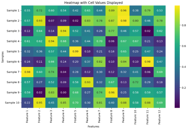
Displaying the Cell Values
Displaying cell values within the squares of a heatmap can provide additional detail that may be helpful for interpreting the data. Seaborn makes this easy with the annot parameter.
import seaborn as sns
import matplotlib.pyplot as plt
import pandas as pd
import numpy as np

# Ensure you have Pandas and Seaborn installed, or install them using pip:
# pip install pandas seaborn numpy

# Create a DataFrame with some data
np.random.seed(0)
data = np.random.rand(10, 12)
df = pd.DataFrame(data, columns=[f'Feature {i+1}' for i in range(12)],
                  index=[f'Sample {i+1}' for i in range(10)])

# Create a heatmap and display the cell values
# 'annot=True' enables annotation within each square of the heatmap
sns.heatmap(df, annot=True, fmt=".2f", cmap='viridis')

# Add titles and labels if needed
plt.title('Heatmap with Cell Values Displayed')
plt.xlabel('Features')
plt.ylabel('Samples')


# Display the heatmap
plt.show()
Customizing the Separating Line
Customizing the separating lines between cells in a heatmap can enhance the visual distinction between them. Seaborn allows you to customize these lines using the linecolor and linewidths parameters.
import seaborn as sns
import matplotlib.pyplot as plt
import pandas as pd
import numpy as np

# Ensure you have Pandas and Seaborn installed, or install them using pip:
# pip install pandas seaborn numpy

# Create a DataFrame with some data
np.random.seed(10)
data = np.random.rand(10, 12)
df = pd.DataFrame(data, columns=[f'Feature {i+1}' for i in range(12)],
                  index=[f'Sample {i+1}' for i in range(10)])

# Create a heatmap with customized separating lines
sns.heatmap(df, annot=True, fmt=".1f", cmap='coolwarm',
            linecolor='black', linewidths=1)


# Add titles and labels if needed
plt.title('Heatmap with Customized Separating Lines')
plt.xlabel('Features')
plt.ylabel('Samples')

# Display the heatmap
plt.show()
In this code:
linecolor='black' sets the color of the lines that separate the cells to black.
linewidths=1 sets the width of the lines that separate the cells.
Hiding the Colorbar
Hiding the colorbar in a Seaborn heatmap can be useful when the color coding is not necessary for the interpretation of the data, or when you want a cleaner look for the visualization.
import seaborn as sns
import matplotlib.pyplot as plt
import pandas as pd
import numpy as np


# Ensure you have Pandas and Seaborn installed, or install them using pip:
# pip install pandas seaborn numpy


# Create a DataFrame with some data
np.random.seed(0)
data = np.random.rand(10, 12)
df = pd.DataFrame(data, columns=[f'Feature {i+1}' for i in range(12)],
                  index=[f'Sample {i+1}' for i in range(10)])


# Create a heatmap and hide the colorbar
sns.heatmap(df, annot=True, fmt=".1f", cmap='viridis', cbar=False)


# Add titles and labels if needed
plt.title('Heatmap without Colorbar')
plt.xlabel('Features')
plt.ylabel('Samples')


# Display the heatmap
plt.show()
In this code snippet:
cbar=False is the parameter that tells Seaborn not to display the colorbar.
Removing the Labels
To create a Seaborn heatmap without axis labels, you can simply set the xlabel and ylabel to an empty string or use the set function of Seaborn's Axes to remove the labels.
import seaborn as sns
import matplotlib.pyplot as plt
import pandas as pd
import numpy as np

# Ensure you have Pandas and Seaborn installed, or install them using pip:
# pip install pandas seaborn numpy


# Create a DataFrame with some data
np.random.seed(0)
data = np.random.rand(10, 12)
df = pd.DataFrame(data, columns=[f'Feature {i+1}' for i in range(12)],
                  index=[f'Sample {i+1}' for i in range(10)])

# Create a heatmap
sns.heatmap(df, annot=True, fmt=".1f", cmap='viridis')

# Remove the axis labels
plt.xlabel('')
plt.ylabel('')

# Alternatively, you can use the following Seaborn method to remove labels
# ax = sns.heatmap(df)
# ax.set(xlabel='', ylabel='')

# Add a title if needed
plt.title('Heatmap without Labels')


# Display the heatmap
plt.show()
In this code snippet:
plt.xlabel('') and plt.ylabel('') set the x and y axis labels to an empty string, effectively removing them from the plot.
The annot=True and fmt=".1f" arguments are used to display the cell values with one decimal place, which can be adjusted as needed.
Advantages of Seaborn Heatmaps
Intuitive Interpretation: Heatmaps provide a color-based visualization, which is intuitive and easy to understand.
Customizable: Seaborn offers extensive customization options to tailor heatmaps to specific needs.
Data Density: Heatmaps can represent large datasets in a compact space.
Frequently Asked Questions
What is seaborn heatmap?
Seaborn heatmap is a visualization tool in Python for plotting rectangular data as a color-encoded matrix. It's part of the Seaborn library.
Why heatmap is used in Python?
Heatmaps in Python are used to represent and visualize data in a matrix format, with colors indicating the values, making patterns and trends more apparent.
How do you plot a heatmap?
To plot a heatmap you can use Seaborn's heatmap function. Example: sns.heatmap(data), where data is your matrix or DataFrame.
How do I import a heatmap into Python?
You can import a heatmap into Python by importing the necessary libraries: import seaborn as sns and import matplotlib.pyplot as plt. Then, use sns.heatmap() to plot your heatmap.
Conclusion
Seaborn heatmaps offer a powerful and flexible way to visualize complex data relationships. With customization options for color, annotation, and layout, they can reveal patterns and insights that might be missed in traditional data analysis. Whether you're a seasoned data scientist or a beginner, mastering Seaborn heatmaps can significantly enhance your data storytelling capabilities.


 9+ registered

