Semantics in Vue
Let's now look at some examples of building components that follow semantics in Vue and can be easily adapted to render the appropriate HTML tag.
Media Object component
The Media Object is a relatively simple yet powerful pattern consisting of a wrapper, a body, and a figure element.
Code:
<template>
 <Component
   :is="tag"
   class="Media"
 >
 </Component>
</template>

<script>
export default {
 name: 'Media',
 props: {
   <!-- Pass the name of the HTML element to be rendered -->
   tag: {
     default: 'div',
     type: String
   }
 }
};
</script>

You can also try this code with Online Javascript Compiler
This is the implementation of the wrapper component of the media object. The component and other UI components declare a tag property that allows us to change which HTML element is rendered.
Code:
<template>
 <Media tag="figure">
   <MediaFigure
     tag="img"
     src="src/images/img"
     alt="Image"
   />
   <MediaBody tag="figcaption">
     Image
   </MediaBody>
 </Media>
</template>
You can also try this code with Online Javascript Compiler
Here we have rendered the Media component as semantic <figure> and <figcaption> elements to describe an <img> element.
Forms
When creating a form, we can use elements like <label>, <form>, <textarea>, <input> and <button>.
Code:
<form action="/dataCollection" method="post" autocomplete="on">
 <div v-for="item in items" :key="item.id" class="formItem">
   // Labels are normally placed on top or to the left of the form fields
   <label :for="item.id">{{ item.label }}: </label>
   <input
     :type="item.type"
     :id="item.id"
     :name="item.name"
     v-model="item.value"
   />
 </div>
 <button type="submit">Submit Form</button>
</form>
You can also try this code with Online Javascript Compiler
Here, we have included autocomplete='on' on the form element, and it will apply to all inputs in the form. We can also set different values for autocomplete attributes for each input field.
Headline Component
Sometimes the visual order of the headlines of an application does not correspond to their semantic order. We can have a headline component to set the visual size independently of the rendered tag in such cases.
Code:
<template>
 <Component
   :is="tag || `h${level}`"
   :class="`Headline Headline--${size || level}`"
 >
 </Component>
</template>

<script>
export default {
 name: 'Headline',
 props: {
   level: {
     default: '1',
     type: String
   },
   size: {
     default: null,
     type: String
   },
   tag: {
     default: null,
     type: String
   }
 }
};
</script>

<style>
.Headline {
 font-weight: bold;
}

.Headline--1 {
 font-size: 2em;
}

.Headline--2 {
 font-size: 1.75em;
}

.Headline--4 {
 font-size: 1.5em;
}
.Headline--5 {
 font-size: 1.25em;
}
.Headline--6 {
 font-size: 1em;
}
</style>
You can also try this code with Online Javascript Compiler
The Headline component can be controlled using level, size, and tag. The level property decides which tag (h1-h6) has to be rendered. Using CSS classes, we have applied the style to the headings. We can also render a different HTML element by changing the tag property.
The headlines can be used as follows.
Code:
<template>
 <Headline level="1" size="2">
   h1 headline looking like h2
 </Headline>
 <Headline tag="p" size="1">
   Headline with p tag
 </Headline>
</template>
You can also try this code with Online Javascript Compiler
Buttons
While using buttons inside a form, we must set the type. This is done to prevent submitting the form. We can also use the input to create buttons.
Code:
<form action="/dataCollection" method="post" autocomplete="on">
 <!-- Buttons -->
 <button type="submit">Submit</button>

 <!-- Input buttons -->
 <input type="submit" value="Submit" />
</form>
You can also try this code with Online Javascript Compiler
We can also use input fields to create functional images and icons. These will act as a submit type button on forms.
Code:
<!-- Image -->
<form role="search">
 <label for="search" class="hidden-visually">Search: </label>
 <input type="text" name="search" id="search" v-model="search" />
 <input
   type="image"
   class="buttonImg"
   src="src/images/searchImg"
   alt="Search Image"
 />
</form>

<!-- Icon -->
<form role="search">
 <label for="searchIcon" class="hidden-visually">Search: </label>
 <input type="text" name="search" id="search" v-model="search" />
 <button type="submit">
   <i class="fas fa-search" aria-hidden="true"></i>
   <span class="hidden-visually">Search</span>
 </button>
</form>
You can also try this code with Online Javascript Compiler
Hiding Content
Typically, it is not recommended to visually hide labels, even if the input has an accessible name. However, we can hide the visual label if the input functionality can be understood with the surrounding content.
Code:
<form role="search">
 <label for="search" class="hiddenVisually">Search </label>
 <input type="text" name="search" id="search" v-model="search" />
 <button type="submit">Search</button>
</form>

<!-- CSS to visually hide elements but keep them available for assistive technology -->
<style>
 .hidden-visually {
   position: absolute;
   overflow: hidden;
   white-space: nowrap;
   margin: 0;
   padding: 0;
   height: 1px;
   width: 1px;
   clip: rect(0 0 0 0);
   clip-path: inset(100%);
 }
</style>
You can also try this code with Online Javascript Compiler
The search button will help the visual users identify the input field's purpose here.
Labels
Labels are used for the purpose of all form control. We must explicitly set the labels with a matching id, which is better supported by assistive technology.
Code:
<template>
 <form class="form">
   <div class="formItem">
     <label for="userName">Username:</label>
     <input type="text" name="userName" id="userName" v-model="userName" />
   </div>
   <button type="submit">Submit</button>
 </form>
</template>

<script>
export default {
 data() {
   return {
     userName: ""
   };
 }
};
</script>

<style>
.form {
 margin: 32px 0 0 15px;
 user-select: none;
}

.formItem {
 margin: 10px auto;
}

.formItem label {
 display: block;
}

button {
 font-size: 1em;
}
</style>
You can also try this code with Online Javascript Compiler
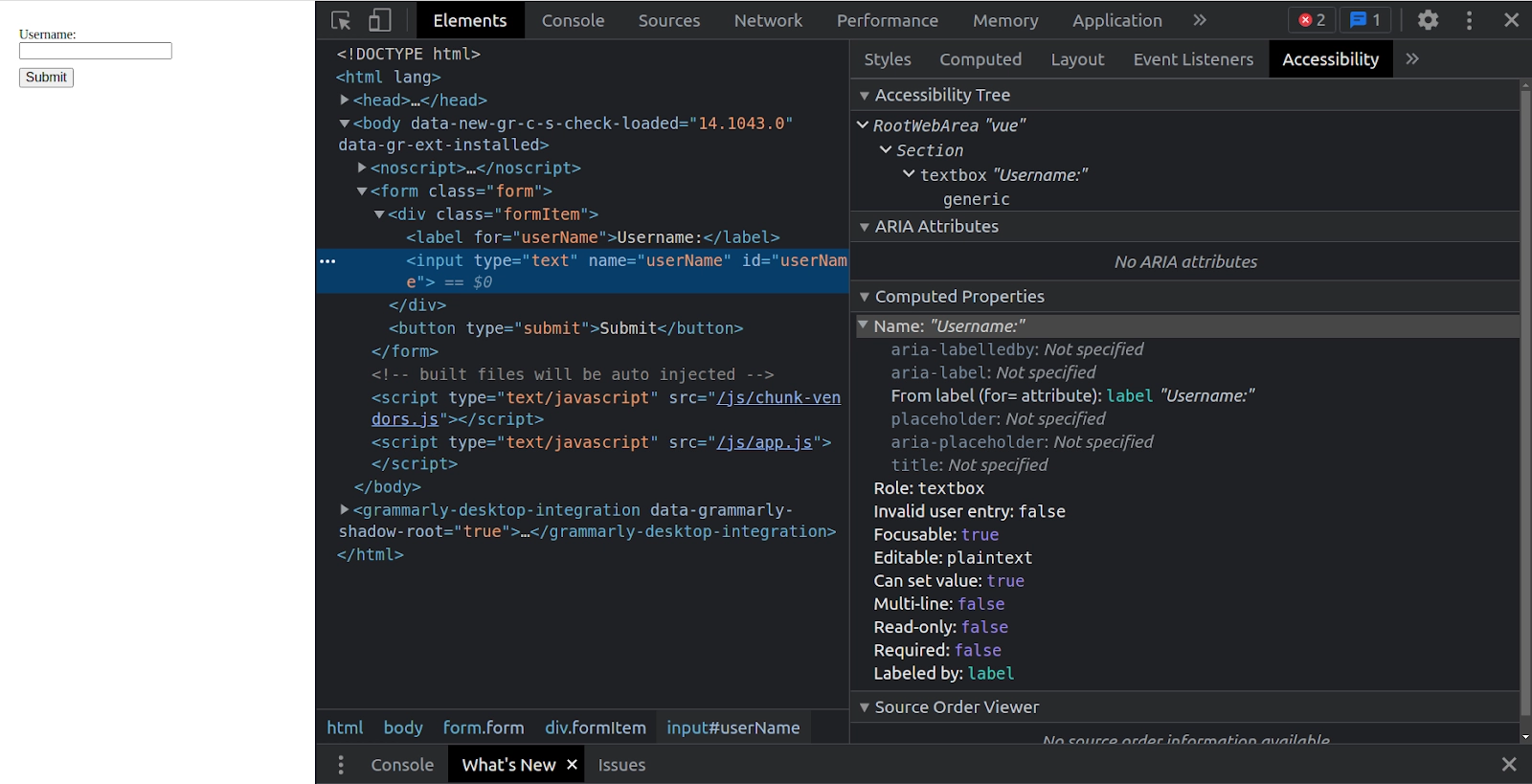
Output
While inspecting this element in the chrome developer tools and opening the accessibility tab inside the elements tab, we can notice how the input gets its name from the label.
We can also give the input an accessible name using aria-label.
Code:
<template>
 <form class="form">
   <div class="formItem">
     <label for="userName">Username:</label>
     <input type="text" name="userName" id="userName" v-model="userName" :aria-label="userNameLabel"/>
   </div>
   <button type="submit">Submit</button>
 </form>
</template>

<script>
export default {
 data() {
   return {
     userName: "",
     userNameLabel: "This label takes over the accessible name"
   };
 }
};
You can also try this code with Online Javascript Compiler
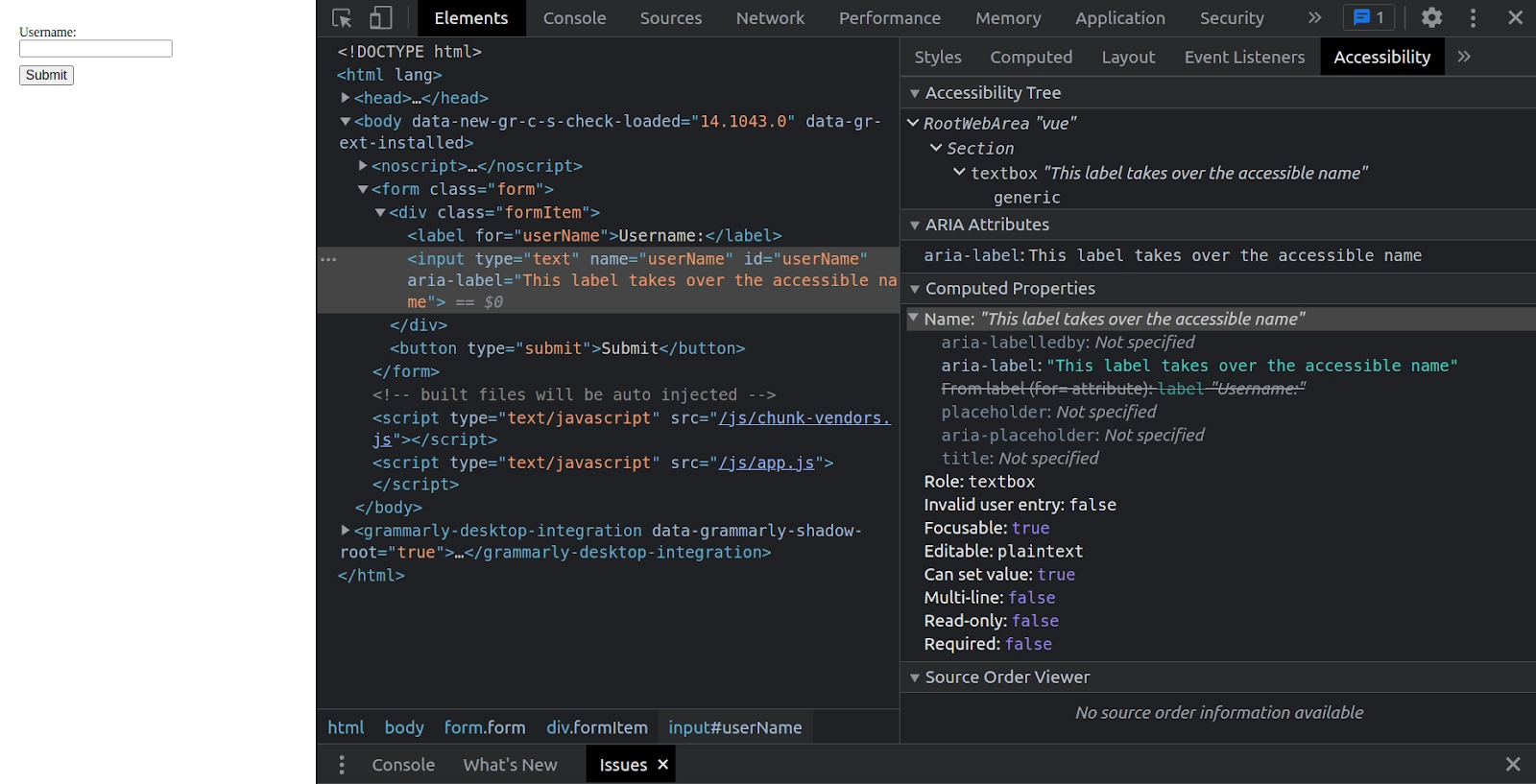
Output
FAQs
-
Why is it advised to avoid using placeholders to achieve semantics in Vue?
It is advised to avoid using placeholders to achieve semantics as it can confuse the users. This is because most placeholders don't meet the color contrast criteria and make the placeholder look like pre-populated data in the input fields. Hence, it is better to provide the information required by the user to fill out forms outside any inputs.
-
How can we add instructions to the input fields?
We can add instructions for the input fields by linking them correctly to the input. We can add additional instructions and bind multiple ids inside an aria-labelledby. Or we can attach the instructions to the input with aria-describedby.
-
What is the use of aria-hidden="true"?
It will hide the corresponding element from assistive technology but leave it visually available for the other users.
-
What is the difference between aria-labelledby and aria-describedby?
aria-labelledby is quite similar to aria-label, except it is used if the label text is visible on the screen. It is paired with other elements by their id, and we can link multiple ids.
aria-describedby is used the same way as aria-labelledby, except that it provides a description with additional information that the user might require. This is beneficial to describe the criteria for any input.
Key Takeaways
While building modern component-based web applications in Vue, we must reach out for semantic HTML elements. This blog discussed the various ways to achieve semantics in Vue and multiple examples. And the end of the blog, we also discussed the frequently asked questions based on semantics in Vue.
Don't stop here. Check out our Learn Vue free course to learn Vue from scratch. Also, feel free to check out the blog Vue JS Vs. React in 2021.
We hope you found this blog on semantics in Vue useful. Liked the blog? Then feel free to upvote and share it.


 9+ registered

