Important Methods of Sliding Drawer
Let's look at some of the most essential SliderLayout methods that may be used to manage the SliderDrawer.
- open(): This method is used to quickly open the drawer. We need to utilize this method because we sometimes open the drawer when we click on a View (onClick button, onClickTextView, etc.).
- close(): This approach is used to quickly close the drawer onClick of the view.
- animateOpen(): This method is used to animate the drawer opening. This method is similar to the standard open() function, with the exception that we utilize it when the drawer is needed to be opened with animation.
- animateClose(): This method is used to animate the drawer closing. This method is identical to the simple close() function, with the exception that we utilize it when the drawer is needed to be closed with an animation.
- isOpened(): This method describes whether the drawer is currently fully opened or not. This method returns a boolean(true or false). If the drawer is currently open, it returns true; otherwise, it returns false.
- lock(): This technique is used to lock the SliderDrawer and prevent it from responding to touch events. In some cases, we need to lock the drawer so that touch events are disabled, and we use this way to do so.
- unlock(): This method unlocks the SlidingDrawer, allowing touch events to be processed. This function is utilized when we lock the drawer for a situation and then need to unlock it so that touch events may be processed.
- setOnDrawerCloseListener(OnDrawerCloseListeneronDrawerCloseListener): As the name suggests, this method is typically used to set the listener that receives a notification when the drawer becomes close.
- setOnDrawerOpenListener(OnDrawerOpenListeneronDrawerOpenListener): As the name suggests, this method is typically used to set the listener that receives the notification when the drawer becomes open.
- setOnDrawerScrollListener(OnDrawerScrollListeneronDrawerScrollListener): As the name suggests, this method is typically used to set the listener that receives the notification when the drawer starts or ends a scroll.
Attributes of Sliding Drawer
Now let's go through some of the basic SliderDrawer attributes that will assist us in customizing it in our layout file (XML); these are given below:
- id: Used to give SliderDrawer a distinct identity.
- handle: This particular attribute is used as an Identifier for the child that represents the drawer's handle, and In the application, this is always displayed(means always visible in the app).
- content: You can specify the contents of the drawer here. The contents can be viewed by clicking on the handle. The open() and close() methods make content visible and invisible, respectively.
- orientation: The child's orientation can be set horizontally or vertically using the orientation attribute. The default orientation of SliderDrawer is vertical.
- rotation: The view can be rotated in degrees using this attribute. To rotate the view in different orientations, we set the rotate value in degrees(90/180/270/360 degrees, etc.).
Let's see the use of these discussed methods and attributes with a working example given below.
Example Application
Open Android Studio, start an empty activity, give a name to your app( Sliding Drawer CN in our case), and let Android do the Gradle syncing.
Now, start working on the studio by editing the activity_main.xml file.
Code:
<?xml version="1.0" encoding="utf-8"?>
<androidx.constraintlayout.widget.ConstraintLayout xmlns:android="http://schemas.android.com/apk/res/android"
    xmlns:tools="http://schemas.android.com/tools"
    android:layout_width="match_parent"
    android:layout_height="match_parent"
    tools:context=".MainActivity">

    <LinearLayout
        android:id="@+id/layout"
        android:layout_width="match_parent"
        android:layout_height="match_parent">

        <SlidingDrawer
            android:id="@+id/simpleSlidingDrawer"
            android:layout_width="match_parent"
            android:layout_height="match_parent"
            android:content="@+id/content"
            android:handle="@+id/handle"
            android:orientation="horizontal"
            android:rotation="180">

            <Button
                android:id="@id/handle"
                android:layout_width="wrap_content"
                android:layout_height="wrap_content"
                android:background="#FFEC43"
                android:rotation="270"
                android:text="@string/open_it"
                android:textColor="#FFC9C9" />

            <LinearLayout
                android:id="@id/content"
                android:layout_width="match_parent"
                android:layout_height="match_parent"
                android:orientation="horizontal"
                android:rotation="180">

                <ListView
                    android:id="@+id/simpleListView"
                    android:layout_width="wrap_content"
                    android:layout_height="match_parent" />
            </LinearLayout>
        </SlidingDrawer>
    </LinearLayout>

</androidx.constraintlayout.widget.ConstraintLayout>
In this step, we have added the code for displaying a SlidingDrawer by using its methods and attributes. This XML code will result in one Button for the SlidingDrawer's handle and a ListView for the SlidingDrawer's content.
Now, create a new XML layout file (main->res->layout) with the name items_list.xml and add the following code to it.
Code:
<?xml version="1.0" encoding="utf-8"?>
<LinearLayout xmlns:android="http://schemas.android.com/apk/res/android"
    android:layout_width="wrap_content"
    android:layout_height="wrap_content"
    android:orientation="vertical">

    <TextView
        android:id="@+id/name"
        android:layout_width="wrap_content"
        android:layout_height="wrap_content"
        android:padding="15dp"
        android:textColor="#FF5E95" />
</LinearLayout>
Here we're going to make items view that will be presented within each row.
Code:
MainActivity.kt
In this step, we'll open MainActivity and add code to start/instantiate the ListView, SlidingDrawer, and Button. We first create a String array(nameArray) and then use an ArrayAdapter to populate the list with data. Here we have also used setOnDrawerOpenListener event to set handle button text to(Close It) and setOnDrawerCloseListener event to set handle button text to(Open It) on opening and closing of the sliding drawer.
package com.codingninjas.slidingdrawercn

import android.os.Bundle
import android.view.View
import android.widget.ArrayAdapter
import android.widget.Button
import android.widget.ListView
import android.widget.SlidingDrawer
import androidx.appcompat.app.AppCompatActivity

class MainActivity : AppCompatActivity() {

    var nameArray = arrayOf(
        "Coding",
        "Ninjas",
        "Technical",
        "Blog",
        "Writing",
        "On Android",
        "App",
        "Development",
        "In Kotlin",
        "- Sliding",
        "- Drawer"
    )

    override fun onCreate(savedInstanceState: Bundle?) {
        super.onCreate(savedInstanceState)
        setContentView(R.layout.activity_main)
        val simpleSlidingDrawer =
            findViewById<View>(R.id.simpleSlidingDrawer) as SlidingDrawer // initiating SlidingDrawer
        val slidingDrawer_bttn =
            findViewById<View>(R.id.handle) as Button // inititating Button
        val simpleListView =
            findViewById<View>(R.id.simpleListView) as ListView // initiating ListView(that stores content of sliding drawer through string array)

        val arrayAdapter =
            ArrayAdapter(applicationContext, R.layout.items_list, R.id.name, nameArray)
        // setting up adapter to fill the data in the ListView
        simpleListView.adapter = arrayAdapter
        // setOnDrawerOpenListener
        simpleSlidingDrawer.setOnDrawerOpenListener { slidingDrawer_bttn.text = "Close It" }
        // setOnDrawerCloseListener
        simpleSlidingDrawer.setOnDrawerCloseListener {
            slidingDrawer_bttn.text = "Open It"
        }
    }
}
Output:
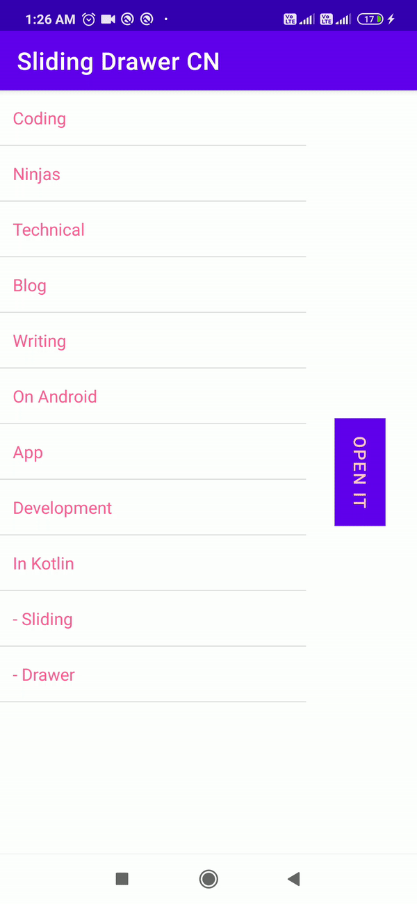
When you launch the app, you'll notice a button with “OPEN IT” text. The content will appear on the screen after you click or slide on that button. All the content will be hidden if you click the button again. In Android, we used Sliding Drawer to accomplish this.
Frequently Asked Question
-
How can I add items to the Android Navigation Drawer?
Declare a DrawerLayout as the root view to add a navigation drawer. Add a layout for the main UI content and another view that contains the contents of the navigation drawer to the DrawerLayout.
-
What is drawer navigation, and how does it work?
The navigation drawer is a user interface panel that displays the main navigation menu for your program. When the user presses the drawer symbol in the app bar or swipes a finger from the left side of the screen, the drawer appears.
-
What is ViewPager Android studio?
In Android, ViewPager is a class that allows the user to navigate across data pages by swiping left and right. This class allows you to flip through pages in your app, and moreover, It's a widget that can be found in the support library.
Conclusion
In this article, we learned about Sliding drawer and their implementation.
You can head over to our Android Development Course on the Coding Ninjas Website to dive deep into Android Development and build future applications.
We hope this article has helped you enhance your knowledge of the Android UI Sliding drawer. If you want to learn more, check out our Android UI and Competitive Programming articles. Do upvote this article to help other ninjas grow.
Happy Coding!


 8+ registered

