Do you think IIT Guwahati certified course can help you in your career?
Introduction
Creating visually appealing layouts that adapt seamlessly to different screen sizes is a must in the exciting world of app development. Flutter, a popular framework for building cross-platform apps, offers a versatile "Staggered GridView" widget that helps developers craft dynamic and responsive grid layouts.
In this article, we will explore Staggered GridView in Flutter and provide you with an example to help you get started.
Understanding Grids and Staggered Grid
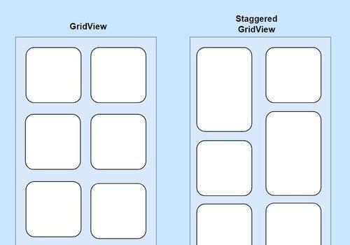
Grids, when it comes to designing apps are basically a way to organize content into rows and columns. This layout is great, for presenting a collection of things, like images, cards or text in a way. A regular grid puts its items in rows and columns making it look neat and orderly. There are situations where a flexible layout is preferred.
That's where the Staggered GridView in Flutter comes in. Unlike a grid a Staggered GridView allows items to have heights and widths resulting in an interesting and irregular arrangement. This dynamic layout works perfectly for showcasing content that varies in size or importance.
The figure below depicts the difference between GridView and StaggeredGridview in Flutter.
Benefits of Using Staggered GridView
The Staggered GridView in Flutter offers several advantages that make it a valuable tool for developers seeking to create unique and responsive layouts:
Visual Appeal: One of the most significant advantages of a Staggered GridView is the visually appealing design it offers. The varying sizes and positions of items break away from the monotony of uniform grids, adding an element of creativity to your app's layout.
Adaptability: Apps need to function seamlessly across a wide range of devices with different screen sizes and orientations. The Staggered GridView's ability to adapt to these variations ensures that your layout looks great on both small smartphone screens and large tablet displays.
Content Hierarchy: Not all content carries the same weight or importance. There are items that hold significance and should be given more space to stand out. By using a Staggered GridView you have the ability to highlight these items effectively by allocating them space.
Efficient Space Utilization: When it comes to utilizing screen space sized items can play a crucial role. This is particularly helpful, in avoiding spaces that often occur in a traditional grid layout due, to uniform cell sizes.
Dynamic Arrangement: A Staggered GridView offers an fluid arrangement, whether you're showcasing images, articles or product cards. This type of layout contributes to an interactive user experience.
Properties of Flutter Staggered GridView
Here are some important properties and attributes associated with the Flutter Staggered Grid View:
crossAxisCount: The property called "crossAxisCount" is responsible, for specifying the number of columns in the grid. It helps to determine how many items can be shown horizontally on the screen.
itemCount: It refers to the count of items that you wish to display within the grid.
itemBuilder: The itemBuilder property is responsible, for defining the content of each grid item by using a function that returns a widget for each item in the grid.
staggeredTileBuilder: To determine the size and positioning of each items tile in the grid you can use the staggeredTileBuilder property. It requires a function that returns a StaggeredTile for each item.
mainAxisSpacing: If you want to control the spacing between items along the axis (rows) you can use the mainAxisSpacing property.
crossAxisSpacing: Similarly if you need to define spacing between items along the axis (columns) you can utilize the crossAxisSpacing property.
padding: To adjust the spacing between the grid and either screen edges or its parent container you can employ padding. It adds padding around the grid.
controller: By providing a ScrollController through the controller property you gain control over how scrolling behaves within the grid. This allows for manipulating scroll position as needed.
physics: The physics property enables customization of scrolling behavior by defining scrolling physics. For instance BouncingScrollPhysics provides a bounce effect.
shrinkWrap: If set to true, the grid will only occupy the space required by its items. This is useful when placing the grid inside a ListView or another scrolling widget.
Implementation
In Flutter you can utilize a Staggered GridView to design a grid layout that accommodates items, with heights. Let me show you an illustration of how you can employ the flutter_staggered_grid_view package to generate a grid;
Step 1: Import the Required Package
Add the flutter_staggered_grid_view package to your pubspec.yaml file and run flutter pub get to install it.
pubspec.yaml
pubspec.yaml
dependencies:
  flutter:
    sdk: flutter
  flutter_staggered_grid_view: ^0.4.0  # Use the latest version of the package
Step 2:Create the Staggered GridView
In a Dart file (e.g., staggered_grid_view_example.dart), build a staggered grid layout using the StaggeredGridView.countBuilder widget.
In this example we have designed a grid, with a layout consisting of two columns and ten items. The staggeredTileBuilder is responsible for determining how each item is displayed within the grid. By using StaggeredTile.count(1, index.isEven ? 1.5 ; 1) we specify the width and height of each item. Items with indexes have a height of 1.5 while those with indexes have a height of 1. The mainAxisSpacing and crossAxisSpacing parameters are used to create spacing between the items, in the grid.
Step 3:Run the App
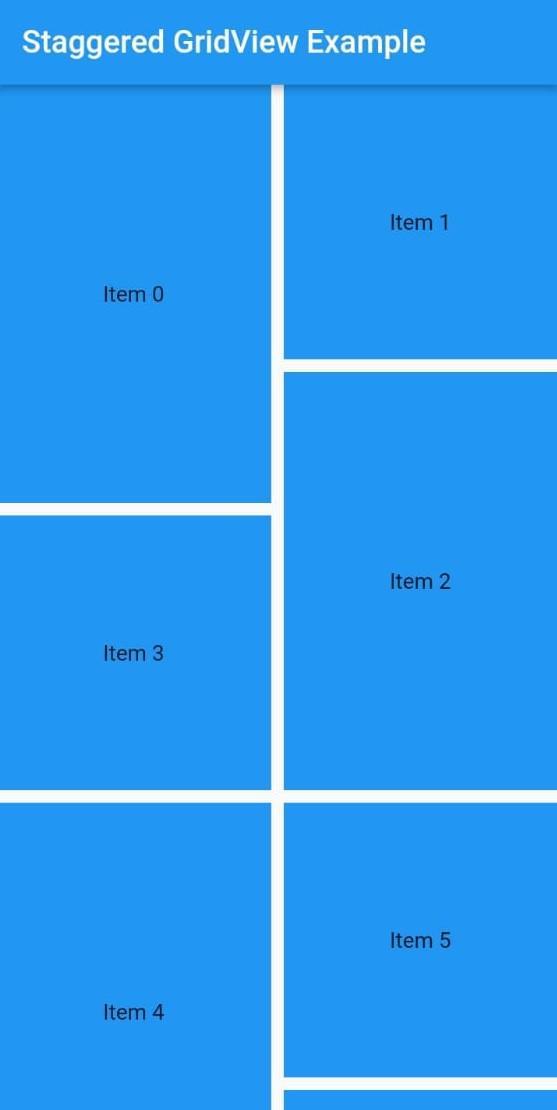
To run your app use the "flutter run" command in the terminal. After executing this command you will observe a grid layout that displays items, with varying heights. The flutter_staggered_grid_view package offers flexibility to create grid layouts with diverse arrangements. It allows you to personalize the number of columns, appearance of each item and spacing between them to align with your design requirements.
Output:
Frequently Asked Questions
How does Staggered GridView differ from a GridView?
While a traditional GridView organizes items, in rows and columns a Staggered GridView allows for items of different sizes and positions. This asymmetrical arrangement brings creativity and uniqueness to the layout.
Is Staggered GridView adaptable to screen sizes?
Certainly! Staggered GridView in Flutter is designed to be responsive, across screen sizes and orientations. It effortlessly adjusts to the dimensions of devices ensuring that your layout maintains its appeal universally.
Are there any performance considerations when utilizing Staggered GridView?
Although Staggered GridView in Flutter is a tool it's important to keep performance in mind when implementing sized items. To ensure optimal app performance it's crucial to manage the number of items and their complexity.
Conclusion
The Staggered GridView feature, in Flutter presents possibilities for designing flexible layouts. Its ability to arrange items of sizes and enhance the content hierarchy makes it a valuable resource, for developers. By following the guidelines outlined in this article you can effortlessly integrate a Staggered GridView into your Flutter project elevating your apps user interface to heights. So lets embrace the creativity and adaptability that the Staggered GridView provides and create grids.


 8+ registered

