Inserting Stock Charts
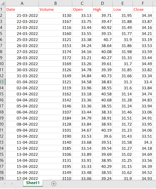
Let us consider we want to insert stock Charts for the following data as shown below.
To insert Charts, follow these steps
1. Select the Cells for which you want to insert Chart.
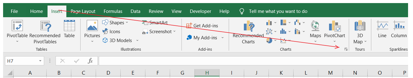
2. Click on the Insert tab and go to See All Charts
3. Click on All Charts
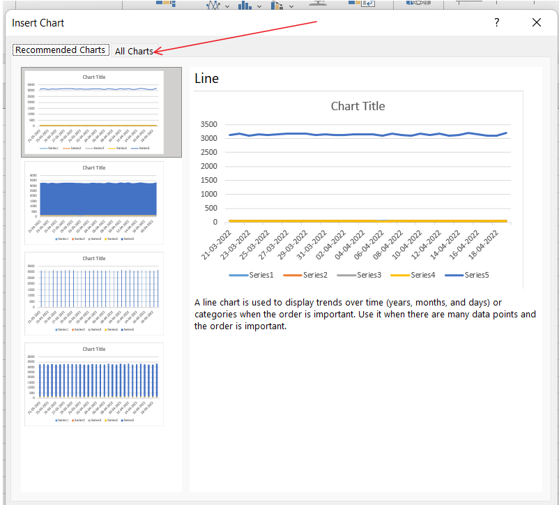
After clicking on All Charts, various Charts will be visible.
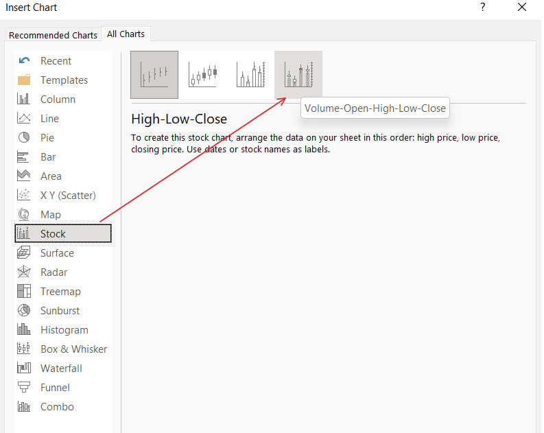
4. Click on Stock to view the different types of stock Charts available.
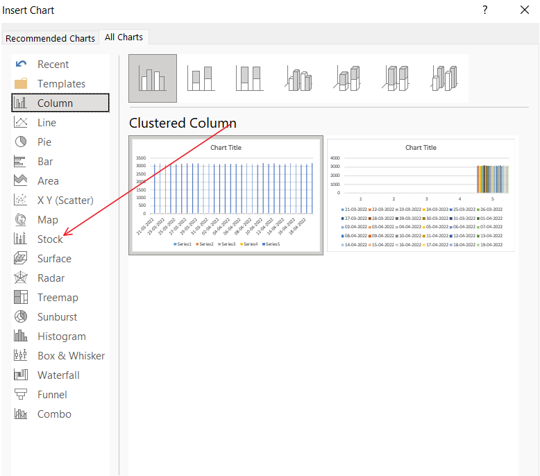
5. Here, we can choose stocks Charts according to the data.
For example, in our case, the data contains Open, Close, High, Low and Volume, so we can select the Last Chart. Click OK, and the Chart will be inserted.
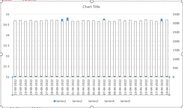
We can see in the below picture that there are 30 dates, but only a few are visible in the Chart.
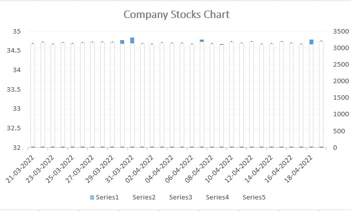
To view all the dates, we can reduce the font size of the dates or increase the Chart size.
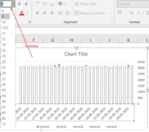
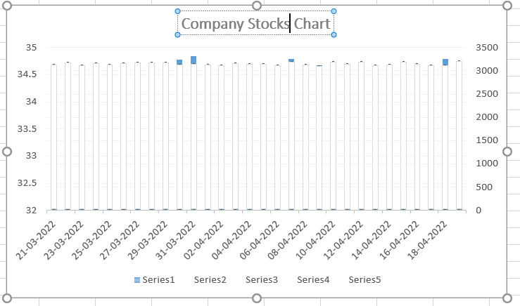
Decreasing the font size of the dates in the Chart.
All dates can be seen now.
Chart Title
We can give a Chart title by clicking on the title label and writing an appropriate name.
Format Axis
To format the axis, click on the axis and then right-click.
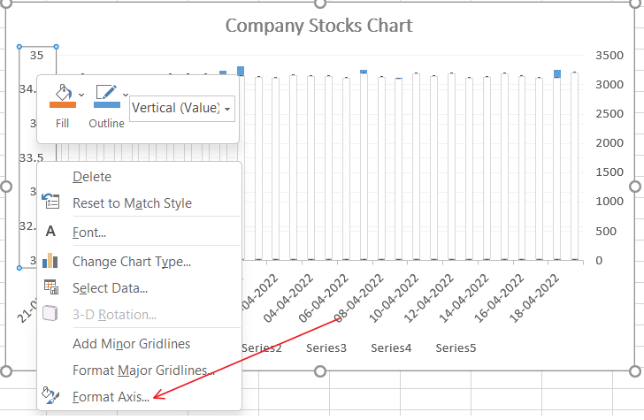
A Format Axis will be shown in the below figure.

Here we can adjust the Minimum and Maximum bounds, Units and other settings about the Chart.
FAQs
1. What are Charts in Excel?
We need to plot graphs and charts for a better understanding and visualization. We need Charts for understanding the fluctuations in the data.
2. What are the stock Charts in Microsoft Excel?
Stock Charts are the special Charts in Microsoft Excel for displaying the fluctuation in the Stock data.
3. What are the advantages of using Stock Charts in Excel?
The stocks data contains columns of high, low, open, close, etc. One can create stock Charts for the Stock values according to the requirements.
4. What are the other Charts we can insert in Excel?
Microsoft Excel provides a variety of Charts. We can insert Pie, Bar, Area etc. Charts in Excel.
5. What are the types of Stock Charts available in Excel?
The types of Stock Charts available are High-Low-Close, Open-High-Low-Close, etc.
Key Takeaways
We have extensively discussed the Microsoft Stocks Charts. We learnt how to insert stock Charts and how to format them.
We hope that this blog has helped you enhance your knowledge regarding the Stock Chart, and if you would like to learn more about the various useful functions of Excel, check out our articles:
Refer to our guided paths on Coding Ninjas Studio to learn more about DSA, Competitive Programming, JavaScript, System Design, etc.
Enrol in our courses and refer to the mock test and problems available.
Take a look at the interview experiences and interview bundle for placement preparations.
Do upvote our blog to help other ninjas grow.
Happy Learning!!!


 18+ registered