Do you think IIT Guwahati certified course can help you in your career?
Introduction
Matplotlib is a popular data visualisation Python library. It helps create static, animated and interactive visualisations of data. Matplotlib plots help explore and analyse complex data. Ticks are essential because they help interpret and understand the displayed data using visual aids.
In this article, we will discuss ticks in matplotlib. We'll cover how to add them to a plot, customise their appearance, and adjust their position and frequency.
Ticks in Matplotlib
Ticks in Matplotlib are the markers along the axes that indicate the data range. They consist of two main components: tick values and tick labels. The tick values are the numerical positions of ticks on the axis, while the tick labels are the data values each tick represents.
Ticks are generated by default when we plot data using the matplotlib library. Sometimes, these default ticks need to be customised, i.e. we need to change their colour, position, etc.
Now, we will look at various ways to customise the ticks.
Customising Ticks
The matplotlib library provides multiple options for customising the ticks to enhance data visualisation. The following are some standard methods for customising ticks.
Setting Tick Location and Colour
Tick location refers to the position of tick marks along the x and y-axis of the plot. We can explicitly give the tick locations and change the ticks' colour and font size.
We can set tick locations in matplotlib using the xticks and yticks functions. These functions take an array of tick values as input and set the tick positions on the x-axis and y-axis, respectively.
Here's an example of how to set tick locations in matplotlib:
Code
import matplotlib.pyplot as plt
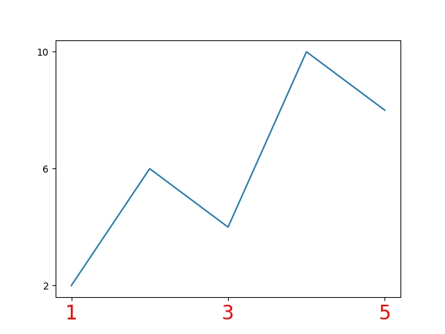
x = [1, 2, 3, 4, 5]
y = [2, 6, 4, 10, 8]
plt.plot(x, y)
# set x-axis tick locations at specific values and customising them
plt.xticks([1, 3, 5], color='red', fontsize='20')
# set y-axis tick locations at specific values
plt.yticks([2, 6, 10])
plt.show()
You can also try this code with Online Python Compiler
In this example, we set the tick positions on the x-axis and y-axis by passing an array of tick values. We also changed the font size and colour of the x-axis ticks.
Setting Tick Format
Tick format defines how the tick labels are displayed, such as decimal places, units, scientific notation, date/time format, currency format, etc.
We can set the tick format using the ticklabel_format function of the Axes class. This function takes two arguments: axis ('x' or 'y') and style ('scientific', 'plain', etc.). Here's an example of how to set the tick format in matplotlib:
Code
import matplotlib.pyplot as plt
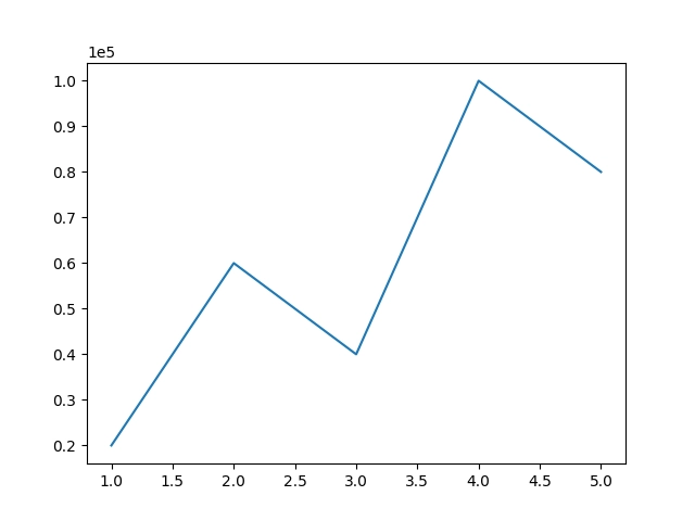
x = [1, 2, 3, 4, 5]
y = [20000, 60000, 40000, 100000, 80000]
plt.plot(x, y)
# Set y-axis tick format to scientific format
plt.ticklabel_format(axis='y', style='sci', scilimits=(0, 0))
plt.show()
You can also try this code with Online Python Compiler
In this example, we set the tick format on the y-axis to scientific notation with a limit of zero decimal places.
Setting Tick Frequency
Tick frequency refers to the spacing between tick marks on an axis. By default, matplotlib automatically determines the tick frequency. Instead of specifying the tick locations explicitly, the tick frequency determines them implicitly.
We can set the tick frequency in matplotlib using the Locator class from matplotlib.ticker module and the set_major_locator function. Here's an example of how to set tick frequency in matplotlib:
Code
import matplotlib.pyplot as plt
from matplotlib.ticker import MultipleLocator
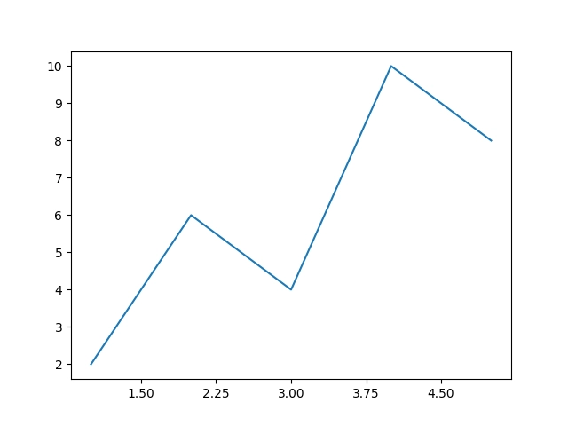
x = [1, 2, 3, 4, 5]
y = [2, 6, 4, 10, 8]
fig, ax = plt.subplots()
ax.plot(x, y)
# Set x-axis tick frequency to 0.75
ax.xaxis.set_major_locator(MultipleLocator(0.75))
plt.show()
You can also try this code with Online Python Compiler
In this example, we set the tick frequency on the x-axis to every 0.75 units.
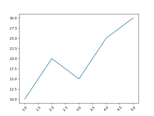
Setting Tick Rotation
Sometimes, the tick labels overlap, making them difficult to read. In these cases, we can rotate the tick labels to avoid overlapping and improve the readability of the plots. The xticks and yticks functions provide the rotation parameter, which we can use to set the rotation angle of the tick labels. Here's an example of how to set tick rotation in matplotlib:
Code
import matplotlib.pyplot as plt

x = [1, 2, 3, 4, 5]
y = [10, 20, 15, 25, 30]

plt.plot(x, y)

plt.xticks(rotation=45)

plt.show()
You can also try this code with Online Python Compiler
In this example, we have rotated the x-axis tick labels by 45 degrees.
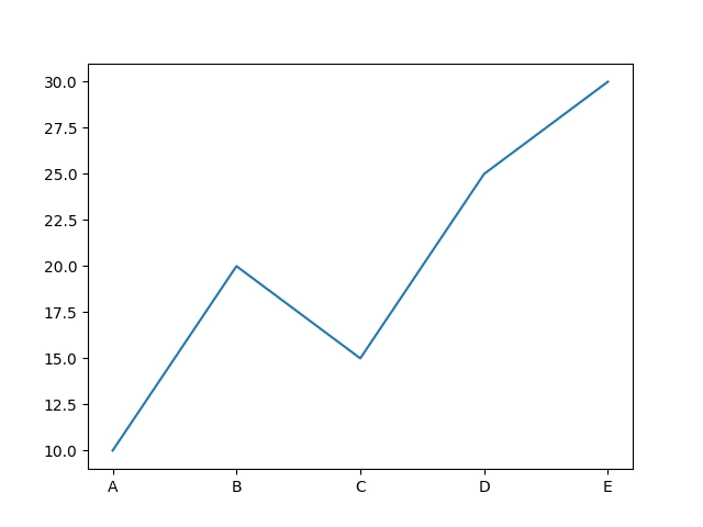
Setting Custom Tick Labels
Sometimes, we may want to use custom labels for the tick values instead of the default numerical values. We can use the xticklabels and yticklabels functions to set custom labels for the tick values. Here's an example of how to set custom tick tables in matplotlib:
Code
import matplotlib.pyplot as plt

x = [1, 2, 3, 4, 5]
y = [10, 20, 15, 25, 30]

plt.plot(x, y)

labels = ['A', 'B', 'C', 'D', 'E']
plt.xticks(ticks=x, labels=labels)

plt.show()
You can also try this code with Online Python Compiler
In this example, we set custom labels for the x-axis ticks to a pre-defined labels list.
Frequently Asked Questions
How to customise the appearance of ticks in Matplotlib, such as changing their colour or size?
The appearance of ticks in Matplotlib can be customised using the tick_params method. This method lets us modify the tick colour, size, width, and style.
What are the different types of plots that can be created using Matplotlib?
Matplotlib supports various plot types, including line plots, scatter plots, bar charts, pie charts, histograms, and more.
What file formats are supported by Matplotlib for saving plots?
Matplotlib supports various file formats for saving plots, including PNG, PDF and SVG.
What are minor tick marks?
Minor ticks are the smaller tick marks that appear between the major tick marks on a plot. They provide a more detailed view of the data and are often used to show smaller intervals or subdivisions of the data. In Matplotlib, minor ticks can be customised using the set_minor_locator method.
How can I remove tick labels in Matplotlib?
You can remove tick labels by setting the tick labels to an empty list using the set_ticklabels method.
Conclusion
This article discussed ticks in matplotlib, along with ways to customise them. By using these customisation options, we can improve the readability and accuracy of the plots.
To learn more about Python, we recommend reading the following articles:


 6+ registered