Do you think IIT Guwahati certified course can help you in your career?
Introduction
In the digital landscape of web design, the transform property in CSS emerges as a silent yet potent force that redefines the aesthetics of web elements. It's the touch of dynamism that can animate the static, the unseen hand that can reshape, reorient, and redefine.
This property is not just about visual flair; it's a testament to the power of CSS to transform user interfaces into interactive experiences.
What is the Transform Property in CSS?
The transform property in CSS allows you to modify the coordinate space of the rendering engine, enabling the manipulation of an element's shape and position. It can be used to rotate, scale, move (translate), and tilt (skew) elements in a two-dimensional (2D) or three-dimensional (3D) space.
Why Do We Use It?
We use the transform property to enhance the user interface with visual effects that can make a webpage more interactive and engaging. It's also used to create complex animations and as a performant alternative to other positioning methods that can be more taxing on browser rendering.
Syntax, Parameters, and Example
The syntax for the transform property is relatively straightforward:
element {
  transform: <transform-function>(<value>);
}
The <transform-function> can be one of several functions, such as rotate, scale, translate, and skew, each taking specific values.
Values-:
none: No Transformation
Explanation
The none value resets the transform property, meaning no transformations will be applied to the element.
In this example, the .box class is styled to appear as a blue square with white centered text. The transform: none; rule is applied, meaning that if any transformations were previously set, they would now be removed, and the box would appear in its normal state.
matrix(a, b, c, d, e, f): 2D Transformations
Explanation
The matrix() function combines all 2D transform functions into one. It accepts six parameters that define the matrix to transform the element. These parameters represent the horizontal and vertical scaling, horizontal and vertical skewing, horizontal and vertical translation.
Example
Here's an example of how to use the matrix() function to rotate an element by 30 degrees and scale it by 50%:
In this code, the .box will appear as a green square that has been rotated 30 degrees and scaled down to half its size along both the X and Y axes. The matrix values are equivalent to rotate(30deg) and scale(0.5, 0.5).
matrix3d(...): 3D Transformations
Explanation
The matrix3d() function extends the 2D matrix by incorporating three-dimensional transformations. It takes 16 parameters that define the 3D transformation matrix, affecting the X, Y, and Z axes, including 3D rotation, scale, translation, and perspective.
Example
Here's an example of how to use the matrix3d() function to apply a 3D transformation:
In this example, the .box will appear as a red square that has been rotated 45 degrees around the X-axis and translated 50 pixels along the Z-axis. This creates a perception of depth and rotation in 3D space.
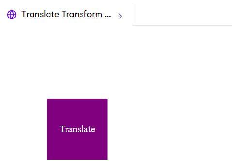
translate(x, y) and translate3d(x, y, z): Moving Elements
Explanation
The translate() function moves an element horizontally and vertically in 2D space, while translate3d() moves an element in 3D space along the X, Y, and Z axes. translateX(), translateY(), and translateZ() are shorthand functions for translating along the individual axes.
Code Example for translate()
Here's how to move an element 50 pixels to the right and 100 pixels down:
/* Move right by 50px, down by 100px, and outwards by 150px */
transform: translate3d(50px, 100px, 150px);
}
</style>
</head>
<body>
<div class="box">Translate3D Transform</div>
</body>
</html>
Output
This code will move the .box 50 pixels to the right, 100 pixels down, and 150 pixels outward from the screen, creating a 3D effect.
rotate(angle), rotateX(angle), rotateY(angle), and rotateZ(angle): Rotating Elements
Explanation
The rotate() function rotates an element around its center point in the 2D plane, while rotateX(), rotateY(), and rotateZ() functions rotate the element around the respective axes in 3D space.
Code Example for rotate()
Here's how to rotate an element by 45 degrees around its center:
This code will rotate the .box 45 degrees around the X-axis, giving the impression that it is tilting away from the viewer.
scale(x, y) and scale3d(x, y, z): Scaling Elements
Explanation
The scale() function changes the size of an element in the 2D plane. The scale3d() function scales an element in 3D space. scaleX(), scaleY(), and scaleZ() are the shorthand functions for scaling along each respective axis.
Code Example for scale()
Here's how to double the width and triple the height of an element:
/* Skew the element by 30 degrees along the X-axis and 20 degrees along the Y-axis */
transform: skew(30deg, 20deg);
}
</style>
</head>
<body>
<div class="box">Skew Transform</div>
</body>
</html>
Output
In this example, the .box will be skewed, creating a distorted square shape that resembles a parallelogram.
perspective(n): Applying Perspective to Elements
Explanation
The perspective() function defines how far the object is away from the user, giving a 3D-positioned element some depth. The lower the value, the more intense the 3D effect.
Code Example for perspective()
Here's how to apply a perspective to a container before rotating its child element:
In this example, the .perspective-container gives a perspective to the .box, which is rotated in 3D space along the X-axis.
rotate3d(x, y, z, angle): Rotating Elements in 3D Space
Explanation
The rotate3d() function allows you to rotate an element around a fixed axis in 3D space. The first three values are a direction vector (x, y, z) that defines the axis of rotation, and the fourth value is the angle of rotation.
Code Example for rotate3d()
Here's how to rotate an element around a diagonal axis:
<title>ScaleX and ScaleY Transform Example</title>
<style>
.box-scaleX {
width: 100px;
height: 100px;
background-color: lightgreen;
color: white;
line-height: 100px;
text-align: center;
margin: 20px;
/* Scale the element only along the X-axis */
transform: scaleX(2);
}
.box-scaleY {
width: 100px;
height: 100px;
background-color: lightpink;
color: white;
line-height: 100px;
text-align: center;
margin: 20px;
/* Scale the element only along the Y-axis */
transform: scaleY(2);
}
</style>
</head>
<body>
<div class="box-scaleX">ScaleX Transform</div>
<div class="box-scaleY">ScaleY Transform</div>
</body>
</html>
Output
In these examples, the first .box-scaleX will be twice as wide due to the scaleX transformation, and the second .box-scaleY will be twice as tall due to the scaleY transformation.
skewX(angle) and skewY(angle): Skewing Elements on One Axis
Explanation
skewX(angle) and skewY(angle) functions skew an element only along the X-axis or Y-axis, respectively.
In these examples, the .box-skewX is skewed along the X-axis, and the .box-skewY is skewed along the Y-axis, both creating a slanted effect on the respective axes.
Frequently Asked Questions
What is the default value for the CSS transform property?
The default value for the transform property is none, which means no transformation is applied to the element.
Can the transform property be animated?
Yes, the transform property can be animated using CSS transitions or animations, allowing for smooth transformations on hover, click, or any other interaction.
How does the transform-origin property affect transformations?
The transform-origin property allows you to change the point of origin of the transformation. By default, it is at the center of the element, but it can be set to any value, affecting the behavior of rotation and scaling transformations.
Conclusion
The CSS transform property is a versatile and powerful tool in the web developer's arsenal, enabling rich interactions and animations without heavy reliance on graphics or scripting. Understanding how to leverage its various functions, from translating, scaling, rotating, to skewing, can significantly enhance the user experience of a web page. With the ability to animate these transformations, the possibilities for dynamic, responsive design are virtually limitless.


 8+ registered

