


Introduction
While plotting data in a chart, you may have visualized some kind of trends in it. What will you do if you want to show these trendlines in your chart? Well, the answer is simple, by using trendlines. Microsoft Excel provides a facility for adding a trendline to a chart.
In this article, we will explore the trendline.
Understanding Trendline
A trendline, also known as a line of best fit, is a straight or a curved line in a chart that depicts the data’s overall pattern or direction. It is an analytical tool used frequently to display data movement overtime or a correlation between two variables. It illustrates the general trend in the data while accounting for statistical mistakes and minor outliers. It can also be used to predict trends in some circumstances.
We can add a trendline to various Excel charts like XY scatter, bubble, stock, unstacked 2D bar, column, area, and line graphs. However, we cannot add a trendline to 3D or stacked charts, pie, radar, and similar charts.
You might be confused between a trendline and a line chart due to their resemblance in appearance. However, a trendline does not link the data points as a line chart does.
Next, we will see how to add a trendline in excel.
Adding a Trendline
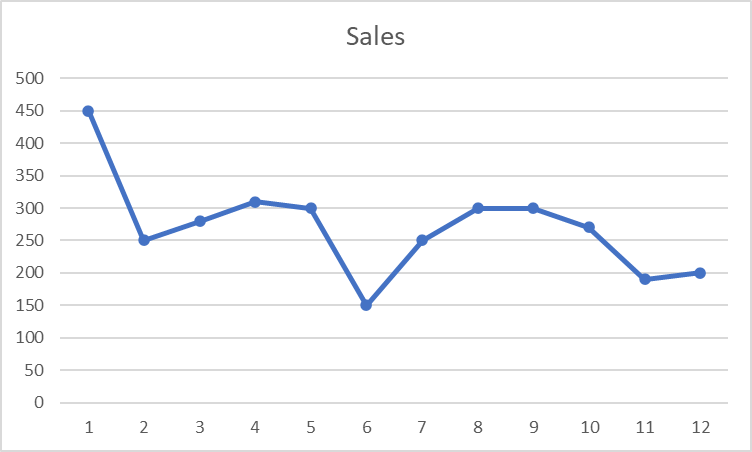
Consider the following chart depicting the sales of an item in a company in the 12 months of 2021.
For the Excel versions 2019, 2016, and 2013, we just need to follow the following steps to add a trendline in excel.
- Select the chart for which you want to draw a trendline.
-
On the right-hand side of the chart, you can see three buttons:
Chart Elements
Chart Styles and
and
Chart Filters
Among them, select the Chart Elements button.
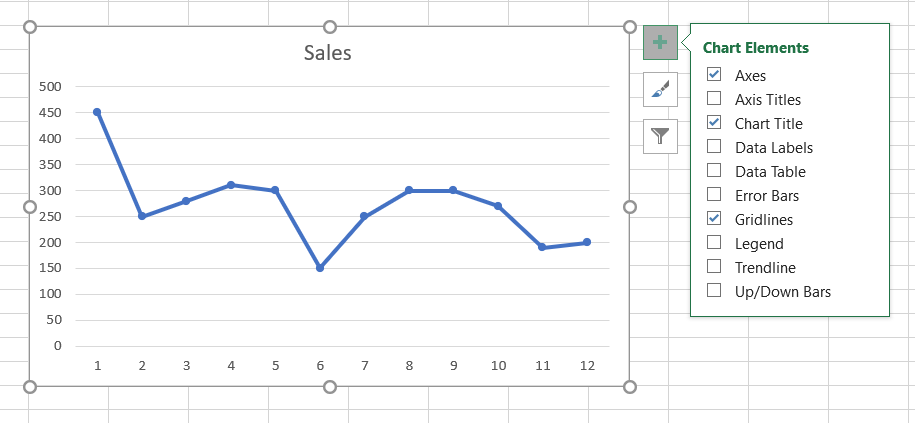
3. A list will appear. From the list, select the Trendline box to insert the default linear trendline.
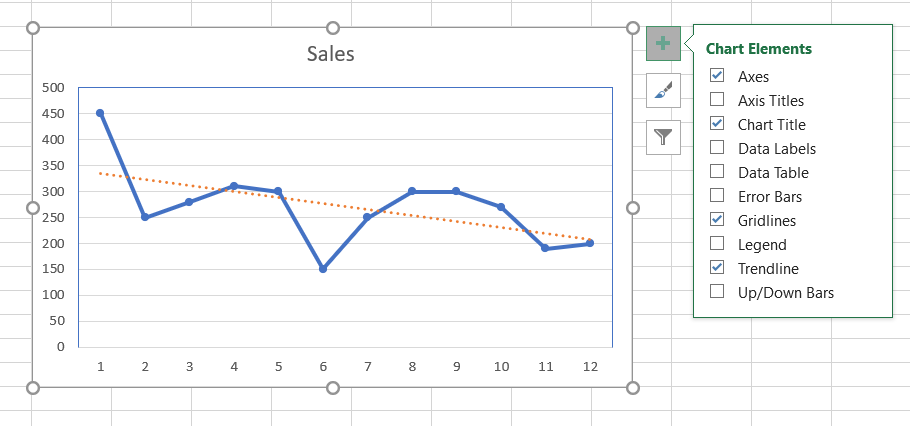
4. If you want to add a different kind of trendline, then click on the arrow next to the Trendline box in the Chart Elements list and select the type of trendline you want. Like here, we have inserted the exponential trendline in the chart.
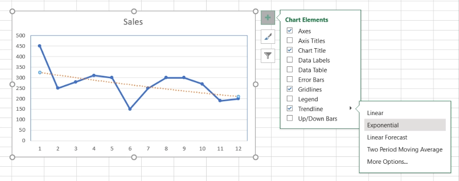
5. Further, if you want to explore more kinds of trendlines available in excel, click on More Options present in the list of Trendline and choose the one you want. By default, the linear trendline option will be selected.
Next, we will see how to add multiple trendlines to a chart.
Adding Multiple Trendlines
Here, we will see two cases to add multiple trendlines in the chart.
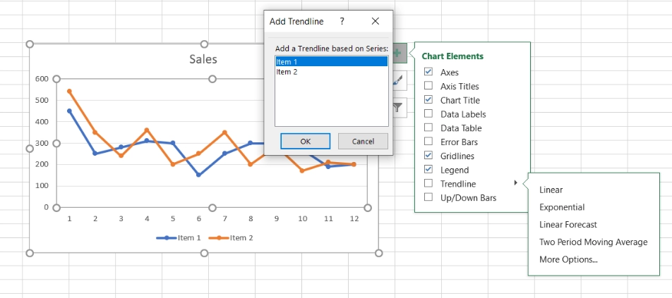
Case 1: Adding a trendline for each data series
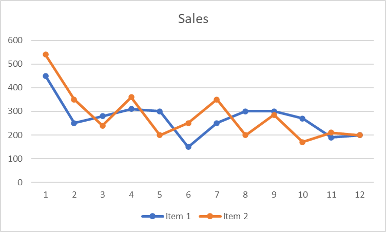
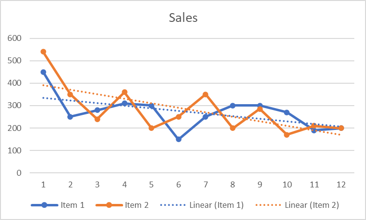
Consider the following line chart depicting the sales of two items in a company.
Follow the step to insert a trendline for each data series, i.e., for item 1 and item 2.
- Select the chart.
- Click on the Chart Elements button on the right side of the chart → Trendline → Trendline type (Linear/ Exponential etc.) → Data series (Item 1/ Item 2).
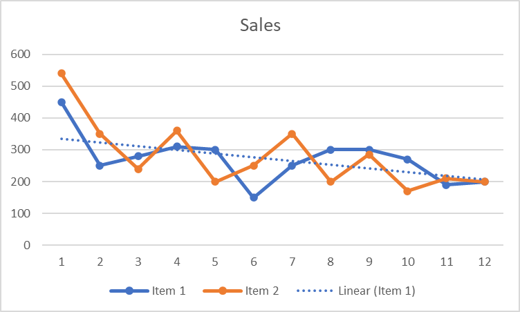
If we select Item 1, it will give us a trendline as a result.
Similarly, we can generate a trendline for Item 2.
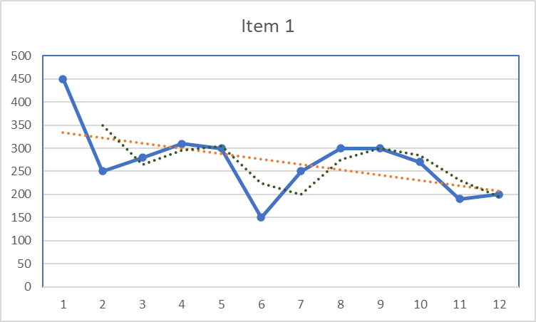
Case 2: Adding different trendlines for the same data series.
To add more than one trend line in the data series,
- Select the chart.
- Click on the Chart Elements button on the right side of the chart → Trendline → Trendline type.
For example, the below chart depicts two trendlines for the sales of Item 1 in a company. The trendline denoted by orange shows a linear trendline, and the trendline by green shows a two-period moving average trendline.
Next, we will see how to format a trendline.
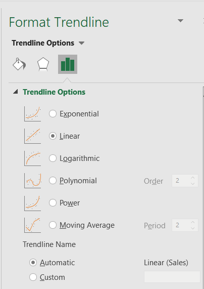
Formatting a Trendline
If you want to make your chart more understandable and interpretable, you can change the appearance of your chart’s trendline.
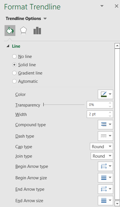
To format a trendline,
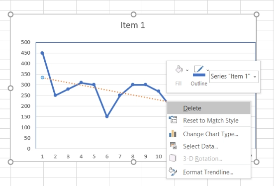
- Select the trendline.
- Right-click → Format Trendline.
-
A pane will appear on the right side of the screen. Go to Fill & Line tab
 . You can format your trendline's color, transparency, width, dash type, line type, etc.
Next we will see how to extend a trendline.
Extending a Trendline
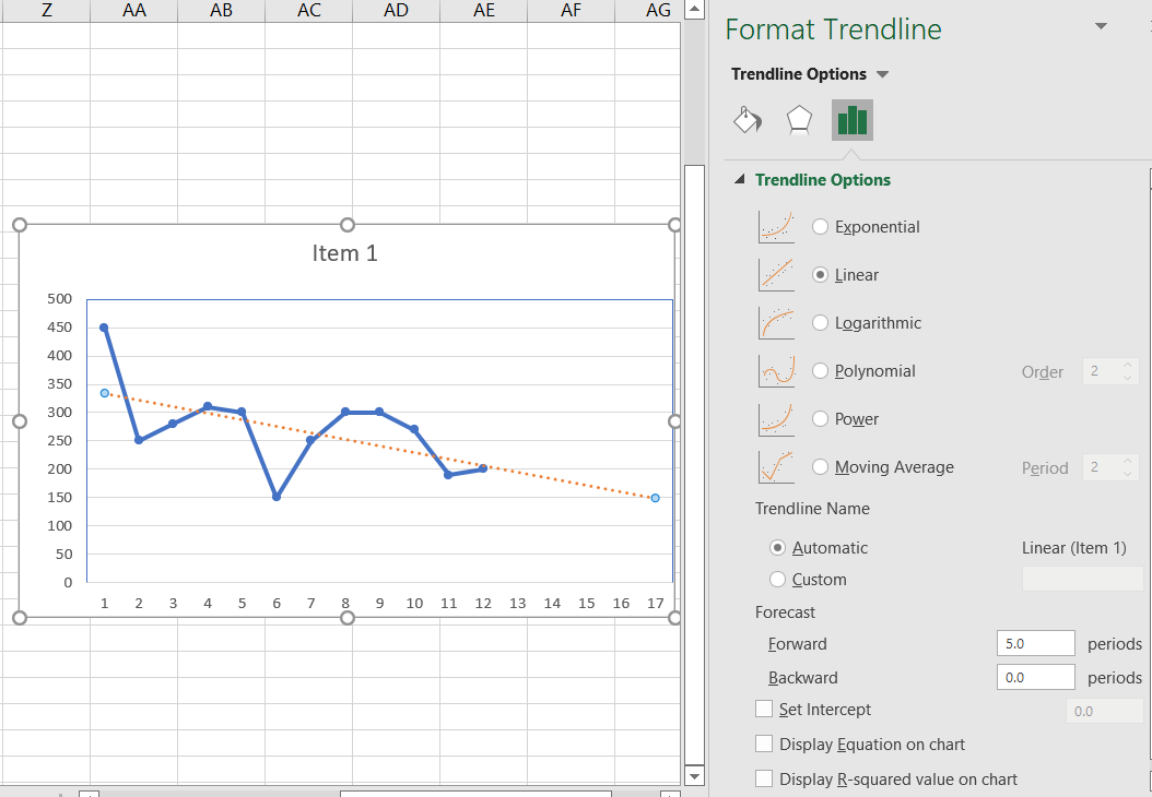
We can also extend a trendline to determine data trends in the past or future. To extend a trendline,
- Select the trendline.
- Right-click → Format Trendline.
-
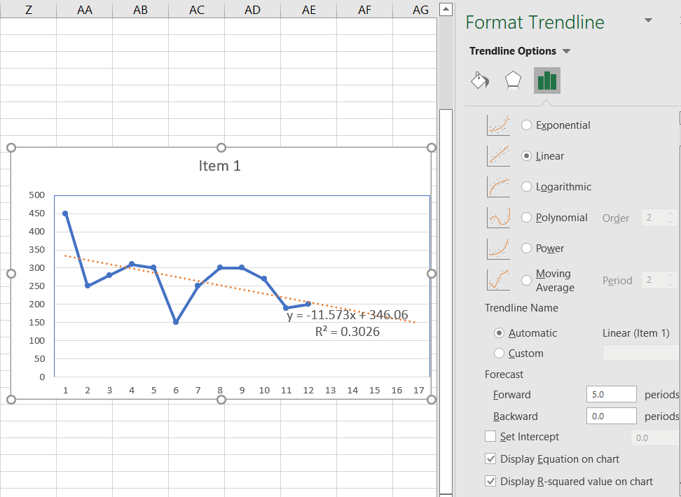
A pane will appear on the right side of the screen. Go to the Trendline Options tab
 . At the bottom, there will be two labels under Forecast, Forward, and Backward. Type the desired value in forward to project the future data trends and backward to project the backward data trends.
For example, the below chart depicts a trendline predicting future trends for the next 5 months of the sales of item 1 in a company.
Next, we will see how to display a trendline equation on the chart.
Displaying Trendline Equation
We can also display the trendline and R-squared value equation in the chart. To do so, follow these steps-
- Select the trendline.
- Right-click → Format Trendline.
-
A pane will appear on the right side of the screen. Go to the Trendline Options tab . At the bottom, there will be two labels Display Equation on chart and Display R-squared value on chart. Check them to display the equation and R-squared value.
For example, the below chart depicts a trendline with the trendline equation and R-squared value.
Next, we will see how to delete a trendline.
Deleting a Trendline
There are two ways to delete a trendline.
Method 1:
- Select the trendline.
- Right-click → Delete.
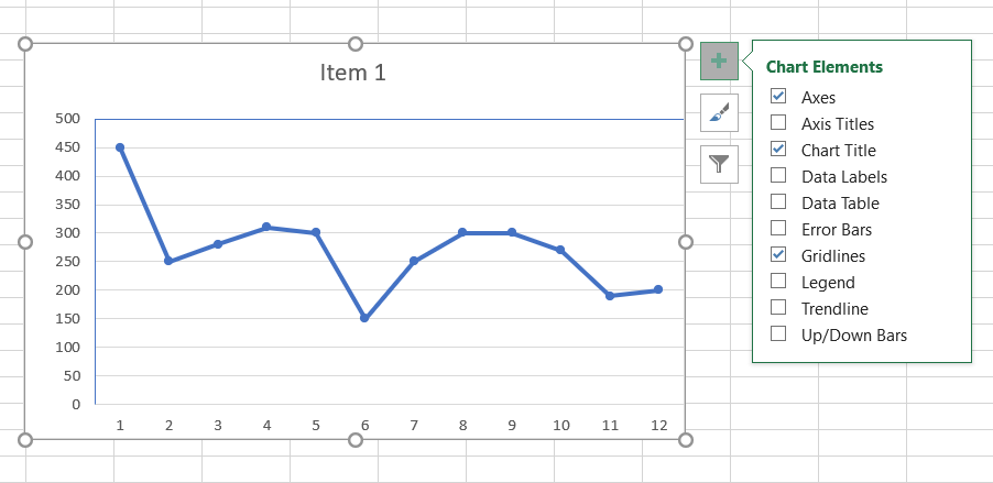
Method 2:
- Select the chart.
- Click on the Chart Elements button.
- Unselect the Trendline box.


 9+ registered

