Do you think IIT Guwahati certified course can help you in your career?
Introduction
Vaadin}> Framework was made available as open source in 2002 and is covered by the highly liberal Apache 2 license. Today, more than 1,50,000 developers around the world utilise Vaadin, which is used by more than 40% of Fortune 100 companies.
Developers can utilise the Vaadin-Grid, one of the Vaadin Components, to load data from any data source. This blog will give you insights into Vaadin-Grid, its components, Sorting, Filtering, Item details, and many more.
Vaadin-Grid
One can display and modify tabular data that is organised into rows and columns using the Vaadin-Grid component.
The component is an excellent illustration of a complicated component that is incredibly flexible and user-friendly and provides a good amount of capability right out of the box.
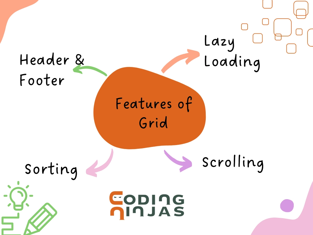
Features of Vaadin-Grid
The features of a Vaadin-Grid include:
🔥 Header and footer
🔥 Sorting
🔥 Scrolling
🔥 Lazy loading
🍁 Header and Footer
Plain text is not the only thing the Vaadin-grid may include in the header and footer. It can also contain components. Providing additional functionality, such as filtering, is simple when components are allowed.
🍁 Sorting
Column sorting is integrated with Vaadin-Grid. Hold down the shift key when clicking the column header to activate alternative sorting criteria or secondary sorting.
🍁 Scrolling
Vertical and horizontal scrolling are both possible in the data area. To keep the left columns visible while horizontally scrolling, we can freeze them.
🍁 Lazy Loading
Only visible data is loaded when retrieving data from the server. Even for devices with limited bandwidth, such as mobile phones, this gives a fantastic user experience.
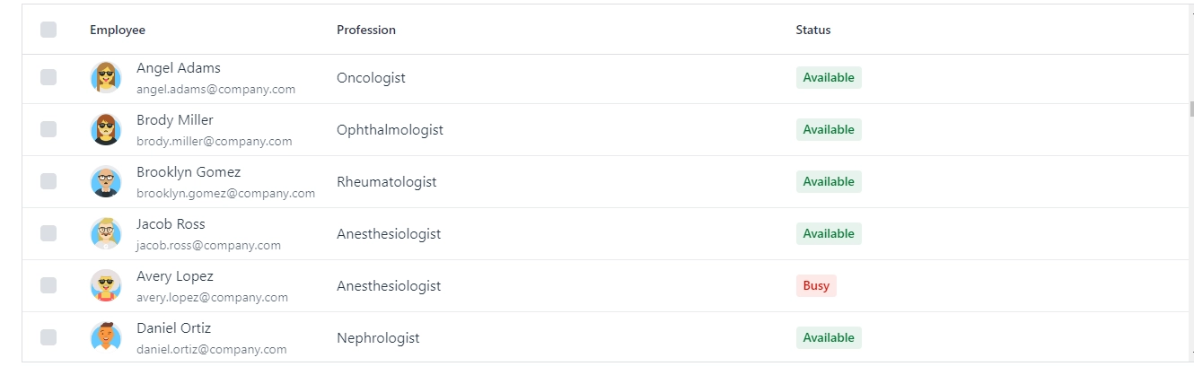
Content of Vaadin-Grid
Simple Grids displays data in rows and columns using plain text. To present extra information in a way that is easier to read, we can use rich content. Elements like input fields and buttons are also supported as the content of Vaadin-Grid.
Let’s understand the content of Vaadin-Grid using an example:
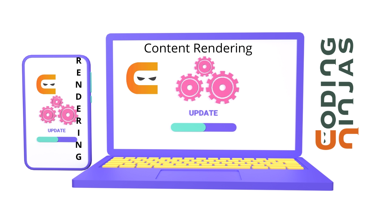
To render custom contents of Vaadin-Grid, we can use:
🔥 Component renderers or
🔥 Lit renderers
Let’s compare Component renderers vs Lit renderers and understand which one is best to use for the rendering of custom contents(flow only).
Selection
By default, the selection is not turned on. Grid allows for single and multiple selections. While multi-select allows the user to select numerous items, single select only allows the user to select one specific object.
Single Select
By clicking anywhere on a row when in single selection mode, the user can choose and deselect that row.
Syntax
Grid<Student> grid = new Grid<>();

grid.setSelectionMode(SelectionMode.SINGLE);

SingleSelect<Grid<Student>, Student> studentSelect = grid.asSingleSelect();

// studentSelect can now be used with Binder or HasValue interface


studentSelect.addValueChangeListener(e -> {
    Student selectedStudent = e.getValue();

});
Multi Select
A checkbox column can be used in multi-select mode by the user to choose and deselect rows.
Vaadin-Grid has a 400-pixel default height. If its contents fill the available space, it becomes scrollable.
The dataset's item count can determine a grid's height in addition to any fixed or relative value, which causes the grid to grow and contract according to the number of rows.
To prevent performance issues, remember that this disables scrolling and shouldn't be used for large data sets.
Columns
It is possible to configure column alignment, freezing (fixed position), grouping, headers and footers, visibility, and width. Column resizing and orders can be made available to users.
📙 Column Alignment
There are three supported column alignments:
🌻 Left (the default)
🌻 Centre
🌻 Right
The right alignment is advantageous when comparing numeric data since it improves readability and scannability. To further enhance digit alignment, tabular numerals (if the font supports them) or a monospace typeface could be utilised.
📙 Column Freezing
To prevent columns and column groups from scrolling a grid horizontally, they can be frozen or made "sticky." A grid with multiple columns can be beneficial for ensuring that the most crucial columns are constantly visible.
Although technically, every column can be frozen, this function is best utilised to freeze the grid's first or last few columns, leaving the columns between them unfrozen.
📙 Column Width
By default, all columns have the same width. Any column can have a specified width defined for it, or you can let the Grid decide the width depending on the contents.
The width of a column may be fixed or variable (default). Non-fixed width columns expand or contract when the number of space changes, whereas fixed width columns do not.
📙 Column Grouping
It is possible to combine columns. The header and footer are the same for all grouped columns. To better view and arrange linked or hierarchical data, use this functionality.
📙 Column Resizing and Reordering
When comparing data that isn't adjacent by default, allowing the user to reorganise columns can be helpful. Columns that are grouped can only be rearranged inside their group.
When a column's content does not fit and is either cut off or changes in length, resizing is useful.
📙 Header and Footer
Each column's header and footer are individually editable. The name is displayed in plain text in a simple column header. Since footers are empty by default, they are hidden. Rich content and components may be found in both.
Sorting
Sorting can be done for any column. Enable sorting so the user can arrange the items in an orderly, logical, chronological, etc.
By specifying the attribute to sort by, we can additionally order columns that include rich or customised material. We may, for instance, have a column with a person's name, email address, and profile image ordered by the last name.
It is usually advised to enable sorting for all appropriate columns, except for situations where the order of the items is a crucial component of the data itself. Sorting aids users in finding and analysing the data (such as prioritised lists).
Filtering
By using filtering, a user can quickly locate a specific item or collection of things. You can utilise external filter fields or apply filters to Grid columns.
We can use the filters outside the grid when:
🌻 Multiple columns are used to base the filter.
🌻 There is a need for a larger field or a filter user interface that cannot easily fit in a column.
Drag and Drop
Grids allow for drag and drop operations, such as rearranging rows and moving rows between grids.
Where a drop can occur depends on the grid's drop mode. Vaadin-Grid provides four distinct drop modes:
🔥 On Grid
🔥 Between
🔥 On Top
🔥 On Top or Between
→ On Grid: Drops can happen anywhere on the grid, not just on top of or between specific rows. When the order is unimportant, choose this option.
→ Between: There may be drops in between rows. Use this mode if the sequence is crucial.
→ On Top: Rows may be dropped on top. This is helpful when linking stuff together or inserting one thing into another, like putting a file inside a folder.
→ On Top or Between: Drops may happen above or between rows.
Styling Vaadin-Grid
You can style specific cells based on the data, for instance, to draw attention to changes or significant data. Theme variants can be used to style the rows and columns of grids.
Grid variations allow users to alter the visibility of the border and row highlights, as well as how cell content overflows will behave.
Variants may be mixed and matched at will.
🍁 Compact
By lowering the header and row heights as well as the space between columns, the compact theme version makes a grid denser.
Without needing to scroll, it can display more information on the screen. Additionally, it can aid in enhancing row-to-row comparability and scannability.
🍁 No Border and No Row Border
The grid's outside border is gone when using the no-border theme option.
The horizontal row borders are gone in the “no row border” variation of the theme. Small datasets are the most suitable for it. Larger sets may be challenging to parse unless combined with the row-stripes theme variant.
🍁 Row Stripes
Each row gets a different backdrop colour thanks to the row-stripes motif. On scannability, it might be advantageous.
🍁 Wrap Cell Content
By default, overflowing cell content is trimmed or truncated. Instead, the content is wrapped in this variation.
Cell Focus
Cells can be focused using the keyboard or by clicking on them.
There are the following keyboard shortcuts:
🔥 Tab: Focus is changed between the header, body, and footer of the grid.
🔥 →, ←, ↑, ↓: Focuses on different cells within a certain area of the grid.
🔥 Page Down: Lowers the cell focus by one visible row's worth of pages.
🔥 Page Up: Raises the cell emphasis by one visible row's worth of pages.
🔥 Home: Focuses on the first row's cell.
🔥 End: Focuses on the row's last cell.
To be informed when the user switches between cells with focus, use the cell focus event. By default, only keyboard navigation allows you to see the focus outline. The example below uses custom styles to show the focus outline when clicking on cells for demonstrative purposes.
Frequently Asked Questions
Is Vaadin utilised widely?
One of the most well-liked Java web development frameworks, Vaadin, is frequently used to create robust and scalable web applications.
Is Vaadin scalable?
Finally, the answer is that Vaadin apps do scale effectively. Errors are possible with any framework, as with anything else. However, it's simple to develop applications with Vaadin that not only scale well but also look amazing and operate excellent, making your users happy by adhering to traditional Java best practices.
Is Vaadin a good framework?
A reliable web framework for creating sophisticated online applications is Vaadin. With Vaadin, creating web-based GUIs is incredibly easy, fast, and similar to creating desktop applications. There are circumstances, though, in which Vaadin is inappropriate.
Conclusion
In this blog, we ran through Vaadin-Grid. We discussed the features, contents, and content rendering in Vaadin-Grid. We briefly discussed the sorting, filtering, drag & drop, and styling of Vaadin-Grid.
We hope this blog increased your knowledge regarding the Vaadin-Grid. We recommend you to visit our articles on different topics of Vaadin, such as


 9+ registered

