Introduction
Traditional weather forecasting uses complex physics models with many atmospheric conditions over a long period. However, these models are volatile due to the disturbance of the weather system, which leads to inaccurate predictions.
This article will explain how the weather is predicted using Machine Learning concepts. Machine Learning is a technique to prepare a model using a training dataset. A model is a formula to predict the output using weights and variables for each training variable.
So let's get started.
Prerequisite
- Basic knowledge of pandas, numpy, matplotlib, seaborn, statsmodels, tqdm_notebook, product.
- Must be familiar with ARIMA, SARIMAX concept.
Implementation
Essential libraries
|
import pandas as pd import numpy as np |
These are some essential libraries that will help in preparing the model.
Dataset Exploration
I will use the GlobalLandTemperaturesByMajorCity dataset available on Kaggle.
This is the first important step in making the model.
Read the dataset using pandas.
|
data = pd.read_csv("GlobalLandTemperaturesByMajorCity.csv") data.head() |
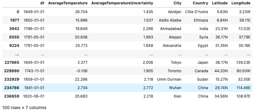
Below is the dataset structure and first five entries of the dataset.

Let us just check the total number of distinct cities in the dataset. Select any one city for forecasting purposes.
|
all_cities = data.drop_duplicates(['City']) all_cities |
We can see that we have a total of 100 distinct cities in our dataset.
Preprocessing, Advanced Visualization, Stationary Check
In this part, we will process the raw data, extract some helpful information, and modify it accordingly.
As we saw, there are 100 different cities in our dataset. You can select any one of them. In the below model, I will perform forecasting on Ahmadabad city.
Let us extract all the data of Ahmadabad city.
|
adi_data = data[data['City'] == "Ahmadabad"] adi_data.shape |
We are storing all the data of Ahmadabad city in the ‘adi_data’ variable. Below is the output of the first five entries of the dataset and the total size of the dataset.


In the preprocessing part, we must check for the NaN values in the dataset. If there are a lot of NaN values in the dataset, we must replace every NaN value with some standard methods, or else we can drop the values.
|
exp = (0.1, 0.1) plt.pie(adi_data.isna().value_counts(), explode=exp, startangle=10,colors=['chocolate','saddlebrown'], labels=['Non NaN elements','NaN elements'], textprops={'fontsize': 15}) |
We can see that a tiny portion of the dataset has NaN values, so we will drop all those NaN values.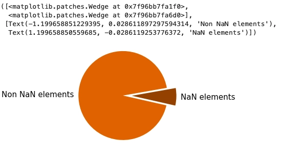
After removing the NaN values from the dataset, let us check the size of the remaining dataset.
|
adi_data = adi_data.dropna() adi_data.shape |
There is a sufficient amount of data left to perform forecasting.

Now reset the index of the dataset. If you don't use the index column, you can drop it too, as I found no use here, so I will drop the index column. Change the “dt” column with proper date-time format using the “to_datetime” function.
|
adi_data = adi_data.reset_index() adi_data = adi_data.drop(columns = ['index']) adi_data.dt = pd.to_datetime(adi_data.dt) adi_data.head() |
This is a modified version of our dataset.

For easier use, let us make separate columns for year, month, weekday, and day.
|
year = [] month = [] weekday = [] day = [] for i in range(len(adi_data)): year.append(adi_data.dt[i].year) month.append(adi_data.dt[i].month) weekday.append(adi_data.dt[i].weekday()) day.append(adi_data.dt[i].day) adi_data['year'] = year adi_data['month'] = month adi_data['weekday'] = weekday adi_data['day'] = day adi_data.head() |
Dataset looks like this after making specific changes.

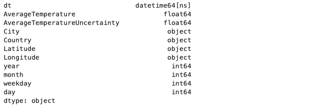
Let us look over the data types in which our data is stored.
| adi_data.dtypes |
Now we will see scatter plot for average temperature values in the data set.
|
avg_tmp_lst = adi_data['AverageTemperature'].tolist() year_lst = adi_data['year'].tolist() month_lst = adi_data['month'].tolist() sns.scatterplot(adi_data['year'].tolist(),adi_data['AverageTemperature'].tolist()) |
The below output shows that the scatter plot has many overlapped values, so it's challenging to analyze the dataset.
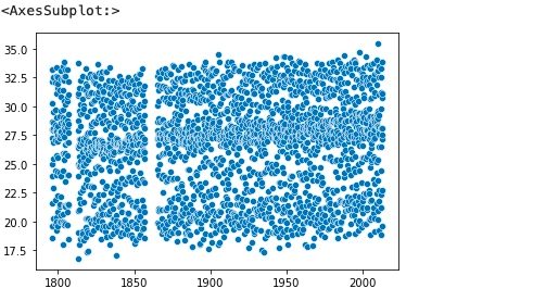
Hence, will check if there are any patterns in the dataset by plotting the average temperature for every decade.
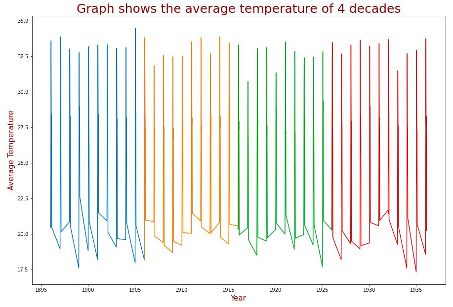
I am defining a time series function; it takes input as starting and ending year and gives the output a list of all the average temperatures and their time from starting to ending year.
Using the time series function and matplotlib we will plot the average temperature of four decades starting from 1896 and ending at 1936.
|
def get_timeseries(start, end):
|
The below graph shows the average temperature plot for four decades. Each color represents a decade. From this graph, we can understand that it follows a particular pattern every year.
While using ARIMA models, we must ensure that our time series data is stationary. To check whether the selected time-series data is stationary, we must plot autocorrelation and partial autocorrelation graphs.
|
fig = plt.figure(figsize=(12,8)) ax1 = fig.add_subplot(211) fig = sm.graphics.tsa.plot_acf(adi_data.AverageTemperature, ax=ax1,color ='firebrick') ax2 = fig.add_subplot(212) fig = sm.graphics.tsa.plot_pacf(adi_data.AverageTemperature, ax=ax2,color='firebrick') |

The above graph suggests that the time series data is not stationary. Nonetheless, performing the AD Fuller Test on the entire dataset tells us that the dataset is stationary.
|
result = adfuller(adi_data.AverageTemperature) print('ADF Statistic on the first decade: {}'.format(result[0])) print('p-value: {}'.format(result[1])) print('Critical Values:') for key, value in result[4].items(): print('\t{}: {}'.format(key, value)) |

But it is true just because we are looking at the entire dataset. In fact, if we analyze a single decade, it is clear that the dataset is absolutely not stationary for the decade period of time.
|
result = adfuller(adi_data.AverageTemperature[0:10]) print('ADF Statistic on the first decade: {}'.format(result[0])) print('p-value: {}'.format(result[1])) print('Critical Values:') for key, value in result[4].items(): print('\t{}: {}'.format(key, value)) |

Machine Learning
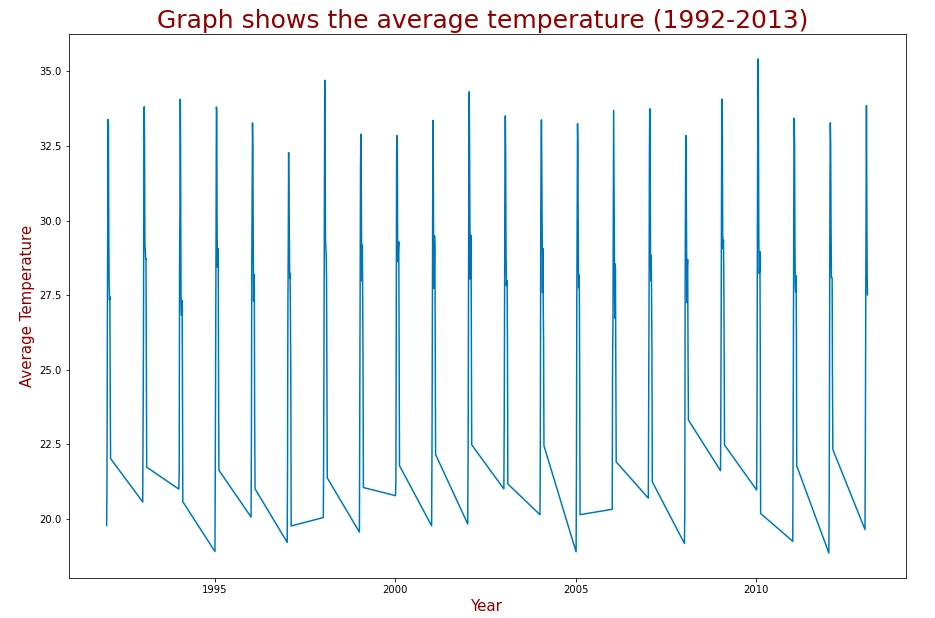
For preparing the model, I will consider the time series from 1992 to 2013.
|
plt.figure(figsize=(15,10)) plt.title("Graph shows the average temperature (1992-2013) ",fontsize=25,color='maroon') plt.xlabel("Year",fontsize=15,color='maroon') plt.ylabel("Average Temperature",fontsize=15,color='maroon') x = get_timeseries(1992,2013) plt.plot(x[0],x[1]) |
Here’s is the plot of average temperature versus year.
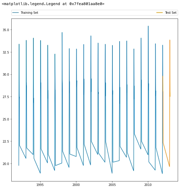
Let us split the dataset (from 1992 - 2013) into training and testing data.
|
dataset = get_timeseries(1992, 2013) N = len(dataset[0]) split = 0.95 training_size = round(split*N) test_size = round((1-split)*N) series = dataset[1][:training_size] date = dataset[0][:training_size] test_series = dataset[1][len(date)-1:len(dataset[0])] test_date = dataset[0][len(date)-1:len(dataset[0])] |
Plotting the train and test data.
|
fig, ax = plt.subplots(figsize=(10,10)) train = ax.plot(date,series, label = "Training Set") test = ax.plot(test_date,test_series, label = "Test Set") ax.legend(bbox_to_anchor=(0., 1.02, 1., .102), loc='lower left', ncol=2, mode="expand", borderaxespad=0.) |
Here comes the main algorithm called ARIMA model. ARIMA is also called as autoregressive integrated moving average this model is based on optimization procedure that adopts maximum likelihood function.
|
def optimize_ARIMA(order_list, exog): """ Return dataframe with parameters and corresponding AIC order_list - list with (p, d, q) tuples exog - the exogenous variable """ results = [] seasonal_order = (0, 0, 0, 0) for order in tqdm_notebook(order_list): try: model = SARIMAX(exog, order=order, seasonal_order=seasonal_order).fit(disp=0) aic = model.aic results.append([order, model.aic]) except: continue result_df = pd.DataFrame(results) result_df.columns = ['(p, d, q)', 'AIC'] result_df = result_df.sort_values(by='AIC', ascending=True).reset_index(drop=True) return result_df |
First we will perform operation for zero-differentiated ARIMA models. In the code below, d = 0 is declared for zero-differentiated ARIMA model.
|
ps = range(0, 10, 1) result_d_0.head() |
The result for the zero-differentiated ARIMA model.
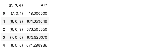
Now lets perform the same operation for d = 1 indicates as first-differentiated ARIMA models.
|
ps = range(0, 10, 1) d = 1 qs = range(0, 10, 1) # Create a list with all possible combination of parameters params = product(ps, qs) paras_list = list(params) order_list = [] for each in params_list: each = list(each) each.insert(1, d) each = tuple(each) order_list.append(each) result_d_1 = optimize_ARIMA(order_list, exog = series) result_d_1.head() |
The result for the first-differentiated ARIMA model.
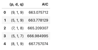
So let us combine the results from both the operations (zero and first differentiated models). Pick the best model from the combined results.
|
final_result = result_d_0.append(result_d_1) bestmodel = final_result.sort_values(by='AIC', ascending=True).reset_index(drop=True).head() best_model_params_0 = bestmodel[bestmodel.columns[0]][0] best_model_params_1 = bestmodel[bestmodel.columns[0]][1] |
|
best_model_0 = SARIMAX(series, order=best_model_params_0).fit() best_model_1 = SARIMAX(series, order=best_model_params_1).fit() |
Till now, we have successfully created the model using ARIMA.
Forecasting
Here comes the final part, now we will train the dataset using the prepared model.
|
fore_l= test_size-1 forecast = best_model_0.get_prediction(start=training_size, end=training_size+fore_l) forec = forecast.predicted_mean ci = forecast.conf_int(alpha=0.05) s_forecast = best_model_1.get_prediction(start=training_size, end=training_size+fore_l) s_forec = s_forecast.predicted_mean s_ci = forecast.conf_int(alpha=0.05) |
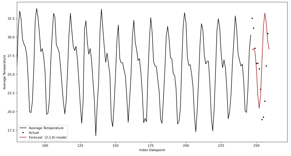
Let us plot our results.
|
fig, ax = plt.subplots(figsize=(15,8), dpi=300) x0 = adi_data.AverageTemperature.index[0:training_size] x1=adi_data.AverageTemperature.index[training_size:training_size+fore_l+1] plt.plot(x0, adi_data.AverageTemperature[0:training_size],'k', label = 'Average Temperature') plt.plot(adi_data.AverageTemperature[training_size:training_size+fore_l], '.k', label = 'Actual') forec = pd.DataFrame(forec, columns=['f'], index = x1) s_forec = pd.DataFrame(s_forec, columns=['f'], index = x1) s_forec.f.plot(ax=ax,color = 'firebrick',label = 'Forecast (2,1,6) model') plt.legend(loc = 'lower left') plt.xlim(80,) plt.xlabel('Index Datapoint') plt.ylabel('Average Temperature') plt.show() |
The below plot shows our forecast; the black line and dotted lines show the actual temperature, the red line shows the predicted temperature.
